Figma brand colors
- Black
#000000 - White
#FFFFFF - Grey 54%
#757575 - Hairline
#D6D6D6 - Wash
#F5F5F5 - Red
#FF3737 - Purple
#874FFF - Green
#24CB71
Independent study. Not official and not affiliated with Figma.
The canvas is the brand. Figma keeps its own chrome black, white and quiet so the things people make in Figma supply all the color, and saves its jumbo primitives for campaigns.

#000000#FFFFFF#757575#D6D6D6#F5F5F5#FF3737#874FFF#24CB71
Plain, Declarative, Calm
A black-and-white product page where the color comes from the work. One light weight of Figma Sans, square media and a giant black Get started button. Behind it sits a jumbo language of primitives and an expanded palette for campaigns.
A black-and-white frame lets the work people make in Figma be the color.
The Brand Book publishes five icon colors with PMS and CMYK. The 2024 refresh kept the signature purple and added bold primaries, neons and earthy tones in three schemes (Core, Warm, Cool), each a primary plus four secondaries, in light and dark modes. The homepage itself is black and white; color arrives only through product imagery.
Figma wanted one face that works for display and long reading, for designers, developers and newcomers.
Figma Sans (Grilli Type) at one light weight; hierarchy is size alone: 88, 56, 44, 30, 24, 16, 14px. Display sizes use a narrower width (wdth 96) and -1.25px tracking. Figma Mono sets the uppercase labels. The family also has Figma Condensed and Figma Hand (OH no Type).
The wordmark carries the brand where it is known; the lockup boosts recognition where it is not.
Three marks: the wordmark (preferred), the five-shape icon (full color or mono outline) and a lockup of icon plus wordmark for low-awareness settings. App icons put the mark in a rounded square. Wordmark black or white only, aiming for APCA contrast 60.
Color scheme, primitives and composition move in campaign work.
Cover the logo. It should still read as Figma: white page, one light grotesque weight, square product media, a giant black Get started, two-tone heads.
Put another SaaS logo on it. If the oversized black button, grey continuation sentences and full-bleed product grid don't feel out of place, it's generic.

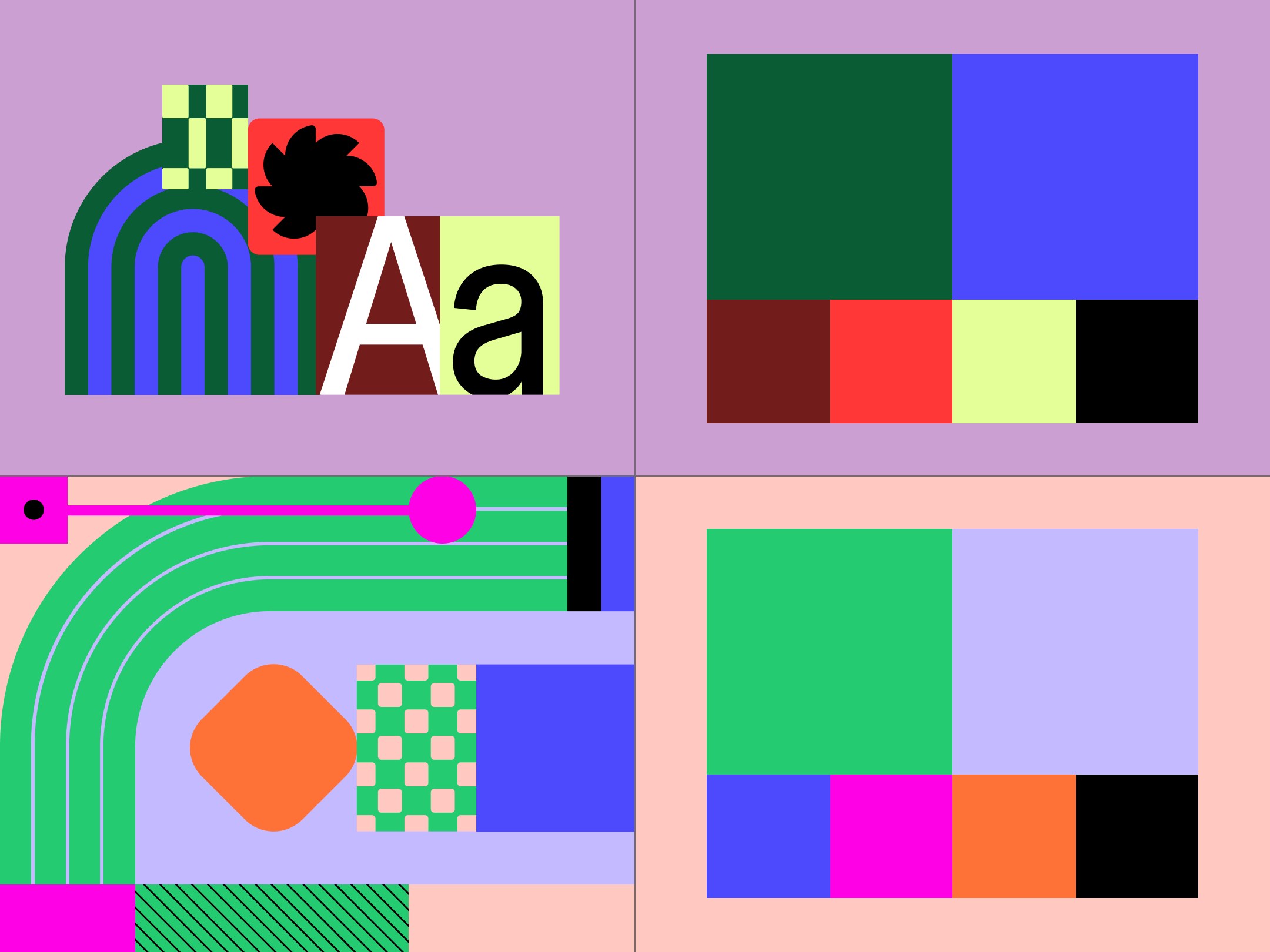

The identity is built in Figma with variables, so the brand demonstrates the product it sells.
One face serves designers, developers and newcomers alike.
Chapters get local expression inside one recognisable kit.
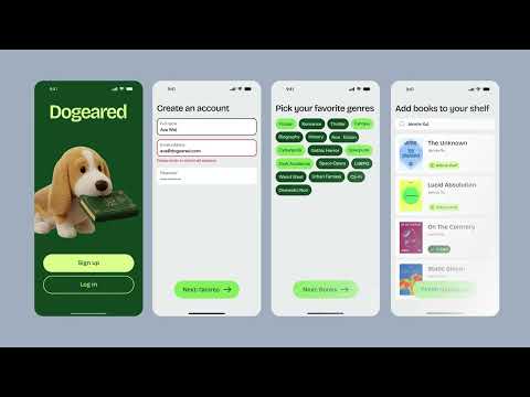 AgentsGoogle, Meta · Jul 2026 – now
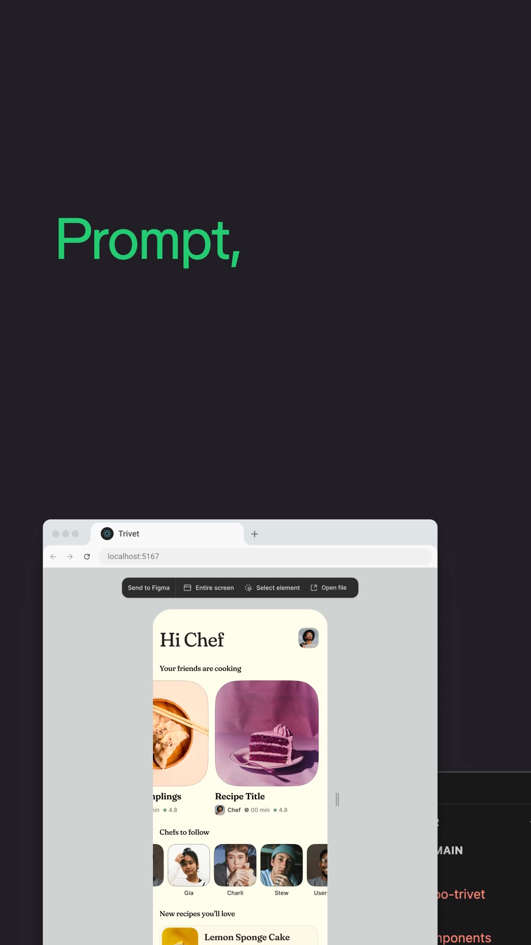 MakeGoogle, Meta · Apr 2026 – now
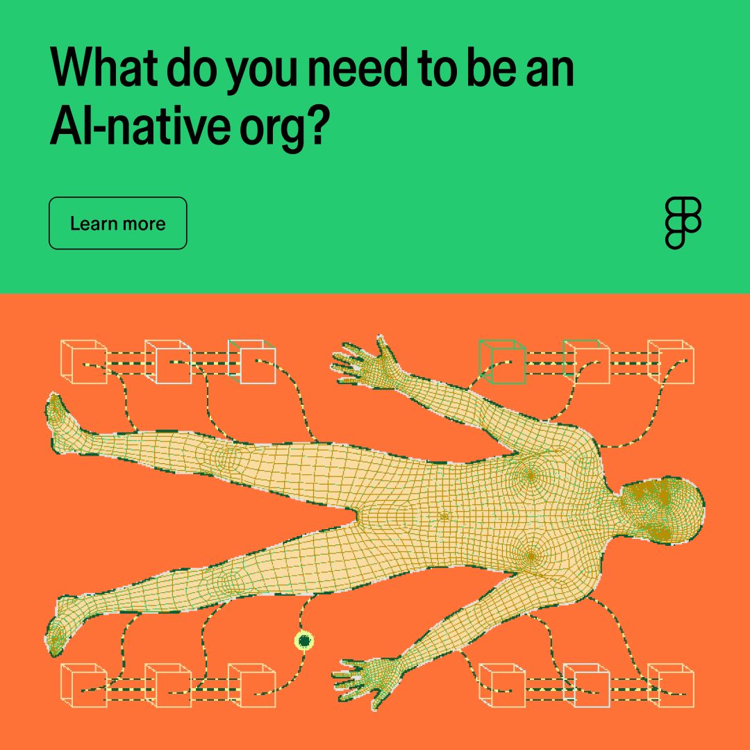 Ai native organizationLinkedIn · Oct – Nov 2026
 Create and collaborate in Figma — because design is…Google · Mar 2026 – now
These are the slips the rules exist to stop. Our reading of the guidelines, not a test of any one model.
The full-stack creative canvas
Get startedYour headline goes here
Your button| Trait | Figma | Your brand |
|---|---|---|
| Main color | #000000 Black | Not read yet |
| Page ground | #FFFFFF | Not read yet |
| Text | #000000 | Not read yet |
| Headline type | Figma Sans | Not read yet |
| Body type | Figma Sans | Not read yet |
| Main color on ground | 21.0:1 | Not read yet |
Figma publishes them at figma.com/using-the-figma-brand, with a public Brand Book PDF that covers identity and logos. The guide points account holders to a Brand Book inside Figma, which needs a sign-in.
Five icon colors: red #FF3737, purple #874FFF, green #24CB71, orange #FF7237 and blue #00B6FF. The wordmark is black or white only.
Figma Sans, commissioned from Grilli Type for the 2024 refresh, with Figma Mono for uppercase labels. Both are proprietary. This page uses Inter and IBM Plex Mono as open stand-ins.
No. Figma lists imitating its visual identity as a don't. Study how the system works, then build your own.
Read the official Figma brand guidelines at figma.com/using-the-figma-brand
This is an independent study. Unfairly is not affiliated with, endorsed by or sponsored by Figma. Logos shown from Figma's own icon file and Brandfetch for reference. Figma is a trademark of Figma, Inc. Not affiliated, and not for download.
Data source: the Figma brand book in Steal Unfairly, built from the sources below. Checked 2026-10-29. Status: draft, facts being checked.
The full Figma brand bookUse this brand in ClaudeSpotify brand guidelinesStarbucks brand guidelinesAll brand guidelines examples
Get your brand auditPut your brand in ClaudeBuild your brand book