Design
Design anything you can imagine: ideas into apps, websites and products (homepage feature). Observed
Brand book
The canvas is the brand. Figma keeps its own chrome black, white and quiet so the things people make in Figma supply all the color, and saves its jumbo primitives for campaigns. Our reading

Color scheme, primitives and composition move in campaign work.
Not published as a ratio. Measured share of the figma.com homepage height at 1440 (8739px): the black footer is 983px (11%), the full-bleed tools grid 1337px (15%), and the white bands with their framed videos take the rest (74%)..
Two voices. The homepage is plain and product-led; the brand language (primitives, schemes, billboards) is louder. Levels are our reading.
Our engine's setting, built from their rules.
Cover the logo. It should still read as Figma: white page, one light grotesque weight, square product media, a giant black Get started, two-tone heads.
Put another SaaS logo on it. If the oversized black button, grey continuation sentences and full-bleed product grid don't feel out of place, it's generic.
Figma presents itself as the full-stack creative canvas: one place where teammates and AI agents design, build and ship together. Observed
Design anything you can imagine: ideas into apps, websites and products (homepage feature). Observed
Build with intention: tools that take you all the way to production (homepage feature). Observed
Teammates and AI agents work in the same space with shared context (homepage section). Observed
The products you love are designed in Figma: customer quote, 95% of the Fortune 500, a logo marquee. Observed
The full-stack creative canvas
Move fast in the right direction on an AI-native canvas.
One workspace for your entire product development process.
Powerfully expressive. Incredibly precise.
In September 2024 Figma's in-house Brand Studio replaced the cursor-and-black-outline look of about five years with a "jumbo" language of primitives, an expanded palette run as variables, motion principles and the custom Figma Sans by Grilli Type.
Category. Collaborative design and product-development platform: Figma Design, Make, Weave, Dev Mode, Motion, Specs, FigJam, Slides, Draw, Sites, Buzz (footer Product column). Observed
Not published on the public brand pages.
Start with design context. Build with consistency.
The products you love are designed in Figma
Ideas no longer have to wait their turn
Explore what you can do in Figma.
Make. Believe.
The homepage leads with one positioning line, "The full-stack creative canvas", then states the product in plain claims: an AI-native canvas, one workspace from WIP to ship, design context for consistent builds. Proof follows: a customer quote, a 95% Fortune 500 stat and a logo row.
Source: figma.com
Tom's plugin for Figma design
Tom's Figma plugin
Adjective use protects the trademark; the plain homepage voice lets the product imagery carry the energy.
PlainDeclarativeCalm
Two voices. Homepage: sentence case, short declaratives, a black claim then a grey explanation, no bold. Trademark guidance: Figma is an adjective (the Figma platform), never a noun, verb or possessive; third parties say "for Figma".
Tom's Figma pluginClara's FigJam tutorialsFigma's (possessive, except the company)to figma (as a verb)
| Case | sentence |
|---|---|
| Two-tone heads | claim #000000 + explanation #757575, same size |


Logos shown from Figma's own icon file and Brandfetch for reference. Figma is a trademark of Figma, Inc. Not affiliated, and not for download.
Figma
Figma Edu
Figma
Figma
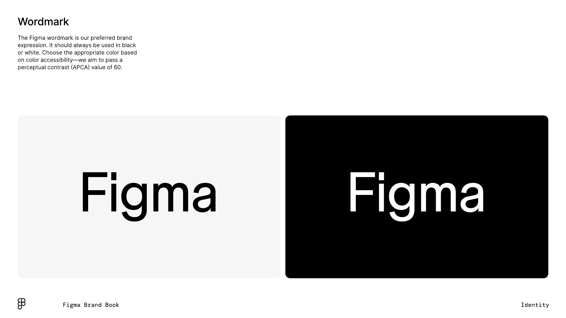
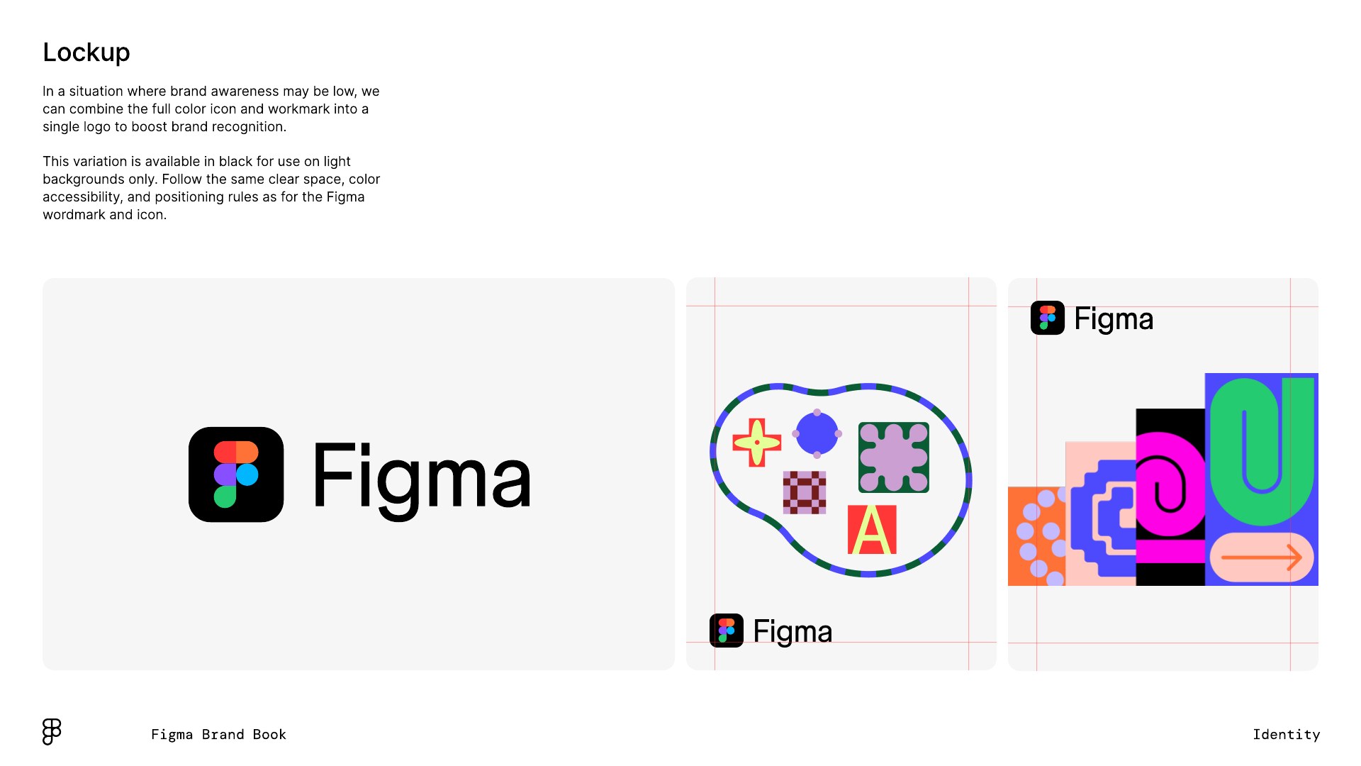
The wordmark carries the brand where it is known; the lockup boosts recognition where it is not.
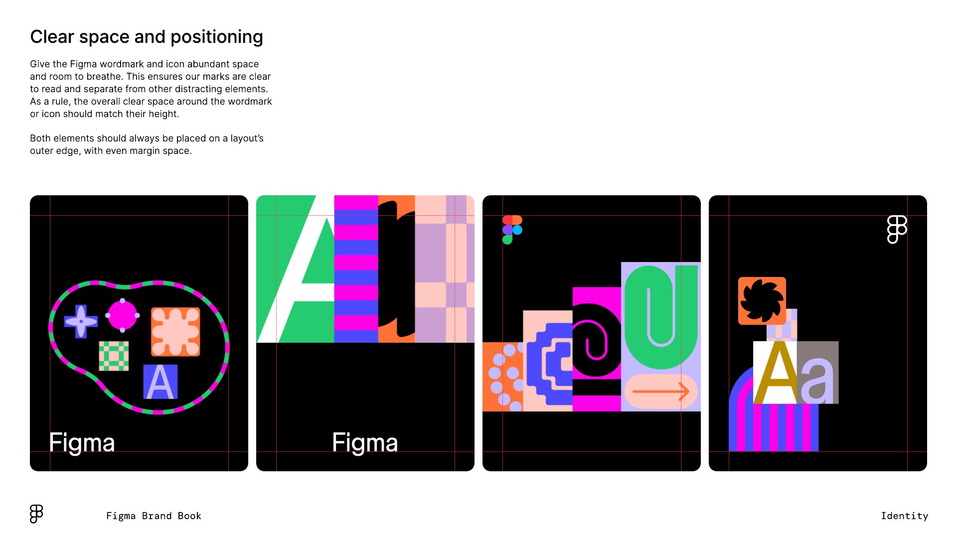
| Clear space | equal to the mark's height |
|---|---|
| Wordmark colors | #000000 or #FFFFFF |
| Contrast target | APCA Lc 60 |
| Minimum size | not published |
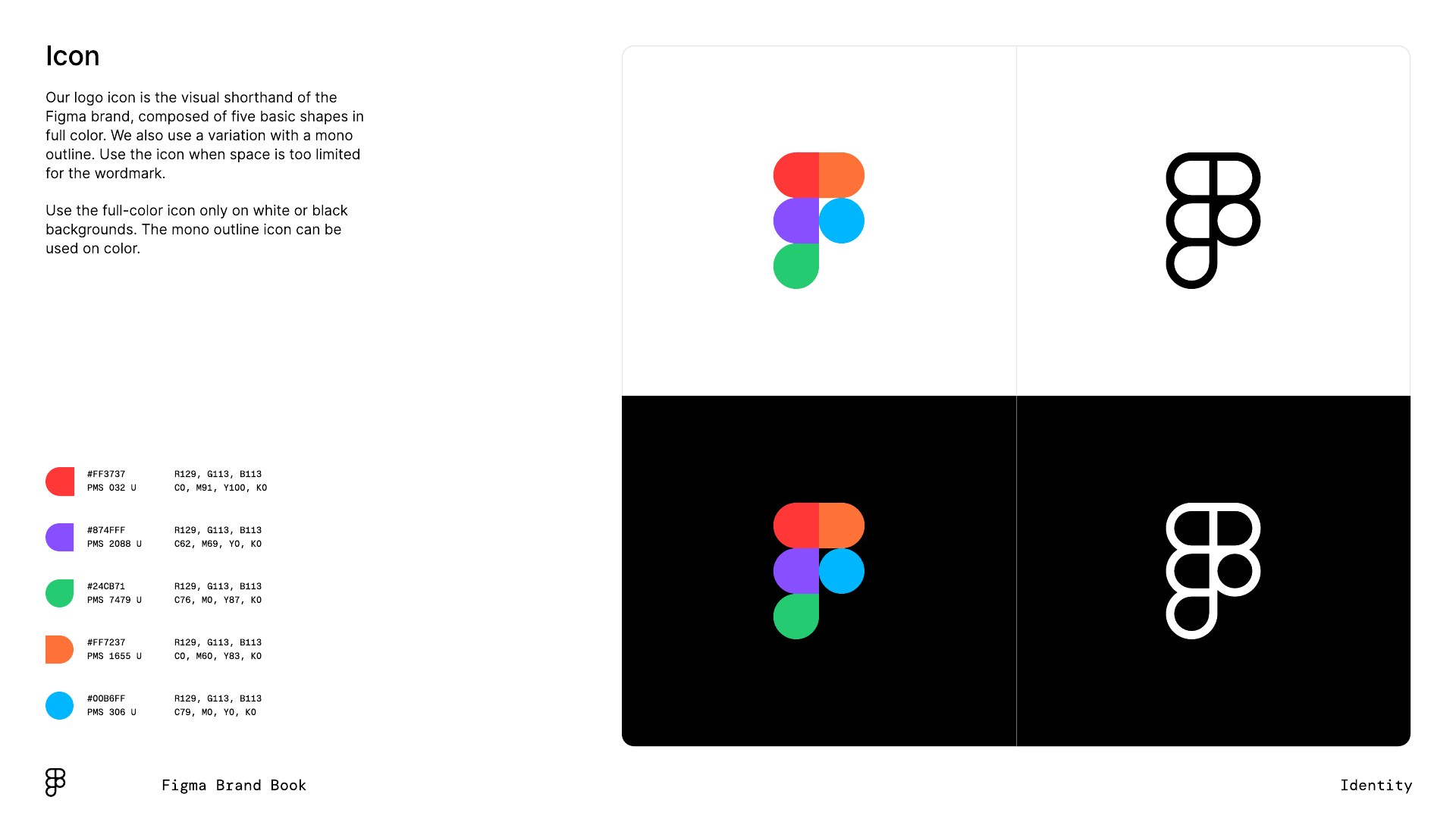
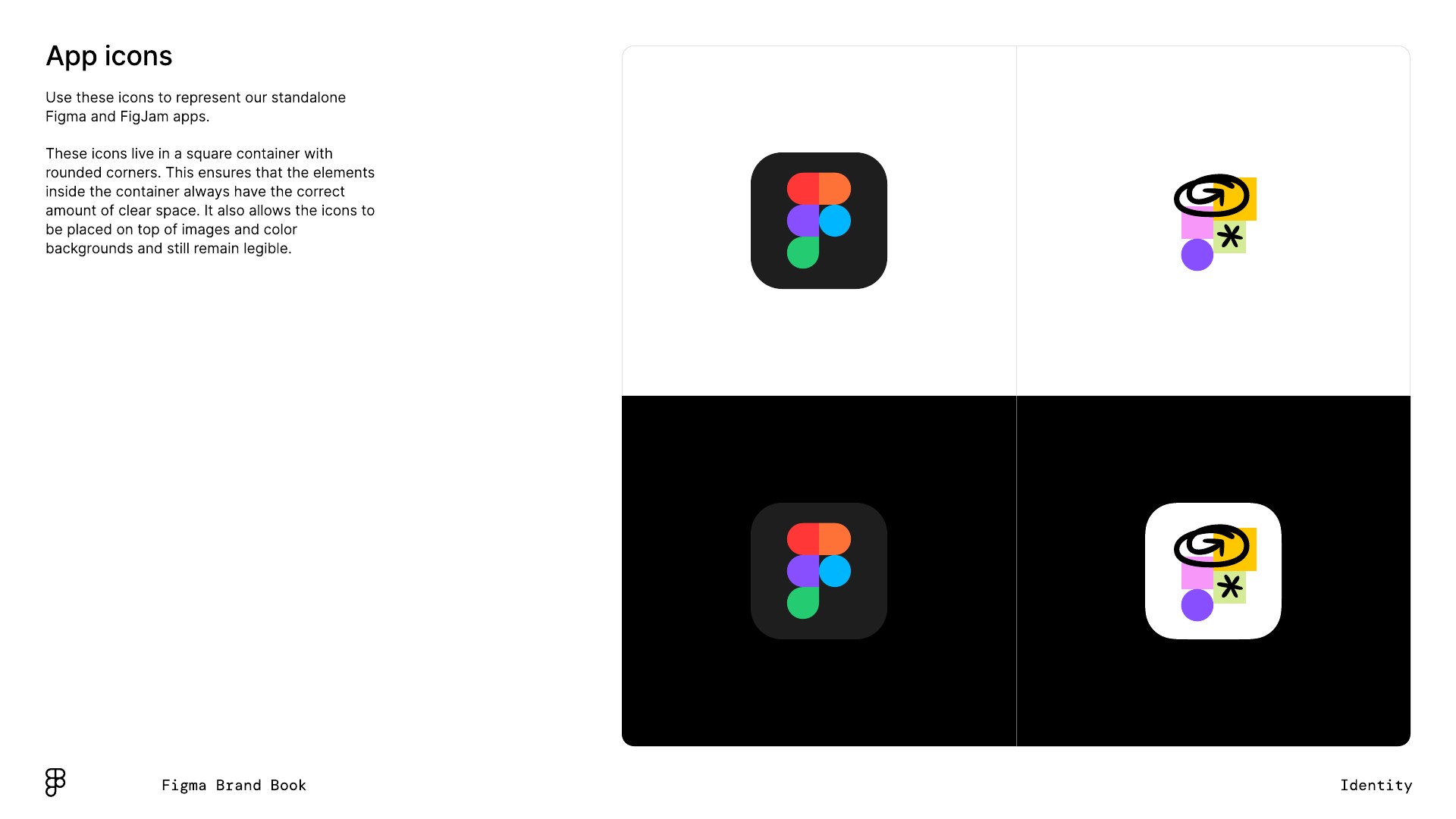
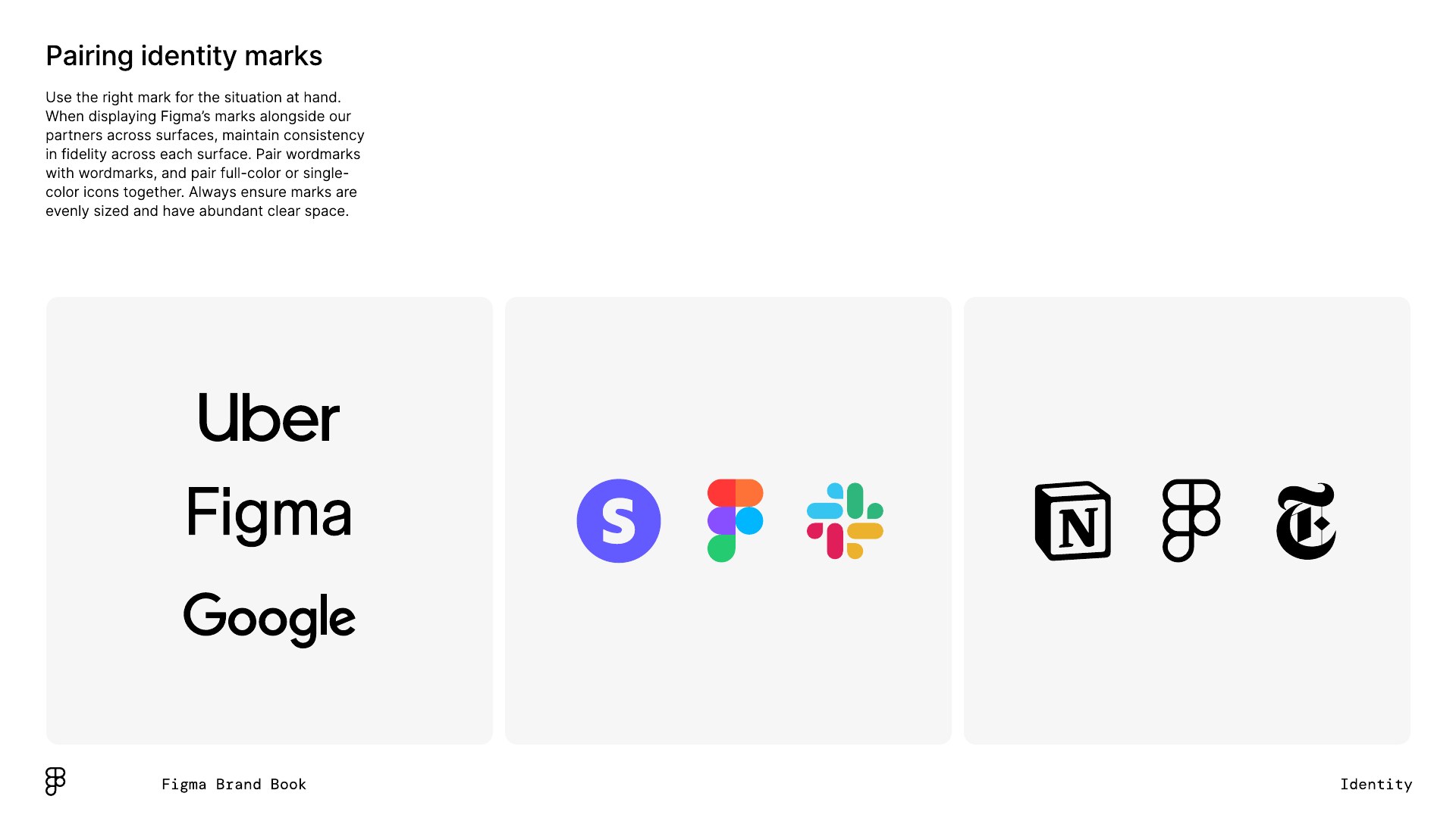
Three marks: the wordmark (preferred), the five-shape icon (full color or mono outline) and a lockup of icon plus wordmark for low-awareness settings. App icons put the mark in a rounded square. Wordmark black or white only, aiming for APCA contrast 60.
Source: static.figma.com/uploads/6645755656177435f83e10b48d9947645b55a033figma.com/using-the-figma-brandstatic.figma.com/uploads/4fbf4d754dbbc027ba1530205f8747cd97d532e5
Get started
A black-and-white frame lets the work people make in Figma be the color.
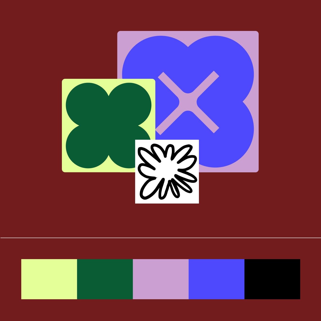
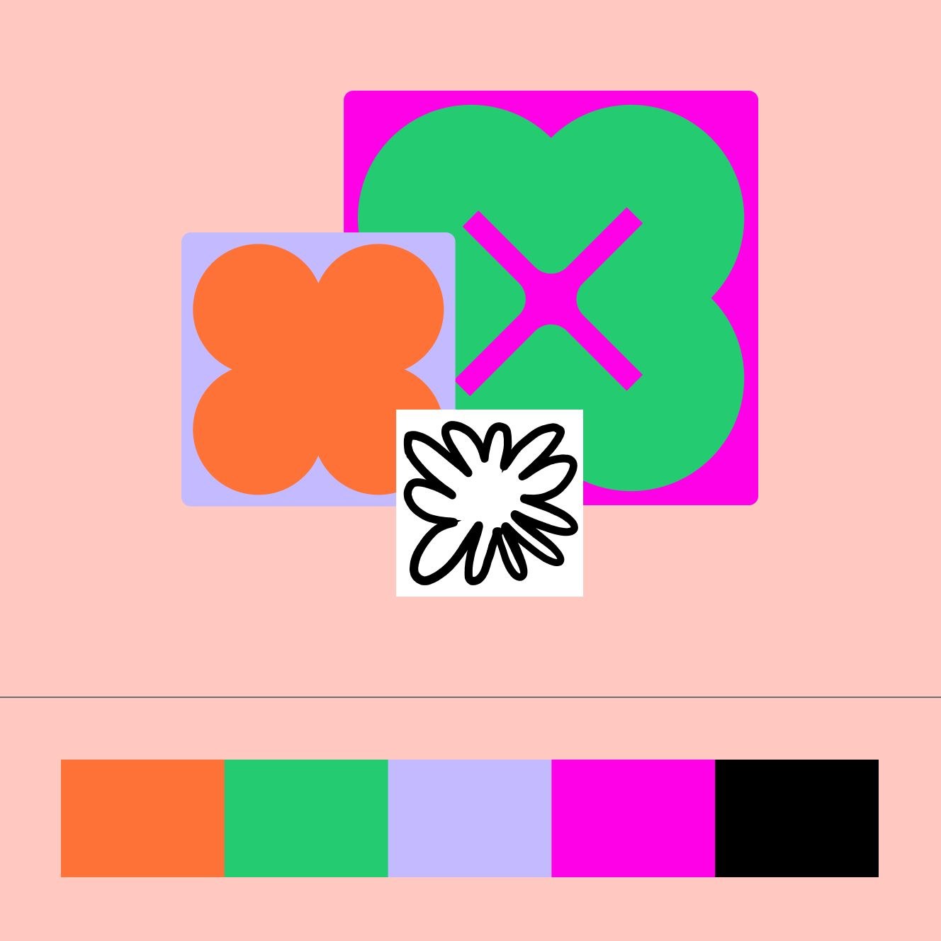
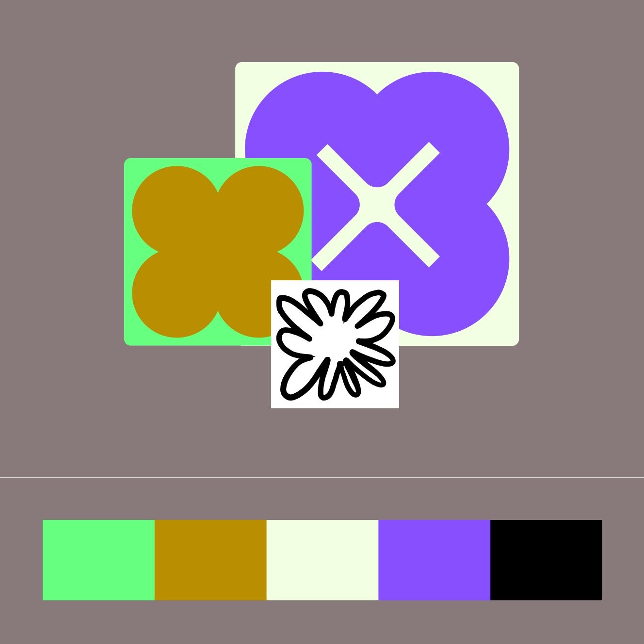
| Icon red | #FF3737 / PMS 032 U |
|---|---|
| Icon purple | #874FFF / PMS 2088 U |
| Icon green | #24CB71 / PMS 7479 U |
| Icon orange | #FF7237 / PMS 1655 U |
| Icon blue | #00B6FF / PMS 306 U |
| Campaign scheme hexes | not published |
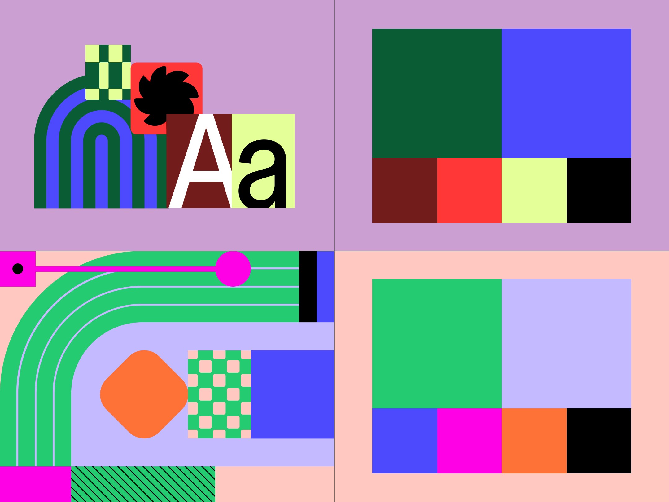
The Brand Book publishes five icon colors with PMS and CMYK. The 2024 refresh kept the signature purple and added bold primaries, neons and earthy tones in three schemes (Core, Warm, Cool), each a primary plus four secondaries, in light and dark modes. The homepage itself is black and white; color arrives only through product imagery.
Source: static.figma.com/uploads/6645755656177435f83e10b48d9947645b55a033figma.com/blog/figma-on-figma-evolving-our-visual-languagefigma.com
The full-stack creative canvas
Move fast in the right direction.
MOVE FAST IN THE RIGHT DIRECTION
Figma wanted one face that works for display and long reading, for designers, developers and newcomers.
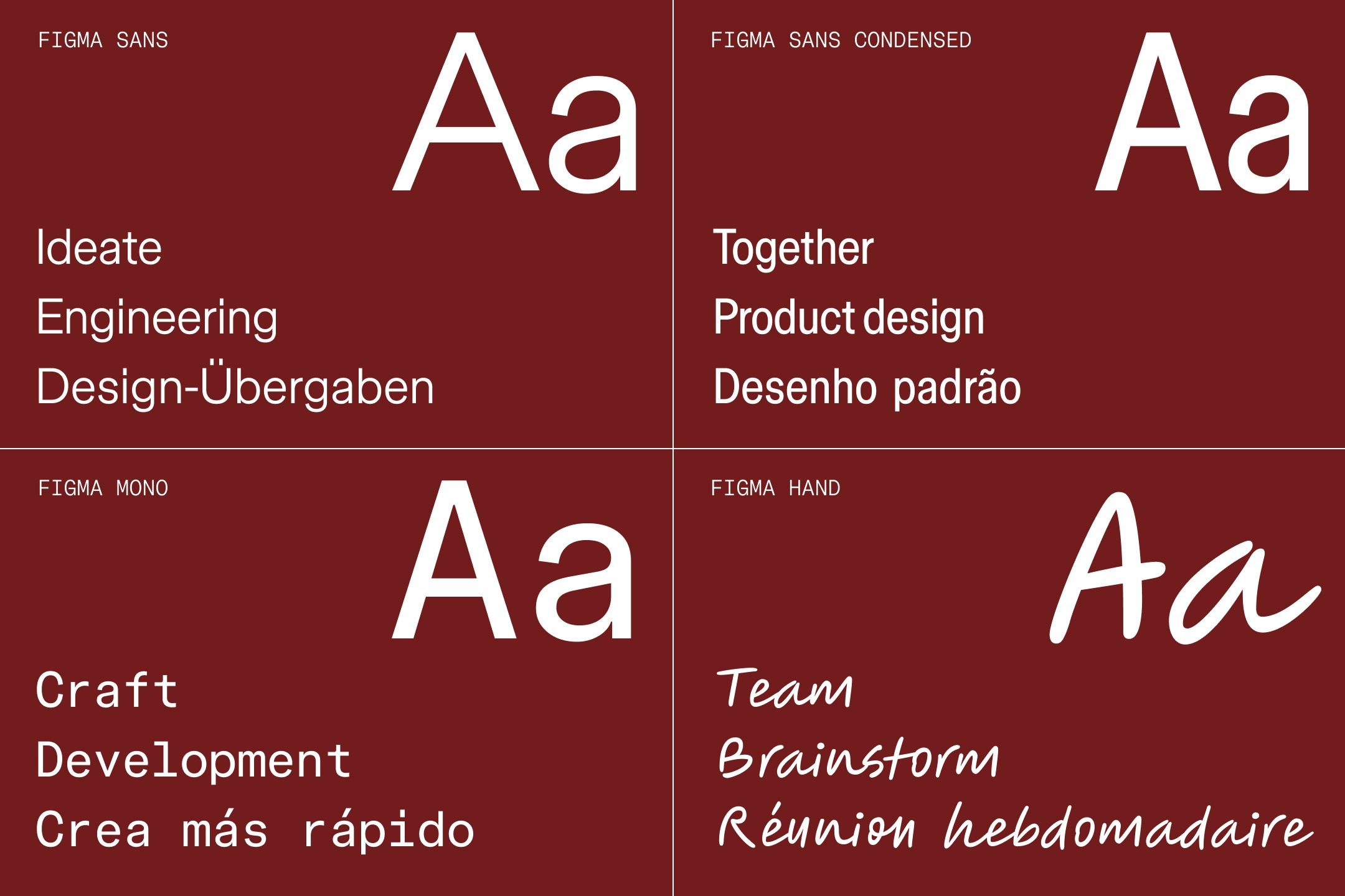
| Their face | Use | License | Open stand-in |
|---|---|---|---|
| Figma Sans | Every heading on figma.com at CSS weight 400 (renders light), wdth 96 at 56px and up | Proprietary: commissioned from Grilli Type for the 2024 refresh; not licensed to third parties | Inter 390, -0.0328em (opsz on) Matches the 56px hero line to within 0.02% of the real width after tracking, ink +0.8%, x-height +3% (see Typography calibration) |
| Figma Sans | Body, nav, buttons, links: 16px weight 400, wdth 98 | Proprietary (Grilli Type for Figma) | Inter 300 at 16px, 330 at 30px (final recipe in spec.type) Matches width and ink against the reference at 1x: 16px 300 -0.12px, 30px 330 -0.45px |
| Figma Mono | Uppercase footer column heads, dropdown group labels, NEW/BETA badges | Proprietary (part of the 2024 type family, with Figma Condensed and Figma Hand by OH no Type) | IBM Plex Mono 400, +0.03em Exact rendered width on the 16px uppercase label, ink +0.3% |
| H1 | 56/56, -1.25px (phone 36/36) |
|---|---|
| Solo H2 / quote | 44/48.4, -0.66px (phone 32/35.2) |
| Two-tone head | 30/36, -0.66px (phone 24/28.8) |
| Body | 16/23.2 |
| Mono label | 16/20.8, +0.48px, uppercase |
Figma Sans (Grilli Type) at one light weight; hierarchy is size alone: 88, 56, 44, 30, 24, 16, 14px. Display sizes use a narrower width (wdth 96) and -1.25px tracking. Figma Mono sets the uppercase labels. The family also has Figma Condensed and Figma Hand (OH no Type).
Source: figma.com/blog/the-story-of-creating-figma-sansfigma.com/blog/figma-on-figma-evolving-our-visual-languagefigma.com
Icons stay out of the way so product imagery leads.
| Size | 24px glyph, 36px circular control |
|---|---|
| Social circles | #3D3D3D |
Interface icons are 24px single-weight line glyphs: arrow-right on every text link, chevrons in the nav, pause/play on media, a globe on the language selector. Social icons sit white on #3D3D3D circles in the footer.
Source: figma.com
Figma's creative director argues identities should work as languages, not systems.


| States | passive, activated, hyper-activated |
|---|---|
| Moves | overlap, reveal, clustering, multi-move |
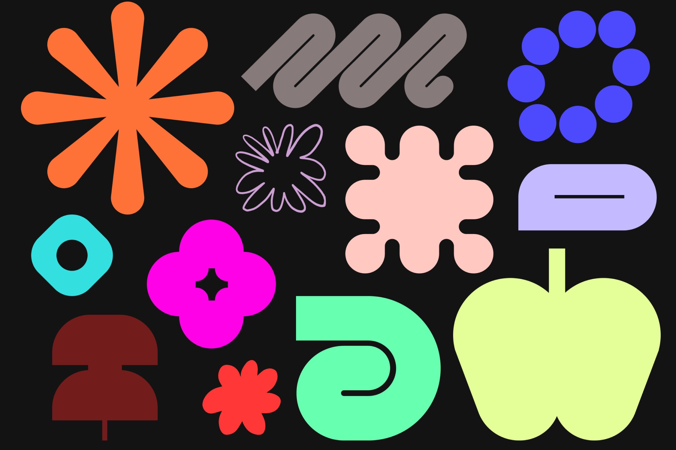
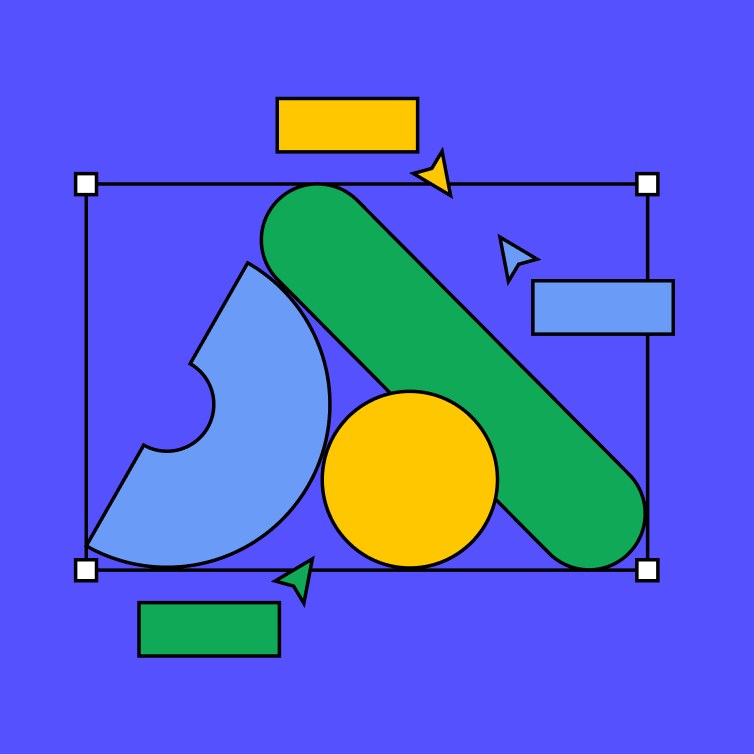
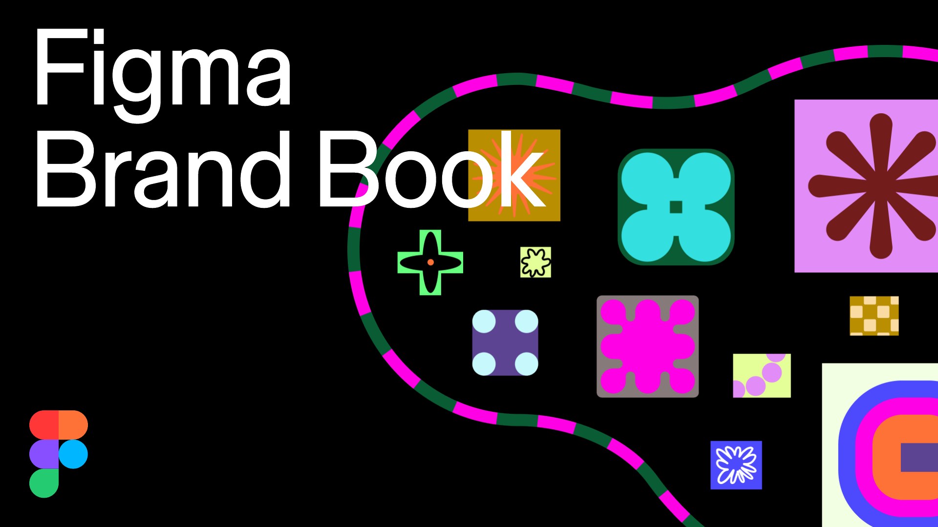
Illustration is a "language" of primitives: vector shapes from blobs to representational forms, made in Figma and drawn jumbo (big shapes, oversized nodes, bold color). They have passive, activated (pattern) and hyper-activated states, and compose by overlap, reveal, clustering and multi-move. It replaced the old black-outline main-character shapes.
Source: figma.com/blog/figma-on-figma-evolving-our-visual-languagestatic.figma.com/uploads/6645755656177435f83e10b48d9947645b55a033
The product's output is the proof.
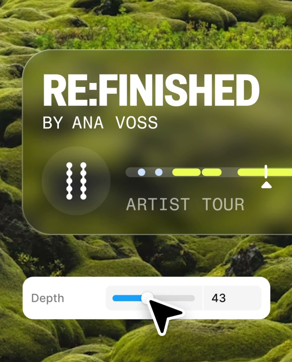
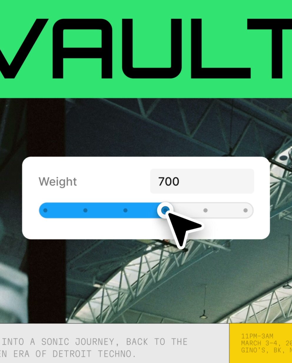
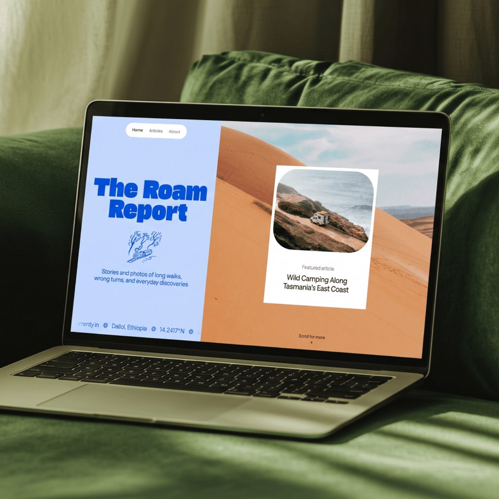
| Media radius | 0 |
|---|---|
| Avatar | 48px circle inside a 54px wrapper, 3px dashed #00B6FF band |
The homepage uses no lifestyle photography. Imagery is Figma-made work: product UI, artboards, templates and motion stills, shown edge to edge with square corners. The only portrait is the customer headshot, black-and-white in a dashed blue ring.
Source: figma.com
Motion shows the product working instead of decorating it.
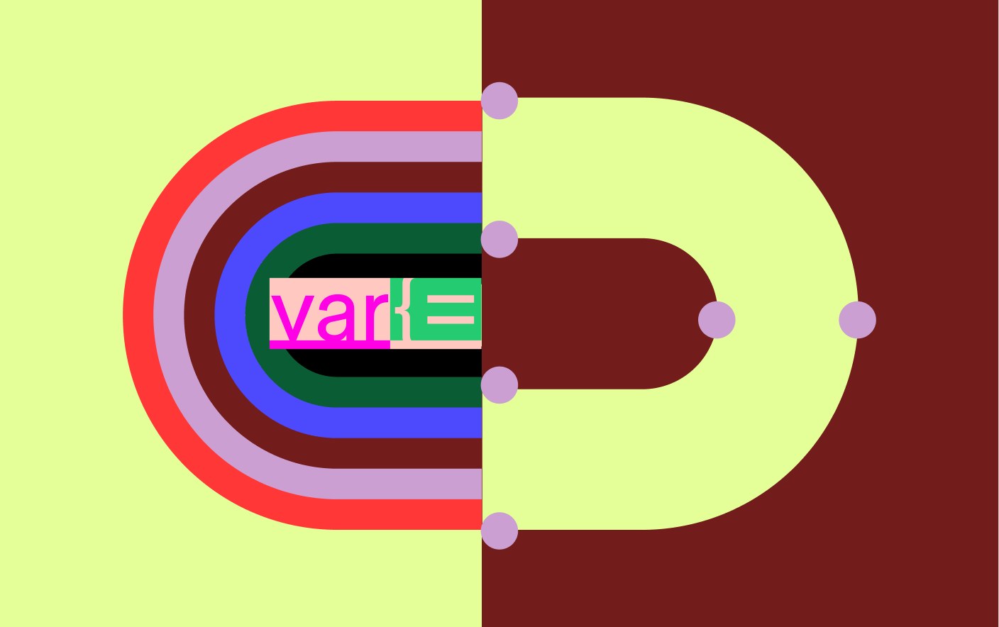
| Hover | 0.18s ease-out, #000000 to #262626 |
|---|---|
| Videos | muted loops with a 36px pause button |
Motion principles are craft, interactivity and freeform, built on selection, activation and transformation without cursors. On figma.com, looping muted product videos carry it; UI motion is 0.18s ease-out hover fills and arrow nudges, a counting stat and a scrolling logo row.
Source: figma.com/blog/figma-on-figma-evolving-our-visual-languagefigma.com
Do A heading is one paragraph block 901px wide: the first sentence in #000000, the next sentence(s) in #757575 (black at 54%) at the same size, weight, tracking and line height (30/36 desktop, 24/28.8 phones, Inter 330 -0.45px; 44/48.4 for "Explore what you can do in Figma. / Browse resources made by the community."). The grey sentence starts on a new line. No eyebrow, no bold, no second size..
Black statement, grey continuation · every section heading on the homepage except the three 44px solo headlines
Do figmaSans at weight 400 everywhere (renders light; footer links even lighter at 320). Hierarchy is only size: 88, 56, 44, 30, 24, 16, 14. figmaSans (reference only): wdth 96 and -1.25px at display sizes, -0.66px at 30-44px. Stand-in (final recipe, see spec.type): Inter 350 at 56px, 340 at 44px, 330 at 30px, 300 at 16px..
One light weight, size does the work · whole page
Do Every video, image and tile has 0 radius and no border or shadow, sitting straight on white. Only controls are rounded: 8px (46px nav buttons), 16px (84px hero button), 24px (136px outro bar), full circles (36px media and carousel buttons). Buttons are solid #000000 with white text, or transparent with a 1px #D6D6D6 inset ring..
Square media, rounded black controls · all media and buttons
Do The primary CTA is oversized rather than repeated: a 224x84 black button with a 30px label floating alone in the hero right columns, and near the end a 1360x136 black bar (24px radius) with a 56px "Get started" centered under a centered 44px headline..
Giant Get started · hero and outro
Do Each band shows a muted looping Vimeo of real Figma UI on a flat pastel or grey field baked into the video (#CAFFF9, #D0D0D0, #F3FFE3), always with a 36px black round pause button 14px inside the bottom-right corner. Media sizes: 581x700 hero, 901x507 (8 columns, left), 1131x636 (centered), 1360x765 (full width)..
Product UI as autoplaying video · hero, AI canvas, One workspace, tools grid, Make
Do figmaMono (stand-in IBM Plex Mono 400 +0.03em) uppercase: 16px +0.48px #999999 footer column heads, 14px #757575 dropdown group labels ("WHAT YOU CAN DO IN FIGMA", "EXPLORE ALL PRODUCTS"), 12px badges on #292929..
Uppercase mono for meta labels · footer heads, dropdown group labels, NEW/BETA badges
Do Twelve 348x435 tiles (6 stills, 6 videos) in 4 columns with 16px gutters running from x 0 to x 1440, ignoring the 40px page margin; 2 columns of 187 on phones. Each tile is a crop of a Figma panel over vivid art..
Full-bleed 4x3 tools grid · Powerfully expressive band
Do Every band from nav to the template carousel is #FFFFFF with no tinted section grounds; color only arrives inside media. The only dark ground is the #000000 footer (white wordmark, #999999 mono heads, 320-weight white links)..
All-white page, one black footer · page grounds
Do Place the wordmark or icon on a layout's outer edge with even margins; clear space all round equals the mark's own height. Black or white wordmark only..
Logo on the outer edge with clear space equal to its height · every layout that carries the wordmark or icon
Specimens use sample copy, not Figma’s.
A 1360px content width with 40px side margins at 1440 on a 12-column grid; 80px band padding. The hero splits into three zones: headline, media and a giant Get started button. Sections alternate centered and left-aligned two-tone heads over large square videos. A full-bleed 4x3 tile grid breaks the margins once, and the footer is black.
Measured from figma.com's computed styles, bounding boxes and hover/focus states at 1440 and 390 in headless Chromium with a desktop Chrome user agent, 2026-10-29; each section scrolled into the viewport and held 2.5s before measuring (lazy Vimeo media)..
| Measure | Desktop | Phone |
|---|---|---|
| Page margin | 40px | 16px |
| Section padding | 80px | 40px |
| Navigation | 78px | 78px |
Hero headline (h1)
Figma Sans · 56px (phone 36) · line 1 · tracking -1.7px · weight 350
Stat numeral
Figma Sans · 88px (phone 72) · line 1 · tracking -2.7px · weight 350
Outro bar label
Figma Sans · 56px (phone 36) · line 1 · tracking -1.7px · weight 350
Section headline large (h2)
Figma Sans · 44px (phone 32) · line 1.1 · tracking -0.66px · weight 340
Section headline (h2, two-tone)
Figma Sans · 30px (phone 24) · line 1.2 · tracking -0.45px · weight 330
Hero button label
Figma Sans · 30px (phone 24) · line 1.2 · tracking -0.45px · weight 330
Dropdown big link
Figma Sans · 24px · line 1.3 · tracking -0.3px · weight 320
Body / feature title / link
Figma Sans · 16px · line 1.4 · tracking -0.12px · weight 300
Small
Figma Sans · 14px · line 1.45 · weight 300
Footer link
Figma Sans · 16px (phone 22) · line 1.45 · tracking -0.5px · weight 300
Mono label
Figma Mono · 16px · line 1.3 · tracking 0.48px · weight 400
Badge
Figma Mono · 12px · line 1 · tracking 0.6px · weight 400
How Figma’s own landing pages are built, observed on figma.com, 2026-10-29. The full measurements are in spec.md.
Source: figma.com
The identity is built in Figma with variables, so the brand demonstrates the product it sells. Our reading
One face serves designers, developers and newcomers alike. Our reading
Chapters get local expression inside one recognisable kit. Our reading
How our engine applies Figma's system to each format. This is our recipe built from their rules, not something Figma publishes. Level = how far toward the campaign end (jumbo primitives, full schemes) from the black-and-white product end.
| Format | What they did | Source |
|---|---|---|
| website | figma.com homepage: white bands, giant black Get started, square product videos, full-bleed tools grid, black footer. | figma.com |
| brand page | using-the-figma-brand: 72px headline beside the full-color icon, a mint #F3FFE3 "Brand together" band of three resource cards, then trademark rules. | figma.com/using-the-figma-brand |
| out of home | "Make. Believe." billboard in the 2024 refresh. | figma.com/blog/figma-on-figma-evolving-our-visual-language |
| community kit | Friends of Figma stickers, chapter badges and templates. | figma.com/blog/friends-of-figma-brand-refresh |
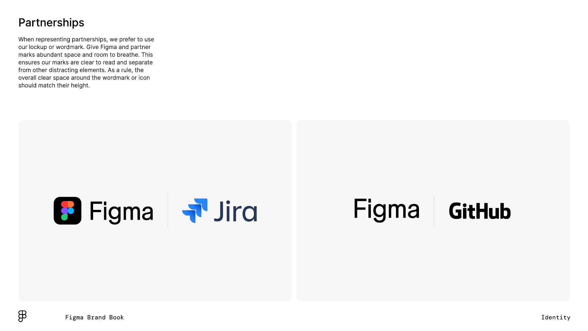
| partnerships | Figma + Jira and Figma + GitHub lockups; wordmarks paired with wordmarks. | static.figma.com/uploads/6645755656177435f83e10b48d9947645b55a033%20p.7 |
| Format | Loudness | Must appear | What varies |
|---|---|---|---|
| Landing page | White 78px nav with the 19x28 five-color Figma icon at x 40 (no wordmark in the nav), five menu labels and a black "Get started for free"; three-zone hero (56px three-line H1 left, square product media centre, 224x84 black Get started right); two-tone 30px section heads; one full-bleed square-tile grid; proof with quote, stat and logos; black footer with mono column heads | which product sections follow the hero and what media fills them | |
| Deck | White slides, one light weight, black wordmark on the outer edge, product imagery square | one color scheme for section dividers | |
| Social | Jumbo primitives in one scheme, wordmark black or white | composition move: overlap, reveal, cluster | |
| Event / out of home | Primitives at billboard scale, short two-word line | scheme and activation state | |
| White, black type, one black button, square product image | one primitive accent |
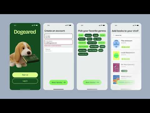 AgentsGoogle, Meta · Jul 2026 – now
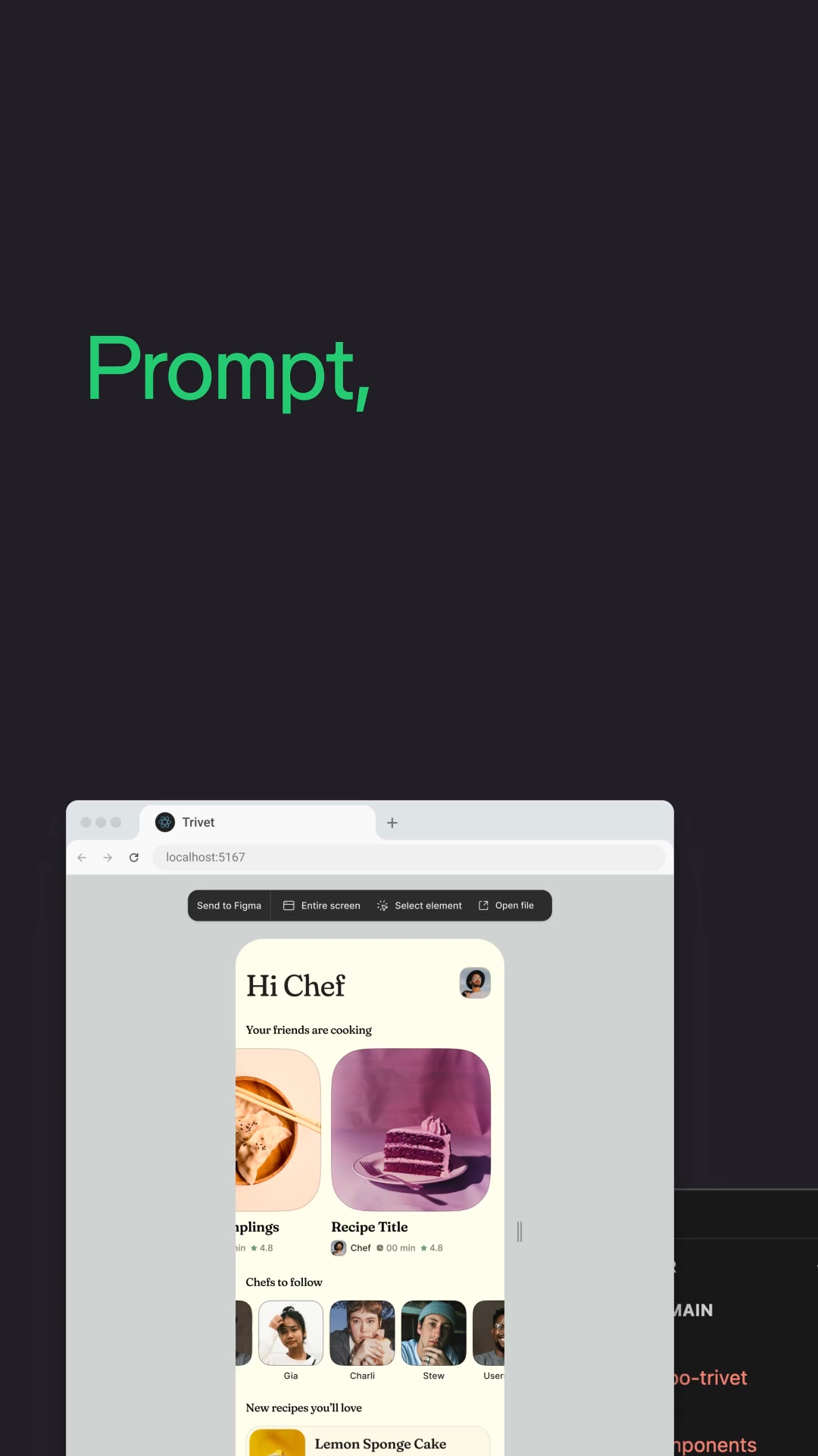 MakeGoogle, Meta · Apr 2026 – now
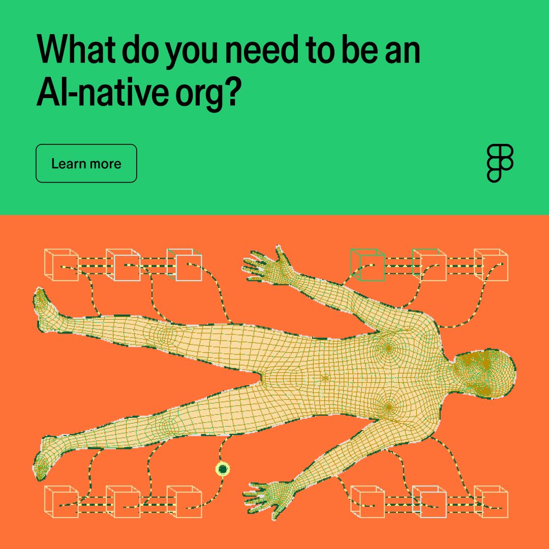 Ai native organizationLinkedIn · Oct – Nov 2026
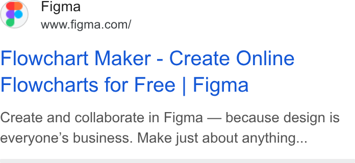 Create and collaborate in Figma — because design is…Google · Mar 2026 – now
Source: figma.com/using-the-figma-brandstatic.figma.com/uploads/6645755656177435f83e10b48d9947645b55a033
Your name and logo, Figma’s system.
Use this kit for my brand Use this brand in Claude
Get your brand audit Put your brand in Claude What goes in a brand book
Each value is marked published, observed, our reading or our recipe, with its source. Checked 2026-10-29. Not affiliated with Figma.