Starbucks brand colors
- Starbucks Green
#006241 - Accent Green
#00754A - Light Green
#D4E9E2 - House Green
#1E3932 - Black
#000000 - Warm Neutral
#F2F0EB - Cool Neutral
#F9F9F9 - White
#FFFFFF
Independent study. Not official and not affiliated with Starbucks.
Hold the greens and the Siren still so everything else can change. Starbucks keeps ordering calm and green and spends its personality on seasonal color, artist-made illustration and playful lines, and it all reads as one brand because a green or the Siren is always there.
#006241#00754A#D4E9E2#1E3932#000000#F2F0EB#F9F9F9#FFFFFF
Functional, Expressive
A family of greens rooted in the apron, the Siren on her own, three faces (Sodo Sans, Lander, Pike) and one dial from functional to expressive: quiet and green where people order, artful and seasonal where they browse.
When greens carry the brand, the seasonal palette can change completely without the work stopping looking like Starbucks.
"Our green is iconic": a family of greens rooted in the apron. Eight brand colors with PMS, CMYK and hex: Starbucks Green (primary, brand moments), Accent Green (sparingly), Light Green and House Green (secondary; House Green used like a neutral), Black (type and accents), Warm and Cool Neutral (backgrounds beside warm or cool colors) and White. Expressive colors change by season (Spring, Summer, Nitro, Fall) and are always shown beside the four greens. The hex values sit in the page source; the page shows names, tooltips and swatches.
A constrained family keeps every touchpoint coherent; three distinct voices (workhorse sans, warm serif, condensed caps) cover functional to expressive without adding faces.
Three faces 'with endless possibilities': Sodo Sans (most versatile, frequently body copy; Thin to Black), Lander (serif accent for expressive moments; Thin to Black; served as Lander Grande and Lander Tall) and Pike (condensed, impactful, for functional headlines and wayfinding; Light, Regular, Bold). The guide is moving away from hand-lettering, with custom modifications to these faces where an artful touch is needed. Each face has an interactive specimen with Small, Medium and Large sizes.
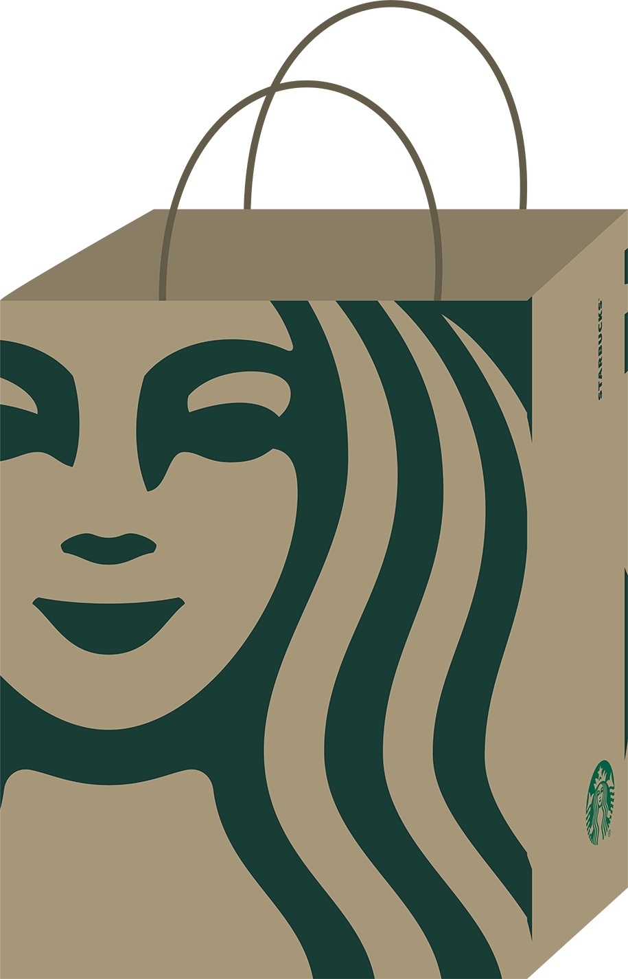
Dropping the ring and the name lets the face carry the brand at any scale, from a cup to a bag cropped to her eyes.
The Siren is 'our muse, the face of our brand'; she and the STARBUCKS wordmark are the most recognizable assets. The preferred use is the Siren alone, unlocked from the wordmark, for prominence and an open, modern look. The page shows each mark's approved grounds and a timeline of four Sirens: 1971 (brown ring, 'Coffee, Tea, Spices'), 1987 and 1992 (green 'Starbucks Coffee' ring) and the current ringless Siren.
Where a piece sits on the functional-to-expressive dial, set by channel, and the seasonal palette, illustration and photo styling, which evolve with trend each season.
How our engine applies Starbucks' system to each format. This is our recipe from their rules and examples, not something Starbucks publishes. Level = how far toward the expressive end of the guide's dial.
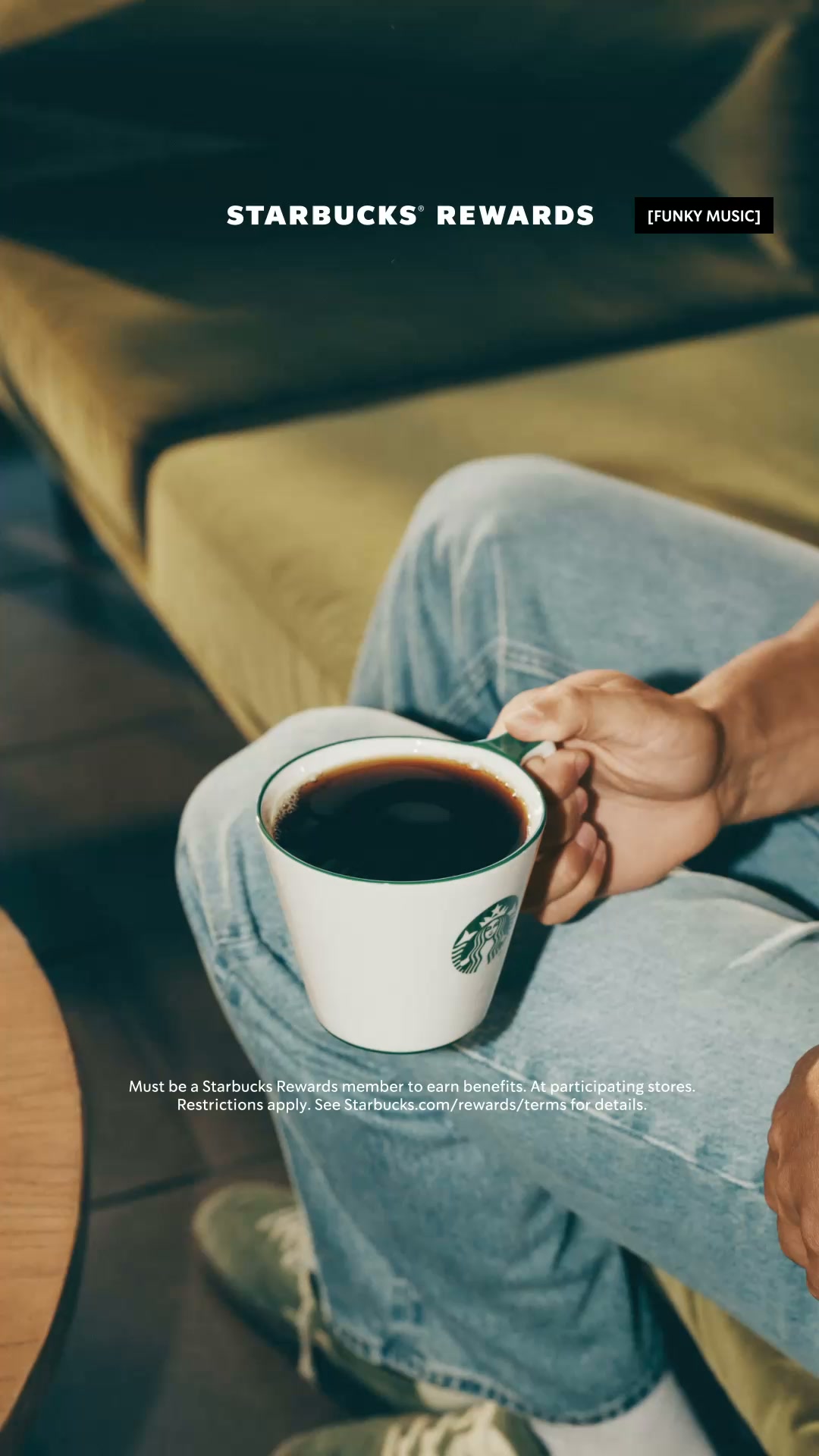
Cover the Siren. A brand green should still be in the frame, with honest product photography and Sodo Sans, Lander or Pike; if not, it isn't Starbucks yet.
Say where the piece sits between functional and expressive and why. Ordering and wayfinding should be the quietest; if the menu is louder than the social post, it's backwards.
Put another coffee chain's logo on it. If the greens, the Siren-led restraint and the warm, playful line don't feel out of place, it's generic.
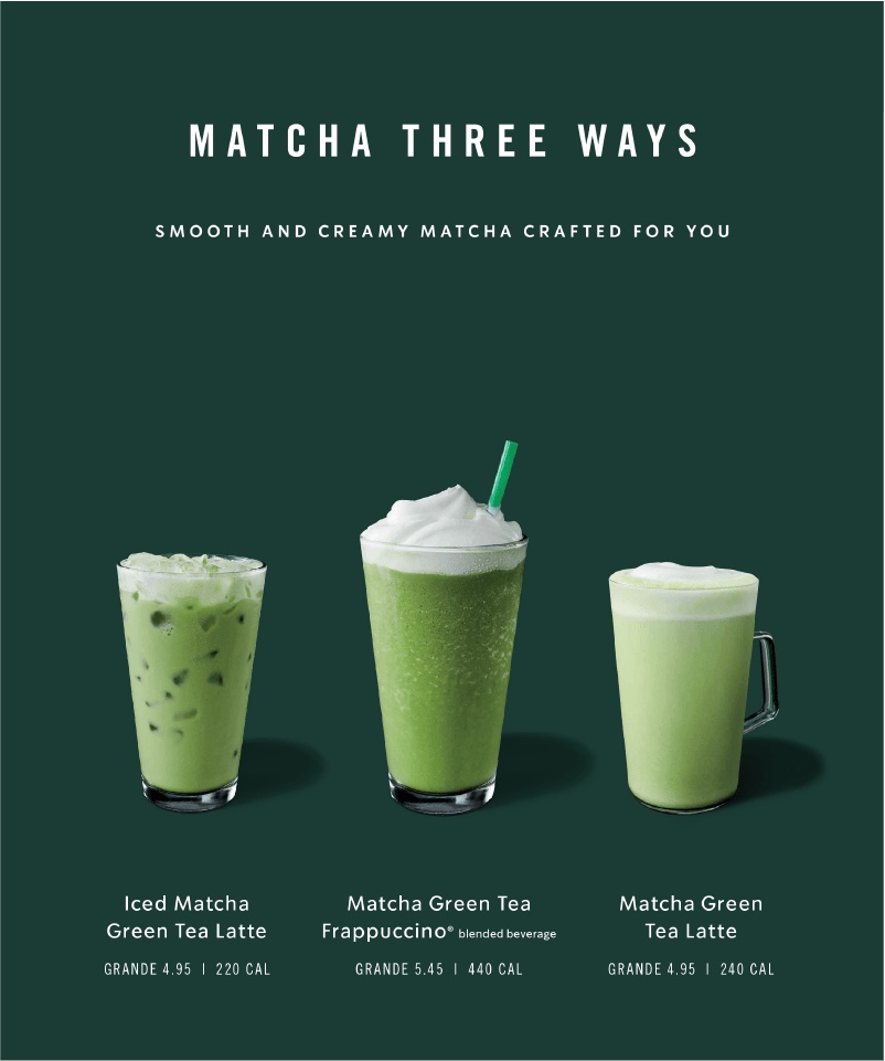
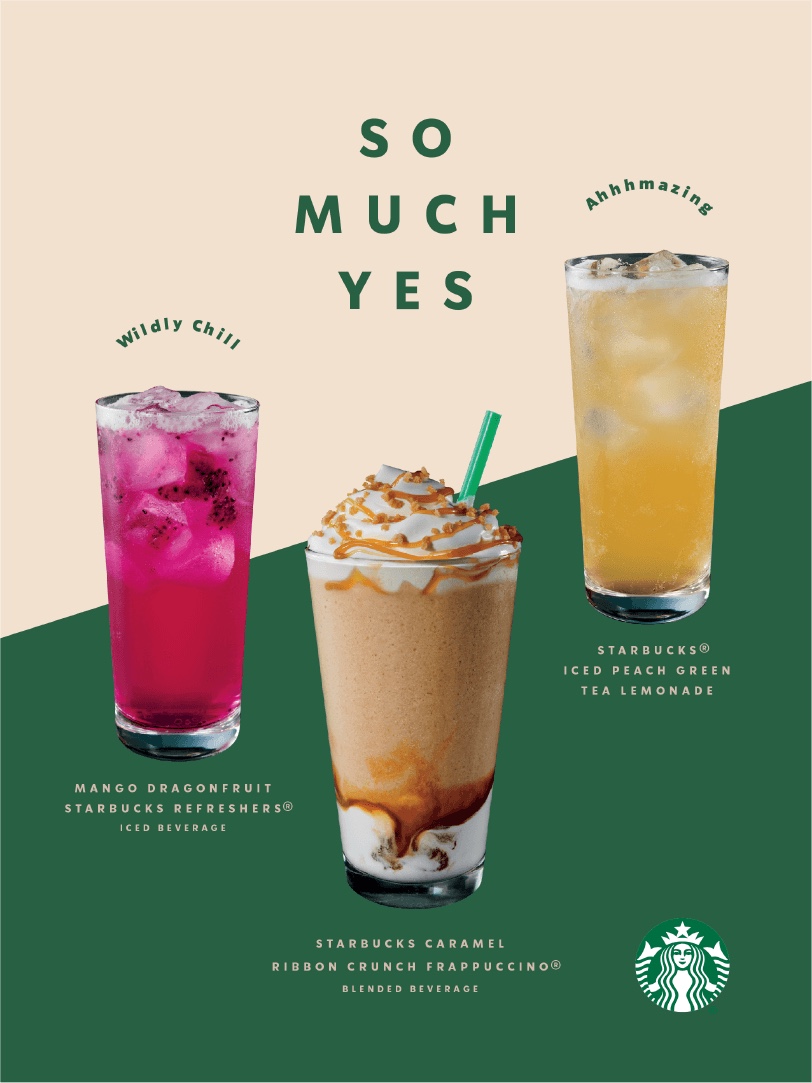
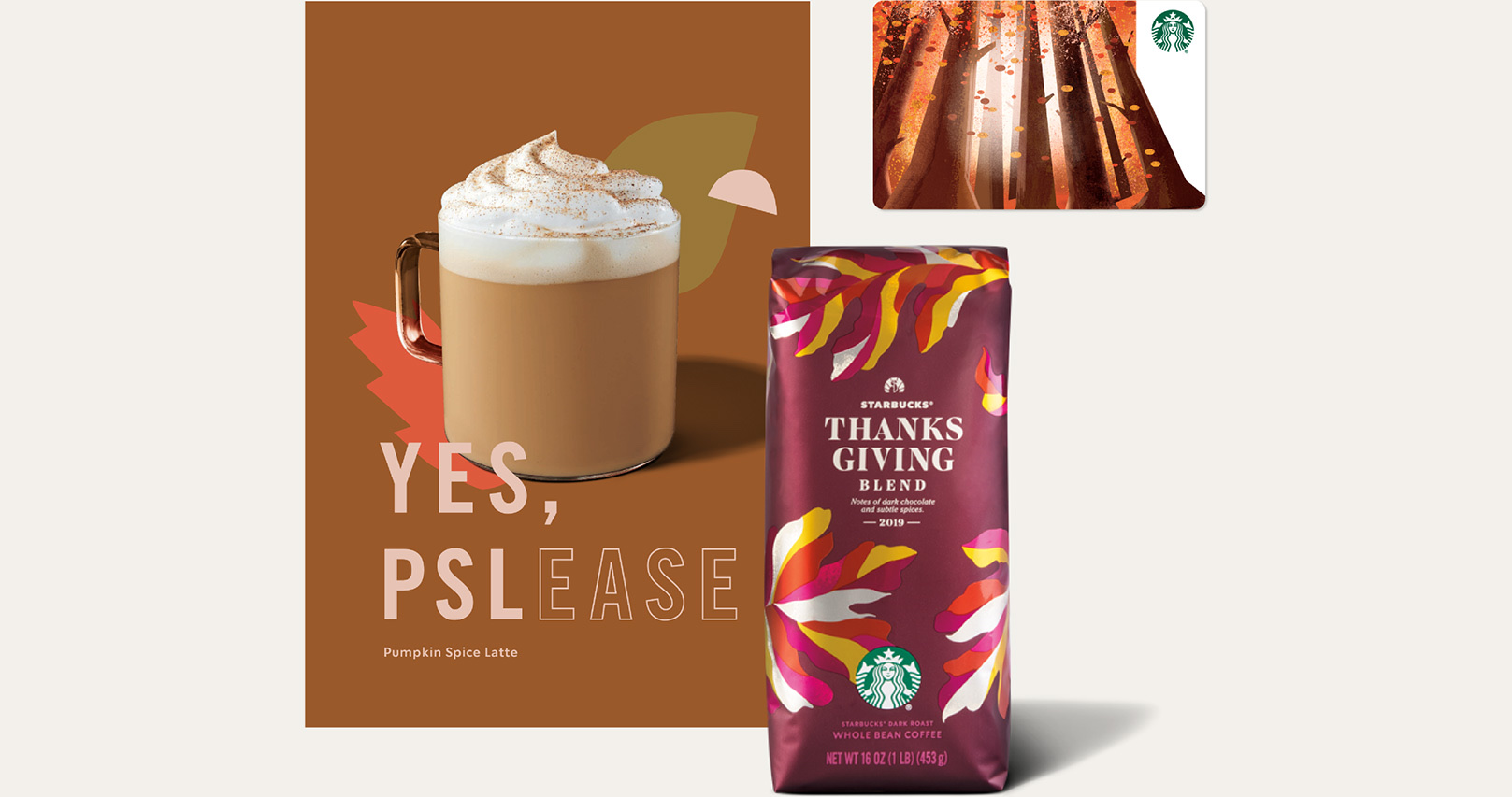

One soft idea (a cloud) runs from the menu to social to merch, while the greens keep it unmistakably Starbucks.
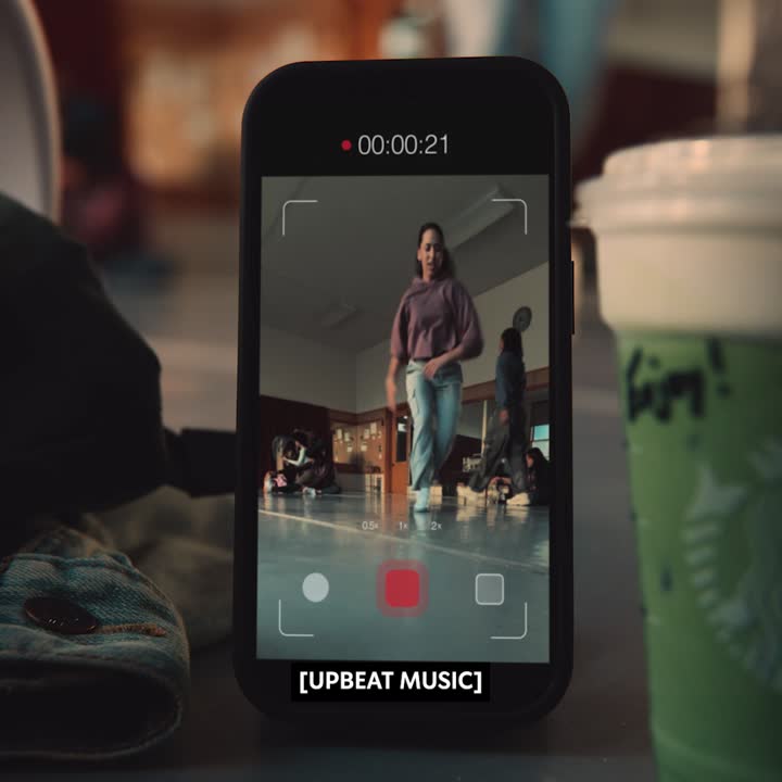
Playful lines and collage make each drink feel like an event without losing the product-first menu.
A distinct sub-palette lets one product line own its own look inside the green system.
These are the slips the rules exist to stop. Our reading of the guidelines, not a test of any one model.
It's a great day for coffee
Join todayYour headline goes here
Your button| Trait | Starbucks | Your brand |
|---|---|---|
| Main color | #006241 Starbucks Green | Not read yet |
| Page ground | #FFFFFF | Not read yet |
| Text | #000000 | Not read yet |
| Headline type | Sodo Sans | Not read yet |
| Body type | Sodo Sans | Not read yet |
| Main color on ground | 7.4:1 | Not read yet |
At creative.starbucks.com. The guide dates from 2020 and its TLS certificate expired in July 2025, so check current starbucks.com before trusting any detail.
Starbucks Green #006241, Accent Green #00754A, Light Green #D4E9E2 and House Green #1E3932, with Warm Neutral #F2F0EB, Cool Neutral #F9F9F9, black and white.
Sodo Sans, Lander and Pike, all Starbucks faces. This page uses Plus Jakarta Sans, Source Serif 4 and Oswald as open stand-ins.
The preferred use is the Siren alone, unlocked from the wordmark. The ringed 1971, 1987 and 1992 badges are history. Clear space and minimum size are not published.
Read the official Starbucks brand guidelines at creative.starbucks.com
This is an independent study. Unfairly is not affiliated with, endorsed by or sponsored by Starbucks. Logos shown for reference from Brandfetch, starbucks.com and the guide's logos page. Starbucks and the Siren are trademarks of Starbucks Corporation. The starbucks.com Siren file uses #00704A, not the guide's #006241.
Data source: the Starbucks brand book in Steal Unfairly, built from the sources below. Checked 2026-10-29. Status: draft, facts being checked.
The full Starbucks brand bookUse this brand in ClaudeFigma brand guidelinesSpotify brand guidelinesAll brand guidelines examples
Get your brand auditPut your brand in ClaudeBuild your brand book