Spotify brand colors
- Spotify Green
#1ED760 - Black
#121212 - White
#FFFFFF - Pure black
#000000 - Plan grey
#242424 - Reserved periwinkle
#576DD6 - DJ blue
#0D72EA - Video orange
#D64000
Independent study. Not official and not affiliated with Spotify.
Spotify keeps the page dark and lets green mean "press play". Color is loud but contained in cards; the logo itself becomes the hero window.
#1ED760#121212#FFFFFF#000000#242424#576DD6#0D72EA#D64000
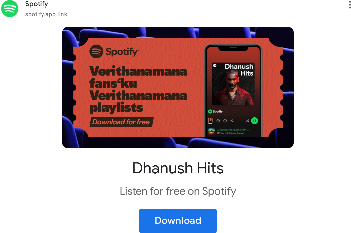
warm, fan-centred, short, exact about offers
A black stage for color: #121212 everywhere, one ultra-wide 128px headline seen through the Spotify icon, saturated rounded feature cards, and Spotify Green kept for the button that says try it.
A black stage makes the saturated cards and the green CTA the only things that glow.
Three published core colors: Spotify Green #1ED760, White #FFFFFF, Black #121212. The guide says the brand now speaks a much more colorful language, with Green as the resting color. On the page the ground never leaves #121212; color arrives as saturated flat card grounds and plan accents, and green is reserved for actions.
One shouting hero line, then a calm grotesque, gives the page its poster-then-product rhythm.
Spotify sets its marketing in its proprietary Spotify Mix family: an ultra-wide black cut (stretch 156%) only for the hero, Mix Title 800 for centered section heads, Mix UI for body and buttons. Partner integrations are told to use the platform sans.
A single colorway rule keeps the logo legible on the colorful brand palette.
The full logo is the icon plus the wordmark; the icon alone is for tight spaces or when the brand is already established. Green logo only on black or white; monochrome on anything else. On spotify.com the nav and footer use the white full logo.
which saturated color each feature card takes
Cover the logo. It should still read as Spotify: a #121212 page, a green pill, a wide black headline and saturated rounded cards.
Put another company's name on it. If nothing else changed, the icon-window hero, green-only actions and card colors are missing.
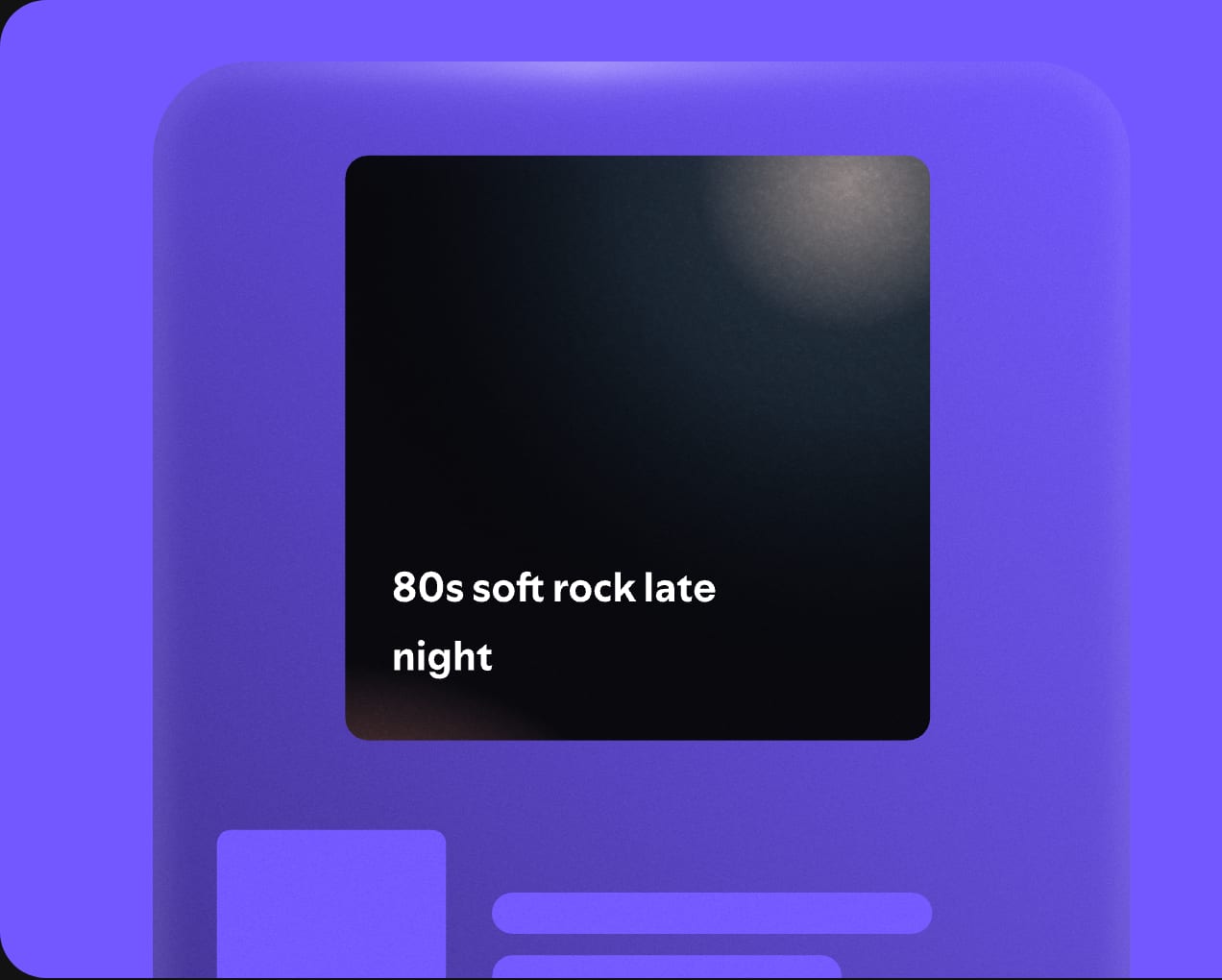

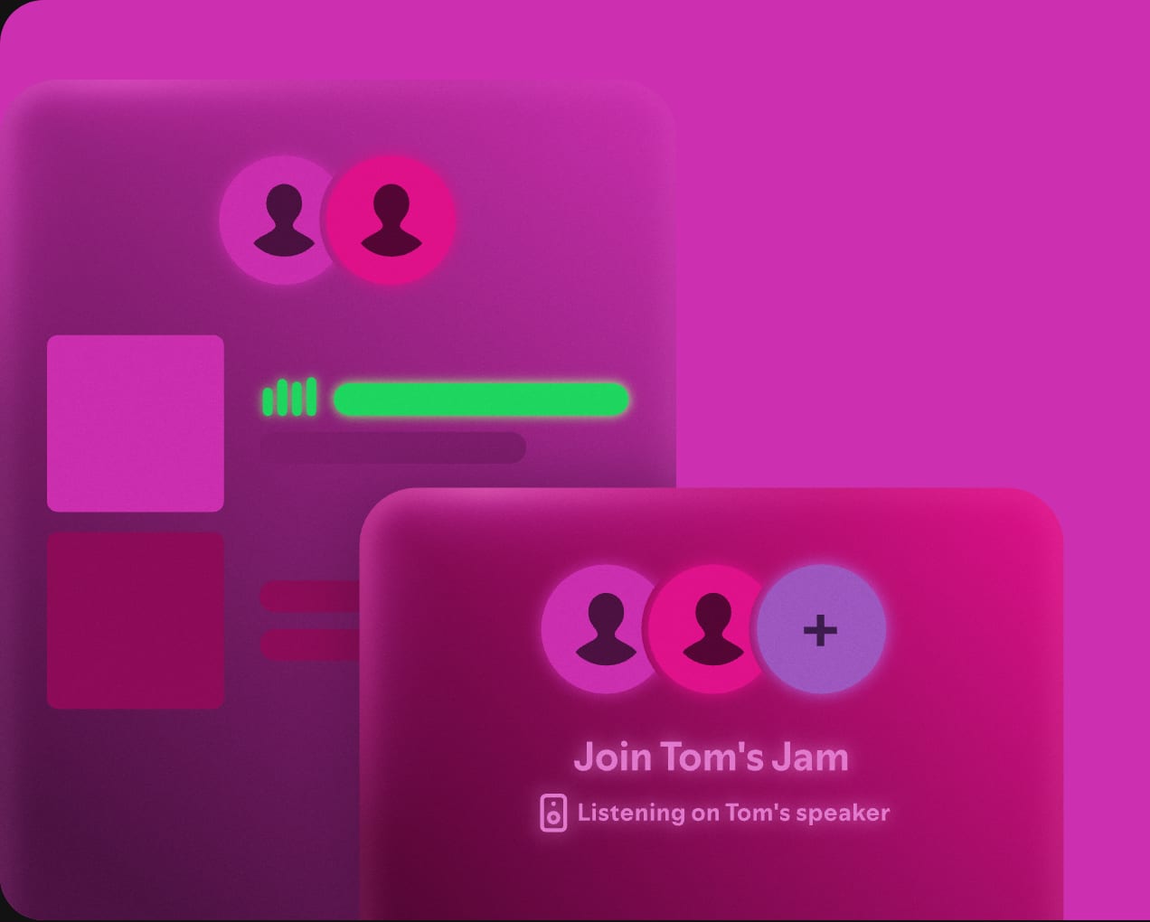

Each listener's own data becomes shareable brand content.
Backs the "fans and artists" promise with published figures.
These are the slips the rules exist to stop. Our reading of the guidelines, not a test of any one model.
The ultimate home for music
Get Spotify FreeYour headline goes here
Your button| Trait | Spotify | Your brand |
|---|---|---|
| Main color | #1ED760 Spotify Green | Not read yet |
| Page ground | #121212 | Not read yet |
| Text | #FFFFFF | Not read yet |
| Headline type | Spotify Mix Title | Not read yet |
| Body type | Spotify Mix | Not read yet |
| Main color on ground | 9.8:1 | Not read yet |
A full Spotify brand book is not public. The public sources are the developer Design and Branding Guidelines and the newsroom logo kit.
Spotify Green is #1ED760. On the Premium page it appears on action pills and the Individual plan accent, on a #121212 ground.
Spotify Mix and Spotify Mix Title, both proprietary. This page uses Unbounded, Bricolage Grotesque and Hanken Grotesk as calibrated open stand-ins.
The exclusion zone is half the icon height. The minimum digital size is 70px for the logo and 21px for the icon. The green logo goes only on black, white or non-duotoned photos.
Read the official Spotify brand guidelines at developer.spotify.com/documentation/design
This is an independent study. Unfairly is not affiliated with, endorsed by or sponsored by Spotify. Logos shown from Spotify's newsroom brand assets for reference. Spotify is a trademark of Spotify AB. Not affiliated, and not for download.
Data source: the Spotify brand book in Steal Unfairly, built from the sources below. Checked 2026-10-30. Status: draft, facts being checked.
The full Spotify brand bookUse this brand in ClaudeFigma brand guidelinesStarbucks brand guidelinesAll brand guidelines examples
Get your brand auditPut your brand in ClaudeBuild your brand book