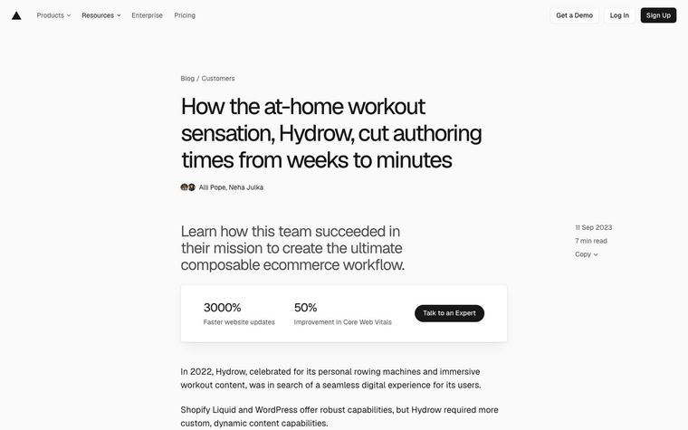
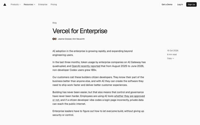
What Vercel does
Vercel's Geist design system describes its icons as a set tailored for developer tools. On the Geist pages the icons render as 16 by 16 SVGs on a 16 unit viewBox, colored with currentColor, drawn as filled outlines with an even-odd fill rule rather than live strokes. The search glyph's ring runs from radius 5 to 6.5, a 1.5 unit line on the 16 grid, and its handle ends square. The package naming seen is PascalCase with an Icon prefix, imported from @vercel/geistcn-assets.
Vercel's system, as published
- Canvas
- 16 x 16 viewBox, rendered at 16 px (20 and 27 px in a few spots)
- Color
- currentColor
- Construction
- expanded outlines, fill-rule evenodd
- Line Thickness
- 1.5 units on 16 (search ring, radius 5 to 6.5)
- Terminals
- square on the search handle
- Package
- @vercel/geistcn-assets/icons
Why it works
A small fixed grid with one line thickness keeps icons quiet next to compact UI text. Inheriting the text color means an icon never needs its own color decision.
Best for
Developer tools, technical docs, dense dashboards and navigation, minimal monochrome brands
What breaks it
- Colored icons in a monochrome system
- Mixing live strokes and outlined fills in one set
- Scaling the 16 unit drawings above about 24 px, where the thin line looks spindly
Sources
- vercel.com: Geist design system home: icons described as tailored for developer tools; page chrome renders data-slot geist-icon SVGs at 16 x 16 with currentColor and evenodd paths
- vercel.com: Geist icons route (served the same shell); same 16 x 16 currentColor SVGs
Steal it for your brand
The same system, written in your colors, type and shapes. Nothing of Vercel's look comes with it.
The recipe
- Take an open line set and redraw or rescale it onto a 16 unit canvas, keeping one line thickness of about
typography.body.weight/ 267 px (1.5 px for regular body text). - Cut open ends square and keep joins mitered; round small corners by 1 px (1.5 px for pill buttons), or leave them sharp when
style.radiusis under 2 px. - Expand the strokes to filled outlines with an even-odd fill rule so the icons render identically at every size.
- Color every icon with currentColor so it takes
palette.inkin body copy,palette.ink mutedin secondary text andpalette.on accentinside an accent button; never assign an icon its own color. - Render at 16 px beside body text; drop to 14 px for dense layouts and go to 20 px for airy ones, without changing line thickness relative to the canvas.
What you'll need
- Where icons appear beside text (nav, buttons, tables)
Recipe as JSON
{
  "recipe": {
    "canvas_px": 16,
    "stroke_px_at_16": "{typography.body.weight} / 267",
    "color": "currentColor",
    "linecap": "butt",
    "linejoin": "miter",
    "corner_radius_px": {
      "by": "style.button_shape",
      "map": {
        "rounded": 1,
        "pill": 1.5
      },
      "default": 1
    },
    "construction": "outline strokes to fills, even-odd",
    "size_by_density": {
      "by": "style.density",
      "map": {
        "dense": 14,
        "balanced": 16,
        "airy": 20
      },
      "default": 16
    },
    "square_when_radius_below_px": 2
  },
  "fallbacks": {
    "palette.ink_muted": "{palette.ink}",
    "palette.on_accent": "{palette.paper}",
    "style.radius": 8
  },
  "steps": [
    "Take an open line set and redraw or rescale it onto a 16 unit canvas, keeping one line thickness of about {typography.body.weight} / 267 px (1.5 px for regular body text).",
    "Cut open ends square and keep joins mitered; round small corners by 1 px (1.5 px for pill buttons), or leave them sharp when {style.radius} is under 2 px.",
    "Expand the strokes to filled outlines with an even-odd fill rule so the icons render identically at every size.",
    "Color every icon with currentColor so it takes {palette.ink} in body copy, {palette.ink_muted} in secondary text and {palette.on_accent} inside an accent button; never assign an icon its own color.",
    "Render at 16 px beside body text; drop to 14 px for dense layouts and go to 20 px for airy ones, without changing line thickness relative to the canvas."
  ]
}
See it working
- Vercel: The sidebar and header glyphs, 16 px and the color of the surrounding text
The lesson
Show an icon set as an even grid in one gray, so consistency is visible before anyone reads a rule.
The move
The Geist landing page gives Icons a card with rows of thin outline glyphs in a single gray at the same size: grid, arrow, bar chart, clock, globe, flag and bell among them. A neighbouring Colors card shows saturated vertical pills in gray, blue, purple, pink, red, orange, green and teal. The title reads "Geist Design System".
Why it works
- Our readIcons on one even grid in a single gray look like a family at a glance.
- Our readKeeping all color in the separate Colors card makes the gray icons read as neutral, not unfinished.
- Our readThe card caption "Icon set tailored for developer tools" names the audience in a few words.
What not to copy
Don't copy these glyph subjects if your product isn't developer tooling. Keep the single-gray, one-weight set and the habit of showing it as a plain grid.