Listen your way
Premium features: ad-free, lossless, offline, any order Observed
Brand book
Spotify keeps the page dark and lets green mean "press play". Color is loud but contained in cards; the logo itself becomes the hero window. Our reading
which saturated color each feature card takes
Not published. Our reading of the Premium page at 1440: near-black ground dominates, saturated card colors next, white type, green only on actions..
Two voices. The partner guide is precise and rule-bound; the Premium page is warm and fan-centred. Levels are our reading.
Our engine's setting, built from their rules.
Cover the logo. It should still read as Spotify: a #121212 page, a green pill, a wide black headline and saturated rounded cards.
Put another company's name on it. If nothing else changed, the icon-window hero, green-only actions and card colors are missing.
Spotify is the world's most popular audio streaming subscription service, with music, podcasts and audiobooks. Published
Premium features: ad-free, lossless, offline, any order Observed
DJ, video, daylist Observed
Jam and Blend Observed
Car, home, wearables Observed
The ultimate home for music
As the world's music hub, Spotify is where fans and artists come together.
Introducing Reserved
With music that never stops
The partner guide states the shift: a more colorful brand language, with Spotify Green kept as the resting color for when the voice must be recognizable.
Category. Audio and video streaming: music, podcasts, audiobooks, live events. Observed
Launched in 2008; the world's most popular audio streaming subscription service, with 788 million users and 306 million subscribers in 184 markets (company-info page, read 2026-10-29).
Made for how you listen
The best place to listen with your crew
Everything you love, right here
Listen to Spotify anywhere
Shaping the big moments in music
The world is listening here.
The Premium page sells by listing what fans get, one band per idea: the ultimate home for music, a manifesto, Reserved, the Premium feature grid, personal features, social features, other content, devices, culture, then plans. Every offer line is followed by its fine print.
Source: spotify.com/us/premiumnewsroom.spotify.com/company-info
Made for how you listen
The Most Advanced Audio Platform
The page speaks like a friend recommending music, while offers stay exact.
warmfan-centredshortexact about offers
Short, warm and fan-centred: "Made for how you listen", "The best place to listen with your crew". Feature lines use verbs ("Soundtrack your mood with daylist"). Partner rules fix the link labels.
Try 2 months for $0View all plansGET SPOTIFY FREELISTEN ON SPOTIFYPremium
product names containing "Spotify" (published partner rule)title-case headlines
| Headline case | sentence |
|---|---|
| Footer heads | UPPERCASE 12/900 |
Source: developer.spotify.com/documentation/designspotify.com/us/premium





Logos shown from Spotify's newsroom brand assets for reference. Spotify is a trademark of Spotify AB. Not affiliated, and not for download.
Spotify
Spotify
A single colorway rule keeps the logo legible on the colorful brand palette.
| Exclusion zone | x = half the icon height |
|---|---|
| Min size digital | 70px logo / 21px icon |
| Min size print | 20mm logo / 6mm icon |
| Nav logo on site | 118x32 white |
The full logo is the icon plus the wordmark; the icon alone is for tight spaces or when the brand is already established. Green logo only on black or white; monochrome on anything else. On spotify.com the nav and footer use the white full logo.
Source: developer.spotify.com/documentation/designnewsroom.spotify.com/media-kit/logo-and-brand-assets
Try 2 months for $0
A black stage makes the saturated cards and the green CTA the only things that glow.
| Green | #1ED760 · RGB 30/215/96 · CMYK 86/0/80/0 |
|---|---|
| White | #FFFFFF |
| Black | #121212 · RGB 18/18/18 |
| Player fallback | #191414 |
Three published core colors: Spotify Green #1ED760, White #FFFFFF, Black #121212. The guide says the brand now speaks a much more colorful language, with Green as the resting color. On the page the ground never leaves #121212; color arrives as saturated flat card grounds and plan accents, and green is reserved for actions.
Source: developer.spotify.com/documentation/designspotify.com/us/premium
The ultimate home for music
The ultimate home for music
With music that never stops
One shouting hero line, then a calm grotesque, gives the page its poster-then-product rhythm.
| Their face | Use | License | Open stand-in |
|---|---|---|---|
| Spotify Mix Title | Hero (ultra-wide 900, stretch 156.25%) and section heads (800) | Proprietary (Spotify) | Unbounded (hero, optically corrected) / Bricolage Grotesque (section heads, manifesto, subs) Not licensed for reuse. Calibrated 2026-10-30 against the real faces on the live page: Unbounded 900 118px -0.01em scaleX(1.162) 1.00 width / 0.96 ink / 1.00 height; Bricolage Grotesque 800 at 66px -0.02em 1.01 / 1.01 / 0.98 for the 64px h2. |
| Spotify Mix | Body, subheads, card titles, buttons, nav, footer | Proprietary (Spotify) | Hanken Grotesk Not licensed for reuse. Hanken Grotesk 450 body 1.00 width / 1.01 ink; a grotesque, so it avoids the round geometric texture Outfit gave in round 1. |
| Hero | 128 / 153 · 900 · stretch 156% (stand-in: Unbounded 118px, -0.01em, scaleX 1.162) |
|---|---|
| H2 | 64 · 800 (stand-in: Bricolage Grotesque 800 at 66px, -0.02em) |
| Sub | 24 · 300 (Bricolage 350) |
| Body | 16 · 400 (Hanken Grotesk 450) |
| Stand-ins | Unbounded (hero), Bricolage Grotesque (Mix Title roles), Hanken Grotesk (Mix UI roles) |
Spotify sets its marketing in its proprietary Spotify Mix family: an ultra-wide black cut (stretch 156%) only for the hero, Mix Title 800 for centered section heads, Mix UI for body and buttons. Partner integrations are told to use the platform sans.
Source: developer.spotify.com/documentation/designspotify.com/us/premium
The icons are the product's own UI set, so the marketing page and the app share one vocabulary.
| Sizes | 16 / 24 / 48 / 88 px |
|---|
Encore UI glyphs: filled 16px-grid glyphs scaled to 48px in green for Premium features, 88px line icons in #10B28E on dark green content cards, a 16px icon before every "Premium" eyebrow.
Source: spotify.com/us/premiumdeveloper.spotify.com/documentation/design
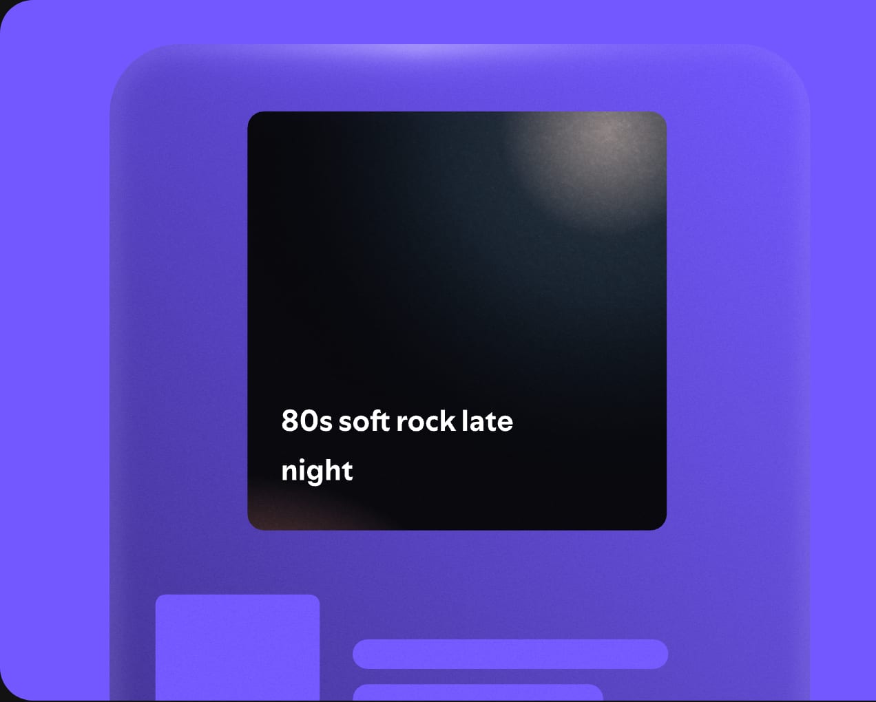
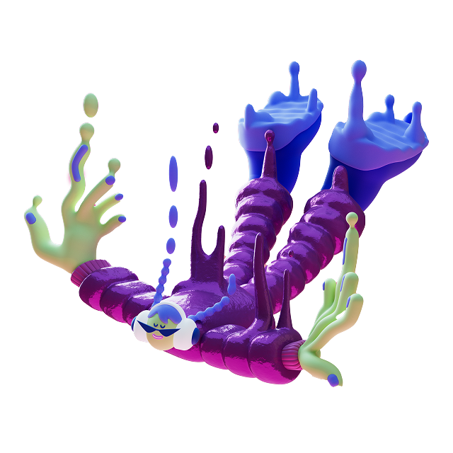
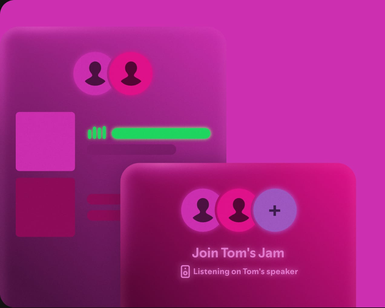
UI vignettes explain features without screenshots; the 3D figure adds art between bands.
| Card art | left 636x509, bleeds to the card edges |
|---|
Two kinds: frosted, glowing product-UI vignettes on flat color (feature cards, Rive animations) and 3D sculptural figures (the "Wistful Sinking" piece above the feature-grid CTAs).
Source: spotify.com/us/premium
Real people and real shows prove the "where fans and artists come together" promise.


| Artwork corners | 4px small and medium devices, 8px large |
|---|
Candid, warm, people-first photography: friends in a car, gaming on a sofa, a man on a seaside rock; and real artist moments (Miley Cyrus, Shaboozey, Selena Gomez) captioned with what happened. Artwork rules for partners: never crop, overlay or distort album art; round its corners 4px (small) or 8px (large).
Source: developer.spotify.com/documentation/designspotify.com/us/premium
Movement reads as music: things keep playing while the layout holds still.
| Button | 150ms cubic-bezier(0.3,0,0,1) |
|---|
Motion is in the media: the hero film behind the icon window, cycling hero keywords, words rising on scroll, sticky stacking cards, Rive card animations and a glowing 3D icon film. Controls only press (0.15s).
Source: spotify.com/us/premiumdeveloper.spotify.com/documentation/design
Do A #121212 layer with the Spotify icon cut out of it: the icon's circle shows the hero video (supplied still), the three sound waves stay solid #121212. The layer is the media box x 0, y 55, 1440x845 (390x789 phone), not the hero box. CSS on that #121212 div: mask-image: linear-gradient(#000,#000), url(data:image/png;base64,<logo-v1.png>); mask-composite: exclude (-webkit-mask-composite: xor); mask-repeat: no-repeat; desktop mask-size: 100% 100%, 763px; mask-position: 0 0, 630px 41px (page x 630-1393, y 96-859; the site writes it as size 53% at position 93.06% / 50%); phone mask-size 100% 100%, 312px; mask-position 0 0, 50% 62px (page y 117-429). The 72px nav sits above and hides the circle's top 31px at 1440. The mask PNG MUST be an inline data URI: a file:// mask silently fails. The 118px headline (see type) overlaps the circle's left third..
The icon is the hero frame · hero, top of the page
Do Only the hero h1 uses the ultra-wide 900 face (128px, three lines, last line italic and cycling). Every other headline is the normal-width heading face at 64px/800, centered, tight..
One stretched black headline, then a plain grotesque · hero vs everything else
Do 1120x509 cards, 24px radius, 32px apart, each its own flat saturated ground (#576DD6, #0D72EA, #D64000, #7358FF, #CC2FAF, #088569) with frosted product UI art on the left and white text on the right. The page itself never changes from #121212..
Saturated rounded cards on a black page · Reserved, Made for how you listen, crew sections
Do #1ED760 appears as pill buttons with black 700 text, the Individual plan name/badge and the 4 feature-grid icons; nothing else is green..
Green is the action · nav, hero, feature grid, plans
Specimens use sample copy, not Spotify’s.
A #121212 page of centered bands in a 1120px column with 256px black gaps, a full-bleed hero, saturated 24px-radius cards, staggered edge-bleeding photo rows, and a black footer.
Measured from spotify.com/us/premium's computed styles and bounding boxes at 1440 and 390 in headless Chromium after a slow scroll (scroll-revealed sections at rest), 2026-10-29; fonts calibrated by rendering on the live page; images downloaded from wwwmarketing.scdn.co; feature-card art is a Rive canvas captured at rest..
| Measure | Desktop | Phone |
|---|---|---|
| Page margin | 160px | 16px |
| Section padding | 256px | 96px |
| Navigation | 72px | 72px |
Hero headline (h1)
Spotify Mix Title · 118px (phone 37) · line 1.297 · tracking -1.18px · weight 900
Hero keyword (h1 3rd line)
Spotify Mix Title · 118px (phone 37) · line 1.297 · tracking -1.18px · weight 900
Section headline (h2)
Spotify Mix · 66px (phone 50) · line 1.167 · tracking -1.32px · weight 800
Section sub (h3)
Spotify Mix · 24px · line 1.2 · tracking -0.24px · weight 350
Manifesto headline
Spotify Mix · 48px (phone 32) · line 1.2 · tracking -0.96px · weight 400
Manifesto body
Spotify Mix · 32px (phone 24) · line 1.15 · tracking -0.32px · weight 350
Feature card title
Spotify Mix · 32px · line 1.2 · tracking -0.64px · weight 800
Eyebrow "Premium" (with icon)
Spotify Mix · 20px · line 1.2 · weight 750
Feature grid / card label
Spotify Mix · 20px · line 1.2 · weight 750
Body
Spotify Mix · 16px · line 1.375 · weight 450
Button label
Spotify Mix · 16px · line 1.375 · weight 750
Plan name
Spotify Mix · 32px · line 1.45 · weight 750
Legal fine print
Spotify Mix · 12px · line 1.42 · weight 450
Footer column head
Spotify Mix · 12px · line 1.4 · tracking 0.96px · weight 900
Footer link
Spotify Mix · 16px · line 1.5 · weight 450
Nav link
Spotify Mix · 16px · line 1.5 · weight 750
Moments photo caption
Spotify Mix · 16px (phone 13) · line 1.2 · weight 300
Offer timer label
Spotify Mix · 14px · line 1.43 · weight 450
How Spotify’s own landing pages are built, observed on spotify.com/us/premium, 2026-10-29. The full measurements are in spec.md.
Source: spotify.com/us/premium
Each listener's own data becomes shareable brand content. Our reading
Backs the "fans and artists" promise with published figures. Our reading
How our engine applies Spotify's system to each format. This is our recipe built from their rules, not something Spotify publishes. Level = how far toward the colorful campaign end from the functional partner end.
| Format | What they did | Source |
|---|---|---|
| website | spotify.com/us/premium: black page, icon-window hero, saturated feature cards, plan grid, black footer. | spotify.com/us/premium |
| partner integration | Attribution, artwork, linking and playing-view rules for third-party apps. | developer.spotify.com/documentation/design |
| press | Newsroom media kits with full logo and icon in green, black and white. | newsroom.spotify.com/media-kit/logo-and-brand-assets |
| Format | Loudness | Must appear | What varies |
|---|---|---|---|
| Landing page | Locale bar optional; black 72px nav with white full logo, product links, one green pill; #121212 hero with a 128px ultra-wide white headline over an icon-shaped photo window; centered 64px section heads with 24/300 subs and 256px gaps; full-width 24px-radius feature cards in flat saturated colors; green pill CTAs with fine print; black footer with four uppercase-headed columns and round socials | which feature cards and which photos follow the hero | |
| Deck | #121212 slides, white Mix-style heads, one saturated color per slide, green only for the ask | photo vs UI art | |
| Social post | One saturated ground, white type, logo per colorway rule | color combination | |
| Partner UI | Full logo attribution, unaltered artwork with 4px/8px corners, link labels per guide | layout |
Your name and logo, Spotify’s system.
Use this kit for my brand Use this brand in Claude
Get your brand audit Put your brand in Claude What goes in a brand book
Each value is marked published, observed, our reading or our recipe, with its source. Checked 2026-10-30. Not affiliated with Spotify.