
The lesson
Answer the competitor question first with a direct comparison, then show the switching path before the final trial call to action.
The move
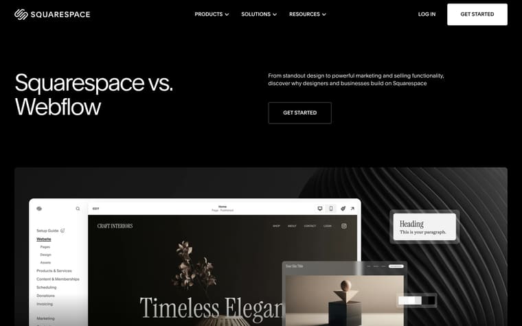
The page opens with “Squarespace vs. Weebly” and the line “From standout design to powerful marketing and ecommerce functionality, discover why businesses of all sizes choose Squarespace,” followed by a get-started call to action and a large product visual. It then gives three short reasons, “Industry-leading design,” “Quality at every step,” and “All-in-one, from day one,” before the “Comparing Squarespace and Weebly” feature-by-feature section. Below that, it adds customer quotes, a Blueprint AI callout, a grid of tools for “every stage of your journey,” and a migration block headed “Bring what you’ve built to Squarespace.” The page closes with related learning links, FAQs about Squarespace and Weebly, and “Start your free website trial today.”
Why it works
- Our readThe hero names the competitor immediately, so a reader coming from a comparison search knows they are in the right place before seeing the pitch.
- Our readThe comparison section uses plain feature rows like pricing, templates, AI website builder, ecommerce, SEO, email marketing, domains, integrations, and support, which makes the difference easy to scan.
- Our readCustomer quotes appear after the comparison, so the page moves from claims about features to people describing how Squarespace fits their work.
What not to copy
Don't copy the broad feature spread unless your product can credibly cover design, ecommerce, marketing, domains, support, migration, and AI. Keep the search-intent structure: competitor headline, scannable comparison, proof, migration help, and FAQs.
More from Squarespace



More landing pages








Steal it for your brand.
Tell us what you want to make. We’ll talk through how to put these ideas to work for your brand.