
The lesson
Use a competitor page to answer the comparison first, then show the switching path so the reader can picture moving over.
The move
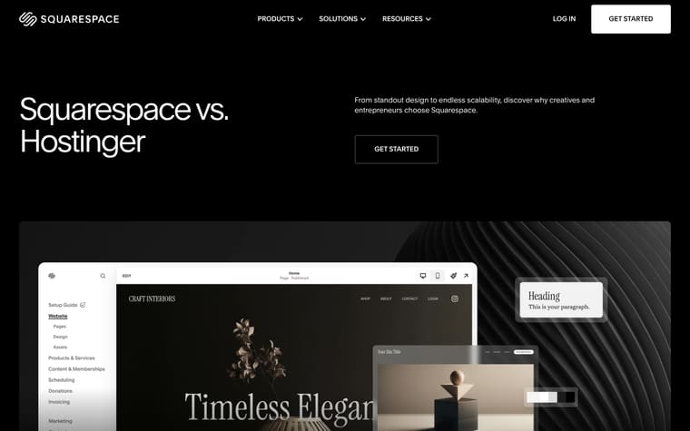
The page opens with "Squarespace vs. Webflow" and a short reason to choose Squarespace, followed by three value blocks: "Industry-leading design," "Quality at every step," and "All-in-one, from day one." It then moves into "Comparing Squarespace and Webflow," a side-by-side table covering product pricing, templates, design, AI, ecommerce, SEO and AIO tools, marketing, email, domains, blogging, integrations, and support. Below the table, "Trusted by millions of customers around the world" introduces customer quotes, then the page pushes "Generate a personalized website in minutes with Blueprint AI" and a grid of Squarespace tools. It closes with migration paths under "Bring what you’ve built to Squarespace," related articles, other platform comparisons, FAQs, and a final free trial CTA.
Why it works
- Our readThe first screen names Webflow directly, but the subhead reframes the choice around design, marketing, and selling rather than only website building.
- Our readThe comparison table covers practical buying questions like pricing, templates, AI website builder, ecommerce, email marketing, domains, support, and integrations in one long scan.
- Our readAfter the table, quotes from named Squarespace customers and a migration section give the reader proof and a next step instead of ending at the feature grid.
What not to copy
Don't copy the direct competitor comparison unless you can support it with concrete feature-by-feature claims. Keep the sequence of positioning, comparison table, customer proof, migration help, and FAQ.
More from Squarespace





More landing pages








Steal it for your brand.
Tell us what you want to make. We’ll talk through how to put these ideas to work for your brand.