
The lesson
Build competitor pages around the buyer’s comparison rows, then use the rest of the page to answer switching and product-depth questions.
The move
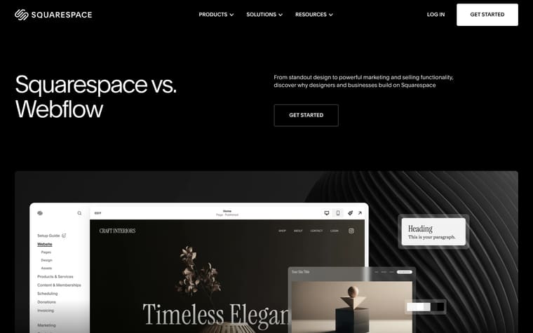
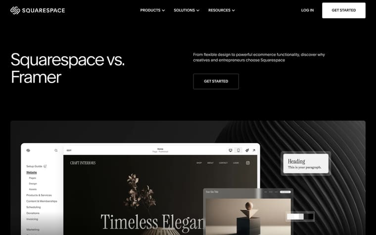
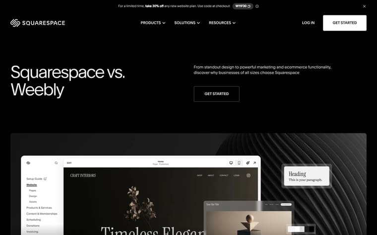
The page opens with “Squarespace vs. Hostinger” and the line “From standout design to endless scalability, discover why creatives and entrepreneurs choose Squarespace.” It then gives three short reasons, “Industry-leading design,” “Quality at every step,” and “All-in-one, from day one,” before a two-column comparison table under “Comparing Squarespace and Hostinger.” After quotes from Squarespace customers, the page shifts back to product depth with “Generate a personalized website in minutes with Blueprint AI,” “Tools for every stage of your journey,” and a migration section headed “Bring what you’ve built to Squarespace.” It closes with related articles, frequently asked questions, and “Start your free website trial today.”
Why it works
- Our readThe hero names Hostinger immediately, so a reader who came to compare platforms knows they are in the right place before the product pitch begins.
- Our readThe comparison table uses plain rows like pricing, templates, ecommerce, SEO, email marketing, domains, integrations, and support, which lets a buyer check the categories they already care about.
- Our readCustomer quotes sit after the table, so the page moves from claims and feature detail into people describing how Squarespace fits their work.
What not to copy
Don't copy the direct named-competitor format unless buyers are already comparing you with that product. Keep the structure of hero claim, scannable comparison table, customer proof, product breadth, migration help, and FAQ.
More from Squarespace




More landing pages








Steal it for your brand.
Tell us what you want to make. We’ll talk through how to put these ideas to work for your brand.