
The lesson
Put the competitor table near the top, then use the rest of the page to answer proof, product breadth, and switching questions.
The move
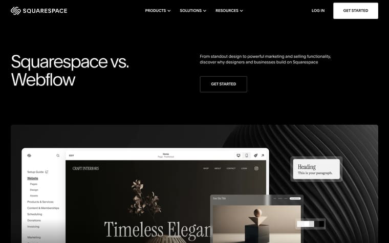
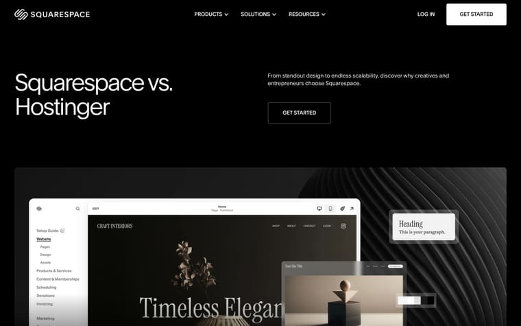
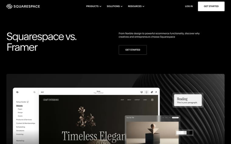
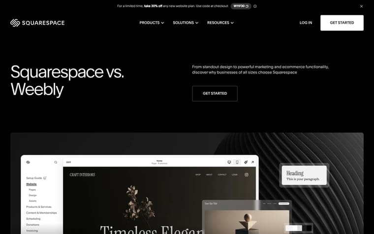
The page opens with “Squarespace vs. Bluehost” and the promise, “From standout design to powerful ecommerce functionality, discover why creatives and entrepreneurs choose Squarespace.” A three-part value section leads into “Comparing Squarespace and Bluehost,” a side-by-side table that covers pricing, templates, design, AI, ecommerce, SEO, marketing, domains, blogging, integrations, and support. After the table, the page adds customer quotes under “Trusted by millions of customers around the world,” promotes Blueprint AI, shows “Tools for every stage of your journey,” and closes with switching links, related articles, FAQs, and a free trial CTA.
Why it works
- Our readThe comparison table arrives before testimonials or product cards, so readers can answer the direct Squarespace versus Bluehost question first.
- Our readEach row compares one buying concern at a time, which makes the page useful for someone checking specific gaps like ecommerce, support, or domains.
- Our readThe “Bring what you’ve built to Squarespace” section handles the next objection after preference: how to move a domain, content, products, or an existing site.
What not to copy
Don't copy the breadth of the table unless you can compare across many real product areas. Keep the order: direct comparison first, then proof, product depth, migration help, and FAQs.
More from Squarespace



More landing pages








Steal it for your brand.
Tell us what you want to make. We’ll talk through how to put these ideas to work for your brand.