The lesson
Make the feature promise readable before the product UI has to explain it.
The move
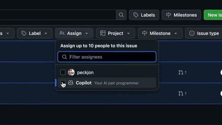
The poster leads with the huge line “Automated PR reviews!” in white and green on a dark purple background. Beside it, the GitHub reviewer picker shows Copilot listed with human reviewers, while a code diff and inline comment sit underneath. The composition uses arrows, neon gradients, and the Copilot bot as visual shortcuts for “this now happens inside your existing pull request flow.”
Why it works
- Our readThe headline says the outcome in the language developers already use: PR reviews.
- Our readShowing Copilot inside the reviewer picker makes the new behavior feel like an addition to an existing workflow, not a separate tool to learn.
- Our readThe code diff and comment preview give the announcement proof that the feature acts on real review work, not just chat.
What not to copy
Skip the GitHub-specific mascot and dark neon treatment unless they fit your brand. Keep the move: pair a plain outcome headline with the exact UI moment where the new feature enters the user’s workflow.
More from GitHub



More launch videos








Steal it for your brand.
Tell us what you want to make. We’ll talk through how to put these ideas to work for your brand.