What GitHub does
#0FBF3E#F2F5F3#E4EBE6#B6BFB8#909692#232925#101411#BFFFD1#8CF2A6#5FED83#08872B#0A241B
GitHub's Octicons are designed twice, on 16 x 16 and 24 x 24 px grids (12 px only for special cases), with a 1.5 px stroke at both sizes, round caps and joins, 1 px corner radius (0.25 px on small filled parts such as arrowheads), 1 px gaps between overlapping objects and 1.5 px gaps around modifiers, 2D perspective, outer edges on the pixel grid, and line arrowheads. The brand toolkit sets illustration loudness in three levels: detailed 3D isometric key art for big moments, the contribution graph (down to four squares in a row for light branding), and a dithering texture that should feel like wallpaper; all illustrations sit in optimistic daylight, and squares are never scattered, scaled past their cell, or mixed with dithering. The primary palette is neutrals with one hero, GitHub Green #0FBF3E, applied as mostly neutral with small moments of green, and secondary themes (Copilot Purple #8534F3, Security Blue #3094FF) appear sparingly and mainly in illustration. Layouts follow a strict grid whose borders are revealed only a couple of times, text and visuals are separated by a solid green line on white, gray or black text themes, speaker photos may be gray-scaled when they compete with illustration, and product UI shots are simplified, bordered with a radius and stroked to the thickness of the background dither squares. Motion avoids slapping, rolling or bouncing and uses five transition patterns (container transform, container masking, lateral, enter and exit, simple ease); Primer's motion tokens publish ease, ease-out, ease-in and ease-in-out cubic-bezier curves with ease-out as the recommended default.
GitHub's system, as published
- Octicon Grids
- 16 x 16 px and 24 x 24 px for every icon; 12 px only when 16 px can't be used
- Octicon Stroke
- 1.5 px at 16 and 24 px
- Octicon Caps Joins
- round
- Octicon Corner Radius
- 1 px; 0.25 px for small filled elements such as arrowheads
- Octicon Gaps
- 1 px between overlapping objects; 1.5 px around modifiers (lines, arrows)
- Octicon Rules
- 2D perspective unless depth adds meaning; outer edges on pixel boundaries; line arrowheads unless no room
- Spot Icons
- built from the gitline shape library (timeline and commit circle); never used at small sizes
- Illustration Levels
- key art (3D, isometric, big moments), contribution graph, textures (dithering)
- Illustration Light
- optimistic daylight; light mode
- Contribution Graph Min
- four squares in a row or column for light branding
- Texture Rules
- feel like wallpaper, not key art; don't break the grid or scatter squares; nothing larger than a cell; never mix dither with the contribution graph
- Primary Palette
- GitHub Green #0FBF3E; Gray 1 #F2F5F3, Gray 2 #E4EBE6, Gray 3 #B6BFB8, Gray 4 #909692, Gray 5 #232925, Gray 6 #101411
- Green Ramp
- #BFFFD1, #8CF2A6, #5FED83, #0FBF3E, #08872B, #0A241B
- Secondary Themes
- Copilot Purple #8534F3, Security Blue #3094FF; used sparingly, primarily in illustration
- Color Proportion
- mostly neutral colors with small moments of green
- Layout Grid
- primary page division plus the margin inside layout boxes; borders show the grid a couple of times, then it works invisibly through negative space
- Text Visual Split
- text and visuals separated by a solid GitHub Green line; text themes White, Gray, Black; copy meets WCAG AA normal-text contrast
- Photo Rule
- speaker photos may be gray-scaled when they compete with other visuals
- Product Ui Rules
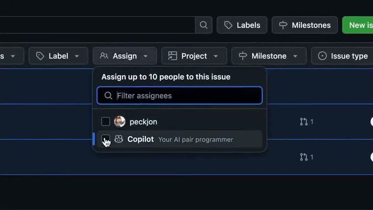
- neutral background (color for big announcements), dither or gradient wallpaper pointing to the key area, gradient fade to recede, border with corner radius stroked at the dither-square thickness, trim sidebars/footers/competing buttons, consistent spacing between images
- Primer Easing
- linear [0, 0, 1, 1]; ease [0.25, 0.1, 0.25, 1] hover and micro-interactions; easeIn [0.7, 0.1, 0.75, 0.9] exits; easeOut [0.3, 0.8, 0.6, 1] entering, recommended default; easeInOut [0.6, 0, 0.2, 1] moving or morphing
- Primer Durations
- 0, 50, 100, 200 to 1000 ms in 100 ms steps
- Motion Transitions
- container transform (modals, expanded views), container masking (celebration and confirmation only), lateral (tabs, navigation), enter and exit (menus, popovers, drawers), simple ease (hover, resize, opacity)
- Motion Bans
- no slapping, rolling or bouncing unless a character is moving; no out-of-the-box presentation effects
- Mono Type Motion
- typing effect with a shifting cursor color, used on hero eyebrows and testimonials
- Primer Layout
- breakpoints 320, 544, 768, 1012, 1280, 1400 px; 1 column under 768 px, a 3rd column optional at 1400 px; page max width 1280 px including 24 px padding; 16 px padding on small screens
- Primer Size Scale
- 2, 4, 6, 8, 12, 16 px and up
Why it works
The brand's art is built from something users already see every day, a grid of activity squares, so even abstract graphics read as the product. Neutral pages with one accent leave room for that art, and product screenshots are trimmed into the hero image instead of being replaced by stock photos.
Best for
Developer tools, infrastructure and data platforms, open-source projects, technical SaaS and conference brands that want to look like the product itself rather than generic marketing
What breaks it
- Stock photography in place of product UI
- Accent color spread across large areas
- Squares scattered, enlarged past their cell, or used as confetti
- Grid texture and dither texture together
- Bounce, roll or slap entrances and preset presentation effects
- Showing every grid line
Sources
- primer.style: Octicon design specs: 16 and 24 px grids, 1.5 px stroke, round caps and joins, corner radii, gaps, perspective, pixel alignment, arrowheads
- brand.github.com: Octicons as the brand's default icon, spot icons built from the gitline shapes, brand usage
- brand.github.com: Three illustration styles by loudness, key art, building blocks, daylight
- brand.github.com: Contribution graph and dithering textures with usage rules
- brand.github.com: Strict grid, revealing borders, gray-scaled speaker photos, text and visuals split by a green line on white, gray or black themes
- brand.github.com: Product UI as marketing visual: backgrounds, bordered and stroked UI, simplify and emphasize
- brand.github.com: Primary palette with GitHub Green and grays, green ramp, Copilot and Security secondary themes, proportion of color
- brand.github.com: Motion goals, type animation, five transition patterns, no slapping, rolling or bouncing
- github.com: Primer easing tokens with cubic-bezier values and usage
- github.com: Primer duration tokens 0 to 1000 ms
- primer.style: Primer layout: viewport ranges, breakpoints, padding, 1280 px max width
- primer.style: Primer base size scale
Steal it for your brand
The same system, written in your colors, type and shapes. Nothing of GitHub's look comes with it.
The recipe
- Restyle an open line icon set to 16 and 24 px masters with a 1.5 px stroke at both sizes, round caps and joins, 1 px corners, 1 px gaps where shapes overlap and 1.5 px around modifiers, flat 2D views and line arrowheads; color them
palette.ink. - Use icons in brand pieces as bullets and small marks on cards; for larger spot icons (48 px and up) build them from a few connected lines and circles and color them with
palette.inkpluspalette.accent. - Choose one illustration level per piece by how loud the moment is: isometric key art for launches, a grid of squares for most pieces, a dither texture as wallpaper behind quiet ones.
- Build the grid of squares from equal cells filled in five steps from
palette.surfacetopalette.accent, deepest cells inpalette.accent dark; keep every square inside its cell, never scatter or enlarge one, and never mix it with the dither texture in the same piece. Four squares in a row is enough for light branding. - Keep pages neutral,
palette.paper,palette.surfaceorpalette.night, and letpalette.accentcover only about a tenth of the area; savepalette.accent secondaryfor illustration. - Make the product the hero image: crop real screens to the key moment, remove sidebars, footers and competing buttons, frame the result with a
style.radiuscorner and astyle.border widthstroke inpalette.border, and set it onpalette.surfacewith a dither or gradient that points to the key area and fades topalette.paper. - When people photos sit beside illustration, convert them to grayscale so the art keeps the color; space several images evenly.
- Lay pages out on a strict grid capped at 1280 px with 16 px padding on small screens and 24 px on large: one column under 768 px, two above, a third only at 1400 px. Draw the grid lines in
palette.borderonce or twice per piece and let the rest of the grid stay invisible. - Separate text from visuals with a solid
palette.accentrule ofstyle.border width* 2, and keep text on one of the three neutral grounds at WCAG AA contrast. - Animate entrances with the ease-out curve, exits with ease-in, moves and morphs with ease-in-out and hovers with ease, at the recipe's hover_ms, enter_ms and move_ms; choose a pattern by relationship (container transform for open-in-place, lateral for tabs, enter and exit for menus, masking only for confirmations).
- Never slap, roll or bounce text or UI; type monospaced lines in character by character with a cursor in
palette.accent.
What you'll need
- Screenshots of the customer's real product
- Photos of speakers or team, if any
- Which piece is a launch-level moment and which are routine
Recipe as JSON
{
  "recipe": {
    "icon_style": {
      "sizes_px": [
        16,
        24
      ],
      "special_px": 12,
      "stroke_px": 1.5,
      "linecap": "round",
      "linejoin": "round",
      "corner_radius_px": 1,
      "small_fill_radius_px": 0.25,
      "overlap_gap_px": 1,
      "modifier_gap_px": 1.5,
      "perspective": "2D",
      "arrowheads": "line",
      "pixel_align": "outer edge",
      "fill": "none",
      "color": "{palette.ink}",
      "color_secondary": "{palette.ink_muted}",
      "spot_icon_min_px": 48,
      "spot_icon_colors": [
        "{palette.ink}",
        "{palette.accent}",
        "{palette.accent_secondary}"
      ],
      "brand_uses": [
        "bullets",
        "card corner marks",
        "labels inside key art"
      ]
    },
    "illustration_style": {
      "levels": [
        "key art",
        "activity grid",
        "dither texture"
      ],
      "level_by_moment": {
        "launch": "key art",
        "standard": "activity grid",
        "quiet": "dither texture"
      },
      "key_art_projection": "isometric",
      "key_art_angle_deg": 30,
      "grid_cell_shape": "square",
      "grid_cell_radius": "{style.radius} * 0.25",
      "grid_cell_gap_ratio": 0.2,
      "grid_intensity_steps": [
        0,
        0.25,
        0.5,
        0.75,
        1
      ],
      "grid_empty": "{palette.surface}",
      "grid_full": "{palette.accent}",
      "grid_deepest": "{palette.accent_dark}",
      "grid_min_cells": 4,
      "dither_color": "{palette.accent}",
      "dither_on": "{palette.night}",
      "light": "daylight",
      "background": "{palette.paper}",
      "accent_share": 0.15,
      "secondary_color": "{palette.accent_secondary}",
      "secondary_scope": "illustration only"
    },
    "photo_treatment": {
      "hero_visual": "trimmed product UI",
      "ui_frame_radius_px": "{style.radius}",
      "ui_frame_stroke_px": "{style.border_width}",
      "ui_frame_stroke_color": "{palette.border}",
      "ui_backdrop": "{palette.surface}",
      "ui_backdrop_pattern": "dither, densest toward the key area",
      "ui_backdrop_fade": "gradient to {palette.paper}",
      "ui_trim": [
        "sidebars",
        "footers",
        "unneeded borders",
        "competing buttons and links"
      ],
      "people_photo_saturation_beside_art": 0,
      "people_photo_saturation_alone": 1,
      "image_gap_px": "{style.radius} * 2",
      "alt_text": "describe the UI elements and their interactions"
    },
    "motion": {
      "easing_hover": [
        0.25,
        0.1,
        0.25,
        1
      ],
      "easing_enter": [
        0.3,
        0.8,
        0.6,
        1
      ],
      "easing_exit": [
        0.7,
        0.1,
        0.75,
        0.9
      ],
      "easing_move": [
        0.6,
        0,
        0.2,
        1
      ],
      "easing_progress": [
        0,
        0,
        1,
        1
      ],
      "hover_ms": {
        "by": "style.motion",
        "map": {
          "crisp": 50,
          "calm": 100,
          "playful": 100
        },
        "default": 100
      },
      "enter_ms": {
        "by": "style.motion",
        "map": {
          "crisp": 200,
          "calm": 300,
          "playful": 300
        },
        "default": 200
      },
      "move_ms": {
        "by": "style.motion",
        "map": {
          "crisp": 300,
          "calm": 400,
          "playful": 400
        },
        "default": 300
      },
      "duration_step_ms": 100,
      "patterns": [
        "container transform",
        "container masking",
        "lateral",
        "enter and exit",
        "simple ease"
      ],
      "masking_only_for": "confirmations and celebrations",
      "overshoot": 0,
      "mono_text": "typed character by character with a cursor in {palette.accent}"
    },
    "layout_move": {
      "size_scale_px": [
        2,
        4,
        6,
        8,
        12,
        16,
        24,
        32,
        40,
        48
      ],
      "breakpoints_px": [
        320,
        544,
        768,
        1012,
        1280,
        1400
      ],
      "columns_by_breakpoint": {
        "320": 1,
        "768": 2,
        "1400": 3
      },
      "max_width_px": 1280,
      "padding_px_small": 16,
      "padding_px_large": 24,
      "grid_border": "{style.border_width}",
      "grid_border_color": "{palette.border}",
      "grid_borders_revealed": 2,
      "text_visual_divider": "{palette.accent}",
      "text_visual_divider_px": "{style.border_width} * 2",
      "text_themes": [
        "{palette.paper}",
        "{palette.surface}",
        "{palette.night}"
      ],
      "text_on_dark": "{palette.on_night}",
      "accent_area_share": 0.1,
      "section_gap_px": {
        "by": "style.density",
        "map": {
          "airy": 96,
          "balanced": 64,
          "dense": 40
        },
        "default": 64
      }
    }
  },
  "fallbacks": {
    "palette.ink_muted": "{palette.ink}",
    "palette.accent_dark": "{palette.ink}",
    "palette.accent_secondary": "{palette.accent}",
    "palette.surface": "{palette.paper}",
    "palette.border": "{palette.ink_muted}",
    "palette.night": "{palette.ink}",
    "palette.on_night": "{palette.paper}",
    "style.border_width": 1,
    "style.radius": 6
  },
  "steps": [
    "Restyle an open line icon set to 16 and 24 px masters with a 1.5 px stroke at both sizes, round caps and joins, 1 px corners, 1 px gaps where shapes overlap and 1.5 px around modifiers, flat 2D views and line arrowheads; color them {palette.ink}.",
    "Use icons in brand pieces as bullets and small marks on cards; for larger spot icons (48 px and up) build them from a few connected lines and circles and color them with {palette.ink} plus {palette.accent}.",
    "Choose one illustration level per piece by how loud the moment is: isometric key art for launches, a grid of squares for most pieces, a dither texture as wallpaper behind quiet ones.",
    "Build the grid of squares from equal cells filled in five steps from {palette.surface} to {palette.accent}, deepest cells in {palette.accent_dark}; keep every square inside its cell, never scatter or enlarge one, and never mix it with the dither texture in the same piece. Four squares in a row is enough for light branding.",
    "Keep pages neutral, {palette.paper}, {palette.surface} or {palette.night}, and let {palette.accent} cover only about a tenth of the area; save {palette.accent_secondary} for illustration.",
    "Make the product the hero image: crop real screens to the key moment, remove sidebars, footers and competing buttons, frame the result with a {style.radius} corner and a {style.border_width} stroke in {palette.border}, and set it on {palette.surface} with a dither or gradient that points to the key area and fades to {palette.paper}.",
    "When people photos sit beside illustration, convert them to grayscale so the art keeps the color; space several images evenly.",
    "Lay pages out on a strict grid capped at 1280 px with 16 px padding on small screens and 24 px on large: one column under 768 px, two above, a third only at 1400 px. Draw the grid lines in {palette.border} once or twice per piece and let the rest of the grid stay invisible.",
    "Separate text from visuals with a solid {palette.accent} rule of {style.border_width} * 2, and keep text on one of the three neutral grounds at WCAG AA contrast.",
    "Animate entrances with the ease-out curve, exits with ease-in, moves and morphs with ease-in-out and hovers with ease, at the recipe's hover_ms, enter_ms and move_ms; choose a pattern by relationship (container transform for open-in-place, lateral for tabs, enter and exit for menus, masking only for confirmations).",
    "Never slap, roll or bounce text or UI; type monospaced lines in character by character with a cursor in {palette.accent}."
  ]
}
See it working
- GitHub: Octicon construction: 1.5 px stroke on 16 and 24 px grids, round caps, corners and gaps
- GitHub: The contribution graph and dithering textures with do and don't rules
- GitHub: Isometric key art built from blocks, in daylight
- GitHub: Product UI framed and stroked over a dither background
- GitHub: The five transition patterns and type animations
The lesson
Document your icon style as rules a stranger can follow: fixed grids, two sizes of every icon, and a contents list of every rule.
The move
The Octicons page, "A scalable set of icons handcrafted by GitHub.", has Icons, Design specs, Usage and Code tabs. Under "Grid sizes" it says "Always design two versions of each icon: a 16px version and a 24px version" and draws both grids labeled 16 and 24. A side list covers Stroke, Caps and joins, Corners, Gaps and Arrowheads.
Why it works
- Our readDrawing the 16 and 24 grids side by side with measurements lets a contributor see the rule instead of interpreting a sentence.
- Our readA short "on this page" list turns a spec into a checklist a designer can work through before submitting a new icon.
- Our readBelow the grids, a note says 12px icons are special and made only when a 16px icon can't be used, so exceptions are written down too.
What not to copy
The specific sizes belong to GitHub's icons, so set your own grid. Keep the pattern of one rule per heading, a drawn example for each and the exceptions stated.