The lesson
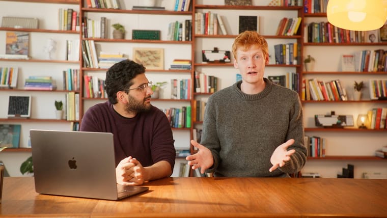
Anchor the release in a human announcement, then cut straight into the product doing the new work.
The move
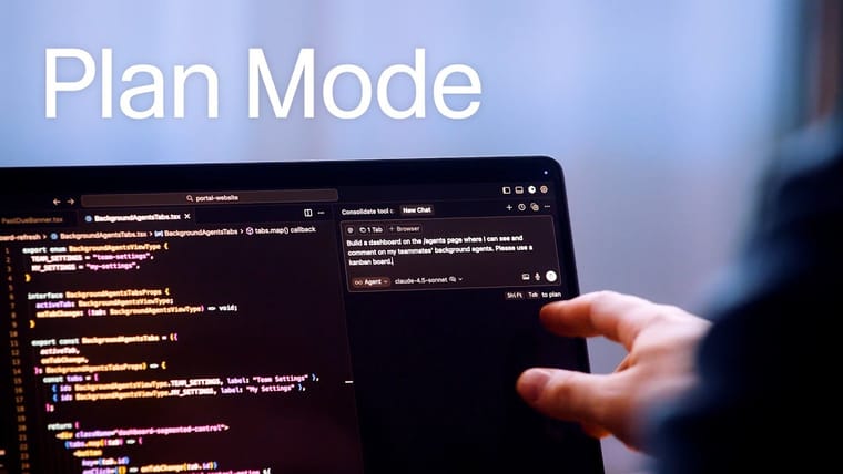
The poster shows a person smiling at a desk with the large title “Cursor 1.0.” The storyboard opens with a clapper and date cards, then moves into a direct-to-camera explanation before switching to dark product screens showing tasks, code, and agent activity. The video closes on abstract Cursor-style cube marks against a dark background.
Why it works
- Our readThe speaker gives the release a clear owner before the video asks viewers to follow several product changes.
- Our readThe UI footage makes the launch feel like a working product release, not just a list of feature names.
- Our readThe dark, minimal visual system matches the developer audience and keeps attention on code, tasks, and tool behavior.
What not to copy
Skip the brand-specific cube animation and Cursor visual language. Keep the structure: human intro, named release, quick cuts of the product proving each new capability.
More from Cursor



More launch videos







Steal it for your brand.
Tell us what you want to make. We’ll talk through how to put these ideas to work for your brand.