The lesson
Open with the whole business on one scannable dashboard before asking readers to follow the narrative.
The move
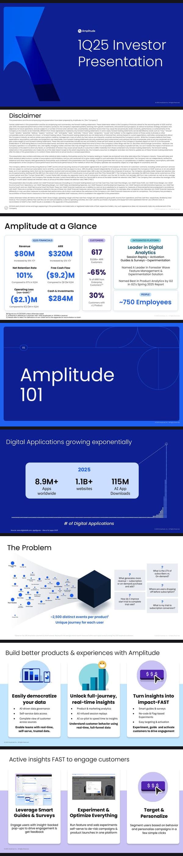
The cover is a simple blue title slide: Amplitude logo, “1Q25 Investor Presentation,” and a large abstract brand shape. After the disclaimer, slide 3 gives “Amplitude at a Glance” in boxed sections for “1Q25 Financials,” “Customers,” “Integrated Platform,” and “People,” with large figures like “$80M,” “$320M,” “617,” and “~750 Employees.” The deck then resets into “Amplitude 101,” moves from market context to “The Problem,” shows the product platform, customer logos, and only then enters “Financial Review.”
Why it works
- Our readThe dashboard slide gives investors the numbers, product scope, customer scale, and analyst proof before they see any explanation.
- Our readThe section divider lets the company shift from financial facts into a basic market and product story without making the opening feel crowded.
- Our readThe problem slide uses buyer questions like “Where are users dropping off before subscription?” to make the platform feel tied to operating decisions, not just analytics features.
What not to copy
Skip the public-company disclaimer and investor-relations density unless you need it. Keep the move of sequencing proof first, category problem second, platform third, and financial review last.
More from Amplitude





More sales decks




Steal it for your brand.
Tell us what you want to make. We’ll talk through how to put these ideas to work for your brand.