Context
Connected context makes teams and agents more effective. Our reading
Brand book
Context is the brand. Atlassian shows the work itself (boards, pages, named teammates and agents) instead of metaphors, and runs everything on tokens, so 30+ apps and a marketing site read as one connected system, which is exactly what it sells. Our reading

Tone dials with the reader's state: bolder and more expressive for confident users, marketing and brand moments; plain and practical for new users, errors and frequent UI.
Atlassian publishes no color ratio. Our reading of the homepage at 1440px, by band height: white bands versus the two #1E1F21 bands. Blue is too small to count: CTAs, links and app tiles only..
One voice dialed by the reader's emotional state. Atlassian publishes the guidance; the levels are our reading.
Our engine's setting, built from their rules.
Cover the logo. It should still read as Atlassian: white page, near-black sentence-case headline, one blue pill, real product UI, named teammates or agents, a number with a source.
Put another SaaS logo on it. If the product UI, the collection tiles and the context argument don't feel out of place, it's generic, and it goes back.
Every color on the page maps to a published token role (brand, neutral, discovery, success, warning, danger). A color with no role is a mistake.
The teamwork platform for the AI era: apps, agents and the Teamwork Graph give teams and AI the shared context to decide and ship (paraphrase). Observed
Connected context makes teams and agents more effective. Our reading
One system of work where people and agents collaborate. Our reading
Hundreds of thousands of teams, measured customer outcomes. Our reading
Enterprise permissions carry across every agent. Observed
Discover the power of knowing
Your context, wherever you need it
Connect the work behind the work
Transform how your teams work
Founded by Mike Cannon-Brookes and Scott Farquhar; Jira 1.0 launched in 2002, Confluence in 2003. Listed on NASDAQ as TEAM in 2015; Trello (2017), Opsgenie (2018) and Loom (2023) joined; Rovo, the AI teammate, was announced in 2024; Strategy and Teamwork Collections debuted in 2025.
Work and information are open by default (published value; also the 'Working Open' philosophy).
PublishedPublished company value.
PublishedCustomers come first, including pricing so every company can afford the products (paraphrase).
PublishedPublished company value.
PublishedPublished company value.
PublishedCategory. Teamwork and work-management software platform with AI agents (Rovo), sold as apps and collections. Observed
Scattered point tools and generic AI without business context (no competitor is named on the homepage).
Atlassian builds apps, AI agents and a platform for teamwork (Jira, Confluence, Loom, Rovo and more), with a mission to help unleash the potential of every team through open work. Founded in 2002 by Mike Cannon-Brookes and Scott Farquhar; 300,000+ customers, 12,000+ employees in 14 countries.
Discover the power of knowing Observed
The teamwork platform for the AI era Observed
Stop searching. Start shipping. Observed
The living map of how work gets done Observed
We help teams change the world Observed
The teamwork platform for the AI era
AI-native strategic portfolio management
Shatter the service quo
Deliver high quality software. Fast.
Better product decisions in the age of AI
Where 350,000+ teams turn context into delivery
Built for how modern teams work
Fueled by Atlassian’s teamwork expertise and research
Stop searching. Start shipping.
We help teams change the world
The living map of how work gets done
Want more confidence in AI? Give it more context.
atlassian.com sells one idea, context: the hero ('Discover the power of knowing'), the Teamwork Graph band, five collection tabs, a wall of customer numbers, research tiles from the Teamwork Lab, and a closing pair of imperatives. Apps are grouped into collections (Teamwork, Strategy, Service, Software, Product), each with a one-line promise.
Source: atlassian.comatlassian.com/companyatlassian.com/system-of-workatlassian.com/platform/teamwork-graph
We can't load this page
The Page Could Not Be Loaded.
Create work item
Create A New Work Item!
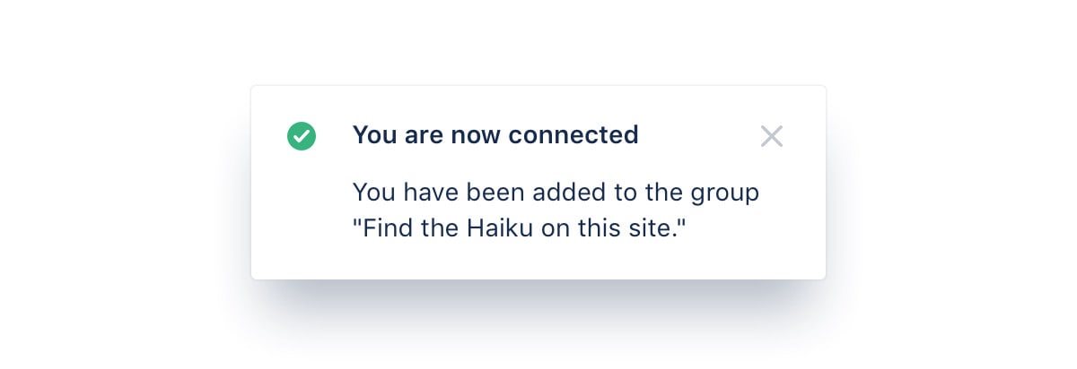
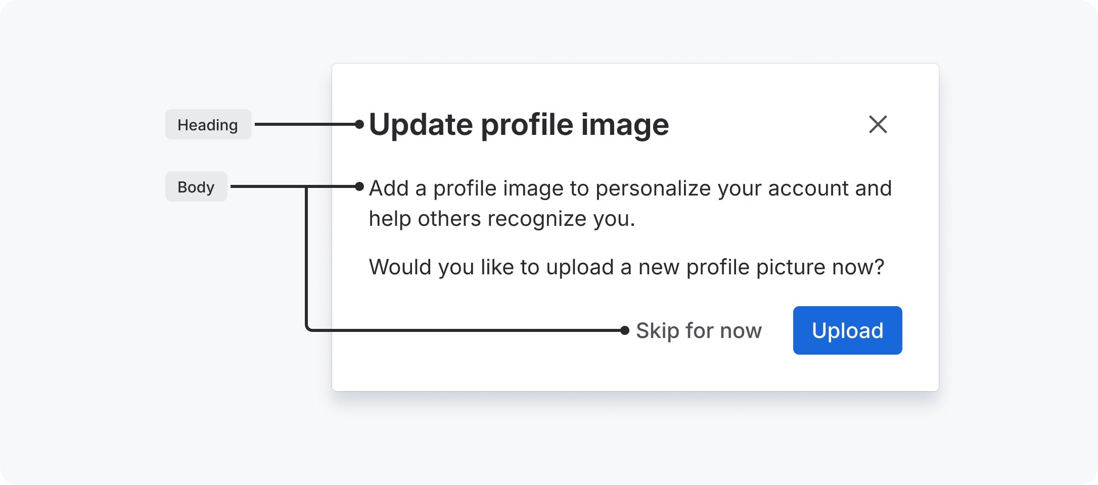
Tying tone to the user's state (confident admin versus confused trial user) keeps a cheerful brand from being glib in an error message.
BoldOptimisticPractical, with a wink
The design system publishes a UI voice: three traits (Bold, Optimistic, Practical with a wink) dialed by the user's emotional state, and six principles from 'Inform to build trust' to 'Delight'. Atlassian's marketing voice guide is internal; on atlassian.com the voice is confident and compact, with stats and research doing the persuading.
teamsteamworkcontextappscollectionsagentsRovoTeamwork GraphSystem of Workwork item
'products' for Atlassian apps in new copy (they are now 'apps')e.g., i.e., etc., &title case in headings and buttons'My' for the user's things (use 'Your')
Source: atlassian.design/foundations/content/voice-toneatlassian.com/company
| Traits | Bold; Optimistic; Practical, with a wink |
|---|---|
| Principles | Inform, Empower, Encourage, Motivate, Satisfy, Delight |
| Case | Sentence case |
| Spelling | US English (Merriam-Webster) |
Source: atlassian.design/foundations/content/voice-toneatlassian.design/foundations/content/language-and-grammaratlassian.design/foundations/content/designing-messagesatlassian.design/foundations/content/inclusive-writingatlassian.com






Logos shown for reference. The three horizontal lockups are rendered from Atlassian's own SVGs in the official logo pack on atlassian.design (the pack is a zip, so there is no direct SVG URL; Brandfetch still serves the retired #0052CC lockup). Other marks load from Atlassian's own CDNs (atlassian.design, the Atlassian blog, dam-cdn.atl.orangelogic.com). Atlassian and its app names are trademarks of Atlassian; logos must be used unaltered, and Atlassian's trademark guidelines ask third-party sites not to mimic atlassian.com's look and feel. Not affiliated, and not for download.
Logo in brand blue on white
Logo with a drop shadow on a photo
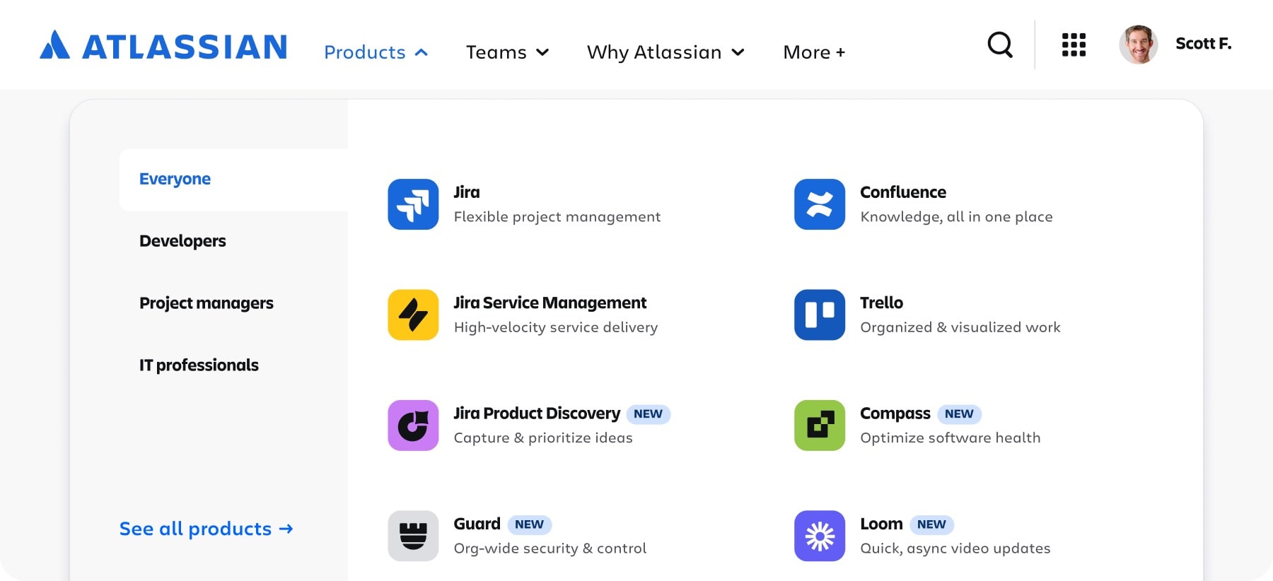
One mark family across 30+ apps: the tile shape says 'Atlassian app', the tile color says which collection, the glyph says what it does.
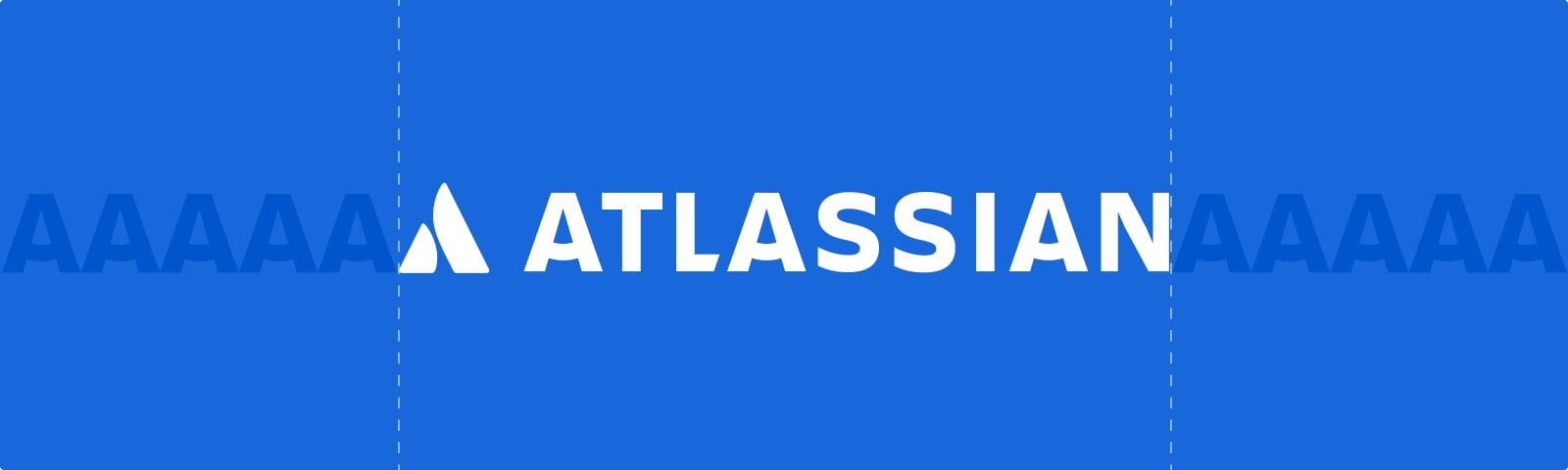

| Colors | brand #1868DB, inverse white, neutral (pack file #6C6F77) |
|---|---|
| Clear space | cap-height of the wordmark 'A' |
| Strapline min width | 280px |
| Component sizes | 16 / 20 / 24 / 32 / 40 / 48px |
| Tile radius | radius.tile, calculated 25% |
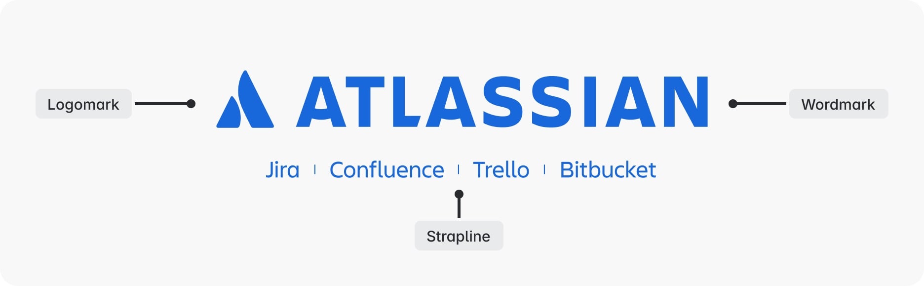
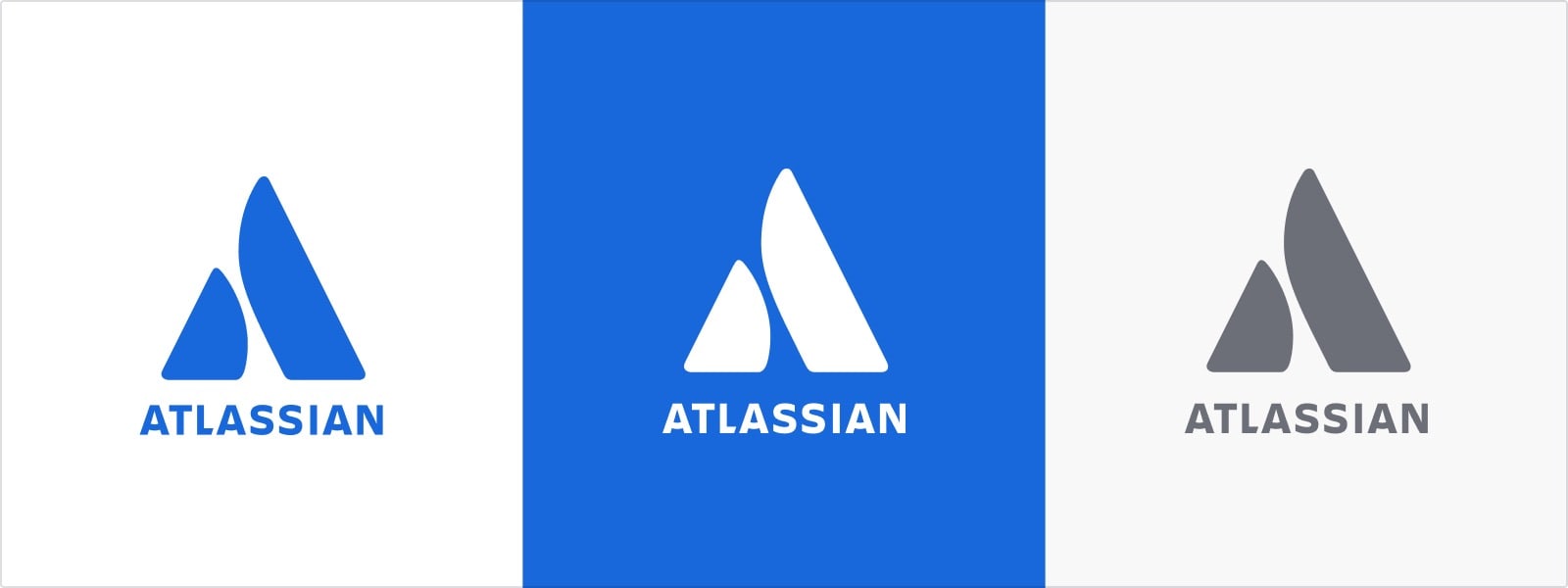
The Atlassian logo is a logomark (the stylized A, two pillars or a high-five) plus the ATLASSIAN wordmark, in three color options: brand (Blue700), inverse (white) and neutral. Lockups include the app strapline, attribution logos (app mark plus the Atlassian strapline), property logos (logo plus a name in Charlie Sans) and app logos: a glyph in a tile colored by collection.
Source: atlassian.design/foundations/logosatlassian.design/components/logo/examplesatlassian.com/blog/developers/our-bold-new-brandatlassian.com/legal/trademark
Get started
Mostly white, near-black type
A page flooded blue
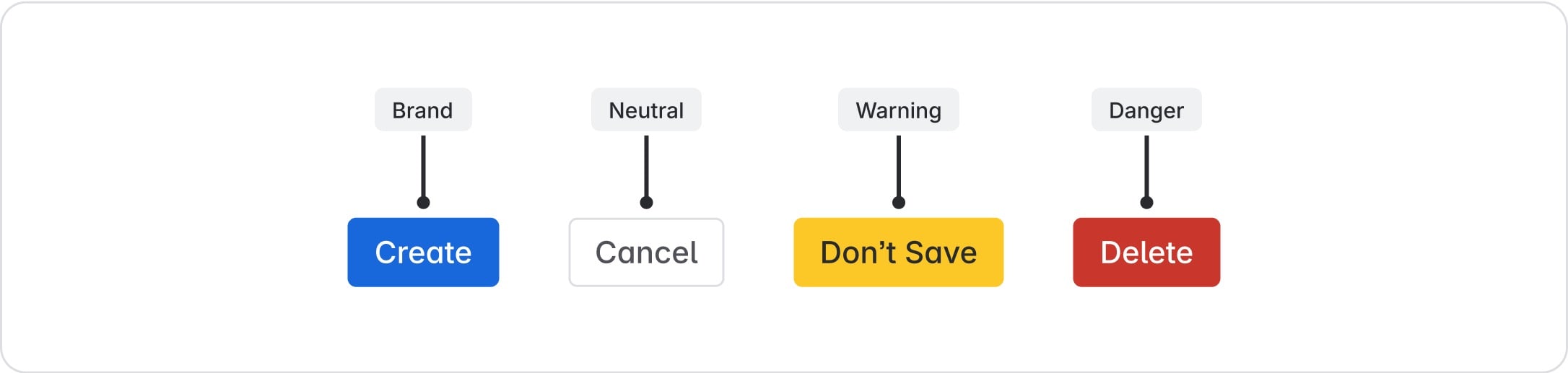
Roles carry meaning across 30+ apps and both themes, so 'danger' is the same red everywhere and dark mode comes for free.
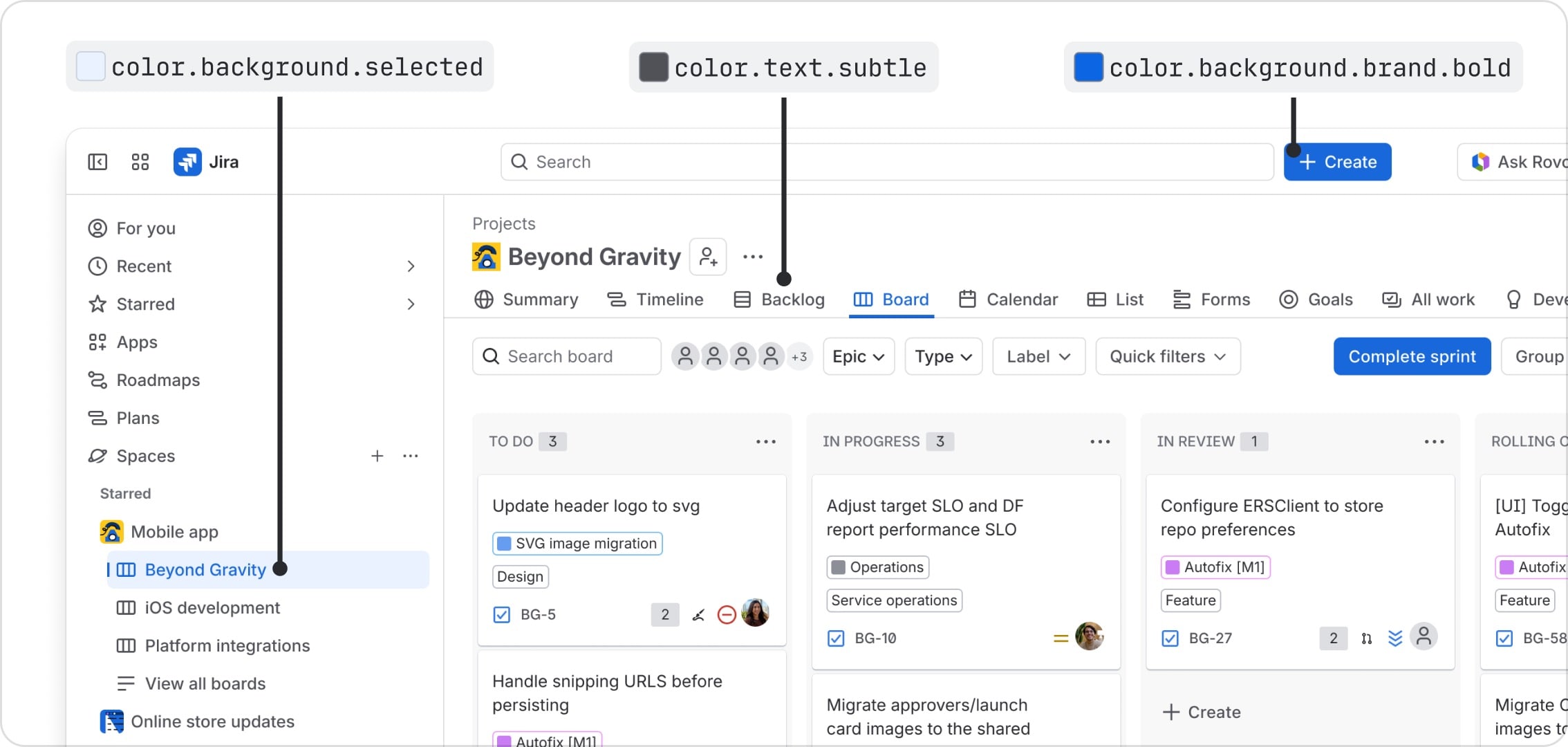


| Brand | Blue700 #1868DB |
|---|---|
| Text | #292A2E |
| Subtle text | #505258 |
| Surface | #FFFFFF; sunken #F8F8F8 |
| Ramps | 10 hues x 12 steps (100-1000) + light and dark neutrals |
| Themes | light and dark |
Color is a token system, not a swatch list: tokens name the property (background, text, border, icon), the role (neutral, brand, information, success, warning, danger, discovery, accent, inverse, input), the emphasis (subtlest to boldest) and the state. Ten saturated ramps (Lime to Magenta, steps 100 to 1000) and separate light and dark neutral ramps sit underneath. Brand is Blue700. atlassian.com is mostly white with near-black type, one blue CTA, and dark #1E1F21 bands.
Not published: a marketing color ratio or proportion; the homepage heading color #101214 as a palette step.
Source: atlassian.design/foundations/coloratlassian.design/foundations/color/color-paletteatlassian.design/components/tokens/all-tokensatlassian.design/foundations/color/accentsatlassian.design/foundations/color/data-visualization-coloratlassian.com
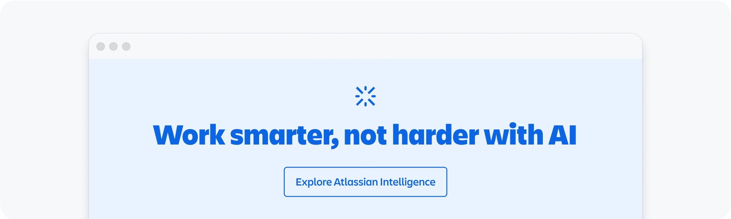
Discover the power of knowing
Discover the power of knowing
DISCOVER THE POWER OF KNOWING
A characterful brand face for persuasion and a neutral, fast UI face for work keeps the apps calm and the marketing distinctive.
| Their face | Use | License | Open stand-in |
|---|---|---|---|
| Charlie Display (Charlie Sans family) | atlassian.com headings, weight 500 (observed) | Proprietary Atlassian brand font; 'only authenticated users can download' it (atlassian.design typography). Served to atlassian.com from Atlassian's CDN; not licensed for third-party use. | Rethink Sans Calibrated against Charlie Display on atlassian.com: Rethink Sans 600 matches its stem (0.113em) and ink within 1% at width-matched tracking. |
| Charlie Text (Charlie Sans family) | atlassian.com body, nav and buttons (observed) | Proprietary Atlassian brand font; same terms as Charlie Display. | Wix Madefor Text Calibrated against Charlie Text on atlassian.com: Wix Madefor Text 450 matches Charlie Text 400's stem (0.088em); 600 matches Charlie Text 500. |
| Atlassian Mono | code (font.code 12/20) | Atlassian app font; downloadable in Atlassian Mosaic (TTF) per the guide; no open licence published. The ADS licence limits design-system assets to building add-ons for Atlassian products. | JetBrains Mono |
| Atlassian Sans | all in-app UI and atlassian.design (observed there) | Atlassian app font; downloadable in Atlassian Mosaic (TTF); hosted at ds-cdn.prod-east.frontend.public.atl-paas.net for Atlassian's own sites. Not an open licence. | Inter |
| Heading XXL | 32/36 bold |
|---|---|
| Heading XL | 28/32 bold |
| Heading L | 24/28 bold |
| Heading M | 20/24 bold |
| Heading S | 16/20 bold |
| Heading XS | 14/20 bold |
| Heading XXS | 12/16 bold |
| Body L | 16/24, paragraph spacing 16 |
| Body M | 14/20, paragraph spacing 12 |
| Body S | 12/16, paragraph spacing 8 |
| Metric L/M/S | 28/32, 24/28, 16/20 bold |
| Code | 12/20 regular |
| Homepage hero (observed) | Charlie Display 500, 64px |
| Homepage H2 (observed) | Charlie Display 500, 48px |
Token sizes are the app (Atlassian Sans) scale; marketing sizes are observed on atlassian.com and are not published.
Two families with two jobs. Marketing expresses the brand in Charlie Sans (Charlie Display and Charlie Text on atlassian.com, observed). Apps use Atlassian Sans and Atlassian Mono through typography tokens in rem. The homepage sets headlines in Charlie Display 500 at 64px (hero) and 48px (sections), tight, centered in the hero.
Source: atlassian.design/foundations/typographyatlassian.comatlassian.com/blog/developers/our-bold-new-brand
Rounded curves echo the type; square ends add boldness and keep strokes pixel-aligned.
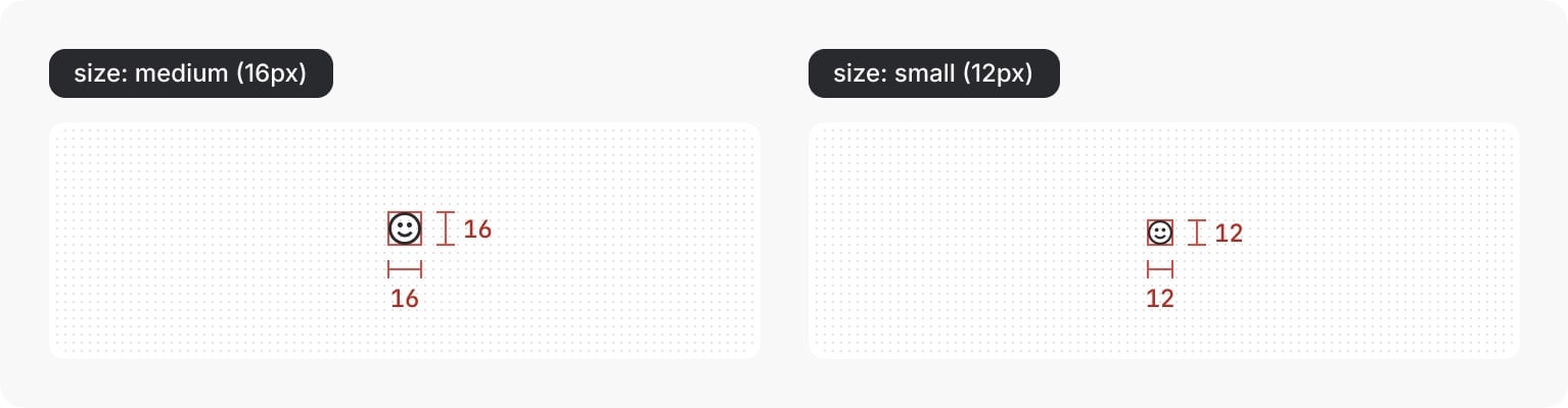
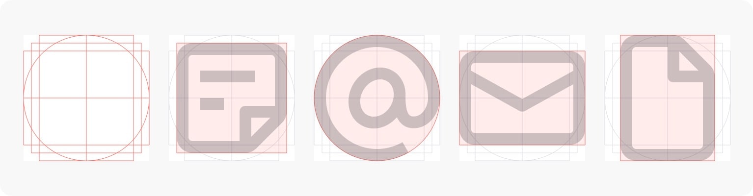

| Grid | 16 x 16px |
|---|---|
| Stroke | 1.5px |
| Sizes | 16px default, 12px small |
| Caps | none (butt) |
| Corners | rounded outside, sharp inside |
System icons are drawn on a 16px box with a 1.5px stroke, rounded outer corners, sharp inner corners and square line ends, shown straight on. 16px is default; 12px is for chevrons, validation, tags and secondary actions. Larger decorative icons go in an icon tile. atlassian.com also uses larger 'brand icons' (observed) in its feature rows.
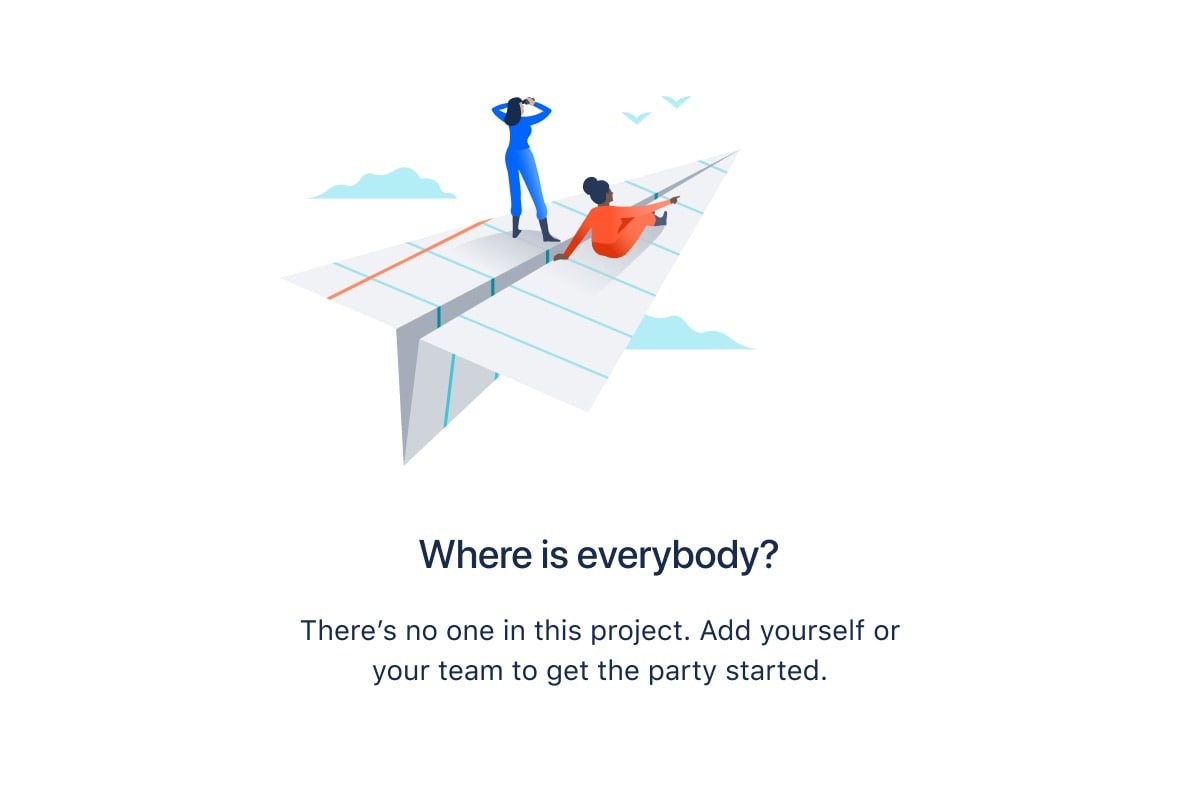
Illustration explains or celebrates; it never decorates a work surface.
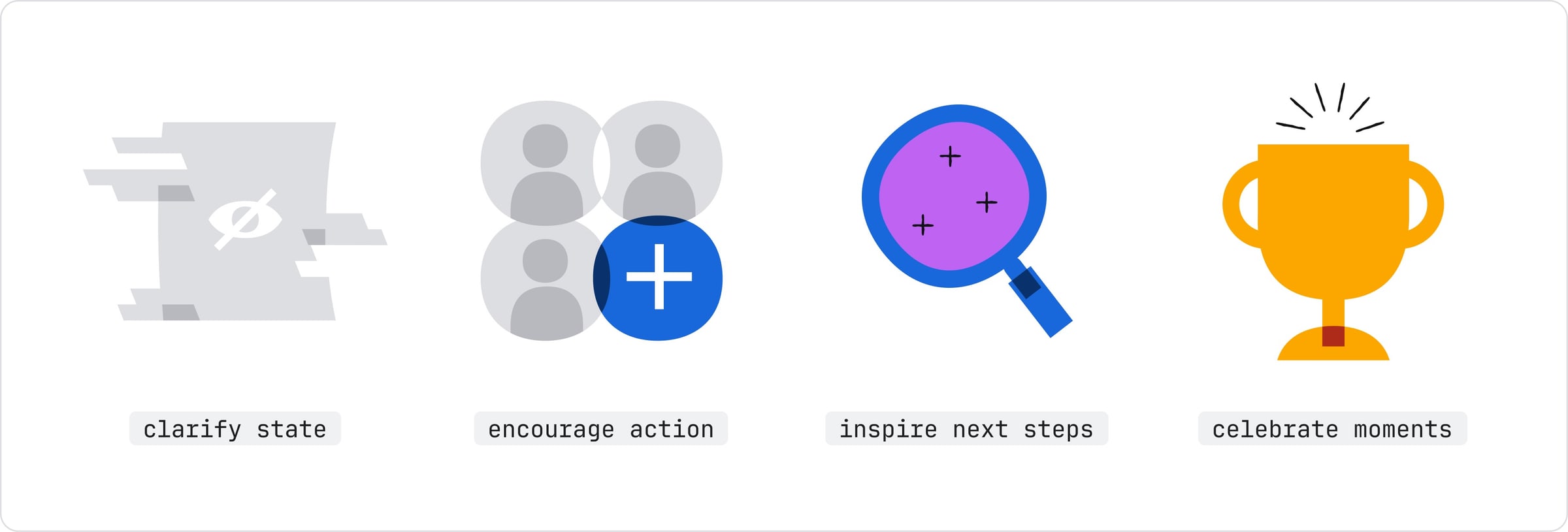
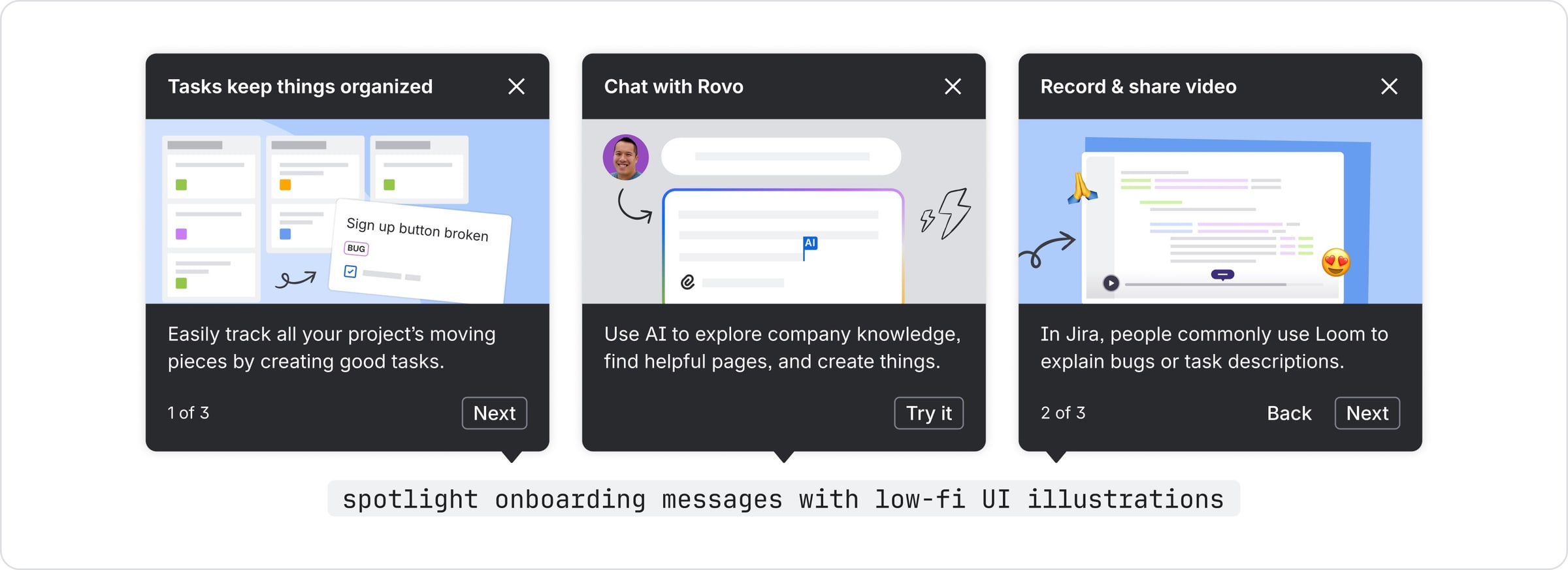
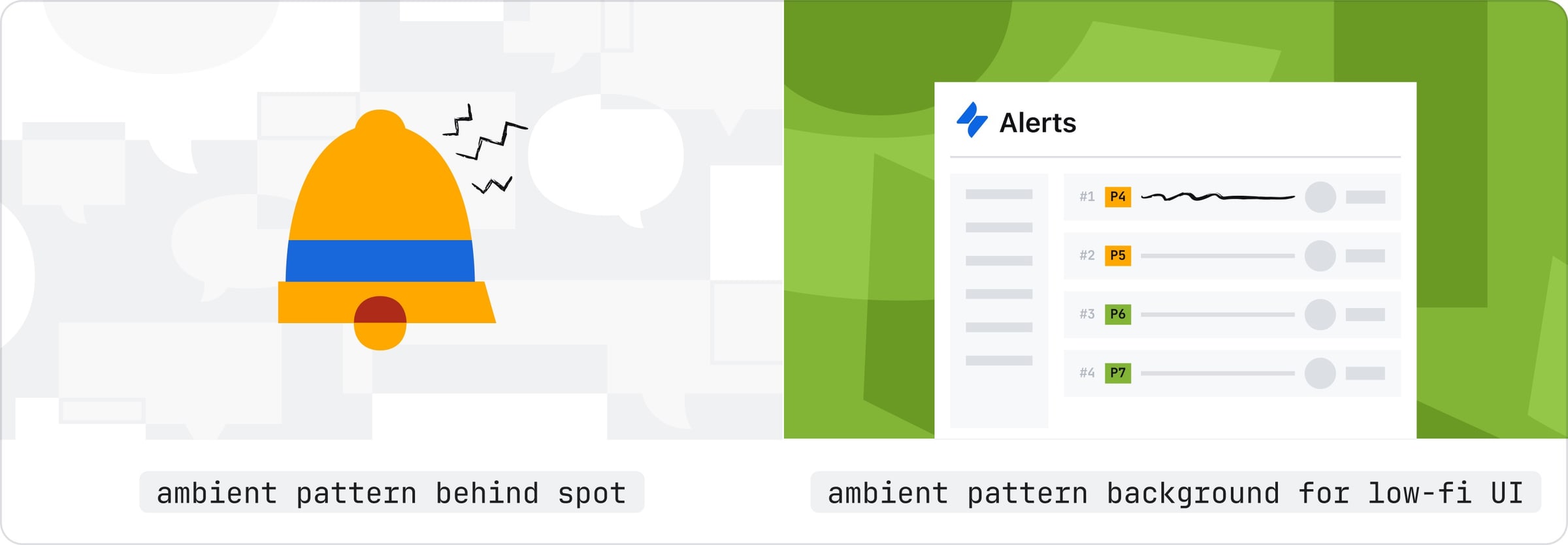
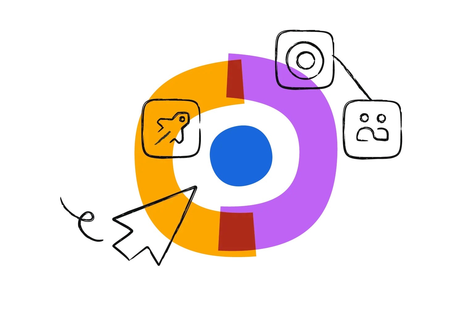
| Types | Spot, low-fidelity UI, ambient pattern; collage for marketing |
|---|---|
| Low-fi UI | basic shapes, sharp corners, mostly gray |
In product: spot illustrations (single concepts for empty, error and success states, colorful or neutral), low-fidelity UI (basic shapes, sharp corners, mostly gray) and ambient patterns. Collage is reserved for marketing landing pages. On atlassian.com and the System of Work page, marketing illustration mixes flat color shapes with hand-drawn black line icons and cursors (observed).
Source: atlassian.design/foundations/illustrationsatlassian.com/system-of-work
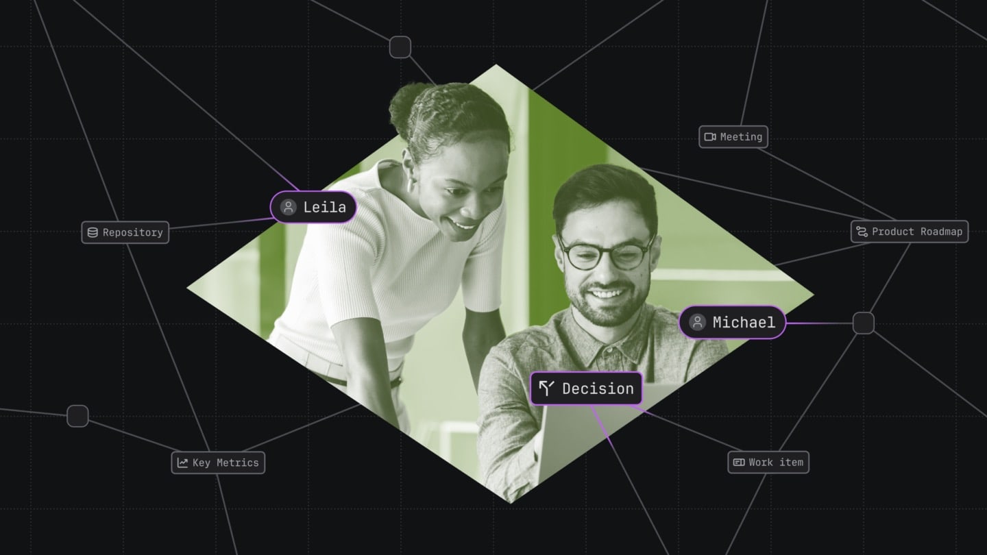
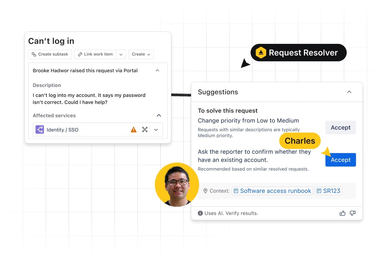
Showing the product and the team graph keeps the story on how work connects.
| Guide coverage | not published |
|---|
Photography is used sparingly on atlassian.com; the homepage hero and feature bands show product UI, not people. Teamwork Lab blog heroes crop real people at work into a geometric shape, tint them, and overlay network lines and name pills on a dark ground (observed). The design system publishes no photography guidance.
Not published: photography style, crops, color treatment.
Source: atlassian.com/blog/ai-at-work/want-more-confidence-in-ai-give-it-more-contextatlassian.com
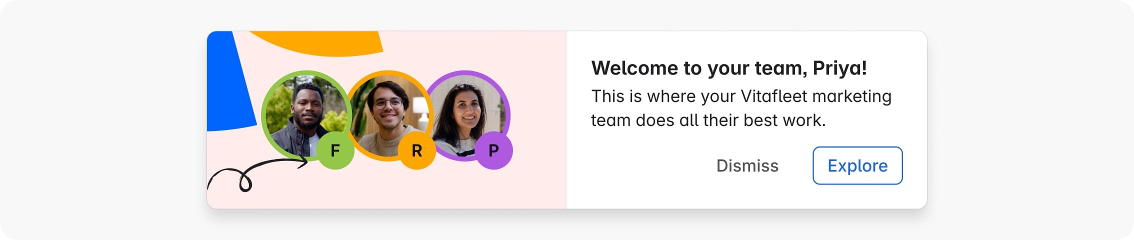
Fast, quiet motion for things seen dozens of times a day; expression saved for rare brand moments.
| Interactions | 50-150ms |
|---|---|
| Transitions | 150-400ms |
| Ease-out bold | cubic-bezier(0, 0.4, 0, 1) |
| Ease-in-out bold | cubic-bezier(0.4, 0, 0, 1) |
| Ease-in practical | cubic-bezier(0.6, 0, 0.8, 0.6) |
| Ease-out practical | cubic-bezier(0.4, 1, 0.6, 1) |
Motion principles are Human, Clarity, Accessible and Performant. Four easing curves and two duration ranges (interactions 50-150ms, transitions 150-400ms) are bundled into semantic tokens such as motion.popup.enter; the token set is in early access behind a feature flag.
Discover the power of knowing
Discover the power of knowing
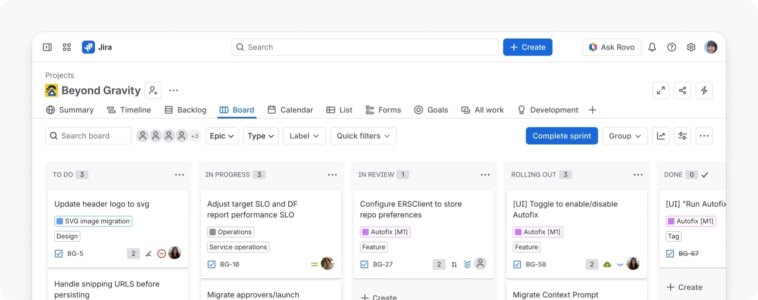
The product is the hero image · the atlassian.com hero: under a centered headline and two CTAs sits a full, rounded browser-style frame of a live-looking Jira board (observed 2026-10-29)
Ask Rovo
AI Assistant
Named people and agents in pill tags · homepage feature images and Teamwork Lab blog heroes: UI cards and photos on a faint grid, labeled with small rounded name pills ('Veronica', 'Gabe', 'Planner', 'Agent') attached to cursors or nodes (observed 2026-10-29)
Jira, Confluence, Loom
Jira in a circle
App logos as colored tiles, colored by collection · app logos everywhere (nav menus, collection tabs on the homepage, product pages)
Get started with Jira
Get Started With Jira
One blue pill, one blue arrow link · hero and closing band on atlassian.com
Specimens use sample copy, not Atlassian’s.
8px base unit, space tokens from 0 to 80px, a 12-column grid inside the main content area, fixed-wide (1296px) and fixed-narrow (864px) containers, and a radius scale from 2px to 16px plus full. Surfaces stack in four elevations (sunken, default, raised, overlay) with published shadows.
Measured from atlassian.com's Playwright computed styles, bounding boxes and canvas text metrics at 1440 and 390 px (768 for the type steps) on 2026-10-29; pixel samples where computed color and render disagreed.
| Measure | Desktop | Phone |
|---|---|---|
| Page margin | 136px | 32px |
| Section padding | 80px | 48px |
| Hero text width | max 968px, centered | full width |
| Card gap | 32px | 32px |
| Navigation | 68px | 68px |
Hero headline (Charlie Display 500 -1.28px; stand-in Rethink Sans 600, phone tracking -1.68px)
Charlie Display (Charlie Sans family) · 64px (phone 44) · line 1.04 · tracking -2.44px · weight 600
Section headline (Charlie 500 -0.96px; stand-in 600, phone tracking -1.11px)
Charlie Display (Charlie Sans family) · 48px (phone 32) · line 1.16 · tracking -1.67px · weight 600
Sub-section headline: context, collection h3 (Charlie 500 -0.4px; stand-in 600, phone tracking -0.74px)
Charlie Display (Charlie Sans family) · 40px (phone 24) · line 1.2 · tracking -1.23px · weight 600
Pillar title (Charlie 500 0px; stand-in 600, phone tracking -0.49px)
Charlie Display (Charlie Sans family) · 32px (phone 20) · line 1.24 · tracking -0.78px · weight 600
Card title, Teamwork Lab (Charlie 500 0px; stand-in 600, phone tracking -0.35px)
Charlie Display (Charlie Sans family) · 24px (phone 18) · line 1.24 · tracking -0.46px · weight 600
Story description / CTA sub (Charlie Display 400 -0.24px; stand-in Rethink Sans 400, phone tracking -0.79px)
Charlie Display (Charlie Sans family) · 24px (phone 18) · line 1.36 · tracking -1.06px · weight 400
Lead / subline (Charlie Text 400 -0.2px; stand-in Wix Madefor Text 450)
Charlie Text (Charlie Sans family) · 20px · line 1.56 · tracking -0.04px · weight 450
Body (Charlie Text 400 -0.16px; stand-in Wix 450)
Charlie Text (Charlie Sans family) · 16px · line 1.56 · tracking -0.1px · weight 450
Button (Charlie Text 400; stand-in Wix 450)
Charlie Text (Charlie Sans family) · 20px (phone 16) · line 1.2 · tracking 0.06px · weight 450
Tab (Charlie Text 500; stand-in Wix 600)
Charlie Text (Charlie Sans family) · 18px (phone 16) · line 1.44 · tracking -0.02px · weight 600
Nav link (Charlie Text 400; stand-in Wix 450)
Charlie Text (Charlie Sans family) · 16px · line 1 · tracking 0.06px · weight 450
Footer link (Charlie Display 400 +0.42px; stand-in Rethink Sans 400)
Charlie Display (Charlie Sans family) · 14px · line 1 · tracking -0.06px · weight 400
Footer column head
Charlie Text (Charlie Sans family) · 13px · line 1.2 · weight 700
Footnote / legal (Charlie Text 400; stand-in Wix 450)
Charlie Text (Charlie Sans family) · 12px · line 1.56 · weight 450
Big stat numeral
Atlassian Mono · 128px (phone 72) · line 1 · weight 700
Card stat numeral
Atlassian Mono · 96px (phone 60) · line 1 · tracking -3px · weight 700
Stat label
Atlassian Mono · 16px (phone 12) · line 1.2 · tracking 1.28px · weight 500
How Atlassian’s own landing pages are built, observed on atlassian.com, 2026-10-29. The full measurements are in spec.md.
Source: atlassian.design/foundations/spacingatlassian.design/foundations/gridatlassian.design/foundations/radiusatlassian.design/foundations/elevationatlassian.design/foundations/border
One mark family built around teamwork lets any new app join without a new identity. Our reading
Color now encodes portfolio structure, so a buyer can read the lineup at a glance. Our reading
Turns a product claim (context) into a measured industry problem. Our reading
Independent-feeling research from a named lab gives the homepage numbers a source. Our reading
Atlassian as its own case study: the brand practices what the product sells. Our reading
A philosophy that frames the app portfolio as one way of working. Our reading
Gives the Software collection its own research proof. Our reading
How our engine applies Atlassian's system to each format. This is our recipe built from their rules, not something Atlassian publishes. Level = how far from calm product UI toward expressive brand moments.
| Format | What they did | Source |
|---|---|---|
| website | atlassian.com homepage: centered hero with product UI, dark context band with stats, collection tabs, customer number cards, platform features with brand icons, research tiles, dark close. | atlassian.com |
| product UI | Jira, Confluence and the other apps, built from ADS tokens, Atlassian Sans and the logo component. | atlassian.design |
| blog | Teamwork Lab articles with tinted photo heroes, network lines and name pills. | atlassian.com/blog/ai-at-work/want-more-confidence-in-ai-give-it-more-context |
| report | Leading with Context reports and State of Teams. | atlassian.com/blog/guides-research/leading-with-context |
| press | Press kit: executive headshots, logo library, company overview. | atlassian.com/company/news/press-kit |
| landing page | System of Work and Teamwork Graph pages with collage illustration and product UI. | atlassian.com/system-of-work |
| Format | Loudness | Must appear | What varies |
|---|---|---|---|
| Landing page | White ground, centered Charlie-style display headline, one #1868DB pill CTA plus a blue arrow link, product UI as the hero image, dark #1E1F21 bands for the context story and the close, numbers with sources | which collection tabs, customer cards and research tiles follow the hero | |
| Deck | White slides, sentence-case headlines, one blue accent, product UI and named-collaborator imagery | one dark section divider | |
| Proposal page | Calm white page, outcomes backed by numbers with sources, one blue pill for the next step | a product UI frame at the top | |
| Ad | Attribution logo (context unclear), short sentence-case line, product UI | collage illustration | |
| Social post | One stat or headline, brand blue or dark ground, named pills or collage | illustration style | |
| White, #292A2E text, one blue pill button | none | ||
| Error message | Practical tone: what happened, what to do next; present tense; no wink | none |
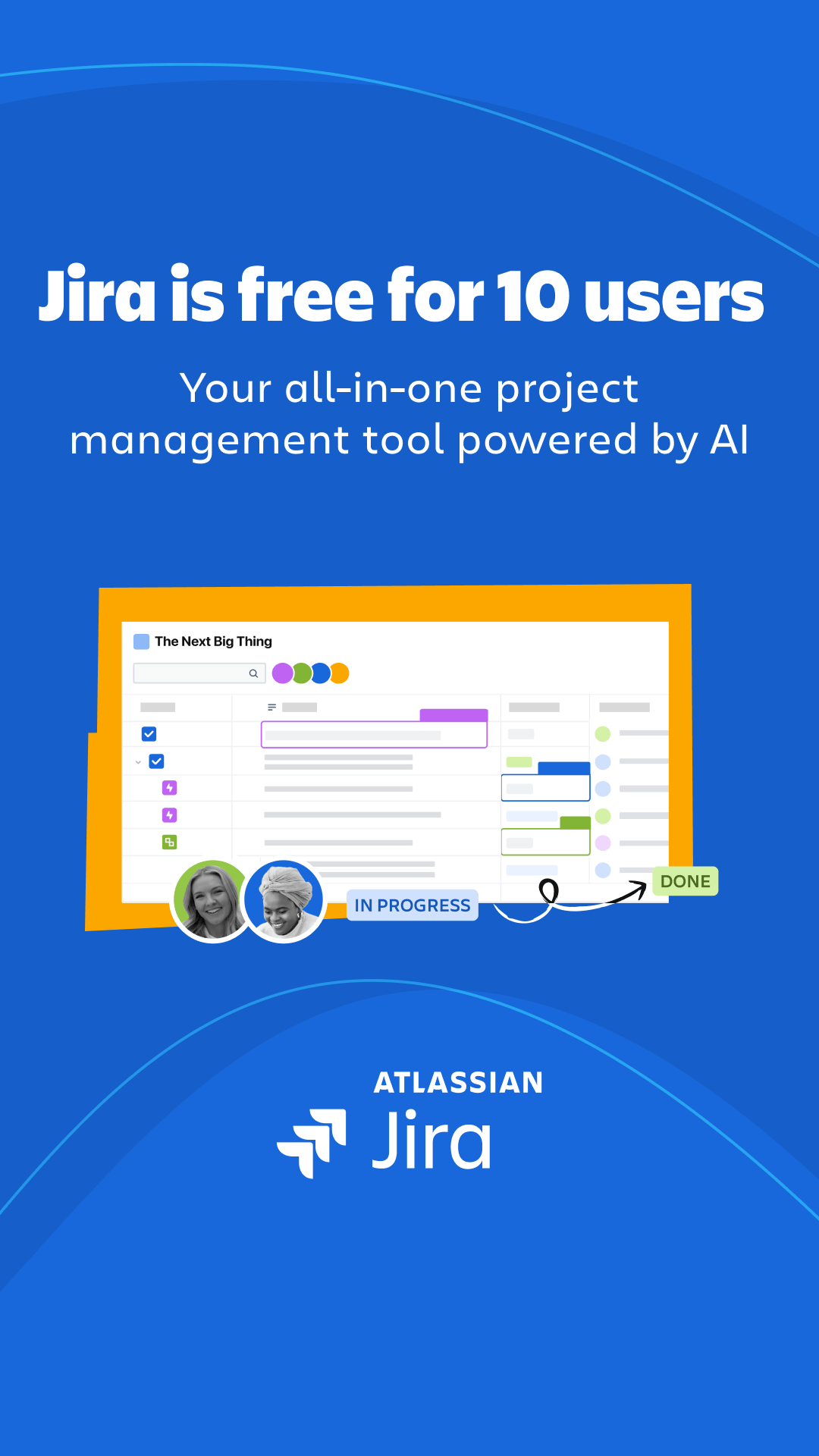 JiraGoogle, Meta, LinkedIn · Feb 2026 – now
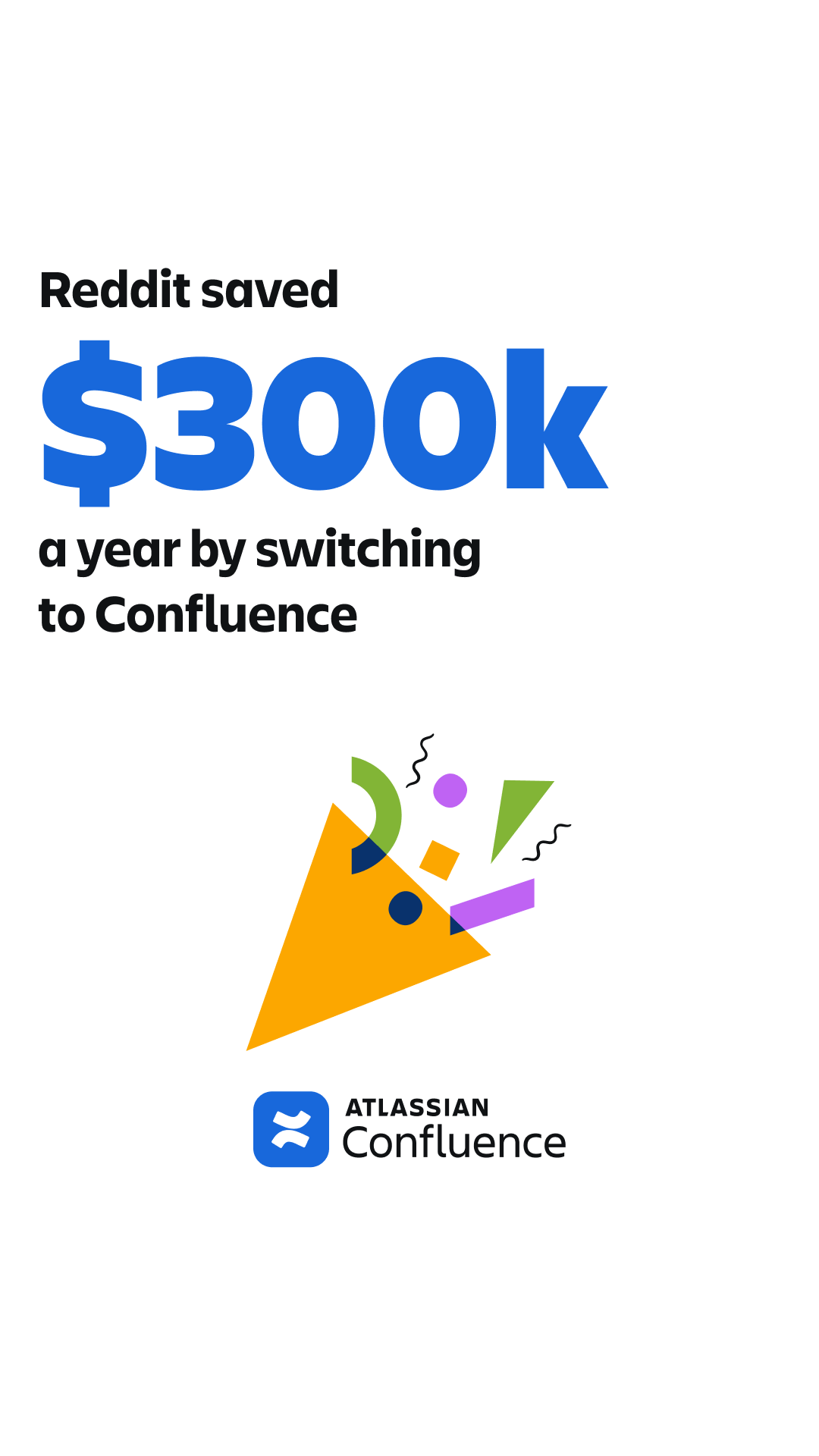 ConfluenceGoogle, Meta, LinkedIn · Apr 2026 – now
 LoomGoogle, Meta, LinkedIn · Oct 2025 – now
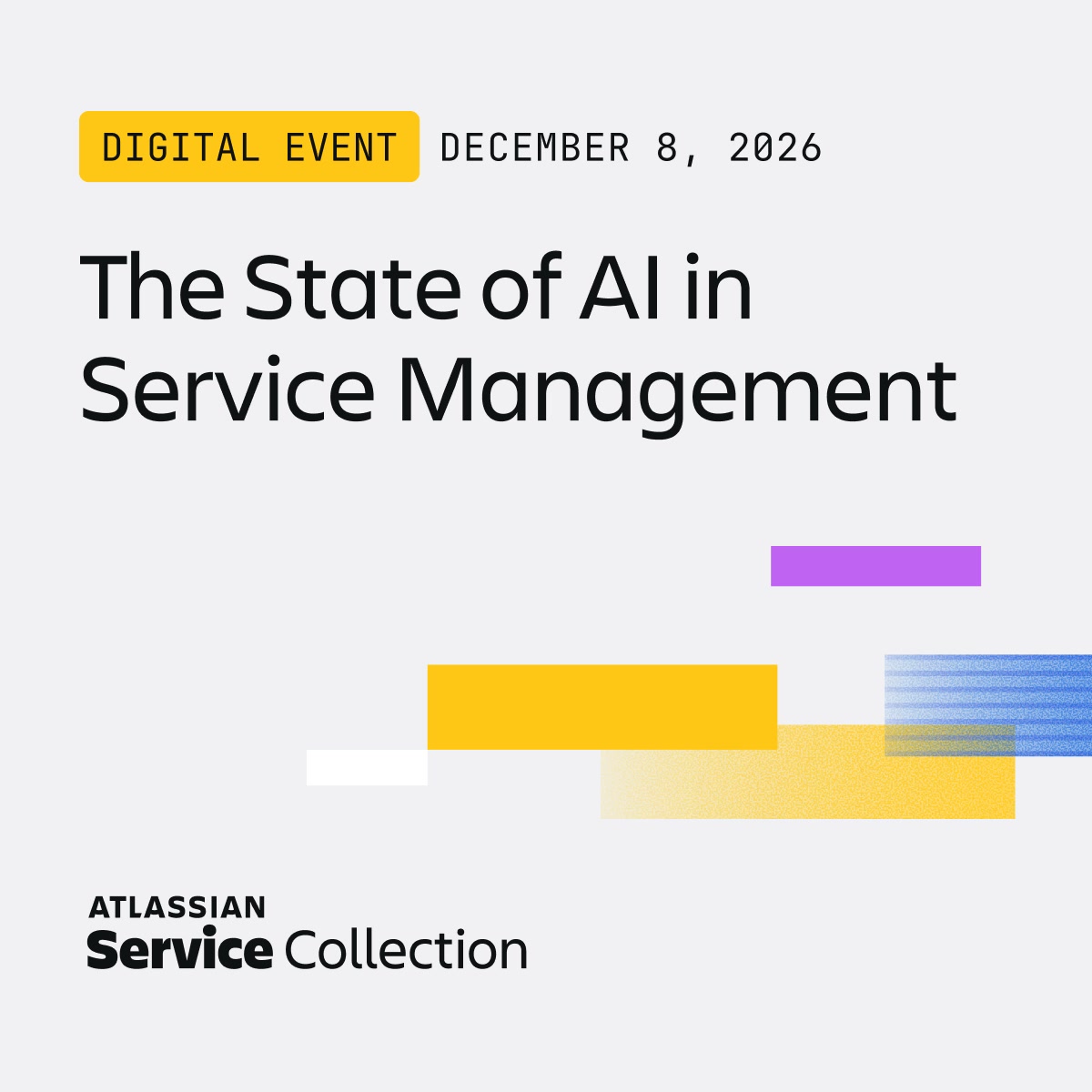 The state of ai in service managementMeta, LinkedIn · Oct 2026 – now
Source: atlassian.design/foundationsatlassian.design/foundations/accessibilityatlassian.com/legal/trademarkorangedam.atlassian.com
Your name and logo, Atlassian’s system.
Use this kit for my brand Use this brand in Claude
Get your brand audit Put your brand in Claude What goes in a brand book
Each value is marked published, observed, our reading or our recipe, with its source. Checked 2026-10-29. Not affiliated with Atlassian.