
The lesson
Put the competitor name in the hero, then make the first product proof a compact side-by-side feature scan.
The move
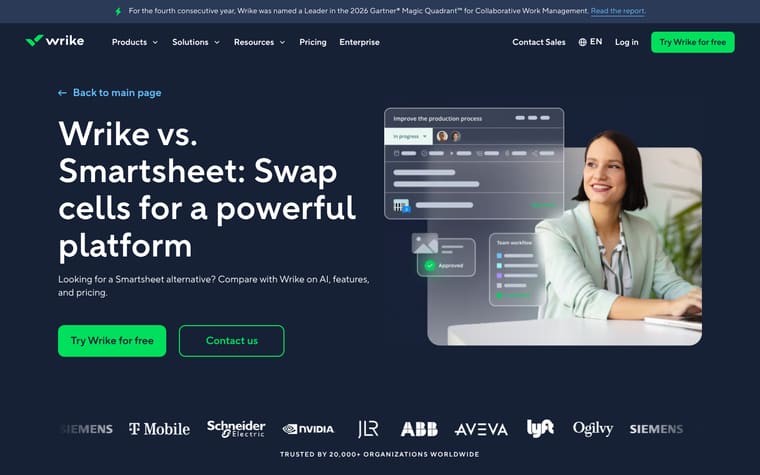
The page opens with "Wrike vs. Monday: Choose the most powerful platform for your work," two CTAs, and a logo row under "TRUSTED BY 20,000+ ORGANIZATIONS WORLDWIDE." It then shows "Wrike vs. Monday: Get more out of every feature" with a compact feature comparison before expanding into sections on scalability, security, analytics, workload views, support, and AI. After a switch CTA, "Why teams choose Wrike over Monday.com" breaks out portfolio-level Gantt charts, dynamic request forms, cross-tagging, and native proofing. The lower section adds customer review quotes and links to named customer stories.
Why it works
- Our readThe hero names Monday immediately and promises a side-by-side comparison, so the reader knows this is a switch page rather than a general product page.
- Our readThe first comparison block reduces the choice to named features like proofing, cross-tagging, approvals, time tracking, kanban boards, and blueprints before the longer explanations begin.
- Our readThe page follows the table with specific difference sections, so claims like native proofing, request forms, and portfolio-level Gantt charts each get their own explanation and link.
What not to copy
Don't copy the breadth of claims unless you can support each comparison with product detail. Keep the pattern of a short feature table first, then separate sections for the differences that matter most.
More from Wrike


More landing pages








Steal it for your brand.
Tell us what you want to make. We’ll talk through how to put these ideas to work for your brand.