
The lesson
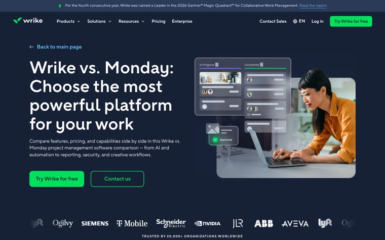
Build a competitor alternative page around the moment of switching, then answer the buyer’s next questions in order: what is better, how hard is migration, who else uses it, and what it costs.
The move
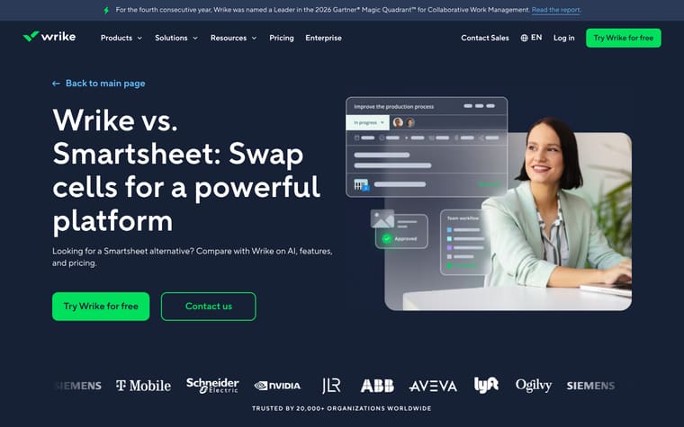
The page opens with “Transform your teams, move from Microsoft Project to Wrike,” a short promise about real-time collaboration, workflow support, and resource management, plus “Try Wrike for free” and “Contact us” CTAs. It then shows “See how Wrike outperforms Microsoft Project,” with comparison themes like Proofing, Time tracking, Table view, Gantt charts, Cross-tagging, and Real-time collaboration. A migration section says “Ready to leave the Microsoft nest? Fly higher with Wrike,” followed by value blocks for collaboration, Gantt charts, request forms, proofing, and customizable workspaces. Lower down, customer reviews, pricing, and a 2026 Gartner® Magic Quadrant™ proof point reinforce the alternative pitch.
Why it works
- Our readThe hero names the switch directly, so a Microsoft Project user lands on a page that matches the decision they are already considering.
- Our readThe first comparison section turns feature gaps into plain objections, from interface and integrations to AI, reporting, and risk management.
- Our readCustomer quotes appear before pricing, giving the claims a proof layer before the page says paid plans start at $10 per user per month.
What not to copy
Don't copy the Microsoft-specific migration language unless you are targeting users of that exact tool. Keep the switch-focused hero, feature-by-feature contrast, proof section, and pricing reassurance in that order.
More from Wrike
More landing pages








Steal it for your brand.
Tell us what you want to make. We’ll talk through how to put these ideas to work for your brand.