The lesson
Show the new creative surface first, then cut into the controls that make it real.
The move
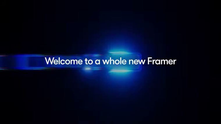
The poster shows a dark canvas with floating poster cards placed at different depths, small coordinate labels, and the word “3D” near the top. The storyboard opens with “Framer Presents” and abstract blue light forms, then moves into Framer UI panels where layers tilt in space. Large type reading “Slide” sits over rows of colorful cards, tying the visual effect to a concrete web interaction.
Why it works
- Our readThe video sells the feature visually before explaining it, so designers understand the creative payoff immediately.
- Our readCutting from polished 3D motion into product controls makes the effect feel buildable, not just a brand animation.
- Our readUsing one repeated interaction pattern gives the viewer a simple use case to remember.
What not to copy
Skip the glossy blue sci-fi treatment unless it fits your product language. Keep the structure: aspirational result, visible UI, and one memorable interaction example.
More from Framer




More launch videos








Steal it for your brand.
Tell us what you want to make. We’ll talk through how to put these ideas to work for your brand.