The lesson
Show the new interaction in the exact interface pattern people will use it for.
The move
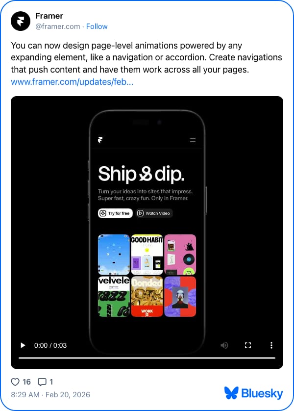
The post says, “You can now design page-level animations powered by any expanding element,” then gives examples: “a navigation or accordion.” The video sits under the copy and shows a phone mockup with a site called “Ship&dip.” where the hamburger menu and page layout animate on screen. The link points to the February update for people who want the full release details.
Why it works
- Our readThe first sentence explains the feature in product terms, while the second turns it into a concrete outcome: navigations that push content across pages.
- Our readThe demo uses a familiar mobile menu pattern, so viewers can understand the behavior without reading docs.
- Our readA short native video fits the feed and makes the animation itself the proof, instead of asking people to imagine it.
What not to copy
Skip the Framer-specific phone mockup and update link style unless you have the same product context. Keep the move: pair a precise feature announcement with a tiny demo of the real interaction.
More from Framer




More social posts

Steal it for your brand.
Tell us what you want to make. We’ll talk through how to put these ideas to work for your brand.