The lesson
Show the new UI in a simple, enlarged product moment instead of explaining the whole workflow.
The move
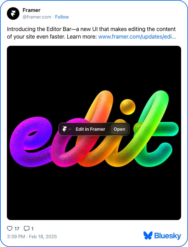
The post says, “Introducing the Editor Bar—a new UI that makes editing the content of your site even faster,” then points to the update link. The image is a black square with large glossy rainbow lettering spelling “edit.” A small dark floating bar sits across the word with the labels “Edit in Framer” and “Open,” making the feature feel like an interface element, not just an announcement graphic.
Why it works
- Our readThe copy names the feature and the user benefit in one sentence, so the launch is clear before the click.
- Our readThe oversized word “edit” makes the use case instantly legible in-feed.
- Our readPlacing the UI control on top of the artwork gives viewers a concrete product cue without needing a full screenshot.
What not to copy
Skip the polished 3D rainbow type unless it fits your brand system. Keep the move: pair a short launch line with one enlarged, recognizable UI moment.
More from Framer



More social posts




Steal it for your brand.
Tell us what you want to make. We’ll talk through how to put these ideas to work for your brand.