Price
highly competitive and open about what we charge Published
Brand book
Wise looks like its product: one loud green field and one loud typeface up top, then calm white and green-tinted panels where every number is plain and every control is a pill. Our reading

How loud a piece is: from the calm product-like homepage panels to campaign pieces with secondary colours, tapestries and international glyphs.
Published as an order, not percentages: white most, then neutral, then content greys, then Forest for interactivity, then a pop of Bright Green (product screens). On the homepage the hero inverts this: Bright Green dominates the first screen.
Our engine's setting, built from their rules.
A global money account and transfer service that is faster, cheaper and more transparent than banks Our reading
highly competitive and open about what we charge Published
works instantly, globally, unlike banks Published
honest about how customers’ money works and how Wise makes its own Published
international from day one, at home and around the world Published
protects all the money held and moved daily Published
tools that over-deliver for every customer, every time Published
The fast way to send money abroad
100% transparent pricing
Make your money do more
Safe at every step
what Wise believes; it makes Wise different
PublishedCategory. International money transfer and multi-currency accounts Observed
Wise is building the fairest way to move, manage, and grow money for everyone, everywhere.
Money without borders
Your money, not ours
The fast way to send money abroad
Excellent everywhere
Built for business too
Take Wise everywhere you go
Wise works nearly everywhere
Your money not ours
Customers should only ever hear Wise, whoever writes (published).
intrepiduniversally authenticdelightfully simpleconciseenergetic
One Wise voice, tone flexing by situation: standing out (billboards, social), converting customers (landing pages, App Store), adding delight, providing reassurance. Principles: intrepid, universally authentic, delightfully simple. How: celebrate the mission, be concise, make it modern, give it energy, add colour. The homepage is the converting tone.
money without bordersfastinstanttransparentfaireverywheremid-market rateinternationalsendreceiveconvertspend
| Tones | standing out, converting customers, adding delight, providing reassurance |
|---|
Source: wise.design/foundations/tone-of-voice%20(Wise%20brand%20guide,%20archived%202026-04-19:%20https://web.archive.org/web/20260419181509/https://wise.design/foundations/tone-of-voice)wise.design/brand%20(Wise%20brand%20page,%20live,%20read%202026-10-29)wise.com/%20(Playwright,%20Chromium%20UA%20Chrome%20130%20Mac,%201440x900%20and%20390x844,%202026-10-29)





The Fast Flag stands for constant progress, not tied to borders (published).


| Primary | Forest #163300 on Bright Green #9FE870; Bright Green on Forest |
|---|---|
| Min size | 35px high digital; 6mm print |
| Clear space | one Fast Flag |
| Homepage nav | 88x20 at x94 y28 |
| Homepage footer | 165x38 |
The logo is the Wise wordmark plus the Fast Flag, a forward-leaning flag mark. Green is used first, last and nearly everywhere; Forest on Bright Green and Bright Green on Forest are the primary versions. On the homepage the nav logo is 88x20 Forest Green on Bright Green; the footer logo is 165x38.
Source: wise.design/foundations/logo%20(Wise%20brand%20guide,%20archived%202026-05-13:%20https://web.archive.org/web/20260513155603/https://wise.design/foundations/logo)wise.com/%20(Playwright,%20Chromium%20UA%20Chrome%20130%20Mac,%201440x900%20and%20390x844,%202026-10-29)
Green is the first impression and the goodbye; the secondary palette signals getting closer (published).


| Bright Green | #9FE870, PMS 7487 |
|---|---|
| Forest Green | #163300, PMS 2411 |
| Neutral | #16330014 (renders #EDEFEB on white) |
| Border | rgba(14,15,12,0.12) (#0E0F0C at 12%) |
| Content | #0E0F0C / #454745 / #6A6C6A |
| Sentiment | #A8200D / #2F5711 / #EDC843 |
| Base dark | #121511 |
Wise is green: Bright Green #9FE870 and Forest Green #163300, plus white with an 8% Forest tint. A secondary palette of four brights and four darks comes in only once green is established. Product tokens give content greys tinted with green, interactive, background, border, sentiment and base colours. The homepage uses only the core greens, white, the 8% neutral and content greys, with tiny functional colours (fee red, savings green, info blue).
Source: wise.design/foundations/colour%20(Wise%20brand%20guide,%20archived%202026-05-13:%20https://web.archive.org/web/20260513165831/https://wise.design/foundations/colour)wise.com/%20(Playwright,%20Chromium%20UA%20Chrome%20130%20Mac,%201440x900%20and%20390x844,%202026-10-29)
Money without borders
Clarity and accessibility first, with one loud face for moments that celebrate (published).

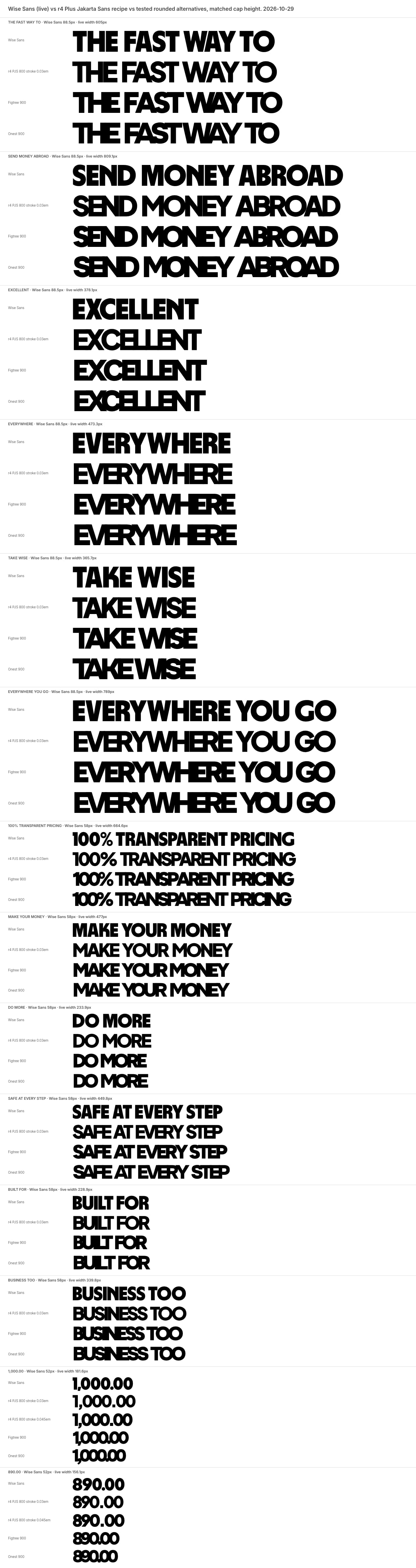
| Their face | Use | License | Open stand-in |
|---|---|---|---|
| Wise Sans (proprietary) | Proprietary to Wise; not available. Stand-in Plus Jakarta Sans 800 (OFL), 0.9032x size, letter-spacing -0.095em, word-spacing 0.13em, -webkit-text-stroke 0.03em currentColor (amounts 0.045em) | ||
| Inter | SIL OFL (Google Fonts) |
| Display | Wise Sans (proprietary); stand-in Plus Jakarta Sans 800, 0.9032x size, -0.095em, word 0.13em, stroke 0.03em currentColor |
|---|---|
| Body | Inter 400/600 (open) |
| Product weights shown | Inter Medium, Inter Semi Bold |
| Line length | 50-60 characters |
| Glyph swaps | about 3 per headline |
Two faces. Inter for most things (headings and body, product). Wise Sans, a proprietary heavy display face, for short, loud headlines; on wise.com every section headline and big number is Wise Sans in capitals at line-height 0.85. International glyphs are a campaign extra.
Source: wise.design/foundations/typography%20(Wise%20brand%20guide,%20archived%202026-03-14:%20https://web.archive.org/web/20260314122548/https://wise.design/foundations/typography)wise.com/%20(Playwright,%20Chromium%20UA%20Chrome%20130%20Mac,%201440x900%20and%20390x844,%202026-10-29)
Do Nav and hero share one Bright Green #9FE870 ground; the headline is Wise Sans capitals in Forest Green #163300 at 88.5px with a 75.2px line box (0.85 of the Wise Sans size; with the stand-in, set 75.2px, never 0.85 of the stand-in size), centred, 2 lines; subtitle Inter 600 in Forest; one Forest pill CTA with a Bright Green label.
Bright Green field with a Forest Wise Sans shout · nav + hero (the first screen), and anywhere a page opens
Do Every flag is a circle from Wise's own 10-colour flag set (assets/flags/*.svg); the strip sits on the green/white seam in 88px white discs; overlapping pairs (from/to) overlap by about 12%.
Circular flags · flags strip, currency selects, testimonials, coverage grid
Do radius 9999 on every control; cards and panels are rounded rectangles (28 / 38 desktop, 24 / 32 phone); no square corners anywhere.
Pills everywhere · buttons, chips, selects, inputs, comparison bars, rate pill
Do white #FFFFFF and the 8% Forest tint (#EDEFEB on white) alternate; cards on white are neutral, cards on neutral are white.
Neutral and white alternation · section grounds
Do #163300 card, all text #9FE870 Inter 600, Bright Green filled button with Forest label.
Forest cards, Bright Green type · testimonials (the one dark moment on the page)
Do a full-bleed photographic collage (tapestry) behind a large white rounded card; the logo or type on a tapestry is only white or Bright Green with plenty of contrast.
Tapestry band · the app-download band
Specimens use sample copy, not Wise’s.
The flags carry the global story; tapestries carry culture and texture (published).


| Flag palette | #FFFFFF #78C9FF #FFD400 #FF7700 #F0263C #000000 #231D9A #005B13 #CC9500 #960A3C |
|---|---|
| Detailed flag threshold | 150px |
| Card radius (marketing) | x-large 40 desktop / 32 mobile in the Card Cluster |
Flags (circular, from a 10-colour palette, bordered with Border Neutral on white, detailed versions above 150px), the Fast Flag as the default flag, tapestries (photographic collages), pills and big rounded cards.
Source: wise.design/foundations/flags%20(Wise%20brand%20guide,%20archived%202026-05-13:%20https://web.archive.org/web/20260513163900/https://wise.design/foundations/flags)wise.design/foundations/tapestries%20(Wise%20brand%20guide,%20archived%202026-06-18:%20https://web.archive.org/web/20260618180357/https://wise.design/foundations/tapestries)wise.design/foundations/marketing-radius%20(Wise%20brand%20guide,%20archived%202024-09-01:%20https://web.archive.org/web/20240901094248/https://wise.design/foundations/marketing-radius)
Clarity beats clever concepts for a global audience (published).

| Product sizes | 16, 24, 32px |
|---|---|
| Editorial sizes | 16, 24, 48, 64, 96px |
| Homepage | 24-32px icons in 48/72px circles |
| Homepage icon files | assets/icons/*.svg, the site's own 24x24 filled-path icons (tw-icon set): benefits mass-payout, switch, headset; security bank, shield, mobile-lock; calculator padlock, tags, lightning-bolt, receipt; chevrons, arrows, check-circle-fill, question-mark-circle, menu; footer social-* |
Simple solid-line icons that pair with both faces. Product sizes 16/24/32; editorial 16/24/48/64/96. Six key feature icons (send, receive, convert, spend, keep, invest). On the homepage icons are 24-32px #0E0F0C inside 48-72px circles.

| Homepage | none |
|---|
Source: wise.design/foundations/illustration%20(Wise%20brand%20guide,%20archived%202026-04-26:%20https://web.archive.org/web/20260426234759/https://wise.design/foundations/illustration)wise.design/foundations/motion-system%20(Wise%20brand%20guide,%20archived%202026-03-14:%20https://web.archive.org/web/20260314122041/https://wise.design/foundations/motion-system)
People are proud to use Wise; real moments build trust (published).
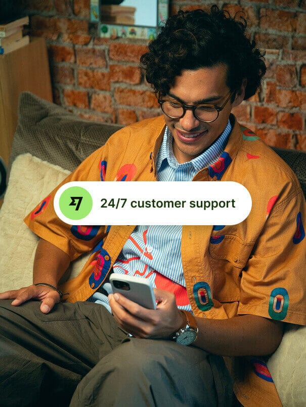
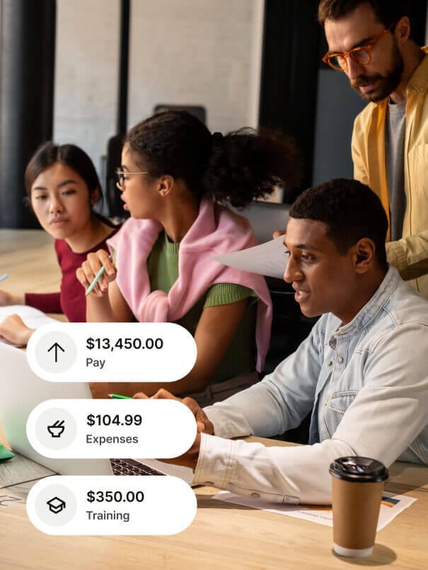
| Homepage frame | 555x739, radius 28 (phone 358x477, radius 24) |
|---|
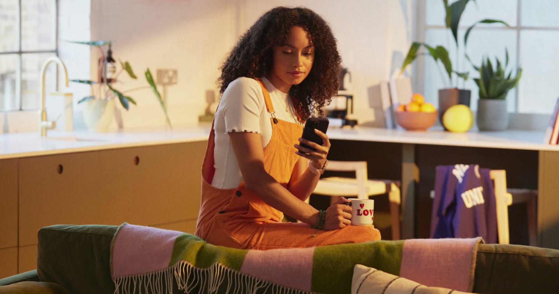
Real, bold snaps anyone would be proud to take: international, unapologetic, authentic. Lifestyle shots of people using money; product shots of devices first-person against real backdrops, and still lifes with travel props. On the homepage: three warm lifestyle photos in 555x739 portrait frames (radius 28) and a looping video of customers, each with a white UI pill (Sent amount, 24/7 support, payment amounts) laid over the photo.
Source: wise.design/foundations/photography%20(Wise%20brand%20guide,%20archived%202026-05-13:%20https://web.archive.org/web/20260513165053/https://wise.design/foundations/photography)wise.com/%20(Playwright,%20Chromium%20UA%20Chrome%20130%20Mac,%201440x900%20and%20390x844,%202026-10-29)
Published grid: 12 columns, 100px margins and 32px gutters at 1200-1440, centred above 1440; 6 columns at mobile with 20/32px margins and 12px gutters. Spacing tokens 5-160px desktop and 4-128px mobile; every pattern has space-7 (60 / 48) top and bottom. The homepage follows it: 1240px content at x100, sections padded 56 (the site scales tokens by 0.9385 at 1440), centred stacks for H2 + lead + one CTA, two-column photo/text splits at 555 + 555 with a 130px gutter, 3-up card rows with 28px gaps.
Measured from wise.com's Playwright at 1440x900 and 390x844 (Chrome 130 Mac UA), page at rest at scroll 0, computed styles and bounding boxes, page coordinates, 2026-10-29.
| Measure | Desktop | Phone |
|---|---|---|
| Page margin | 100px | 16px |
| Section padding | 56px | 48px |
| Hero text width | max 605px, centered | full width |
| Card gap | 28px | 28px |
| Navigation | 76px | 76px |
Hero H1, "Excellent everywhere", "Take Wise everywhere you go". Stand-in px shown. Recipe: Plus Jakarta Sans 800, uppercase, letter-spacing -0.095em, word-spacing 0.13em, -webkit-text-stroke 0.03em currentColor
Wise Sans (proprietary) · 79.9px (phone 40.6) · line 0.9415 · tracking -7.59px · weight 800
Section H2 (100% transparent pricing, Make your money do more, Safe at every step, Built for business too). Stand-in px shown; Plus Jakarta Sans 800, uppercase, letter-spacing -0.095em, word-spacing 0.13em, -webkit-text-stroke 0.03em currentColor, #0E0F0C
Wise Sans (proprietary) · 52.4px (phone 36.9) · line 0.9408 · tracking -4.98px · weight 800
Calculator amounts. Stand-in px shown: desktop both rows 47px; phone "You send" 30.7px, "Recipient gets" 47px (not 30.7). Plus Jakarta Sans 800, stroke 0.045em currentColor, letter-spacing per number
Wise Sans (proprietary) · 47px (phone 30.7) · line 1.66 · tracking -5.83px · weight 800
Wise amount in the comparison bar; 3.4% APY tile. Stand-in px shown; Plus Jakarta Sans 800, letter-spacing -0.10em, stroke 0.045em currentColor
Wise Sans (proprietary) · 36.1px (phone 21.7) · line 0.942 · tracking -3.61px · weight 800
Coverage H2 "Wise works nearly everywhere" (sentence case, Inter)
Inter · 44.75px (phone 34.45) · line 1.27 · tracking -1.34px · weight 600
Lead paragraph under section H2s
Inter · 20px (phone 17.27) · line 1.4 · tracking 0.1px · weight 400
Hero subtitle
Inter · 20px (phone 17.27) · line 1.4 · tracking 0.1px · weight 600
Product card title
Inter · 24.5px (phone 19.27) · line 1.3 · tracking -0.37px · weight 600
Benefit, security-row and quote titles
Inter · 20px (phone 17.27) · line 1.4 · tracking 0.1px · weight 600
Card body, security body, footer links
Inter · 18px (phone 15.27) · line 1.44 · tracking 0.18px · weight 400
Benefit body, disclaimer text, legal lines
Inter · 16px (phone 14) · line 1.5 · tracking 0.08px · weight 400
Buttons, nav links, chips, link-buttons
Inter · 16px · line 1.5 · tracking -0.176px · weight 600
Calculator labels, notes, chips, comparison fee lines
Inter · 14px · line 1.55 · tracking -0.08px · weight 400
Footer column heading
Inter · 18px (phone 15.27) · line 1.44 · tracking 0.18px · weight 600
How Wise’s own landing pages are built, observed on wise.com/%20(US%20locale%20served%20to%20this%20capture:%20Wise%20US%20Inc), 2026-10-29. The full measurements are in spec.md.
Source: wise.design/foundations/grid%20(Wise%20brand%20guide,%20archived%202026-03-14:%20https://web.archive.org/web/20260314124649/https://wise.design/foundations/grid)wise.design/foundations/marketing-spacing%20(Wise%20brand%20guide,%20archived%202024-05-21:%20https://web.archive.org/web/20240521174755/https://wise.design/foundations/marketing-spacing)wise.design/foundations/marketing-radius%20(Wise%20brand%20guide,%20archived%202024-09-01:%20https://web.archive.org/web/20240901094248/https://wise.design/foundations/marketing-radius)wise.com/%20(Playwright,%20Chromium%20UA%20Chrome%20130%20Mac,%201440x900%20and%20390x844,%202026-10-29)
Where the system shows up and how loud it gets.
| Format | Loudness | Must appear | What varies |
|---|---|---|---|
| Landing page (wise.com homepage, as the live site builds it) | Exactly kit.spec.page, sections in this order: Bright Green nav + hero (Wise Sans capitals H1, Inter 600 subtitle, Forest Sign up, white calculator card), flags strip on the green/white seam, benefits + video, neutral pricing comparison, products cards, security split, Forest testimonial carousel, business split, tapestry app band, neutral coverage grid, disclaimer card, neutral footer. Display type: Plus Jakarta Sans 800 as the Wise Sans stand-in (0.9032x the Wise Sans size, -0.095em, word-spacing 0.13em, same-colour 0.03em stroke, uppercase, measured px line boxes, each headline placed by its measured cap-top ink y); everything else Inter 400/600. Headings #0E0F0C on every white or neutral band, #163300 only on Bright Green. Voice: the homepage voice (kit.voice.notes, the guide's Converting customers tone); no international glyphs and no secondary colours on this page. Nav, footer and legal labels verbatim and in order. Every image slot uses study.slot_assets | Live numbers (exchange rate, amounts, fees) may change but keep the reference values for a rebuild; testimonial cards beyond the first two are off-screen | |
| Campaign landing page (guide-led) | Open and close on green; Wise Sans headline, optionally with up to 3 international glyphs; a tapestry or bold lifestyle photo; secondary colours only after green is established; Standing out tone | Which secondary colour; tapestry vs photo | |
| Product screen | White first, neutral, content greys, Forest for interactivity, a pop of Bright Green; Inter only, Wise Sans only on success, success-progress and feature-intro screens | Dark mode | |
| Social / Instagram story | Start and end with green; dial secondary colours up as the story goes | Colour sequence | |
| Video | Snappy, fluid, intuitive motion; captions reviewed; no more than three colour flashes per second | Cuts and transitions |
 Open your Wise account todayGoogle, Meta · Jun 2026 – now
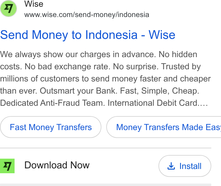 We always show our charges in advanceGoogle · Oct 2021 – now
 App on Google PlayMeta · Aug 2026 – now
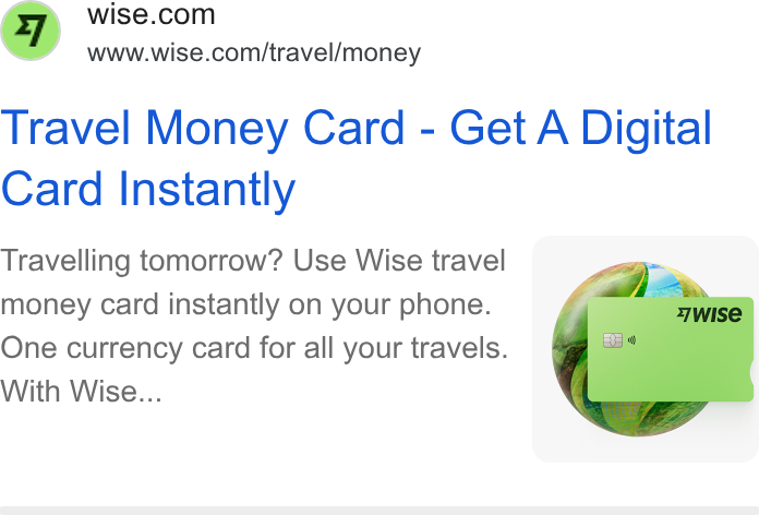 PodcastGoogle · May 2022 – now
Source: wise.design/foundations/colour%20(Wise%20brand%20guide,%20archived%202026-05-13:%20https://web.archive.org/web/20260513165831/https://wise.design/foundations/colour)wise.design/foundations/typography%20(Wise%20brand%20guide,%20archived%202026-03-14:%20https://web.archive.org/web/20260314122548/https://wise.design/foundations/typography)wise.design/foundations/logo%20(Wise%20brand%20guide,%20archived%202026-05-13:%20https://web.archive.org/web/20260513155603/https://wise.design/foundations/logo)wise.design/foundations/flags%20(Wise%20brand%20guide,%20archived%202026-05-13:%20https://web.archive.org/web/20260513163900/https://wise.design/foundations/flags)
Your name and logo, Wise’s system.
Use this kit for my brand Use this brand in Claude
Get your brand audit Put your brand in Claude What goes in a brand book
Each value is marked published, observed, our reading or our recipe, with its source. Checked 2026-10-29. Not affiliated with Wise.