For coding agents
Agents deploy in their native language, through Vercel's API, CLI, MCP and Skills. Observed
Brand book
Infrastructure you can see through. Vercel strips the page to gray, one face and one shape so the customer’s product and the number beside it are the only things that stand out. Our reading

Which product screens and customers appear, the hero object’s lighting, light or dark theme, seasonal touches to the nav mark.
Our engine's setting, built from their rules.
Cover the triangle. It should still read as Vercel: #FAFAFA ground, tight Geist headlines, gray two-tone sentences, hairline pills, real product UI.
Put another cloud vendor’s logo on it. If the grayscale restraint and one-number proof feel generic, add the lit triangle hero and the fading customer screens.
Vercel is agentic infrastructure for every app and agent. Observed
Agents deploy in their native language, through Vercel's API, CLI, MCP and Skills. Observed
Ship apps and agents in sandboxed VMs with durable backends, scaling from zero to millions. Observed
Infrastructure that investigates errors, plans fixes and opens PRs on its own. Observed
Vercel started as the company behind Next.js and frontend hosting, called itself the Frontend Cloud, and now presents itself as agentic infrastructure: the platform where people and coding agents build and ship software together. Its design team publishes the Geist design system, the Geist typeface and a public list of web interface guidelines.
One of the three design principles Geist embodies (paraphrase).
PublishedSecond of the three Geist principles; drawn from the Swiss design movement (paraphrase).
PublishedThird Geist principle; also the product promise: ship instantly (paraphrase).
PublishedThe design team describes itself as stewards of the brand who imbue work with care and craft (paraphrase).
PublishedCategory. Agentic infrastructure (homepage, 2026); previously the Frontend Cloud Observed
Vercel is agentic infrastructure for every app and agent: the platform where humans and agents build software together.
Agentic Infrastructure Observed
Built by you, or your agents Observed
Vercel frees the world to ship what’s next Observed
The Frontend Cloud Published
The homepage reduces Vercel to one category name, three pillar lines and three customer proofs, each a single sentence beside a product screen. The closing line hands the work to the reader or their agents.
Source: vercel.comvercel.com/about
The Web Interface Guidelines treat copy as interface: fewer words and consistent nouns make the product faster to read.
PreciseConciseConfidentDeveloper-native
Plain, declarative and short. Product UI follows strict Title Case and action labels; marketing pages use sentence case. Numbers are numerals, units get a space, ellipses are real characters.
shipdeployagentsinfrastructureinstantlyscale
NextJSNext JSEveEVESubmitOKContinue (as a button label)
Source: vercel.com/fontvercel.com/designvercel.com/design/guidelines
| Marketing case | sentence |
|---|---|
| Product case | Title Case (Chicago) |
| Counts | numerals |
| Units | 10 MB (nbsp) |
Source: vercel.com/design/guidelinesvercel.com/geist/buttonvercel.com/design/brands


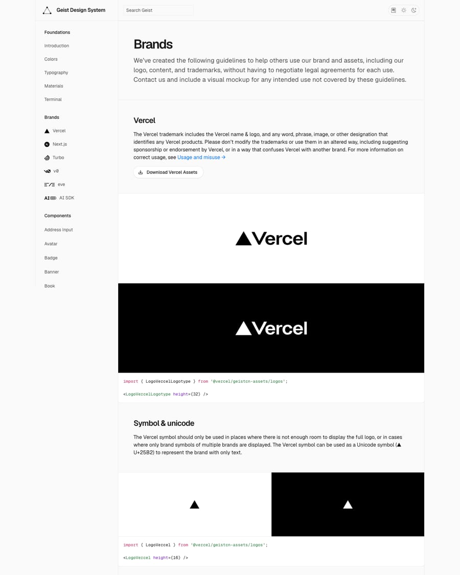
Official files from the Vercel brand assets zip linked on vercel.com/design/brands (logotype and icon, light and dark). Vercel marks are trademarks of Vercel, Inc.; the guidelines allow only truthful descriptive use and refuse use in other products. Shown for reference; not affiliated.
A single geometric shape reads at 14px in a nav and at 200px as a hero object; the same mark becomes the terminal prompt.
| Clear space | height of the symbol |
|---|---|
| Minimum size | not published |
| Symbol ratio | 1155:1000 (from the official SVG) |
| Logotype ratio | 2048:407 (from the official SVG) |
A black equilateral triangle, alone (the symbol) or before the Vercel wordmark (the logotype), black on light and white on dark. The symbol is for tight spaces or rows of brand symbols, and may stand in as the ▲ character in plain text.
Source: vercel.com/design/brands
Deploy now
Functional steps mean a color is chosen by job (hover, border, text), not by taste, so light and dark themes swap cleanly.
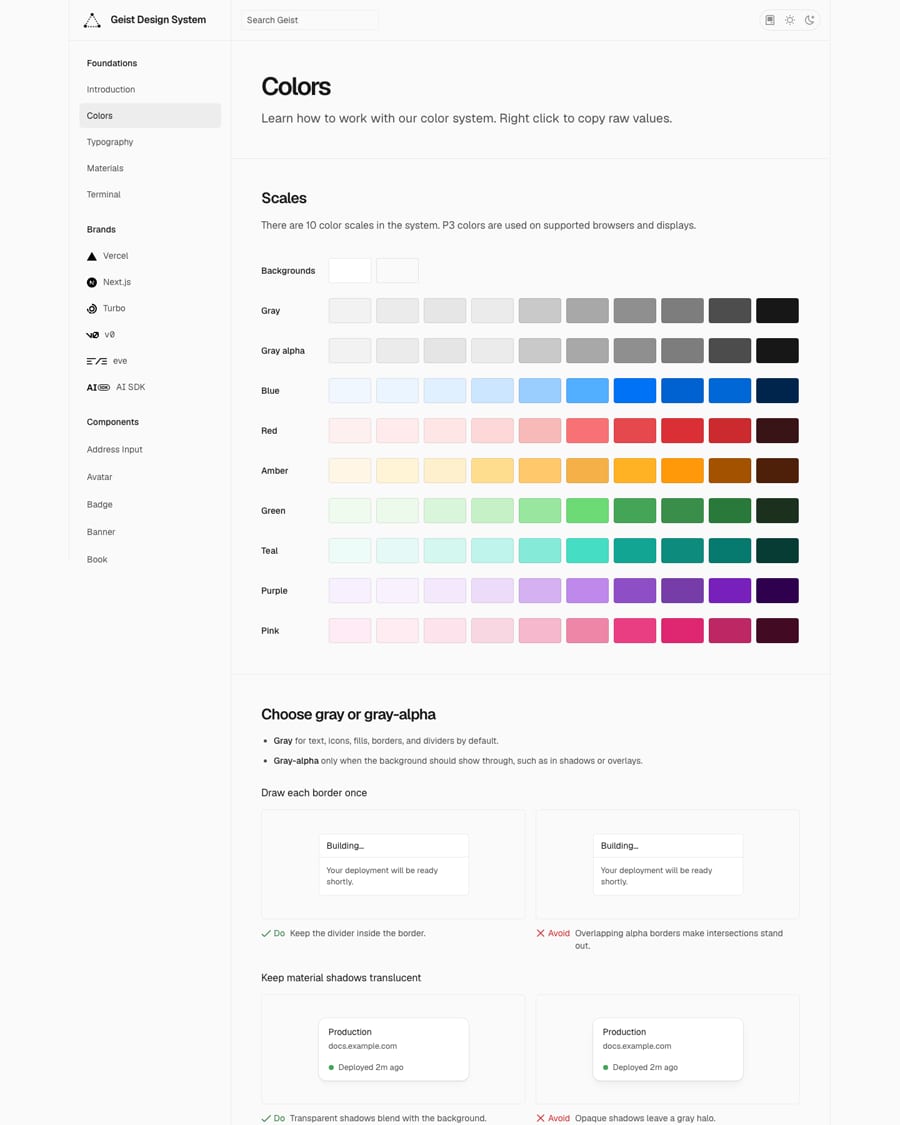
| Scales | 10 (backgrounds, gray, gray-alpha, blue, red, amber, green, teal, purple, pink) |
|---|---|
| Steps | 100-1000, ten per scale |
| Gamut | P3 on supported displays |
| Page ground (site) | #FAFAFA |
Geist is a grayscale system with nine supporting scales (blue, red, amber, green, teal, purple, pink), each in ten functional steps, rendered in P3 where supported. Two backgrounds, then steps 1-3 for component fills, 4-6 for borders, 7-8 for high-contrast fills and 9-10 for text and icons. The homepage uses almost only the grays.
Not published: color proportions or ratios; brand accent beyond the functional scales.
Agentic Infrastructure
Agentic Infrastructure
AGENTIC INFRASTRUCTURE
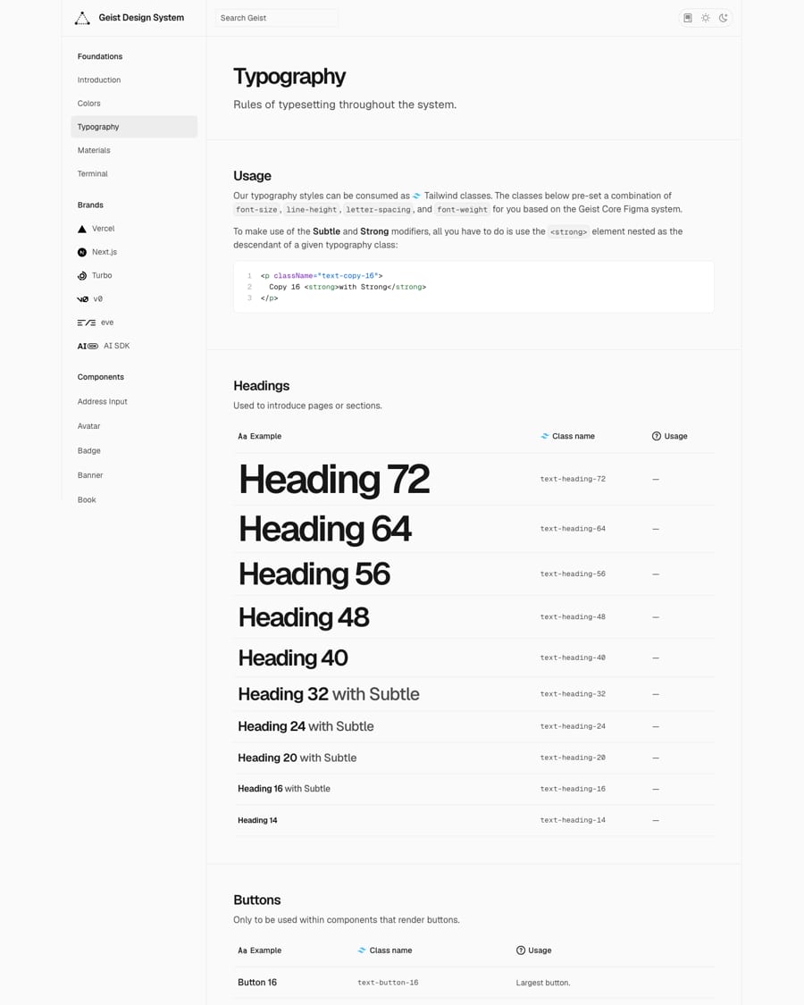
One face in two widths keeps code, numbers and prose in a single voice; preset classes stop drift.
| Their face | Use | License | Open stand-in |
|---|---|---|---|
| Geist Sans | Everything: hero 64px 400, section heads 56px 450, leads 24px 450, UI 14-16px | Open (SIL OFL 1.1). Vercel in collaboration with basement.studio; npm geist 1.9.0, Google Fonts, or .zip | Geist No stand-in needed: Geist is open and ships with this book (fonts folder). Load the variable face so the 450 weight renders. |
| Geist Sans | Copy and labels 13-16px at 400-500 | Open (SIL OFL 1.1) | Geist The real face; it is open. |
| Geist Mono | Code, status labels, the phone hero subline, tabular numbers | Open (SIL OFL 1.1) | Geist Mono The real face; it is open. |
| Heading 72 | 72/72, -4.32px |
|---|---|
| Heading 64 | 64/64, -3.84px |
| Heading 56 | 56/56, -3.36px |
| Heading 48 | 48/56, -2.88px |
| Heading 32 | 32/40, -1.28px |
| Heading 24 | 24/32, -0.96px |
| Copy 24 | 24/36 |
| Copy 16 | 16/24 |
| Copy 14 | 14/20 |
| Label 14 | 14/20 |
| Button 16 | 16/20, 500 |
| Metrics | cap 710, x-height 530, descender -150 (UPM 1000) |
Geist Sans and Geist Mono, Vercel’s own open typeface, drawn for developers and designers and inspired by Swiss design. A fixed pixel scale (Heading 72 to 14, Copy 24 to 13, Label 20 to 12, Button 16 to 12) sets size, leading, tracking and weight together; headings carry negative tracking.
Do An equilateral black triangle, nothing else. Hero: 192px-wide triangle centred in a 222px box at the centre of the page, lit from above with a soft drop shadow and a faint white halo (supplied image hero-triangle-glow-*.png). Nav: 21x18px. Footer: 16x14px. Prompt: ▲ U+25B2.
The triangle · The logomark, the hero object, the footer mark, the terminal prompt and text-only brand mentions (▲)
Do #FAFAFA ground, #171717 ink, #4D4D4D secondary, #EBEBEB hairlines. Color appears only as a small status or product signal (the blue status dot, the blue sheet in the Backends card). Customer logos are flattened to #171717.
Monochrome page, color as signal · Every marketing page
Zapier serves over 100 million monthly website visits on Vercel.
Two-tone proof sentence · Beside each product screenshot
Do 40px-tall full pills, 16px Geist 500, 12px side padding. Primary #171717 fill, white text. Secondary #FFFFFF fill with a 1px #EBEBEB ring drawn as box-shadow. 12px gap.
Pill CTAs with hairline rings · Hero and closing CTA
Do A real customer UI screenshot 921px wide (desktop) whose bottom 160px fades into #FAFAFA with linear-gradient(to top, #FAFAFA, transparent). No frame, no shadow, no radius on the image itself.
Customer product screens that fade into the page · The three customer sections
Do Two-dimensional cell-and-guide layouts where the 1px rule lines and cell borders are part of the design; solid cells occlude guides; guides are decorative (aria-hidden).
Geist Grid guides · Marketing pages, docs landing pages, feature breakdowns
Specimens use sample copy, not Vercel’s.
Elevation is encoded once in a material type, so the page stays flat and the few raised things read clearly.

| Material base/small | 6px |
|---|---|
| Medium/large/menu/modal | 12px |
| Fullscreen | 16px |
| Hairline | 1px #EBEBEB ring |
The triangle, hairline rings, fading product screens and the Geist Grid. Surfaces come from Materials: base and small at 6px radius, medium and large at 12px, menus and modals at 12px, fullscreen at 16px, each with a preset shadow.
Source: vercel.com/geist/materialsvercel.com/geist/gridvercel.com/design/guidelinesvercel.com
Geist icons are a 16px set "tailored for developer tools": filled outline shapes at a consistent weight, colored by currentColor in Gray 1000 or Gray 700.

| Grid | 16px |
|---|---|
| Fill | outline paths, evenodd |
| Construction rules | not published |
Source: vercel.com/geist/introductionvercel.com/geist/buttonvercel.com/design/guidelinesvercel.com
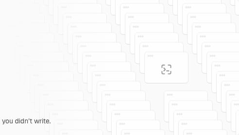
Illustration is built from interface parts, so it explains the product rather than decorating it.
| Style guide | not published (observed recipe) |
|---|
Vercel does not publish an illustration style. The homepage uses product-native drawings instead: a stack of browser-window outlines for Sandbox, a blue grid sheet curling at a card corner for Backends, and chat bubbles for Agents, all in grays with one blue.
Source: vercel.com
Not published, and not used: the homepage carries no photographs.
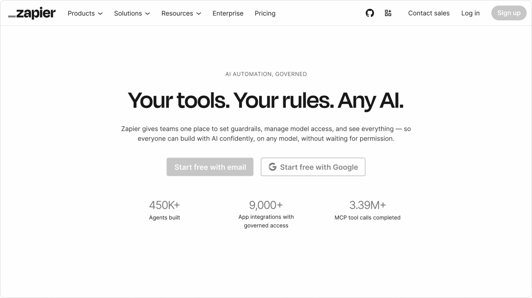
Not published, and not used: the homepage carries no photographs. Customer proof is shown as real product screenshots (Notion, Zapier, Mintlify) in light theme.
| Photography guide | not published |
|---|
Source: vercel.com
Motion principles are published as engineering rules: honor reduced motion, CSS first, transform and opacity only, interruptible and input-driven.
Motion principles are published as engineering rules: honor reduced motion, CSS first, transform and opacity only, interruptible and input-driven. On the homepage the hero triangle fades in its lighting, the phone subline types, and the phone logo row scrolls.
| Easing curves | not published |
|---|---|
| Durations | not published, except loading 150-300ms delay and 300-500ms minimum |
A 24px page margin and a full-width 1392px column at 1440; one #FAFAFA ground from nav to footer with no section bands. Sections alternate a 921px media column left or right against a 333px text column, with 150-230px between sections.
Measured from vercel.com/design/brands's Vercel's public brand page and the Geist design system (vercel.com/geist: colors, typography, materials, grid, button, terminal), the Geist font page, and the Web Interface Guidelines, read 2026-10-31; color values from the Geist CSS tokens in light theme.
| Measure | Desktop | Phone |
|---|---|---|
| Page margin | 24px | 24px |
| Section padding | 208px | 80px |
| Hero text width | max 444px, centered | full width |
| Card gap | 20px | 20px |
| Navigation | 64px | 64px |
Hero H1
Geist Sans · 64px (phone 48) · line 1 · tracking -3.84px · weight 400
Section H2
Geist Sans · 56px (phone 32) · line 1 · tracking -3.36px · weight 450
Proof sentence (two-tone lead)
Geist Sans · 24px · line 1.3333 · tracking -0.96px · weight 450
Card title
Geist Sans · 24px · line 1.1 · tracking -1.2px · weight 450
Hero pillar lines
Geist Sans · 16px · line 1.5 · tracking -0.32px · weight 450
Button (pill)
Geist Sans · 16px · line 1.5 · weight 500
Nav link / list / footer link / card copy
Geist Sans · 14px · line 1.4286 · weight 400
Chat bubble
Geist Sans · 13px · line 1.3846 · weight 400
Badge
Geist Sans · 11px · line 1.818 · weight 500
Phone hero subline
Geist Sans · 16px · line 1.5 · weight 400
Status label
Geist Sans · 12px · line 1.6667 · weight 500
One or two sentences on what this does for the reader.
One or two sentences on what this does for the reader.
Card: 6px corners on the surface band, 20px apart.
How Vercel’s own landing pages are built, observed on vercel.com, 2026-10-31. The full measurements are in spec.md.
Source: vercel.comvercel.com/geist/gridvercel.com/design/guidelines
The new category rides on an unchanged visual system, so the shift reads as continuity, not a rebrand (our reading). Our reading
How our engine applies Vercel's system to each format. This is our recipe built from their rules, not something Vercel publishes. Level = how much color the format carries (0 grayscale, 5 full functional color).
| Format | What they did | Source |
|---|---|---|
| terminal theme | Vercel Dark and Light terminal themes built from Geist, with a ▲ prompt that turns red on failure. | vercel.com/geist/terminal |
| font site | vercel.com/font: Geist Sans, Mono, Serif and Pixel with a glyph inspector and playground. | vercel.com/font |
| Format | Loudness | Must appear | What varies |
|---|---|---|---|
| Landing page | Build it the way vercel.com is built (kit.spec.page): one #FAFAFA ground, 64px nav, 64px Geist 400 hero headline at -3.84px with pill CTAs, a centred lit black triangle, three pillar lines right; a justified row of six #171717 customer logos; alternating 921px fading product screens with two-tone proof sentences and feature lists; a three-card Recently shipped grid; a centred closing CTA; a 6-column footer | Which customers and products; the hero object (the triangle by default) | |
| Deck | Black or #FAFAFA slides, Geist with negative tracking, one claim per slide, triangle in a corner | Geist Grid guides behind diagrams; one functional color for data | |
| Proposal page | #FAFAFA ground, #171717 ink, two-tone proof sentences, one black pill CTA | a fading product screen | |
| Ad | Black or white ground, one short sentence-case line in Geist, triangle | a lit triangle hero image | |
| Social post | Black or #FAFAFA, Geist headline at heading tracking, product UI crop | Geist Mono label | |
| White, #171717 text, one black pill button, Title Case button label | a small triangle at top | ||
| Error message | Say what to do next; red only on the status label with a text label | none |
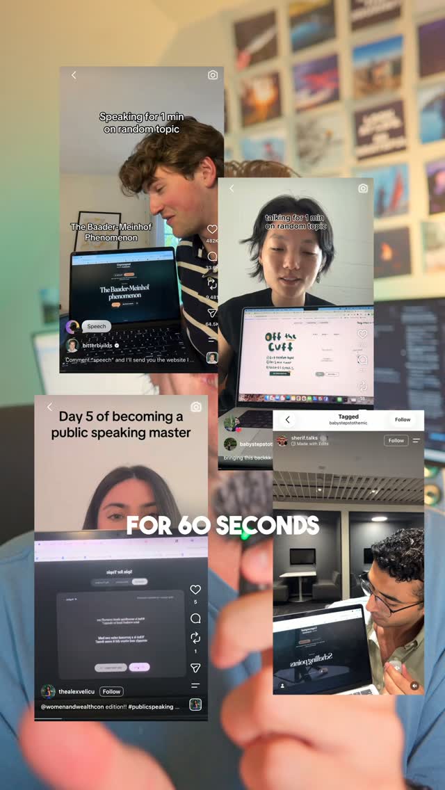 DropMeta · Sep 2026 – now
 Agentic InfrastructureLinkedIn · May 2026
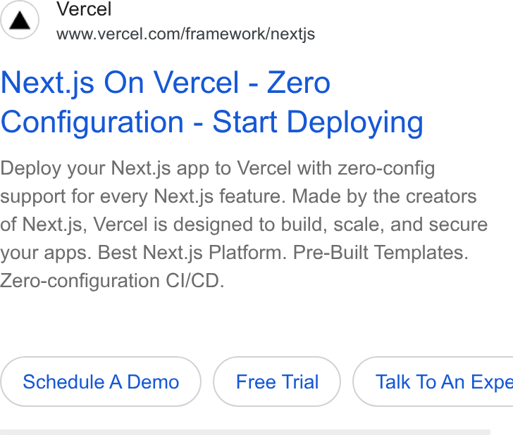 NextjsGoogle · Jan 2026 – now
 PricingGoogle · Feb 2026 – now
Source: vercel.com/design/brandsvercel.com/geist/colorsvercel.com/design/guidelinesvercel.com
Your name and logo, Vercel’s system.
Use this kit for my brand Use this brand in Claude
Get your brand audit Put your brand in Claude What goes in a brand book
Each value is marked published, observed, our reading or our recipe, with its source. Checked 2026-10-31. Not affiliated with Vercel.