Brand books Draft · facts being checked

Brand book

Red Hat

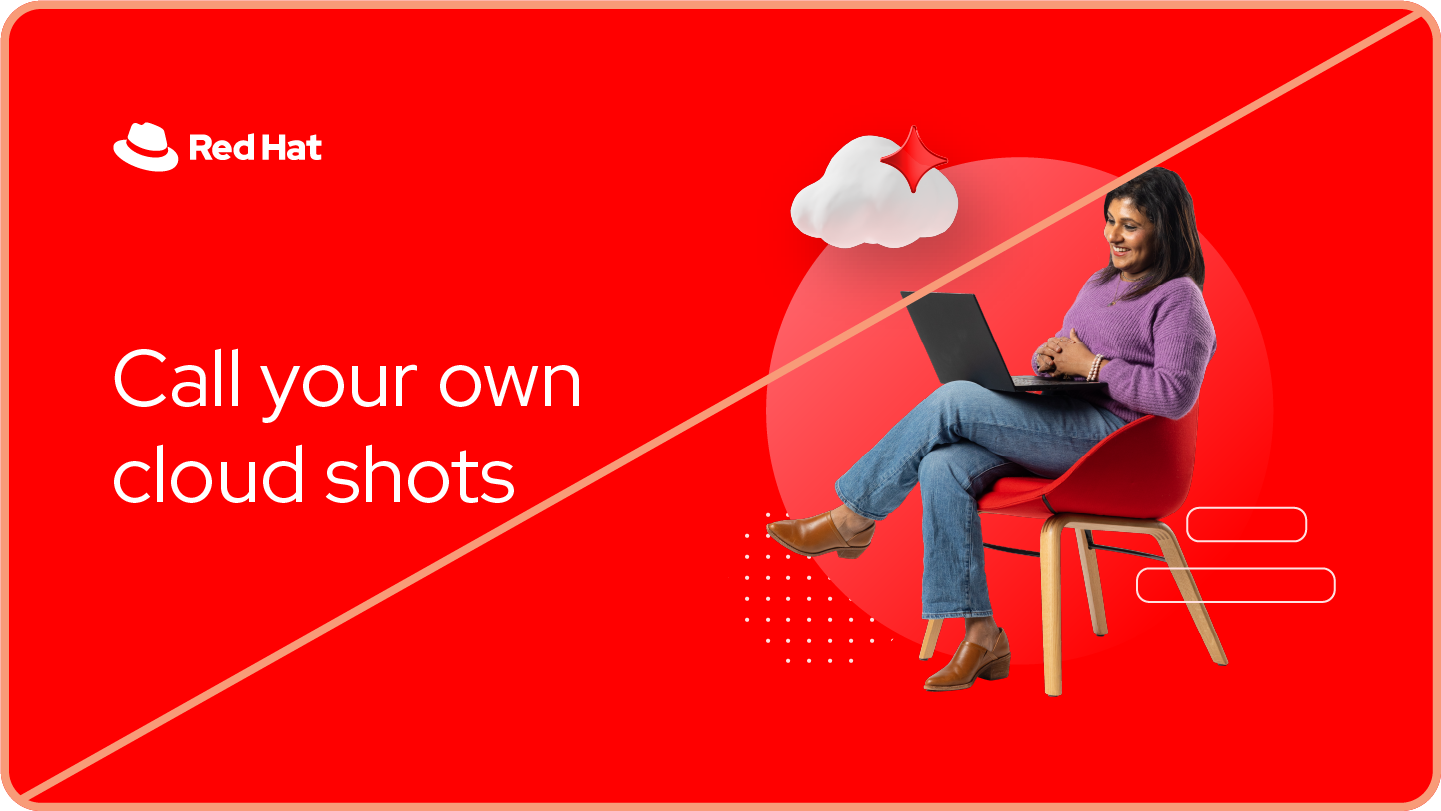
Open, with one red signal. Red Hat keeps everything around the red quiet (roomy layouts, plain sentence-case type, real people in soft light) so a single pop of pure red, and the hat, carries the brand. Our reading

The system

Fixed, everywhere

Red Hat logo
Logo
Red Hat red (red-50)
Signature color
AaRed Hat Display + Red Hat Text
Type pairing
  • The hat: red fedora with black band, exactly as drawn
  • Red Hat red #EE0000 in everything, used as pops
  • The Red Hat font family, sentence case, untracked
  • Real people, never AI-generated

The one thing that varies

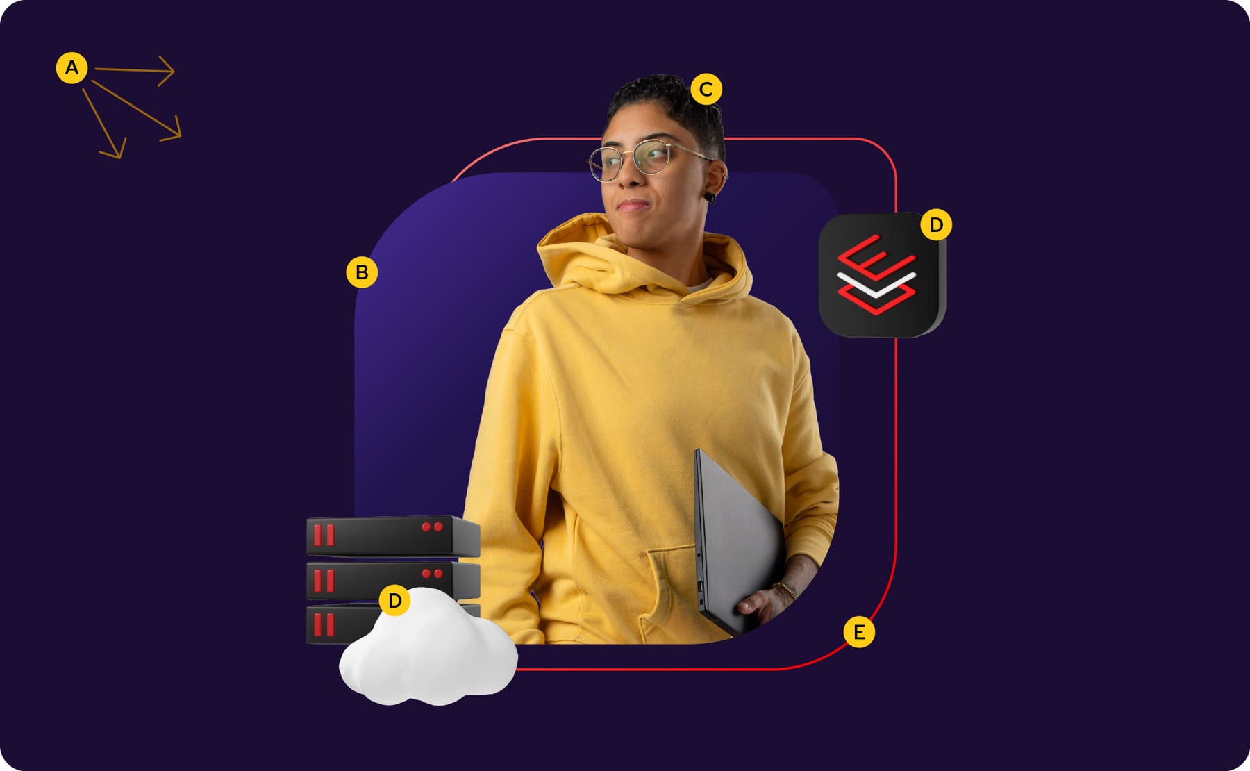
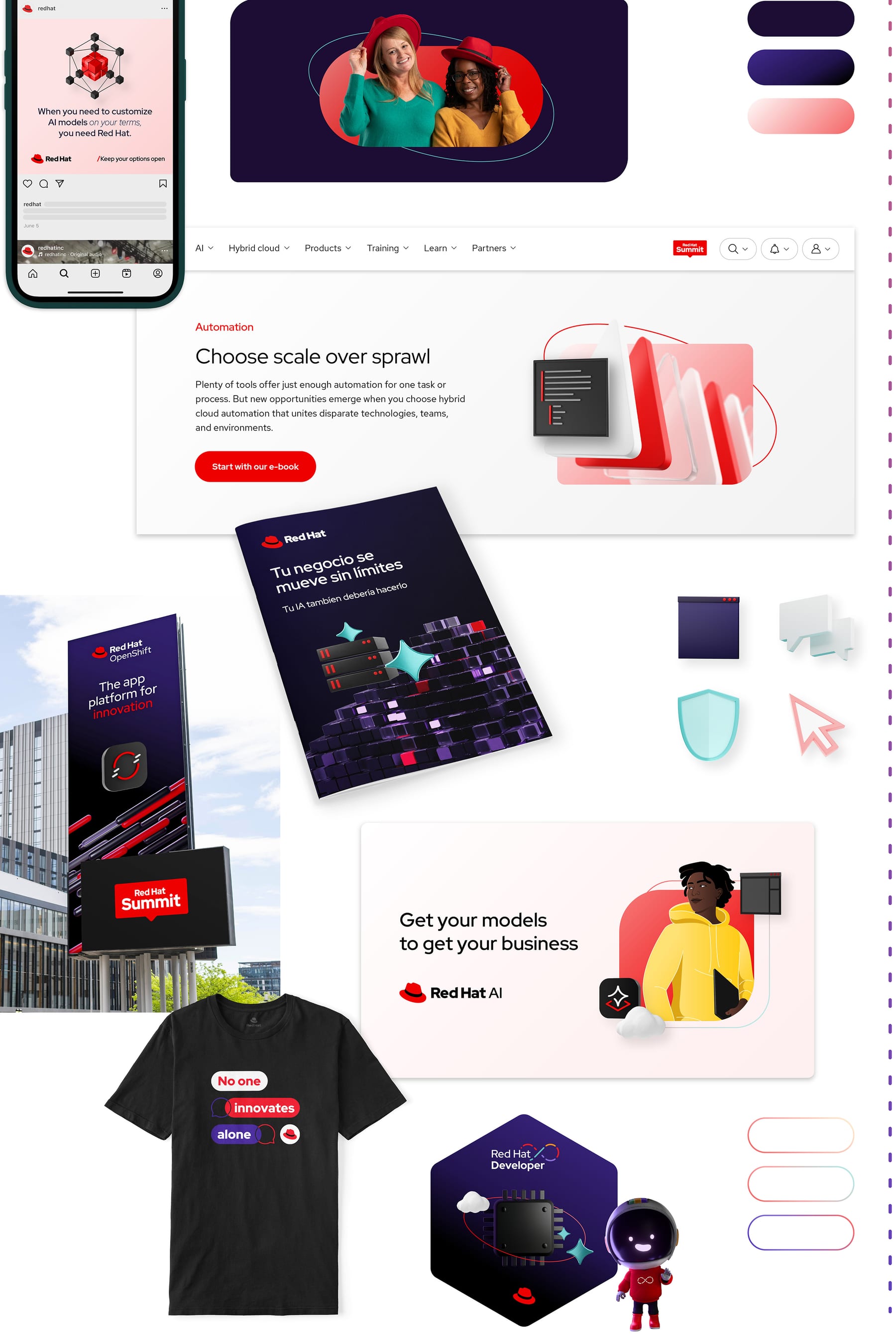
How expressive a piece gets on the essential-to-expressive spectrum: from logo, core colors, icons and type on white, to hybrid collages with purple-80 grounds, accent colors, 3D platform art, portraits and gradient strokes.

Source: redhat.com/en/about/brand/standards/hybrid-style-handbookredhat.com/en/about/brand/standards/color

How loud each format gets

SilentProduct UI
QuietProposal pageEmail
CalmLanding pageSwag / signage
WarmDeck
LoudAdSocial post
Loudest

Our engine's setting, built from their rules.

Every piece passes 3 checks

Logo hidden

Cover the hat. It should still read as Red Hat: pure red as a pop on a quiet ground, Red Hat Display in sentence case, real people or hat-shaped collages.

Red check

Is red-50 present, and is it a pop rather than a flood? Is any red used to mean something bad? Fix both.

Swap test

Put another enterprise vendor's logo on it. If the plain sentence-case type, the single red signal and the specific, sourced copy still fit, it is generic: go back.

Strategy

Red Hat is the leading provider of enterprise open source software solutions. Observed

01

Collaborators who show up for people

How to innovate confidently: passionate open source experts who solve tough problems with customers (paraphrase). Published

02

Builders of hybrid cloud platforms

How to innovate consistently: platforms built to run anywhere the customer's most important projects need to (paraphrase). Published

03

The most reliable partner in tech

How to innovate comprehensively: an open ecosystem of partners and communities that keeps choices open (paraphrase). Published

Full spec
For Published
IT professionals and the enterprises that run on them, from developers and operations teams to IT decision makers, plus partners and open source contributors (paraphrase).
Problem Our reading
Hybrid reality: workloads spread across datacenter, cloud and edge, and tools that do not talk to each other (paraphrase of the voice examples and hybrid style handbook).
Promise Published
We unlock opportunities for innovation, everywhere.
Mission statement (2009) Published
Be the catalyst in communities of customers, contributors and partners that build better technology the open source way (paraphrase).

Proof behind each pillar

Story Published

Red Hat began when Marc Ewing, who sold his own Linux distribution on CDs and was known as the helpful guy in the red hat, joined Bob Young; Red Hat Software was born in 1995. It took on proprietary software with the rebel Shadowman logo, went public in 1999, swapped boxed Linux for Red Hat Enterprise Linux subscriptions in 2001, passed US$1 billion in 2012, and in 2019 joined IBM as an independent subsidiary and launched the current logo and fonts through the Open Brand Project.

Values

Open

Open source methods applied to how Red Hat shows up, honest so audiences can take part (paraphrase; a brand personality trait, the values themselves are not listed on the public pages).

Published
Authentic

Real people and real uses of technology; relatable and mindful (paraphrase).

Published
Helpful

Sharing knowledge and focusing on what customers actually need (paraphrase).

Published
Brave

Standing up for beliefs even when the industry goes another way (paraphrase).

Published

Category. Open hybrid cloud technology leader; enterprise open source software Observed

Why them

  1. Open source the whole way: products built the open source way, upstream communities, and open fonts and icons. Published
  2. Hybrid cloud platforms for consistency anywhere apps run. Published
  3. An open ecosystem of partners and communities: freedom to change, flex or stay the course. Published
  4. Support from open source experts who care about solving the problem together. Published

Instead of

Closed, proprietary software vendors (the upstart role Shadowman stood for).Clones of Red Hat Enterprise Linux (the 2006 Unfakeable Linux response).

Boilerplate Observed

Red Hat is an open hybrid cloud technology leader that gives enterprises a consistent, comprehensive foundation for transformative IT and AI applications. A trusted adviser to the Fortune 500, it offers cloud, developer, Linux, automation and application platform technologies, plus award-winning services.

Taglines

Keep your options open Published

No one innovates alone Published

We unlock opportunities for innovation, everywhere. Published

They never claim

  • Tell the truth no matter what; no absolute promises. Published
  • Be specific without being a know-it-all: a real number, not "more than any other platform". Published
  • Third parties may use Red Hat word marks only truthfully and referentially; logos need a written agreement. Published
  • Never imply Red Hat certification, endorsement or affiliation that does not exist. Published
  • "No one innovates alone" is a mantra, not a marketing headline. Published
  • Cite the source of statistics (the Fortune 500 claim carries a source line). Observed

A brand platform of three statements (value proposition, brand position, brand promise) summed up in the mantra "No one innovates alone". The public page gives the promise and three "We are..." lines, each tied to a way of innovating: confidently, consistently, comprehensively. The full statements live on the login-only intranet.

Source: redhat.com/en/about/brand/standards/platformredhat.com/enredhat.com/en/about/brand/standards/personality

Personality and voice

OpenOpen source ways applied to how Red Hat shows up; honest so people can take part (paraphrase).Published
Authenticbut not Presumptuous or carelessPublished
HelpfulShare knowledge; focus on what customers need (paraphrase).Published
BraveStand out and stand up for beliefs (paraphrase).Published
Experiencedbut not PuristPublished
Compassionatebut not CompliantPublished
Progressivebut not RecklessPublished

Trusted by 90% of Fortune 500 companies

Do Specific and sourced (the guide's Red Hat voice line).

Trusted by more enterprises than any other platform

Don’t Too know-it-all.

Red Hat sells to experts who distrust hype; specific, honest, plain lines sound like a peer who has "been in the room".
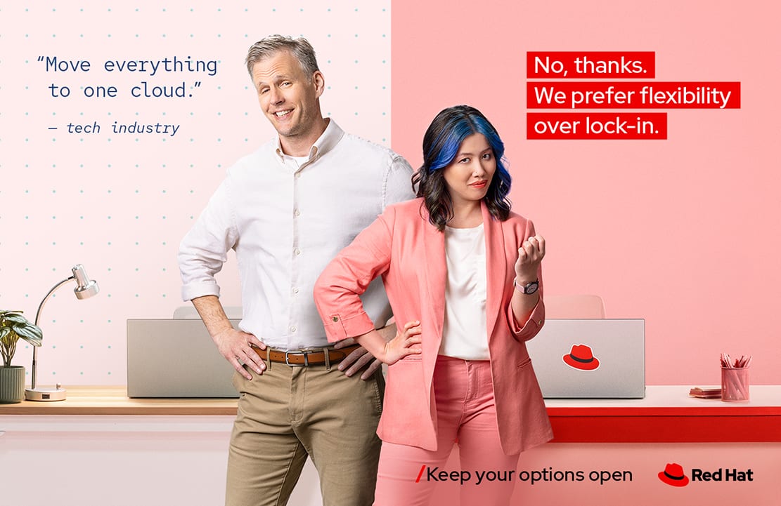
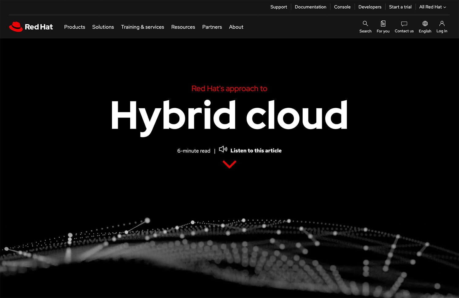
Full spec
  • Sentence case headlines
  • Never set text in all caps, not even small labels (acronyms excepted)
  • Title case only for proper nouns such as product names or book titles
  • No spaces before or after em or en dashes; hyphens join words, en dashes separate numbers, em dashes mark a break
  • Write "and" when there is room; in tight UI labels or headlines use an ampersand, never a plus sign
  • Curly quotation marks and apostrophes; straight marks only as primes for feet and inches
  • Emphasize with bold or color, one treatment at a time; never italics, underline or caps for emphasis
  • Headlines run three lines at most, avoid widows, and are about 3/4 the length of the text below
  • Red Hat is two capitalized words, in the same typeface as the surrounding text, on one line where possible, and never translated (Simplified Chinese exception: 红帽)
  • Superscript (R) after the first use of "Red Hat" as an adjective in body copy; none in headlines, quotes, tables of contents or when naming the company
  • Use the full product name with trademark symbols on first mention in body copy (e.g. Red Hat(R) Enterprise Linux(R)); RHEL is the only listed short form, after first use
  • Offerings start with "Red Hat" plus a descriptive name in title case; components are sentence case and add "Red Hat" only when needed
  • Use a trademark as an adjective, never a verb, plural or possessive, and never in an acronym
  • Never: RHAAP, AAP, RHAI, RAI, RHOS, ROSA, ARO, EL, Red Hat Artificial Intelligence. Say the full platform name (Red Hat Ansible Automation Platform, Red Hat AI, Red Hat OpenShift, Red Hat Enterprise Linux)
  • Tell the truth: no absolute promises (the guide rejects "You will never have to think about security again")
  • Do not talk down to experts with leading rhetorical questions; say what they will learn
  • Never use red to signal something negative; errors and decreases are danger-orange
  • When AI tools help write copy, re-check every product name and trademark

ExperiencedCompassionateProgressive

Voice is experienced (not purist), compassionate (not compliant) and progressive (not reckless), each shown as a too-soft, right and too-hard line. Tone moves along four dials (formality, urgency, empathy, authority) chosen by reading the audience. Style asks for clear, concise, conversational, credible and compelling copy, with paired do and don't lines.

  • Pick the line between too deferential and too know-it-all: specific and sourced
  • Write like people talk, to people, not at them
  • Keep it concrete: name the tool, the number, the outcome
  • Cut every word that does not earn its place
  • Never promise the impossible; never patronize experts
  • Say something only Red Hat can say
  • Sentence case; no all caps; no spaced dashes; ampersand only when tight, never a plus
  • Voice is experienced, compassionate and progressive; tone flexes by audience along four dials: formality, urgency, empathy and authority.
  • Start with the reader: their state of mind, how they should feel afterwards (flip the tension: uncertain becomes confident) and the one thing to take away.
  • Style: clear, concise, conversational, credible, compelling. Write like people talk, to people not at them, and say something only Red Hat can say.
  • Specific numbers beat vague claims and superlatives: "Trusted by 90% of Fortune 500 companies" sits between too deferential and too know-it-all.
  • Typography carries the voice: sentence case everywhere, minimal ornament, big or bold headlines, red reserved for short lines.
  • The trademark rules (two words, never translated, (R) after first adjectival use in body copy, full product names first) apply to all copy and AI-assisted copy.

Their words

openauthentichelpfulbravetogetherchoice

Never

RedHat (one word)red hat (lowercase)RHAAPAAPRHAIRHOSROSAARO+ in place of "and"ALL CAPSTux the penguin (imagery)Shadowman (legacy imagery)

Source: redhat.com/en/about/brand/standards/personalityredhat.com/en/about/brand/standards/personalityredhat.com/en/about/brand/standards/personality

  • Don’t use abstract verbs like streamline or harness the power of
  • Don’t write "Our platform delivers comprehensive automation"-style claims at the reader
  • Don’t use leading rhetorical questions with experts
  • Don’t translate or split "Red Hat"
Voiceexperienced, compassionate, progressive
Personalityopen, authentic, helpful, brave
Tone dialsformality, urgency, empathy, authority
Styleclear, concise, conversational, credible, compelling
Casesentence case, even headlines

Source: redhat.com/en/about/brand/standards/personalityredhat.com/en/about/brand/standards/typographyredhat.com/en/about/brand/standards/naming-and-trademarksredhat.com/en/about/trademark-guidelines-and-policies

Color

Choose scale over sprawl

Do A large headline in red-50 on white, body in black (typography color guidance).

Choose scale over sprawl

Don’t Red flooding the whole space.

Restraint makes the pure red unmistakable: neutral, open layouts with one pop of red read as Red Hat even before the logo.
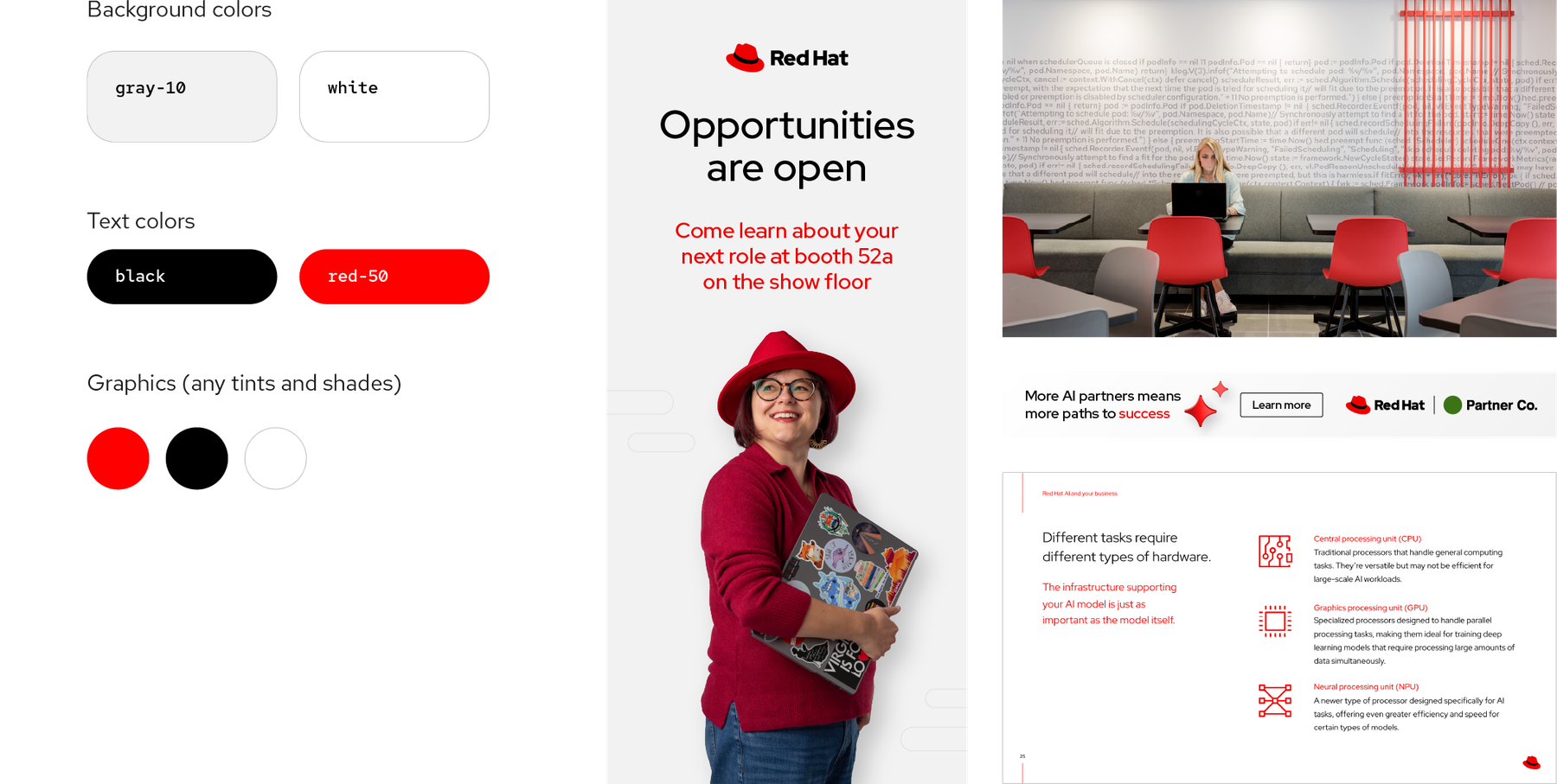
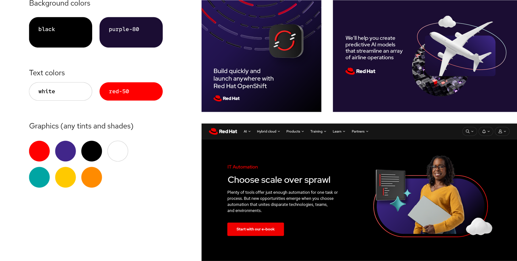
Full spec
  • Start every project from a collection: core light (white or gray-10 ground; black or red-50 text), core dark (black or gray-80; white or red-50 text), core red (red-10 or white; black or red-50 text), expressive light (gray-10, red-10 or white; black, purple-80 or red-50 text), expressive dark (black or purple-80; white or red text), interface light (white, gray-10, gray-30; gray-95, gray-80, blue-50 or red-50 text), interface dark (gray-95, gray-80, gray-70; white, gray-30, blue-20 or red-50 text)
  • Include red-50 in everything, as pops, never as a flood
  • Fill large areas with the lightest tints, darkest shades or subtle gradients; save saturated values for callouts and navigation
  • Use one or two secondary families per piece; hybrid style allows at most two accent colors per layout
  • Information colors only for status and interaction; people colors only for skin
  • Data colors: red = Red Hat, danger-orange = error/decrease, orange = caution, yellow = warning, success-green = success/increase, teal = neutral, interaction-blue = link, purple = info, gray = Null (unavailable)
  • Small text (17pt or smaller) 4.5:1; large text (18pt+) and informative graphics 3:1 (WCAG AA)
  • Use labels as well as color; avoid vibrating pairs of equally saturated hues
  • Only the gradients in the hybrid style handbook; never create new ones
  • Don’t use colors outside the palette
  • Don’t flood everything with red
  • Don’t forget red
  • Don’t overuse gradients or make new ones
  • Don’t use AI-generated images without correcting their colors
  • Don’t use red for negative things
  • Don’t set red-50 on gray-80, white on teal-40, black on red-60 or white on purple-30 (fail contrast)
Red Hat red#EE0000, RGB 238 0 0, CMYK 0 98 85 0, Pantone 1788 C
Familiesred, gray, orange, yellow, teal, purple, success-green, danger-orange, interaction-blue, cool-tone, warm-tone
Secondary anchorsorange-40 Pantone 144 C; yellow-30 108 C; teal-50 2234 C; purple-50 2097 C
Contrast4.5:1 small text, 3:1 large text and graphics
Secondary per piece1 or 2

Core colors are red, black and white, with red tints and shades and neutral grays for depth. Expressive secondary families (orange, yellow, teal, purple) add energy but never stand alone. Auxiliary palettes are strictly functional: information (success-green, danger-orange, interaction-blue) and people (skin tones for illustration). Seven named collections set grounds and text colors per project. All families run 10 (light) to 80 (dark), and equal numbers share visual weight.

Not published: overall color proportions or ratios (only qualitative "pops of red"); CMYK and Pantone for most tints (login-only); exact gradient angles and sizing (login-only "gradient specs").

Source: redhat.com/en/about/brand/standards/colorredhat.com/en/about/brand/standards/hybrid-style-handbookux.redhat.com/tokens/colorux.redhat.com/foundations/color

Typography

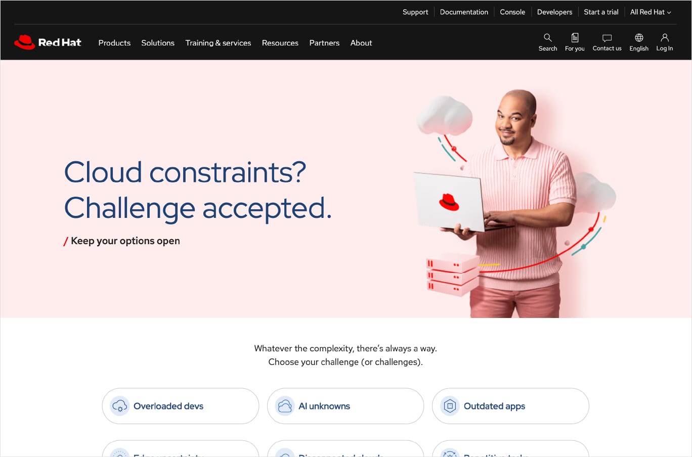
Keep your options open

Aa
Red Hat DisplayDisplay · open stand-in
Aa
Red Hat TextText · open stand-in

Choose an OS that moves with you

Do Sentence case, concise, conversational.

HARNESS THE POWER OF AN OPERATING SYSTEM

Don’t All caps and inflated wording, both ruled out.

The faces are built to look best in sentence case at default spacing, so restraint and size do the work; making them open source is itself on-brand.

Full spec
Their faceUseLicenseOpen stand-in
Red Hat DisplayHeadlines and the wordmark; the default face. Big, bold or both; sentence case; never trackedOpen (SIL OFL 1.1). Red Hat's own face, by Jeremy Mickel with Red Hat, 2019; free on Google Fonts and GitHub
Red Hat TextParagraphs and small text: taller x-height contrast, more space between narrow letters. 1.5 line height on the webOpen (SIL OFL 1.1)
Red Hat MonoReal code snippets only, or stylized headlines on developer and technical designsOpen (SIL OFL 1.1)
  • Display for headings, Text for body, Mono only for code or technical headlines (never Text for web headings or Display for web body)
  • Sentence case everywhere, even headlines; never all caps
  • Flush left by default; center only short headers or captions in narrow centered layouts; right only for narrow sidebars or RTL; never justify
  • Never change tracking (text under 6px may open to +10 or +20)
  • Line height 1.2 to 1.5 for most text; 1.1 for very large text; never under 1.1 or over 1.5 (web: 1.3 headings, 1.5 body)
  • Line length 20 to 100 characters (web: 30 to 120, or 2 to 7 desktop columns; body never wider than 789px)
  • Headlines big, bold or both, often red; at most three lines; no widows
  • Links blue-50 on light, blue-30 on dark, underlined (dashed where possible)
  • Named weights only: Display 300/400/500/700/900; Text and Mono 300/400/500/700; no Bold in web body or code
  • At most three text styles in one block on the web
  • Don’t use other fonts
  • Don’t fill a whole space with text
  • Don’t use all caps
  • Don’t track text in or out
  • Don’t justify text
  • Don’t stack more than one emphasis treatment
  • Don’t set long paragraphs in red
DisplayRed Hat Display (headings, logo)
BodyRed Hat Text, 16px base, 1.5
MonoRed Hat Mono, code only
Web headings48/40 Regular, 36/28/24/20/18/16 Medium, 1.3
Expressive64/80/96 at 1.1 (48 under 768px)
Body sizes12/14/16/18/20/24 at 1.5
Trackingnever changed
Non-LatinNoto Sans

One open source family designed for Red Hat: Display (default, geometric with human touches and 12-degree ascenders), Text (for reading) and Mono (for code). Typography is plain and roomy: flush left, sentence case, no tracking changes, generous margins, big or bold headlines, often in red. The design system publishes a full pixel scale.

Source: redhat.com/en/about/brand/standards/typographyux.redhat.com/foundations/typographyux.redhat.com/foundations/typography/scale-and-rhythmux.redhat.com/foundations/typography/type-specificsux.redhat.com/foundations/typography/guidelinesux.redhat.com/tokens/font

Graphic elements

Opportunities are open

Do Restrained, mostly neutral layouts (white or gray-10, or black, gray-80 or purple-80) with red-50 #EE0000 used sparingly to draw the eye; large headlines are often set entirely in red-50 with black or white body copy. Red-50 must appear in everything Red Hat makes. Reserve red for short lines; paragraphs stay black or white.

Opportunities are open

Don’t flood a space with red, set body copy in red, or leave red out entirely.

Pops of Red Hat red · every piece: large headlines, a key word, pull quotes, the hat, a CTA

Choose scale over sprawl

Do Nine fixed shapes inspired by the hat: circle, pill, rectangle, diamond, square, hexagon, hat brim, hat crown, hat pinch. Rectangle and diamond round two opposite corners 3x more than the other two; square and hexagon corners are equal. Shapes can be scaled, flipped, rotated, filled with an accent color or gradient, or drawn as a thin stroke; they mask photos and platform art, and key elements break out of the frame. One light source (upper left by default), soft drop shadows. One clear focal point per collage, with red-50 in every collage.

Choose scale over sprawl

Don’t distort shapes, change their corner radii, combine shapes into new ones, invent new shapes, or use the hat itself as a base shape.

Hybrid style base shapes · collages for web bands, cards, ads, social and slides

Build quickly and launch anywhere

Do Four strokes only: red-40 #F56E6E to red-50 #EE0000; red-40 to purple-50 #5E40BE (via #C96E96, #996EC2, #876FD4); red-40 to orange-10 #FFE8CC (via red-30 #F9A8A8 at 40%); red-40 to teal-20 #B9E5E5 (via red-30 at 40%). Lightest end toward the light source; the line stays thin. A stroke is a line, never a fill.

Build quickly and launch anywhere

Don’t use a gradient stroke as a fill, background or glow, thicken it, or make new gradients.

Thin gradient strokes · weaving through hybrid collages, in front of and behind elements

We are Red Hat

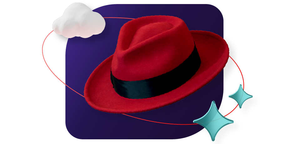
Do The exact trademarked hat (crown, band, brim) used as a mask, masked inside shapes, repeated as a pattern or cropped off the edge, in core colors only (red, black, gray or white), with the Red Hat name or logo nearby. Only where the audience already knows Red Hat.

We are Red Hat

Don’t redraw, flip, tilt, recolor outside core colors, drop the band, render in 3D, or generate hats with AI.

The hat as artwork · internal, event and swag pieces where everyone knows the brand

Specimens use sample copy, not Red Hat’s.

Software cannot be photographed; collages show the people and the technology together, the visual form of "no one innovates alone".
Full spec
  • Choose the level per goal: essential for information and awareness; expressive for storytelling
  • Backgrounds, dark: black, gray-80, purple-80, or gradients gray-60 to black, purple-60 to purple-80, purple-60 to black
  • Backgrounds, light: white, gray-10, red-05, or gradients white to gray-10, white to red-05, red-10 to red-20
  • Accents: red, orange, yellow, teal, purple and gray families plus two accent gradients, red-40 to red-50 and red-05 to red-40; max two accent colors per layout
  • Every collage: single light source, grounding element, one focal point; add story elements and accent shapes only when needed
  • Mask photos, portraits and platform art inside base shapes; let key elements break the frame
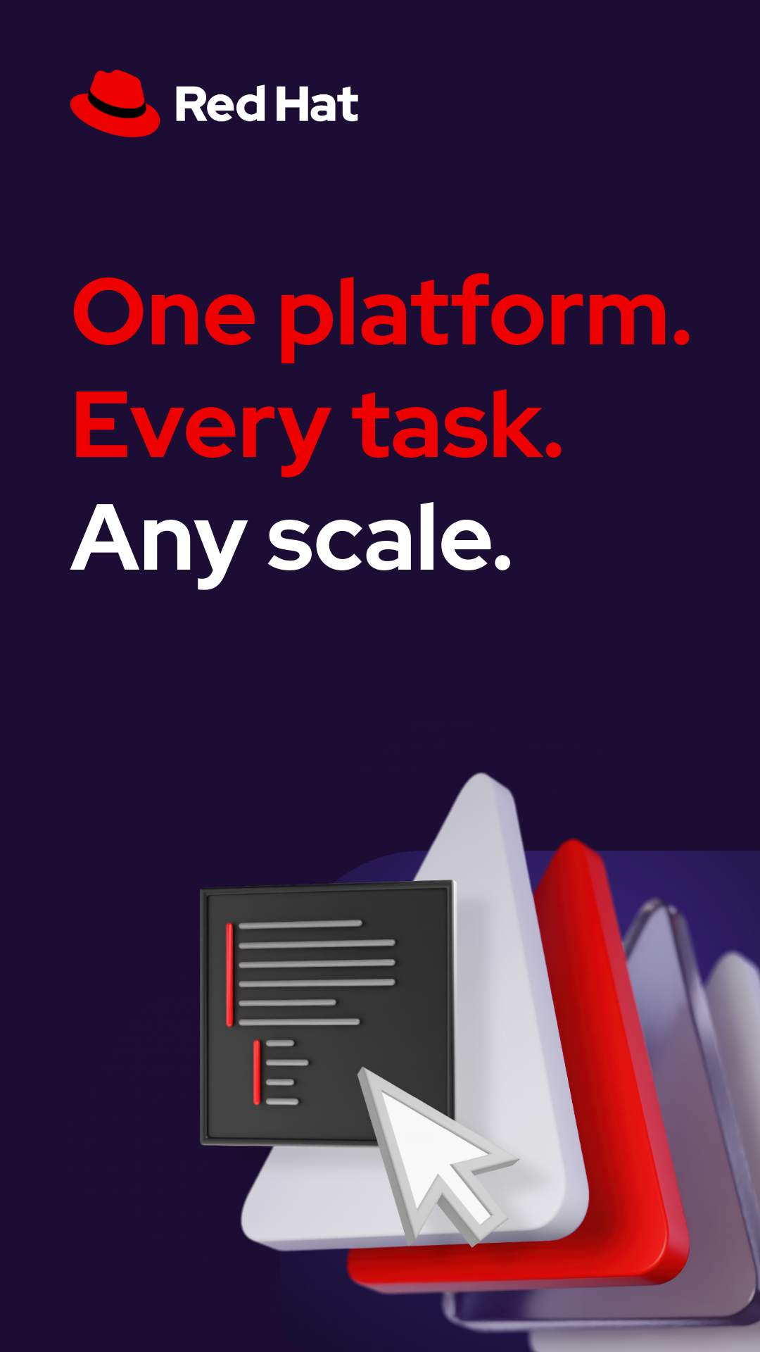
  • One platform-art style per composition: Linux standardization (platforms), application development (speed-line pills), automation (repeating triangles), AI (cube blocks), cross platform, cross platform grid
  • Icons go on a backing shape (circle, square, oval) with room to breathe; logos keep clear space
  • 3D objects only in provided colorways, with soft shadows matching their light
  • Don’t use colors or gradients outside the handbook
  • Don’t make accent colors the main color
  • Don’t use gradient strokes as fills, backgrounds or glows
  • Don’t distort or re-radius base shapes
  • Don’t put text on platform art
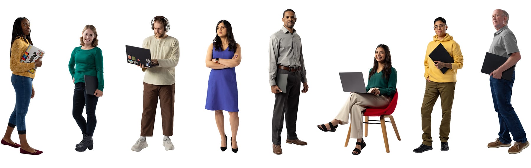
  • Don’t use stock photos full-bleed or remove photo backgrounds (studio portraits excepted)
  • Don’t mix 2D and 3D technology icons
  • Don’t put several studio portraits in one shape
  • Don’t generate people, hats or 3D with untrained AI
Base shapescircle, pill, rectangle, diamond, square, hexagon, hat brim, hat crown, hat pinch
Corner rulerectangle/diamond: two corners 3x the other two
Dark groundsblack, gray-80, purple-80 + 3 gradients
Light groundswhite, gray-10, red-05 + 3 gradients
Gradient strokesred-40 to red-50, purple-50, orange-10 or teal-20
Lightsingle source; upper left by default

Hybrid style is Red Hat's expressive layer: collages that mix photography, studio portraits, people illustrations, 3D objects, 3D platform artwork, icons and logos on nine hat-derived base shapes, tied together by thin gradient strokes and one light source. Each project sits on a spectrum from essential (logo, core colors, icons, type) to expressive (secondary colors, 3D, portraits). A March 2026 update made light red, not light purple, the light-theme depth color and added an accent gradient.

Source: redhat.com/en/about/brand/standards/hybrid-style-handbookredhat.com/en/about/brand/standards/3dredhat.com/en/about/brand/standards/the-hatredhat.com/en/about/brand/standards/color

Iconography

36px standard icon
32px UI icon
20px micron

Three icon types: standard icons (artwork, 36-128px), UI icons and microns (interface), and technology icons (one per product or component, in a rounded rectangle).

Full spec

Three icon types: standard icons (artwork, 36-128px), UI icons and microns (interface), and technology icons (one per product or component, in a rounded rectangle). All share the visual metaphors, rounded strokes and 12-degree angles of the type. Standard and UI icons are CC BY 4.0.

  • Standard icons: 30px grid, 1.25pt strokes, rounded corners and ends, saved at 36 x 36 with a 3px margin; use 32-128px
  • UI icons: 32px grid, 2px stroke (1px at 16px), use 16-32px; microns: 20px grid, 2px stroke, 10-20px, only for spaces 12px or less
  • Angles 0/45/90 degrees or plus/minus 12 degrees; circles overshoot squares by 1px
  • Default colors red, black or white; any palette color allowed; UI icons and microns 3:1 contrast minimum
  • Technology icons: 9pt-radius rounded rectangle; products black fill with gray-60 outline and red-50 + white strokes; components white fill with gray-20 outline and red-50 + black strokes; about 50:50 between the two stroke colors
  • One-color tech icons only in red-50, black, white or grays; products filled, components outlined
  • Marketplace badges: gray-10 rounded square, one third the icon height, bottom right, 5px gap, gray-20 outline, gray-95 glyph; marketplaces only
  • Keep the Red Hat logo, product logo or product name near any technology icon
  • Don’t combine, rotate or distort icons
  • Don’t add shadows, gradients or 3D
  • Don’t make multicolor icons or use off-palette colors
  • Don’t use other companies' or free icons
  • Don’t generate icons with AI
  • Don’t blow icons up to fill large spaces
  • Don’t use UI icons as decoration
  • Don’t remove a technology icon from its rounded rectangle
Standard30px grid, 1.25pt, 36px file, 32-128px use
UI32px grid, 2px stroke, 16-32px
Micron20px grid, 2px stroke, 10-20px
Tech icon corner9pt radius
Badge1/3 icon height, 5px gap, gray-10
LicenseCC BY 4.0

Source: redhat.com/en/about/brand/standards/icons/standard-iconsredhat.com/en/about/brand/standards/icons/ui-iconsredhat.com/en/about/brand/standards/icons/technology-iconsux.redhat.com/foundations/iconography

Illustration

Precise geometry signals reliability; realistic people keep technology human and avoid enterprise clichés.

Full spec
  • Minis: single concept, 1-2 objects, front-on, light from top left, white/red-30/red-50 only
  • One-color minis exist for light and dark grounds
  • Mini collages: minis on a base shape with a subtle drop shadow
  • People: natural anatomy, real faces with expressions, simple clothing in core/secondary colors
  • One skin-tone family per person, two tones for the gradient
  • One light source across a scene; people are the focal point
  • Don’t add colors or light sources to minis
  • Don’t combine minis or use them in complex collages
  • Don’t use minis where details are illegible (use icons)
  • Don’t oversimplify people or erase facial features
  • Don’t change a person's skin tone (no purple people)
  • Don’t use AI-generated or near-style illustrations externally
Mini palettewhite, red-30, red-50 (50:50 white to red)
Mini artboard1080 x 1080, 1000 key line
Lighttop left
Skincool-tone or warm-tone families

Two 2D types. Mini illustrations show one idea from the icon metaphors, flattened, lit from the top left, in white, red-30 and red-50 at about 50:50 white to red, on a 1080px artboard with a 1000px key line. People illustrations are realistic, photo-referenced professionals with true proportions, gradients, hard shadows and edge lighting, skin from the people palette. A new people style arrived in March 2026.

Source: redhat.com/en/about/brand/standards/illustrationredhat.com/en/about/brand/standards/hybrid-style-handbookredhat.com/en/about/brand/standards/color

Photography

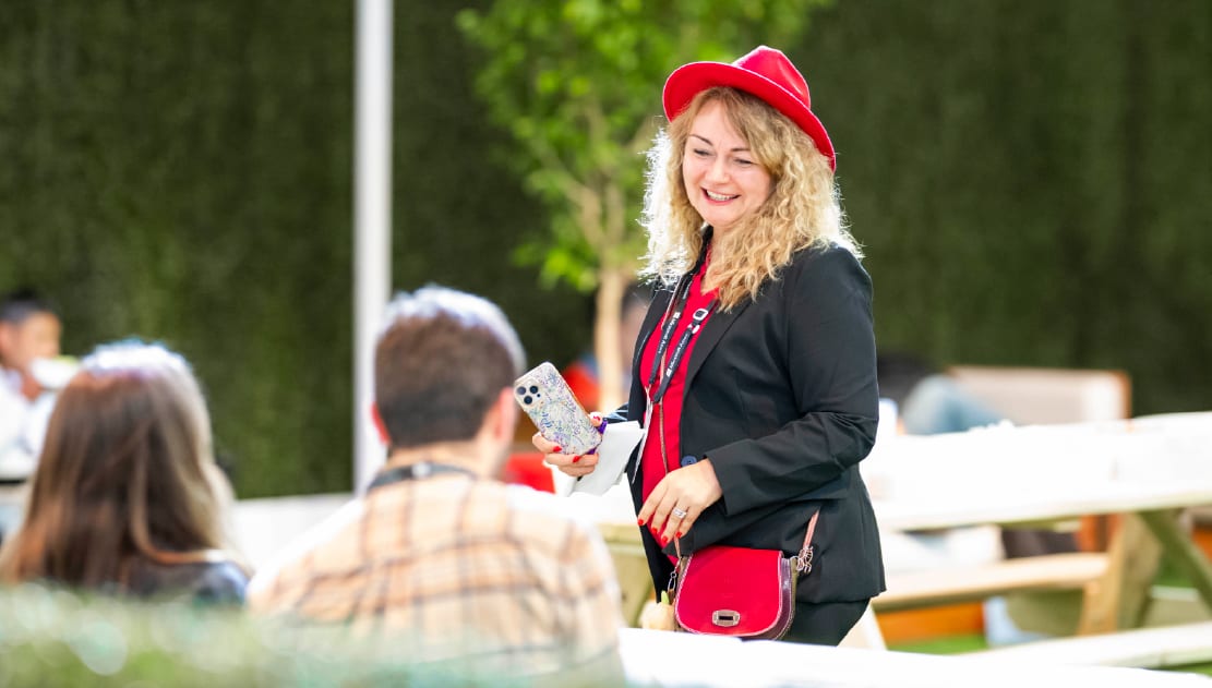
Candid, documentary photos of real people (Red Hatters, attendees, selected models) at work: whiteboards, conversations, hands on laptops, in naturally lit modern offices.

Full spec

Candid, documentary photos of real people (Red Hatters, attendees, selected models) at work: whiteboards, conversations, hands on laptops, in naturally lit modern offices. Shallow depth of field, over-the-shoulder framing with foreground objects, soft diffused window light, slightly desaturated warm-neutral grade, with a little natural red as a focal point.

  • Real people only; never AI people
  • Observational framing that puts the viewer in the scene
  • Soft, diffused natural light; realistic screen or task light for developer/dark-mode shots
  • Slightly desaturated, warm-neutral color that does not fight red
  • A touch of natural red can create the focal point
  • Studio portraits (background removed, wardrobe in hybrid accent colors) for hybrid collages
  • Stock only when the library lacks the concept, and it must match
  • Don’t use tech graphic overlays
  • Don’t use stock clichés or staged, generic people
  • Don’t generate people or red fedoras with AI
  • Don’t use hyper-stylized, lens-flared or oversaturated images
  • Don’t use cold, sterile or plasticky images
Lightsoft, diffused, window-like
Gradeslightly desaturated, warm neutral
Depthshallow, blurred background
Redsmall, natural focal point

Source: redhat.com/en/about/brand/standards/photographyredhat.com/en/about/brand/standards/hybrid-style-handbook

Motion

Motion is described only for hybrid style: collages come alive as base shapes scale and morph to carry scene changes, platform-art backdrops frame video, and elements pop out of frames.

Full spec

Motion is described only for hybrid style: collages come alive as base shapes scale and morph to carry scene changes, platform-art backdrops frame video, and elements pop out of frames. Video outros use the animated logo. No curves or durations are public.

  • Base shapes are the transition vehicle between scenes
  • Carry elements between scenes, changing scale and position
  • Fully animated 3D scenes are animation-only
  • Focus states disable transitions
  • Don’t invent easing values as brand fact (none published)

Source: redhat.com/en/about/brand/standards/hybrid-style-handbookredhat.com/en/about/brand/standards/3dredhat.com/en/about/brand/standards/logoux.redhat.com/foundations/interactions/focus-indicators

Interface & layout

The page, band by band

Event hero
Featured
Statement + stat
Products intro
Open source
Tech topics
Account pre-footer

Buttons

Primary action
Primary: 59px tall · 32px sides · 64px corners · 1px #EE0000 ring · 16px, weight 700 · #EE0000 fill, #FFFFFF text
Full spec

Layouts are open and uncluttered with generous white space; elements may overflow and overlap for depth. The design system sets a 12-column grid (2 on phones), 4px-based spacers from 4 to 128px, 64px default section padding, and body text no wider than 789px.

Measured from redhat.com/en/about/brand/standards's Red Hat brand standards (redhat.com/en/about/brand/standards, every public tab read from the live HTML and its images) and the Red Hat Design System foundations and tokens (ux.redhat.com), fetched 2026-10-30. Login-gated pages (The Source, Brand Portal, gradient specs, logo downloads) were not read.

Spacing

MeasureDesktopPhone
Page margin32px16px
Section padding96px64px
Hero text widthmax 672px, centeredfull width
Card gap32px32px
Navigation82px82px

Type, at size

Hero headline

Red Hat Text · 64px (phone 35) · line 1.1 · weight 400

Statement H1

Red Hat Text · 36px · line 1.3 · weight 500

Section H2 / featured card title

Red Hat Text · 28px (phone 24) · line 1.3 · weight 500

Small section H2 / card title

Red Hat Text · 24px (phone 20) · line 1.3 · weight 500

Stat / H4

Red Hat Text · 20px (phone 18) · line 1.3 · weight 500

Footer column heading

Red Hat Text · 18px (phone 16) · line 1.3 · weight 500

Hero lead

Red Hat Text · 20px (phone 18) · line 1.5 · weight 400

Body large

Red Hat Text · 18px (phone 16) · line 1.5 · weight 400

Body / nav menu / eyebrow

Red Hat Text · 16px · line 1.5 · weight 400

CTA and link label

Red Hat Text · 16px · line 1.5 · weight 700

Small: tags, utility nav, footer links

Red Hat Text · 14px · line 1.5 · weight 400

Caption: source line, 'Available on'

Red Hat Text · 12px · line 1.5 · weight 400

Shadow
Soft, subtle drop shadows matching the scene's single light source (upper left by default) under 3D objects and portraits; RHDS box shadows sm 0 2px 4px 0 rgba(21,21,21,.2), md 0 4px 6px 1px rgba(21,21,21,.25), lg 0 6px 8px 2px rgba(21,21,21,.3), xl 0 8px 24px 3px rgba(21,21,21,.35)
Motion
Hybrid style animation: base shapes scale and morph to carry scene transitions; elements pop out of frames. Focus states switch transitions off. No easing curves or durations published
Buttons
rounded

Page anatomy

How Red Hat’s own landing pages are built, observed on redhat.com/en, 2026-10-30. The full measurements are in spec.md.

Navigation
White sticky masthead: full Red Hat logo at left, six primary menus with chevrons, then three small utility links (Console, Docs, Support) and three 18px icons (search, bell, user) at right. Phone: hat-only logo, hamburger, then waffle, search, bell, user icons.
Hero
Full-bleed black event hero: a purple outline date tag, a 3-line 64px white Display Regular headline, a 3-line 20px white lead with a bold date phrase, and one red pill CTA in the left half; a 3D black shield with a silver AI sparkle and green check fills the right half as the section's background image; four soft white four-point sparkles float over it.
Featured (news cards)
White band with a small 24px 'Featured' heading, a row of one wide event card (copy + secondary pill + illustration) and one narrow press card (title + blue arrow link), then three compact 'Blog post' cards.
Company statement with stat (accent bar)
White band: the page's H1 statement and a paragraph at left; at right a proof stat set off by an 8px red left bar with a small source line.
Products intro line
One centred 28px line on white introducing the dark products band.
Products (dark band, featured product + 2x2 product cards)
Near-black band washed with a purple-to-black gradient: a full-width 'Featured product' card (Lightwell), four product cards in a 2x2 grid, each with a hybrid-style product icon, title, text, white outline pill and a row of cloud-provider logos, then a centred red 'See all products' pill.
Customer logos
White band: a 24px heading, one row of six full-colour customer logos in equal cells, and a blue arrow link.
Open source that works your way (copy + collage)
White two-column band: heading, paragraph and red pill at left; a hybrid-style photo collage at right.
Tech topics worth exploring (vertical tabs)
Heading with a secondary pill at right, then a vertical tab list (14 topics) beside a bordered panel holding a topic definition, a list of article links and a customer proof block.
Get more with a Red Hat account (pre-footer)
Light-grey full-bleed band: heading, paragraph, red pill and a blue link at left; a hybrid-style portrait collage at right.
Footer
Dark three-tier footer: logo and language select over a hairline; four link columns plus an 'About Red Hat' block; then a black legal strip with the hat, two rows of small links, copyright and five social icons.

Source: ux.redhat.com/foundations/gridux.redhat.com/foundations/spacingux.redhat.com/tokens/spaceux.redhat.com/tokens/borderux.redhat.com/tokens/breakpointux.redhat.com/foundations/typography/scale-and-rhythmux.redhat.com/foundations/interactions/focus-indicatorsredhat.com/en/about/brand/standards/personality
In use

Open Brand Project · 2019

The rebrand itself was done the open source way, so the identity proves the claim. Our reading

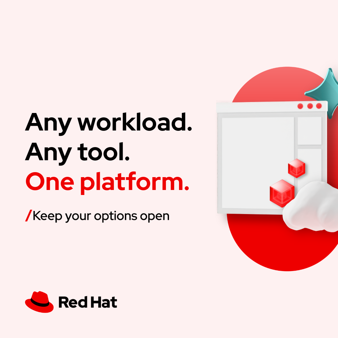
Keep your options open

It turns open source into a buyer benefit: choice. Our reading

Unfakeable Linux · 2006

A two-word reply made the rival's launch Red Hat's story. Our reading

No one innovates alone (brand mantra anthem)

It ties the mantra back to the founding story. Our reading

Full spec

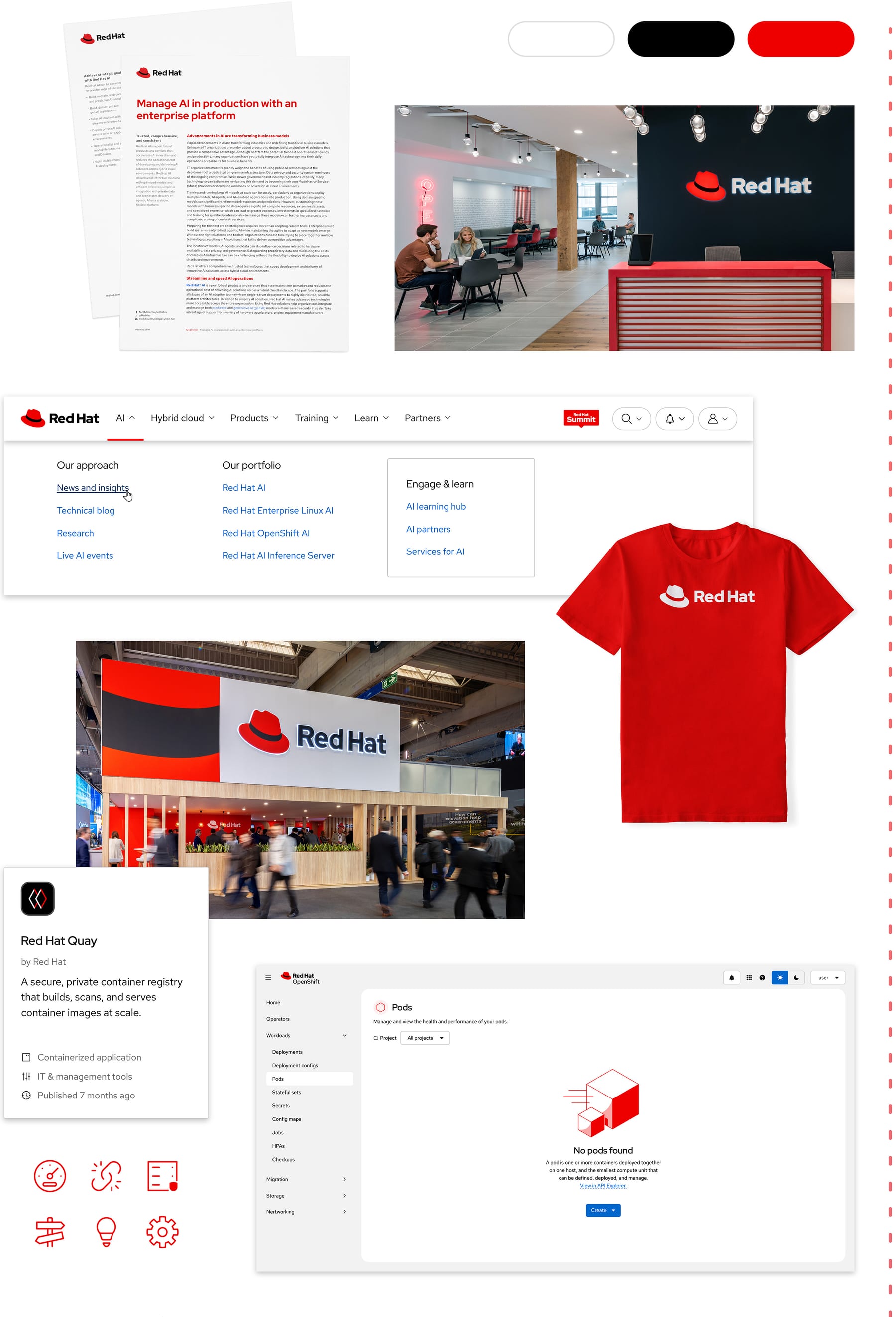
How our engine applies Red Hat's system to each format. Our recipe from their rules, not something Red Hat publishes. Level = how far toward hybrid style's expressive end (0 essential only, 5 full collage, accents and gradients).

  • Open Brand Project. Started in 2018 and launched in 2019 with the Red Hat community: Shadowman retired, the hat simplified into a bold red fedora, and the Red Hat Display, Text and Mono family released open source. redhat.com/en/about/brand/standards/history
  • Keep your options open. Global brand campaign built from customer research; the tagline stands for freedom to choose and room to grow. redhat.com/en/about/brand/standards/platform
  • Unfakeable Linux. The day after Oracle announced a Red Hat Enterprise Linux clone at Oracle OpenWorld, Red Hat handed out hundreds of T-shirts reading "Unfakeable Linux". redhat.com/en/about/brand/standards/history
  • No one innovates alone (brand mantra anthem). The mantra was introduced to Red Hatters through an anthem video and campaign about the helpful person in the red hat, with felt-textured people. redhat.com/en/about/brand/standards/platform
FormatWhat they didSource
web pageredhat.com: Logo A top left on white or gray-95 nav, Display headlines, red CTA buttons, hybrid collages in bands.redhat.com/en/about/brand/standards/color
favicon / social avatarThe hat alone, red with black band.redhat.com/en/about/brand/standards/the-hat
business cardThe hat beside the person's details on the front.redhat.com/en/about/brand/standards/the-hat
travel mugLogo B, stacked with large type, fits the squarer space.redhat.com/en/about/brand/standards/logo
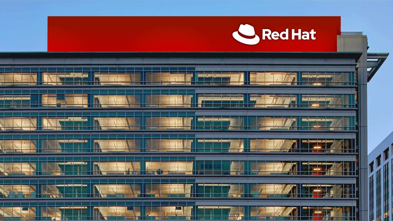
building signageLogo A one-color white on a red band atop Red Hat Tower.redhat.com/en/about/brand/standards/logo
technology icons in marketplacesTech icons with optional badges in partner marketplaces and the Ecosystem Catalog.redhat.com/en/about/brand/standards/icons/technology-icons
presentation slidesIcons paired with short text; mini collages beside copy.redhat.com/en/about/brand/standards/icons/standard-icons
swagHat lapel pins and keychains; hat pattern T-shirts; icon-pattern mugs.redhat.com/en/about/brand/standards/the-hat
event fedorasSpecial event fedoras with the logo on the band, given to partners, customers and contributors.redhat.com/en/about/brand/standards/the-hat

Our setting for each format

FormatLoudnessMust appearWhat varies
Landing pageBuild it the way redhat.com/en is built (kit.spec.page, homepage voice): white sticky 82px masthead with Logo A top left; a full-bleed black hero with a 64px Red Hat Display Regular white headline, 20px lead and one red #EE0000 pill CTA (64px radius, 16/32 padding, Display 16px 700); white bands of 1px #C7C7C7 16px-radius cards; one sourced stat behind an 8px red left bar; a near-black #151515 band with a purple-70 gradient and #4D4D4D-bordered dark cards; light-grey #F2F2F2 pre-footer; #1F1F1F footer. Headlines sentence case in #151515 or white, never red; links #0066CC (#92C5F9 on dark); red only in pills, the accent bar, the active tab and the hatwhich sections and how many cards; the hero image or collage; the guide's campaign voice (red headline or key word, hybrid collage with gradient strokes, 3px buttons) for campaign and event pages that are not homepage-style
DeckLogo or hat present, sentence-case Display headlines, red headlines or key words, icons with short text, generous marginsexpressive dark slides, mini collages, platform art backgrounds
Proposal pageWhite ground, black body, red headline, sourced numbers only, full product names with (R) on first useone mini collage or icon set
AdClear focal point, red-50 present, Logo A, short sentence-case headlineplatform art, portraits, accent colors, gradient strokes
Social postHybrid collage with one light source, red-50, logo or product logopurple-80 or black ground, accent colors
EmailLogo A in a slim header, white ground, black text, one red CTA, blue linkssmall header collage
Swag / signageLockup that fits the space (B for squares, C for large signage), hat always red with black band or one-colorhat artwork in core colors
Product UIPatternFly/RHDS tokens, UI icons, interaction-blue, status colors from the information palettenone

Ads

Rules

Do

  • Red-50 in everything, as pops, on restrained neutral layouts
  • Red Hat Display headlines, sentence case, big or bold, often red; Red Hat Text body in black or white
  • Logo A by default, "e" clear space, hat always red with black band
  • Never change tracking; never all caps; never justify
  • Hybrid elements only from the handbook: nine base shapes, listed gradients, one light source
  • Real people, never AI-generated

Don’t

  • redraw, recolor or 3D the hat
  • use colors or gradients outside the palette
  • use red for errors
  • translate or split "Red Hat"
  • generate logos, hats, icons, people or 3D with AI

Source: redhat.com/en/about/brand/standards/logoredhat.com/en/about/brand/standards/the-hatredhat.com/en/about/brand/standards/colorredhat.com/en/about/brand/standards/typographyredhat.com/en/about/brand/standards/hybrid-style-handbookredhat.com/en/about/brand/standards/naming-and-trademarks

Steal this kit

Your name and logo, Red Hat’s system.

Comes with you

  • Color roles and how much of each
  • Type pairing, with open fonts
  • Voice rules the writing check enforces
  • Icon, photo, illustration and motion recipes
  • The strategy frame, to fill with yours

Stays yours

  • Your name and logo
  • Your proof: numbers, customers, quotes
  • Your purpose and claims. Theirs aren’t yours to make

Use this kit for my brand Use this brand in Claude

Hand it to a developer

Your brand next

Get your brand audit Put your brand in Claude What goes in a brand book

What Red Hat doesn’t publish
  • Color proportions or ratios across a layout: not published (only "pops" of red, 1-2 secondary families, max 2 accent colors, and 50:50 inside minis and tech icons).
  • Minimum size of logo lockups A, B and C: not published (only the hat alone: 16px / 0.22 in / 5.5 mm).
  • Official logo files: the download is login-only (Brand Portal); this book uses the logo page images and redhat.com's site logo files.
  • Exact gradient specs (angles, sizes): login-only; stops here are read from the guide's own SVG samples. The color page's gradient image (fill-10/20/50, stroke-4/20/30) predates the March 2026 handbook sets and differs slightly; follow the handbook.
  • CMYK and Pantone values for most tints: login-only; only the anchors (red-50, white, black, orange-40, yellow-30, teal-50, purple-50, success-green-50, danger-orange-50, interaction-blue-50) are public.
  • Motion easing curves and durations: not published.
  • Button height, size variants and states: not published by the brand guide beyond the 2:1 CTA padding (RHDS gives a 3px default radius); the homepage's 64px-radius pills, 59px height and hover states are observed 2026-10-30
  • Company values and the full value proposition and brand position statements: login-only (The Source).
  • Corporate style guide (spelling, numbers, dates, word list): login-only.
  • Current mission statement: not published; the 2009 statement is quoted on the history page.
  • Spacing range conflict: the spacing page says spacers run 4 to 80px, while the space tokens go to 128px (6xl 96, 7xl 128).
  • Line height: the brand guide allows 1.1-1.5 (1.2-1.5 for most text); RHDS web sets a 1.3 minimum except expressive headings at 1.1.
  • Line length: brand guide 20-100 characters; RHDS web 30-120 characters and 789px max.
  • Typography page alt text says white passes on purple-60 but the image shows purple-80.

Each value is marked published, observed, our reading or our recipe, with its source. Checked 2026-10-30. Not affiliated with Red Hat.