Unlimited
Everything, as much as you want, for one monthly price Observed
Brand book
Netflix lets the catalogue be the decoration. The system is almost nothing (black, one red, one typeface, one curve) so that thousands of titles, each with its own art, can sit in it and still read as Netflix. Our reading
The art: every page is coloured by the titles it shows, so the only variable is which posters and key art fill the frame
Our reading of the homepage at 1440: black ground, white type, and red only on the wordmark, two buttons and the arc. Not published..
Our reading: the homepage stays plain everywhere; title marketing runs louder.
Our engine's setting, built from their rules.
Cover the wordmark. It should still read as Netflix: black page, a wall of posters, one red button, a thin red arc.
Count the red things. More than the logo, the buttons and the arc means red has turned into decoration; take it back out.
Symbol and Wordmark never together, N never on red, clear space at least one N leg or one T width.
Unlimited movies, TV shows, and more Observed
Everything, as much as you want, for one monthly price Observed
Every screen, online or downloaded Observed
Cancel online, no fees Observed
Unlimited movies, TV shows, and more
Starts at $8.99. Cancel anytime.
Ready to watch? Enter your email to create or restart your membership.
The Netflix you love for just $8.99.
Category. Subscription streaming entertainment: series, films and games Observed
Get our most affordable, ad-supported plan.
Trending Now
More Reasons to Join
Enjoy on your TV
Download your shows to watch offline
Watch everywhere
Create profiles for kids
Frequently Asked Questions
Welcome to the Netflix Brand Site
We are here to entertain the world, one fan at a time.
The signed-out homepage sells one thing: membership. Headline = breadth ("Unlimited movies, TV shows, and more"), second line = price and the exit ("Starts at $8.99. Cancel anytime."), then a single action (enter your email). The FAQ repeats the three pillars: unlimited, everywhere, cancel anytime.
Source: netflix.com
A global service writes for translation: short literal sentences localise cleanly into every market.
plainconfidentinvitingbrief
Second person, short, literal. Questions as prompts ("Ready to watch?"), Title Case two-to-four word section headings, friendly plain FAQ answers. The guide's own prose is first person plural and assured ("We're a confident brand.").
Source: brand.netflix.com/en/assets/logosnetflix.comitsnicethat.com/news/netflix-sans-typeface-dalton-maag-graphic-design-210318

Logos shown from Brandfetch, netflix.com and Netflix's public brand page for reference. Netflix is a trademark of Netflix, Inc. Not affiliated, and not for download.
NETFLIX
N
Two marks.
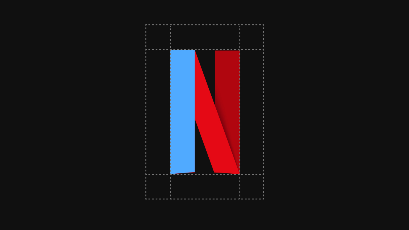
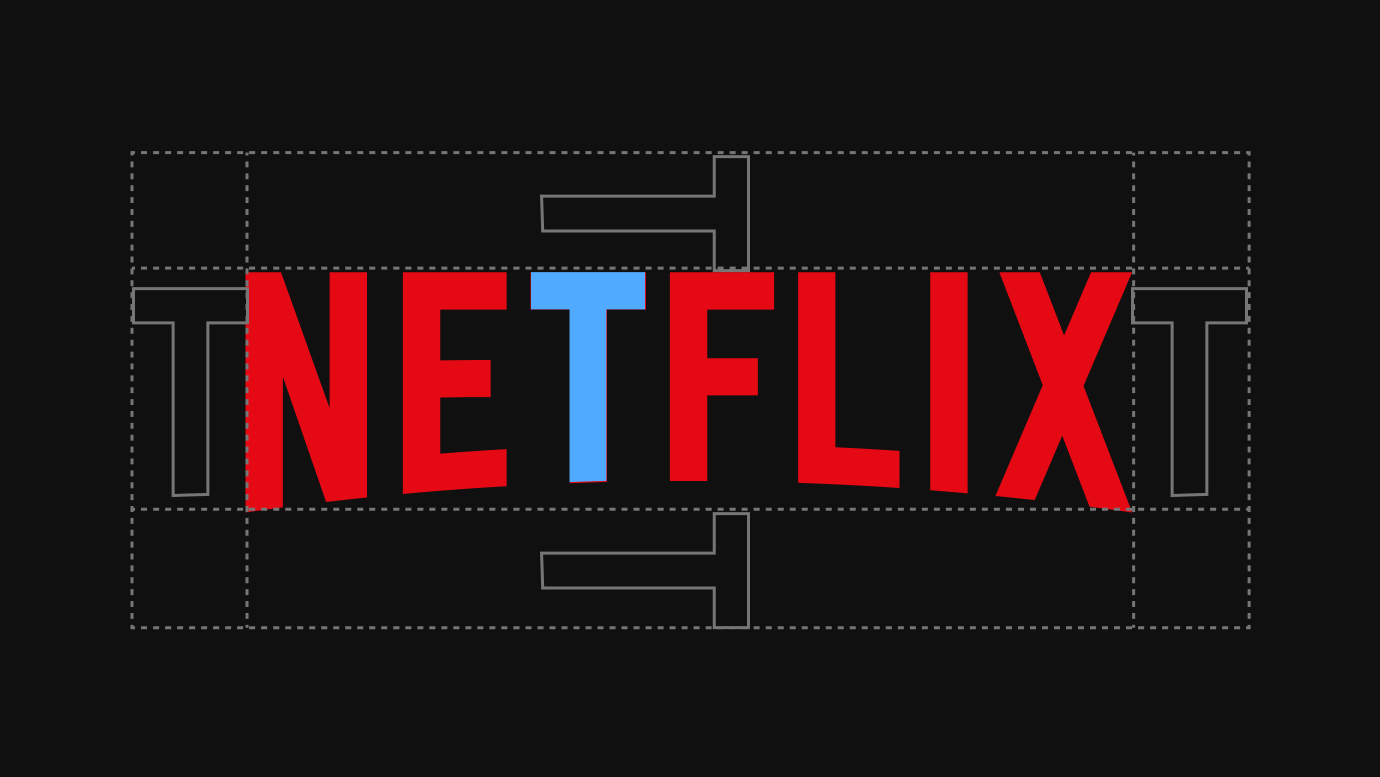
Two marks. The N Symbol (a folded red ribbon N in Netflix Red with a Symbol Dark Red fold) leads in high-awareness markets; the NETFLIX Wordmark carries recognition in low-awareness markets or when production limits colour. The symbol always appears in its signature colour. netflix.com uses the red Wordmark in the nav and the N Symbol only inside poster art.
Source: brand.netflix.com/en/assets/logosweb.archive.org/web/20220223165412/https://brand.netflix.com/en/api/brand_assets
Unlimited movies
With a black page, red reads as the brand and the next step at once; the cool navy gradients keep cards from competing with poster art.
The guide publishes two colours, both for the logos: Netflix Red #E50914 (PMS 1795 C) and Symbol Dark Red #B20710 (PMS 7627 C). netflix.com builds everything else from black: a #000000 page, #2D2D2D and #232323 greys, white type with 70% and 50% white for secondary text, and two deep navy-to-plum gradients for cards and the promo banner. Red is the logo and the buttons.
Not published: the full colour palette and textures chapters (brand.netflix.com/en/assets/color and /textures are behind partner sign-in).
Unlimited movies, TV shows, and more
Unlimited movies, TV shows, and more
UNLIMITED MOVIES
One family at three weights keeps a text-light page calm; the art carries the drama.
| Their face | Use | License | Open stand-in |
|---|---|---|---|
| Netflix Sans | Headlines (Bold 700) and section heads (Medium 500) | Proprietary (Netflix, made with Dalton Maag, 2018); not licensed for third parties | Geist Closest rendered match among 14 open grotesques: 100-102% line width and 96-102% ink at weights 400, 560 and 700 (see calibration) |
| Netflix Sans | Body, FAQ, buttons, footer (Regular 400, Medium 500) | Proprietary (Netflix, made with Dalton Maag, 2018); not licensed for third parties | Geist Same face as display; Geist 400 matches Regular at 101% width, 102% ink |
Netflix Sans, a proprietary geometric grotesque made with Dalton Maag (2018, replacing Gotham), in thin to black. netflix.com uses three weights: Bold 700 for the hero headline, Medium 500 for section heads, card titles, buttons and the price line, Regular 400 for everything else. No uppercase styling, normal tracking, line height 1.25.
Source: netflix.comitsnicethat.com/news/netflix-sans-typeface-dalton-maag-graphic-design-210318
Two kinds on netflix.com: small 24px solid UI glyphs (chevron, caret, translate, a thin 1px X for FAQ), and glossy illustrated 72px spot icons (TV, download disc, telescope, profile tiles, popcorn) with pink-magenta-red gradients.
Source: netflix.com
netflix.com has no brand photography: its imagery is title key art.
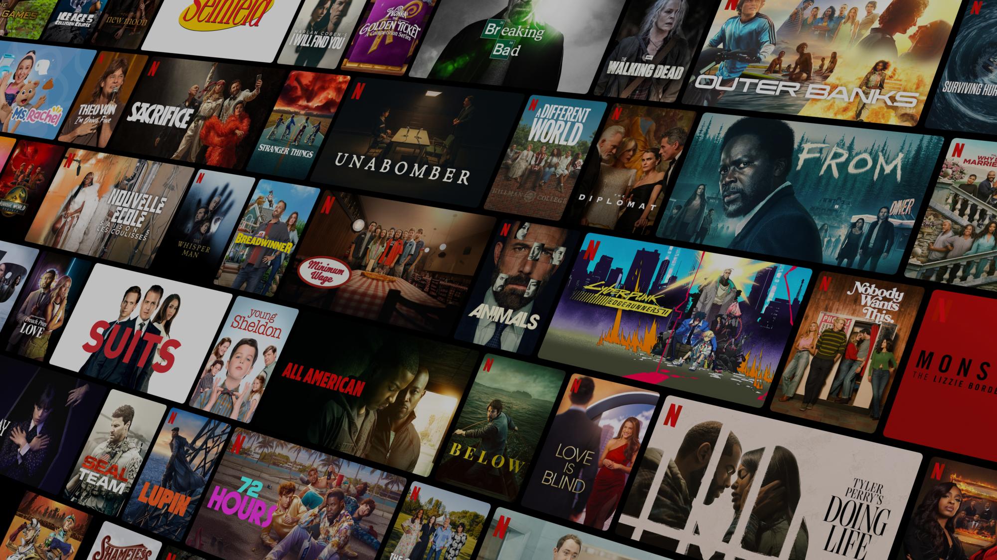
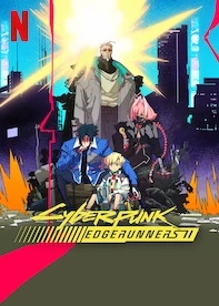
netflix.com has no brand photography: its imagery is title key art. The hero is a tilted wall of posters under a dark scrim and Trending Now shows ten vertical posters. This art is studio-owned and credited here as Netflix's homepage imagery, not as photography rules. The guide's application examples show the N Symbol set against title art on posters and billboards.
Not published: photography rules (brand.netflix.com/en/assets/photography is behind partner sign-in).
The guide names a Motion + Sonic Toolkit and shows partnership end cards (stacked single and sequential lockups) as videos; the toolkit itself is gated.
The guide names a Motion + Sonic Toolkit and shows partnership end cards (stacked single and sequential lockups) as videos; the toolkit itself is gated. Since February 2019 originals open with an animated N: the ribbon N then a zoom into coloured bands, with the TUDUM sound unchanged. On netflix.com motion is small: buttons change colour in 0.25s and posters scale to 1.05 in 0.2s.
Not published: easing curves and durations for brand animation (the Motion + Sonic Toolkit is gated).
Source: brand.netflix.com/en/assets/logosmobilesyrup.com/2019/02/01/new-netflix-logo-animationabout.netflix.com/en/news/netflix-announces-tudum-a-global-fan-event-live-from-brazilnetflix.com
A red arc of light closes the hero
The glowing arc · once on netflix.com, at the foot of the hero, where the poster wall meets the black page (observed 2026-10-29)
1 2 3 behind the posters
Outlined rank numerals · Trending Now on netflix.com
Unlimited movies, TV shows, and more
The poster wall under a scrim · the netflix.com hero
Get Started
Red means the brand or the next step · every netflix.com band
Specimens use sample copy, not Netflix’s.
One centered container (1144px at 1440, 148px margins; 24px on phones) on a black page. A full-bleed hero, then content bands 64-72px apart, each led by a 24px Medium heading at the left. Grids are even: five posters, four cards, two FAQ columns.
Measured from netflix.com's computed styles, pseudo-elements and bounding boxes at 390, 768, 1024 and 1440px wide on 2026-10-29 (signed-out US page, Chromium); hover and focus states by hovering in Playwright.
| Measure | Desktop | Phone |
|---|---|---|
| Page margin | 148px | 24px |
| Section padding | 64px | 48px |
| Hero text width | max 588px, centered | full width |
| Card gap | 16px | 16px |
| Navigation | 88px | 88px |
Hero headline
Netflix Sans · 56px (phone 32) · line 1.25 · tracking -0.56px · weight 700
Hero subline
Netflix Sans · 20px (phone 16) · line 1.25 · weight 560
Form prompt
Netflix Sans · 16px · line 1.5 · weight 400
Section headline
Netflix Sans · 24px (phone 18) · line 1.25 · weight 560
Promo title
Netflix Sans · 20px · line 1.25 · weight 560
Card title
Netflix Sans · 24px (phone 20) · line 1.25 · weight 560
Card body
Netflix Sans · 16px · line 1.25 · weight 400
FAQ question
Netflix Sans · 24px (phone 18) · line 1.25 · weight 400
FAQ answer
Netflix Sans · 24px (phone 18) · line 1.25 · weight 400
Rank numeral
Netflix Sans · 100px (phone 64) · line 1 · weight 700
Button large
Netflix Sans · 24px (phone 18) · line 1 · weight 560
Button small
Netflix Sans · 14px · line 1 · weight 560
Button medium
Netflix Sans · 16px · line 1 · weight 560
Footer phone line
Netflix Sans · 16px · line 1.25 · weight 400
Footer link
Netflix Sans · 14px · line 1.5 · weight 400
Legal note
Netflix Sans · 13px · line 1.5 · weight 400
How Netflix’s own landing pages are built, observed on netflix.com, 2026-10-29. The full measurements are in spec.md.
Source: netflix.com
One owned face across thousands of titles and every market makes the catalogue read as one brand without adding colour or ornament. Our reading
A few seconds of motion before every title turns the N into a cinema ident, repeated billions of times. Our reading
It turns a four-note ident into a place fans go, without adding a new mark. Our reading
How our engine applies Netflix's system to each format. This is our recipe built from their public rules and homepage, not something Netflix publishes. Level = how loud the signature moves are.
| Format | What they did | Source |
|---|---|---|
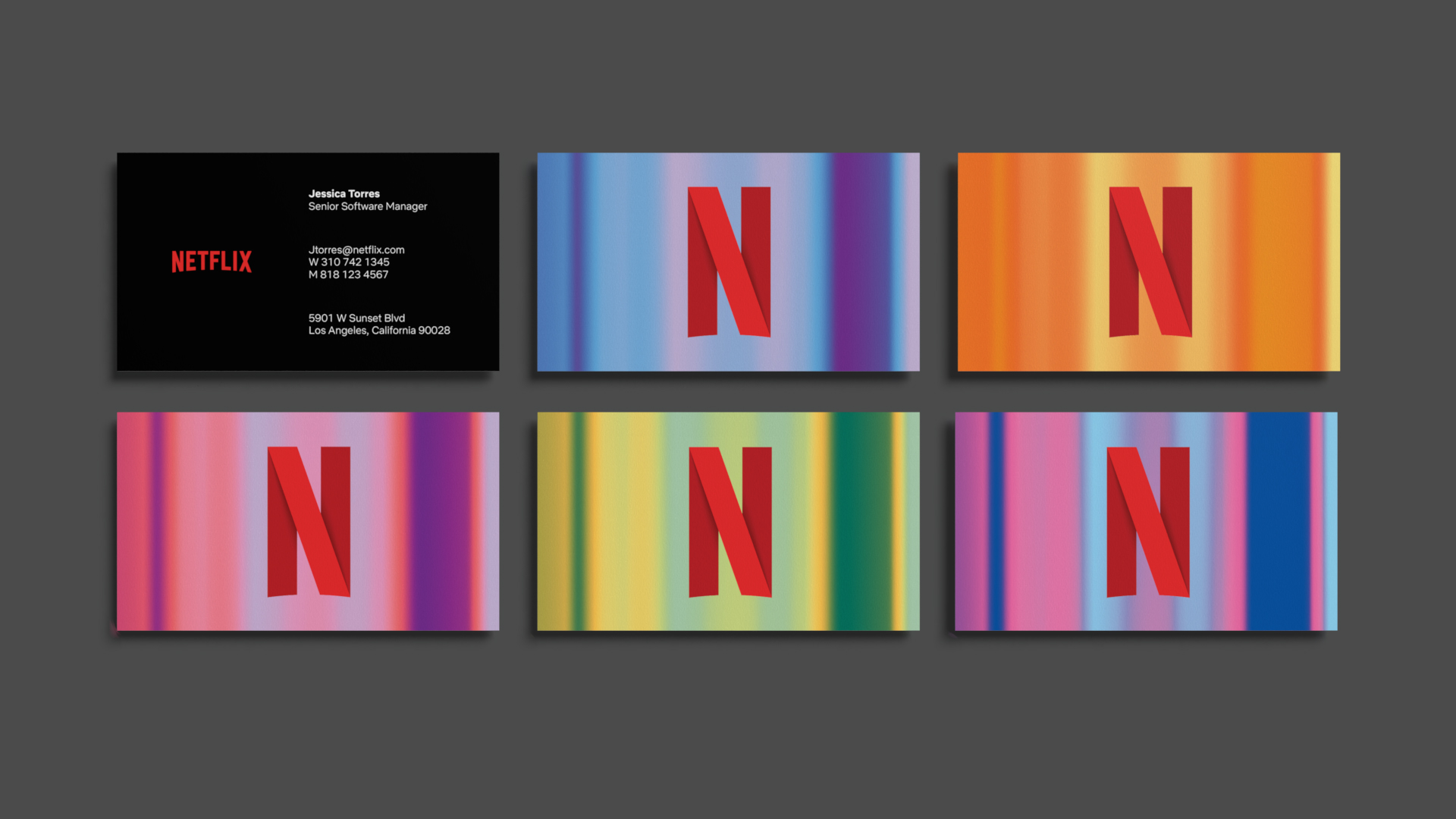
| business cards | Black card with the red wordmark; reverse cards in colour-streak textures with the N Symbol. | brand.netflix.com/en/assets/logos |
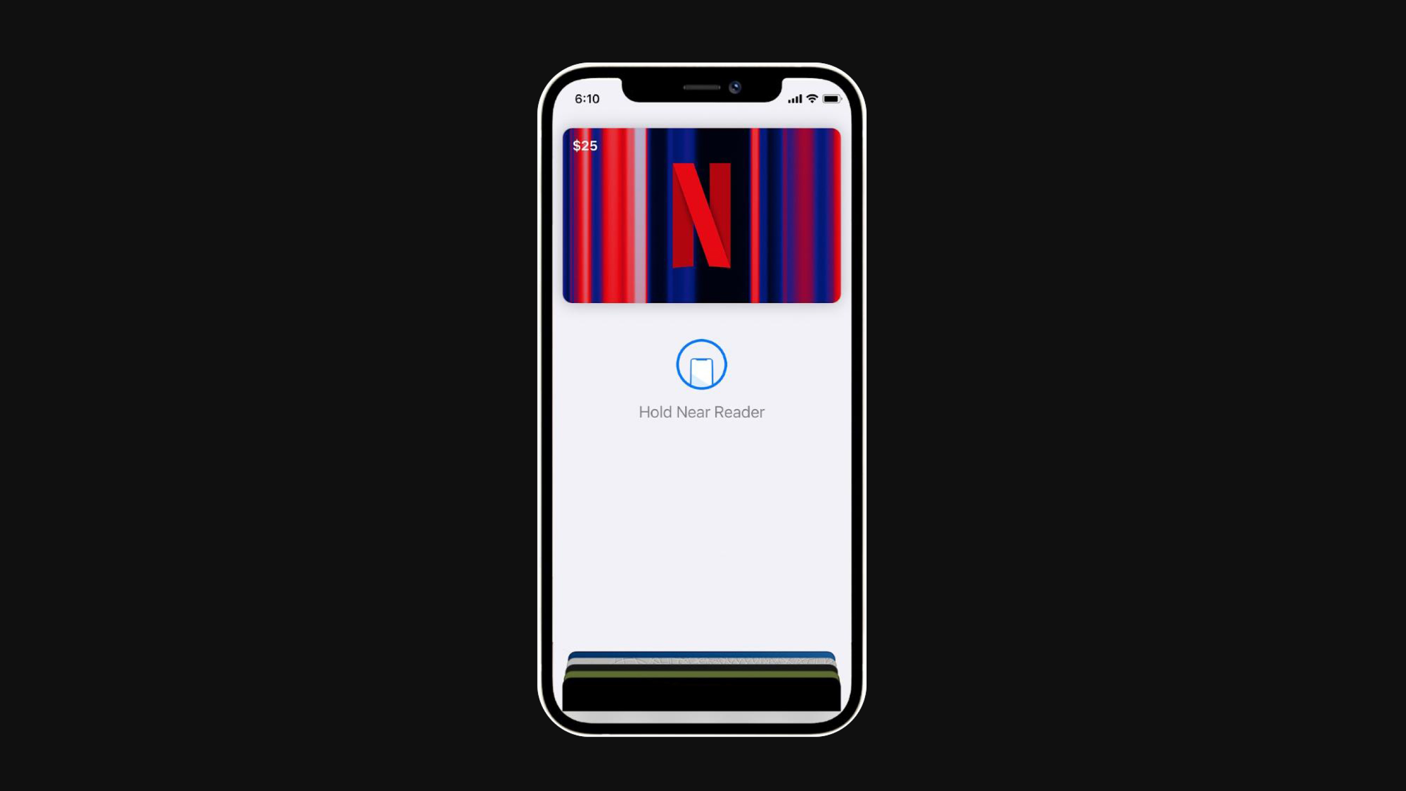
| mobile wallet card | N Symbol centered over a red-and-blue streak texture card on a phone. | brand.netflix.com/en/assets/logos |
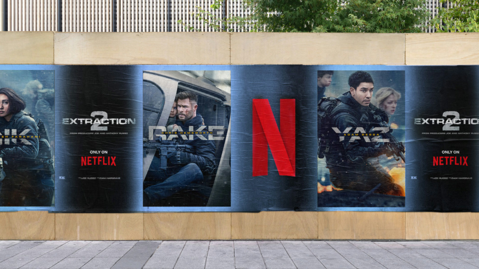
| wild posting | Extraction 2 posters in a row with a large N Symbol between them. | brand.netflix.com/en/assets/logos |
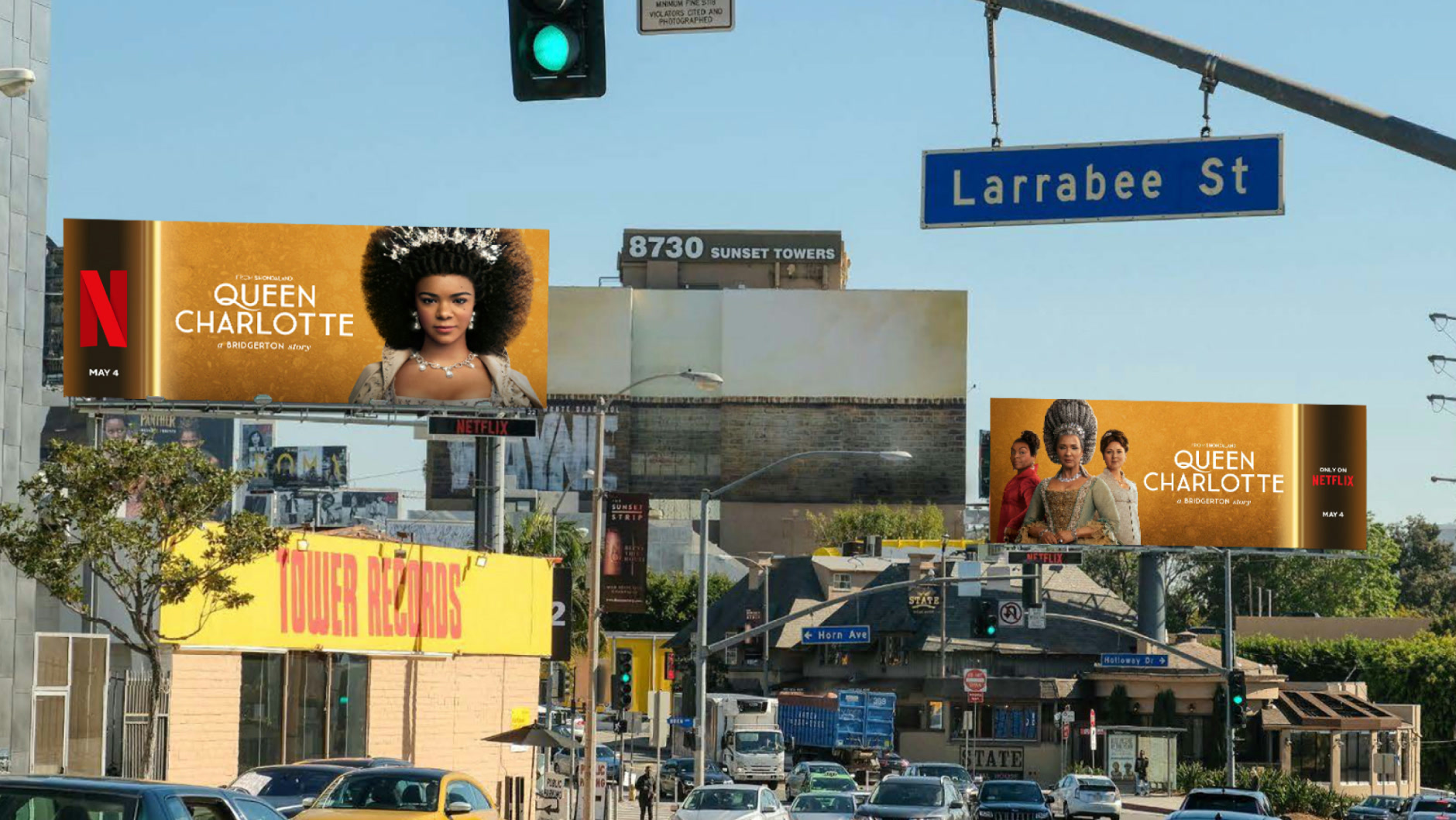
| billboards | Queen Charlotte billboards on Sunset Blvd with the N Symbol at the left of each board. | brand.netflix.com/en/assets/logos |
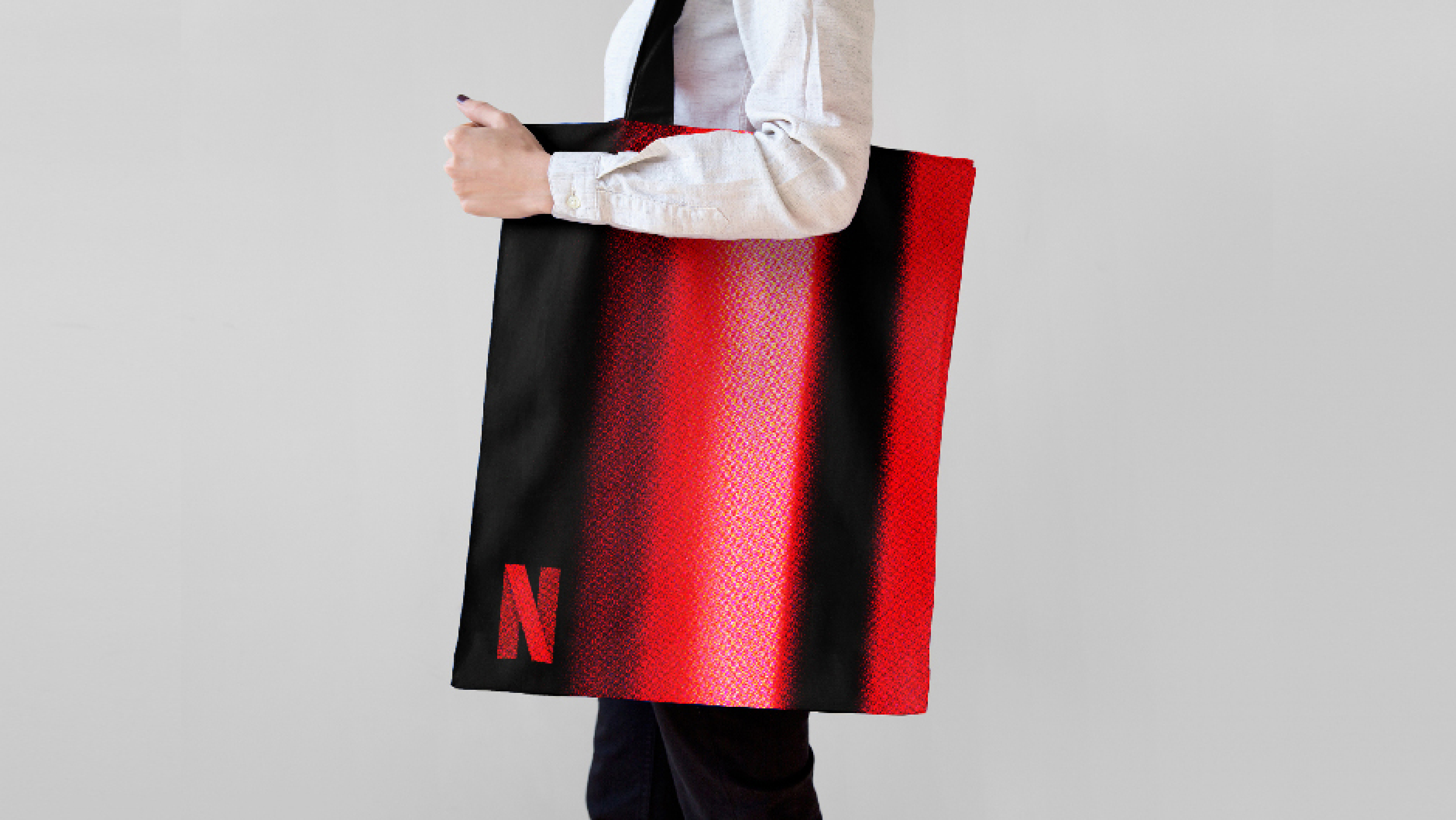
| tote bag | Black-to-red streak tote with a small N Symbol low on the side. | brand.netflix.com/en/assets/logos |
| co-branding | Netflix mark first, a red vertical rule, then the partner mark at equal size. | brand.netflix.com/en/assets/logos |
| website | netflix.com signed-out page: poster-wall hero, ranked top 10, benefit cards, open FAQ, email capture twice. | netflix.com |
| Format | Loudness | Must appear | What varies |
|---|---|---|---|
| Landing page | Black page, red wordmark floating over a scrimmed poster-wall hero, centered Bold two-line headline, price line, inline email + red Get Started, the glowing arc, then left-headed bands (ranked posters, gradient benefit cards, open FAQ), the form again, grey underlined footer links | which titles fill the wall and the top 10; the promo banner offer | |
| Deck | Black slides, white Netflix Sans (Geist), red only on the logo and the ask | title art as full-bleed backgrounds under a scrim | |
| Proposal page | Homepage voice: plain, priced, one next step as a red button | a poster row as proof | |
| Social post | Title art first, N Symbol small in a corner with clear space | streak textures behind the symbol | |
| Black, white type, one red button | one poster row | ||
| Out of home | Key art plus the N Symbol, never the Wordmark and Symbol together | which title |
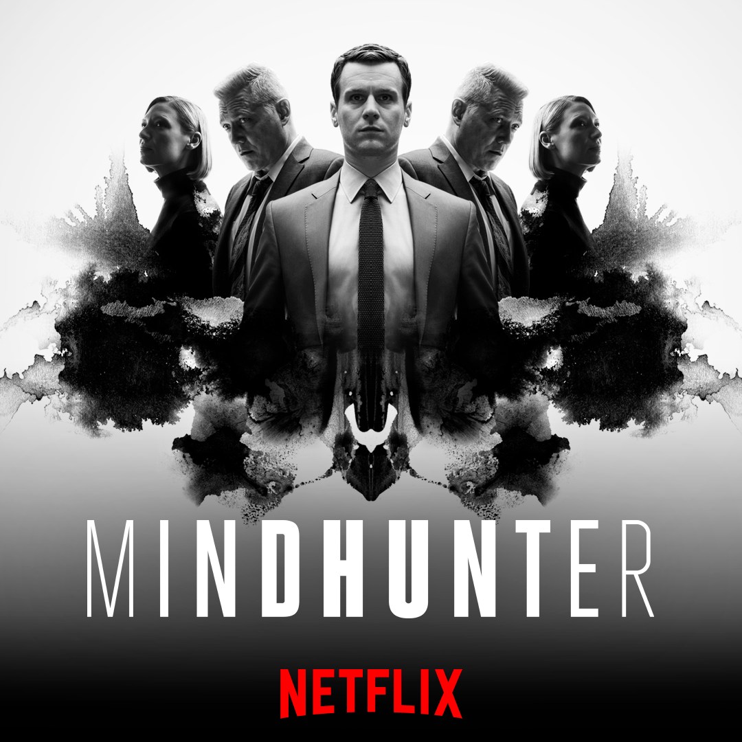 MindhunterMeta · Oct 2026 – now
 Ten years ago, Netflix went from entertaining audiences…LinkedIn · May 2026
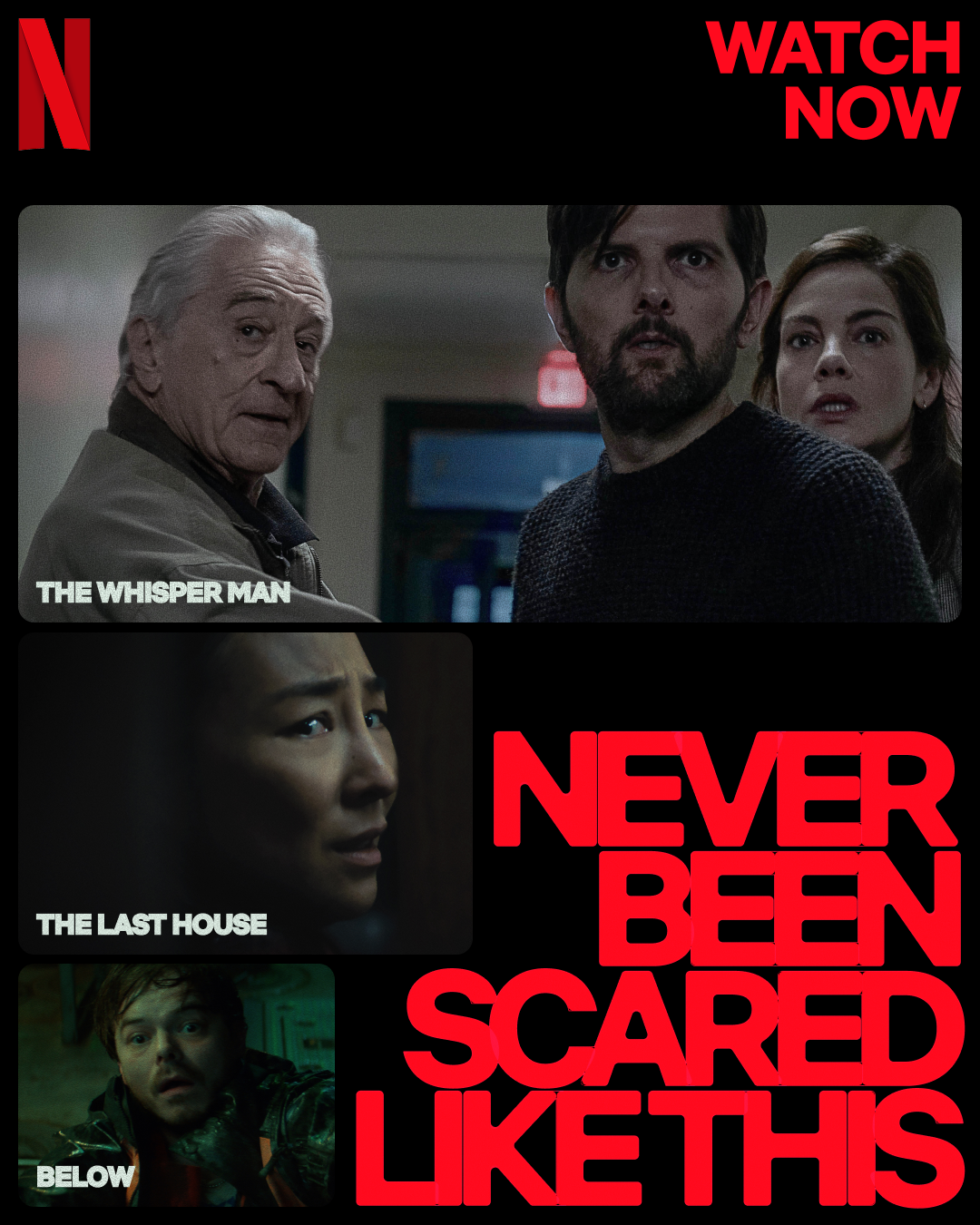 Now Playing on NetflixMeta · Oct 2026 – now
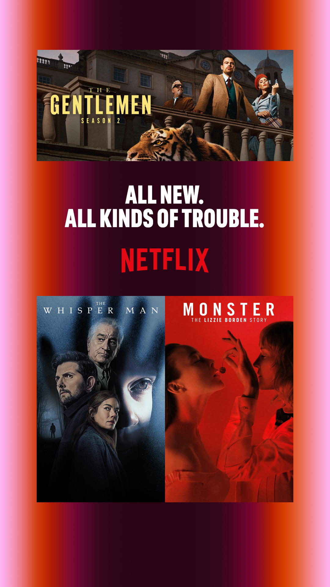 New on NetflixMeta · Oct 2026 – now
Your name and logo, Netflix’s system.
Use this kit for my brand Use this brand in Claude
Get your brand audit Put your brand in Claude What goes in a brand book
Each value is marked published, observed, our reading or our recipe, with its source. Checked 2026-10-29. Not affiliated with Netflix.