Intelligent data
Give AI the real-time, trusted enterprise data and context it needs. Observed
Brand book
Engineered restraint. IBM fixes the parts that carry identity (Plex, the 2x Grid, Blue 60, the 8-bar) and lets teams flex only along one published axis, productive to expressive, so a data table and a keynote film still read as the same company. Our reading
Productive to expressive: the same parts run from quiet task UI (14px type, productive curves, grays and one blue) to expressive brand moments (light display type, expressive curves, gradient and vibrant families, flat or isometric illustration, the rebus).
Source: ibm.com/design/language/animation/overviewcarbondesignsystem.com/elements/motion/overviewcarbondesignsystem.com/elements/typography/type-setsibm.com/design/language/iconography/pictograms/design
IBM publishes no percentages. The guide says grays and the core black, white and blue should dominate every experience, with other families used sparingly; the split below is our reading of ibm.com on 2026-10-29 (white ground, Gray 100 type, blue actions, a Gray 100 footer), not an IBM figure..
Two scoped voices. The levels are our reading of IBM's pages, not a published scale.
Our engine's setting, built from their rules.
Cover the 8-bar. IBM's own test: it should still read as IBM through Plex, the grid, grays and one blue.
Every edge, gap and image size should land on the 8px mini unit and the column grid; anything off-grid goes back.
Every number has a named source beside it, and no line could pass for hype.
IBM has always been a medium between people and machines, science, service and society, working in partnership toward progress (paraphrase of the guide's point of view). Published
Give AI the real-time, trusted enterprise data and context it needs. Observed
Build and modernize software and workloads faster with AI. Observed
Automate and govern IT and agent operations across their lifecycle. Observed
Secure and control identities, secrets and agents across hybrid environments. Observed
IBM TechXchange 2026
Step inside IBM’s hands-on technical conference through replays and insights
Catch up with the highlights
The future starts at Current
IBM took its name in 1924. Its design heritage is modernist: Eliot Noyes taught that brand is character built through curation, Paul Rand drew the 8-bar logo (unchanged since 1972) and the 1981 Eye-Bee-M rebus, and Charles and Ray Eames brought out IBM's playful side. The IBM Design Language carries their attitude, not their mid-century style, into Plex, the 2x Grid and Carbon.
Decide whether a thing is essential before doing it; remove everything gratuitous; respect the time asked of people (paraphrase).
PublishedFixed and fluid elements together: recognizable, repeatable, reusable, identifiable as IBM with the logo covered (paraphrase).
PublishedEverything communicates; every execution should show care, craft and expertise, down to the last detail (paraphrase).
PublishedLead, think ahead, communicate confidence and remove friction; give more than it takes (paraphrase).
PublishedCategory. Global provider of hybrid cloud, AI and consulting services, working with clients in more than 175 countries (paraphrase of the About IBM boilerplate). Published
Unnamed: ibm.com names no competitors. The implied alternative is AI that stays in pilots, and point tools that don't connect to existing systems.
IBM is a global provider of hybrid cloud, AI and consulting services, helping clients in more than 175 countries, across sectors such as financial services, telecommunications and healthcare, modernize their operations, including on its hybrid cloud platform and Red Hat OpenShift. It also works in quantum computing and industry-specific cloud, with stated commitments to trust, transparency, responsibility, inclusivity and service.
Let's create Published
Let's create smarter business Published
THINK Published
Design is how we build bonds. Published
The essentials to scale AI
Take AI beyond experimentation and into everyday operations.
Bring agents under control with IBM® watsonx Orchestrate®
Build and modernize software faster with IBM Bob™
Smarter impact powered by IBM
See how watsonx Orchestrate helped Scuderia Ferrari automate fan content
Training for what’s next
Stay connected
IBM's public messaging runs on the 'Let's create' platform (2022), refreshed in 2025 as 'Let's create smarter business', aimed at moving enterprise AI from pilots to value. The homepage turns that into four capabilities (intelligent data, workload action, automated operations, hybrid control) and a stack of verb-first product lines, each with one sourced number.
Source: newsroom.ibm.com/2025-09-03-IBM-Addresses-the-AI-Adoption-Gap-with-Lets-create-smarter-businessibm.com/us-en
Connect enterprise systems with IBM Integration
Unleash revolutionary AI-powered synergy!
The manifesto voice keeps designers aligned on intent; the plain voice serves busy enterprise readers.



The manifesto voice keeps designers aligned on intent; the plain voice serves busy enterprise readers. Keeping them apart stops brand poetry leaking into product claims.
EssentialConfidentPlain
Two voices. The design guide speaks in manifesto: short declaratives, arrows and equals signs ('Think → Guide', 'Stand for = Stand out'), Paul Rand quotes, 'we' as IBMers. The homepage is plainer and institutional: sentence-case, verb-first lines ('Bring agents under control with IBM watsonx Orchestrate'), one benefit and one number. Carbon points copywriters to IBM Style for grammar, which is not published openly.
ExploreLearn howSee howDiscoverBuildConnectSecureBringManage, govern, securewatsonx (lowercase w)
ALL CAPS paragraphsstraight quoteshyphen or en dash in place of an em dashhyperbole and jargon
Source: ibm.com/design/language/layout/overviewibm.com/design/language/philosophy/principlesibm.com/design/language/photography/tips-and-techniquesibm.com/design/language/iconography/overview
| Case | sentence case |
|---|---|
| Spelling | US English |
| Dates (homepage) | 10 November 2026, 12 PM ET |
| CTA pattern | Explore / Learn how / See how + object |
Source: ibm.com/design/language/philosophy/povibm.com/design/language/typography/type-basicsibm.com/design/language/photography/tips-and-techniquescarbondesignsystem.com/guidelines/content/writing-styleibm.com/us-en


Logos shown from IBM's public design-language pages and Brandfetch for reference. IBM and the 8-bar logo are trademarks of International Business Machines Corporation. Not affiliated, and not for download.
8-bar in black on white
8-bar in Blue 70 on Blue 60
One unchanging mark authenticates everything it touches; the rebus gives IBM a warmer, playful mark without diluting the official sign-off.
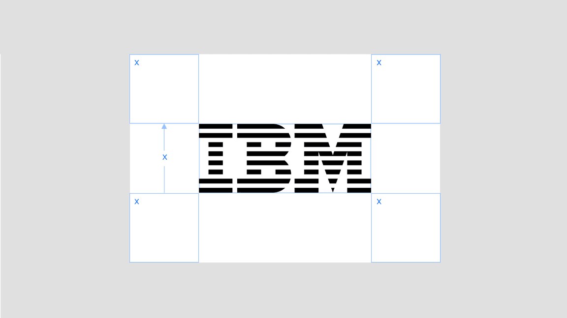
| Clear space (8-bar) | 1x logo height |
|---|---|
| Clear space (rebus) | 1x M height |
| Contrast | 5 steps minimum |
| Approved positive pairs | Black/Gray 30, Blue 70/Blue 20, Gray 60/White |
| Approved reversed pairs | Blue 50/Black, Blue 40/Blue 90, Gray 10/Blue 60 |
| Legal line | © International Business Machines [year] |
| Minimum size | not published |
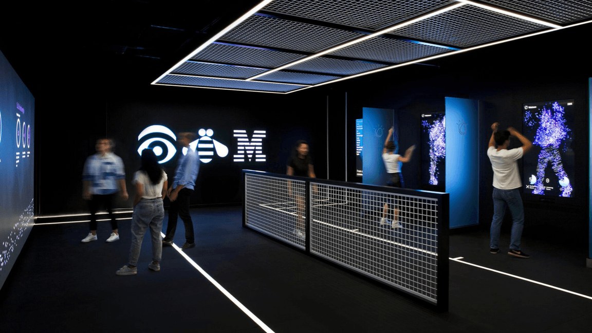
Two marks. The 8-bar logo, drawn by Paul Rand and unchanged since 1972, is the official sign-off and appears on every official communication. Positive and reversed versions differ: on light grounds the black stripes are drawn thicker, on dark grounds the white stripes are thinner, and counter points are sharper on the positive. The 1981 Eye-Bee-M rebus (in MoMA's collection) and the totem rebus are for merchandise, badges and events; the classic rebus in original colors only on black with permission.
Source: ibm.com/design/language/ibm-logos/8-baribm.com/design/language/ibm-logos/rebus
Explore the event
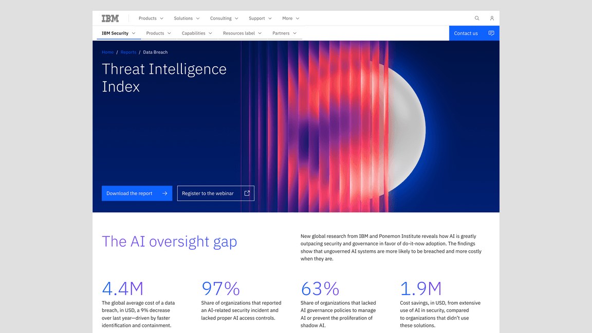
Mostly grays, one blue
A page flooded in blue
Restricting action to one blue makes every interaction recognizably IBM, and the step system makes contrast predictable without measuring.
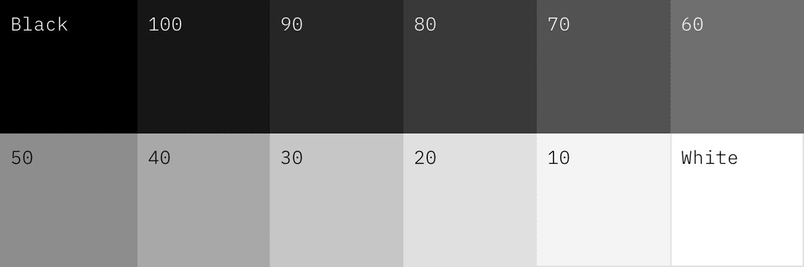
| Core action | Blue 60 #0F62FE |
|---|---|
| Primary text (light) | Gray 100 #161616 |
| Secondary text | Gray 70 #525252 |
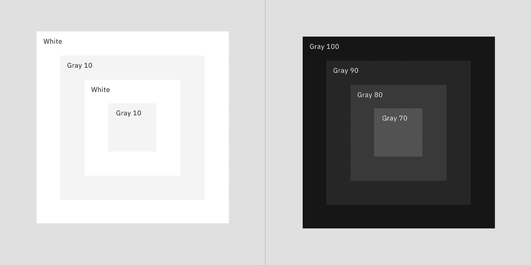
| Page grounds | White #FFFFFF, Gray 10 #F4F4F4, Gray 90 #262626, Gray 100 #161616 |
| Focus | 2px Blue 60 (light themes), White (dark) |
| Alerts | Red 60 #DA1E28, Green 50 #24A148, Alert 40 #FF832B, Alert 30 #F1C21B |
| Usage ratio | not published |
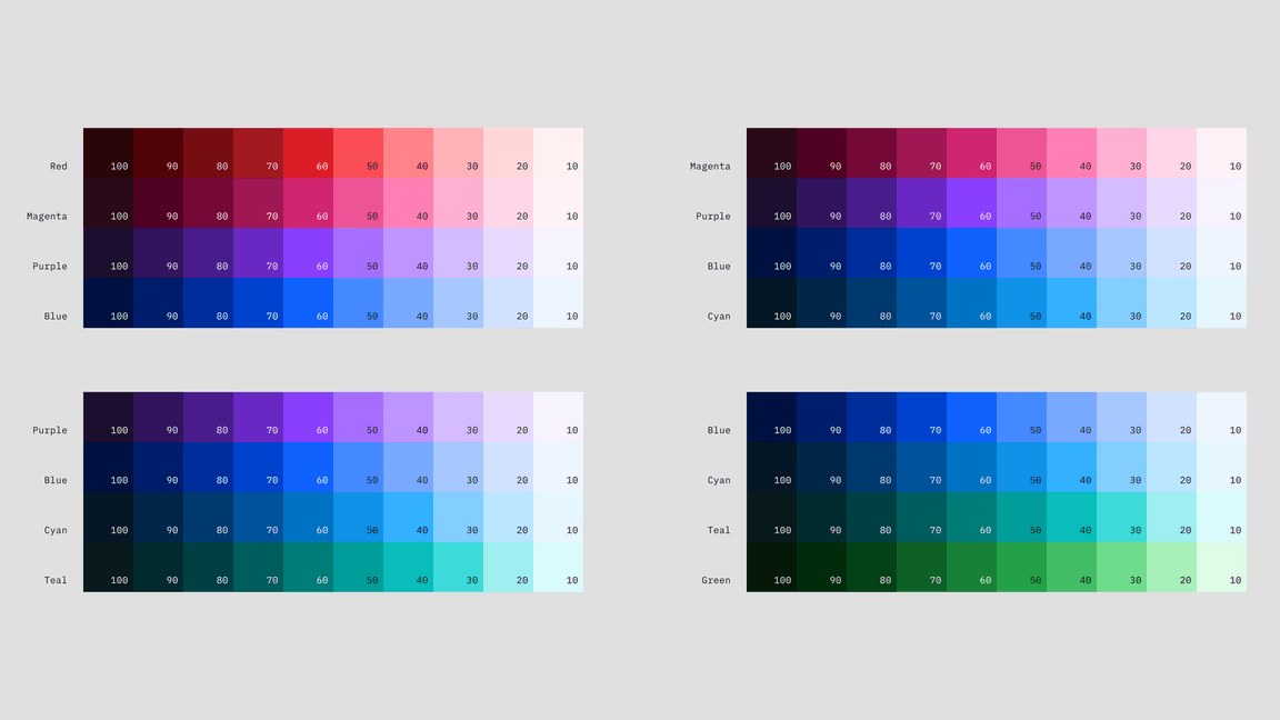
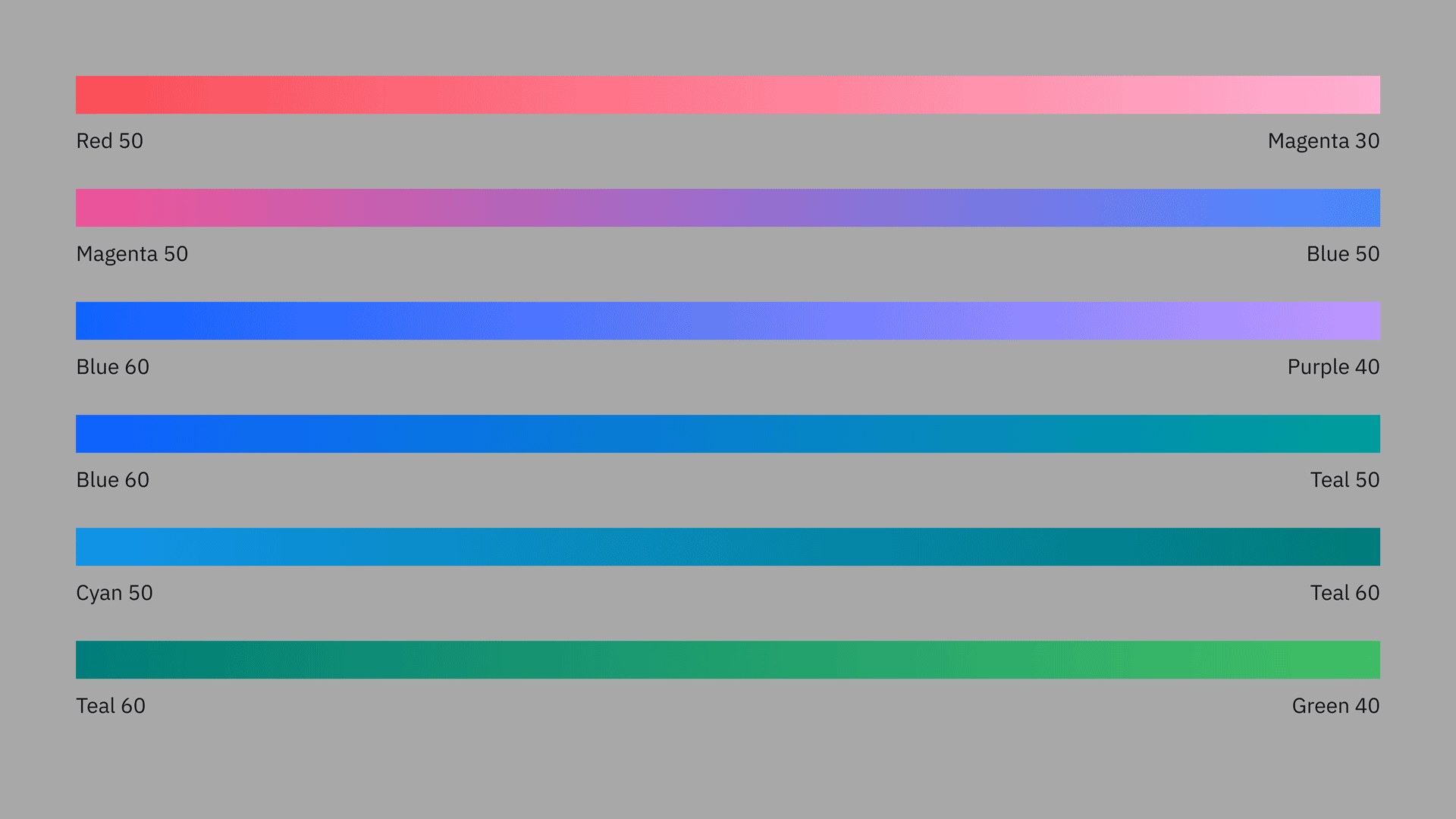
Ten color families (red, magenta, purple, blue, cyan, teal, green and three grays: cool, neutral, warm), ten steps each from 10 to 100, plus black and white. Blue is at the core; even the reds lean blue. Experiences are dominated by grays and the core black, white and blue, with other families for purposeful moments. In UI, neutral gray is dominant and Blue 60 is the single action color. Carbon's four themes are White, Gray 10, Gray 90 and Gray 100, named for their page ground.
Source: ibm.com/design/language/colorcarbondesignsystem.com/elements/color/overviewcarbondesignsystem.com/elements/color/tokensibm.com/design/language/ibm-logos/8-bar
Let's create
The essentials to scale AI
THE ESSENTIALS TO SCALE AI
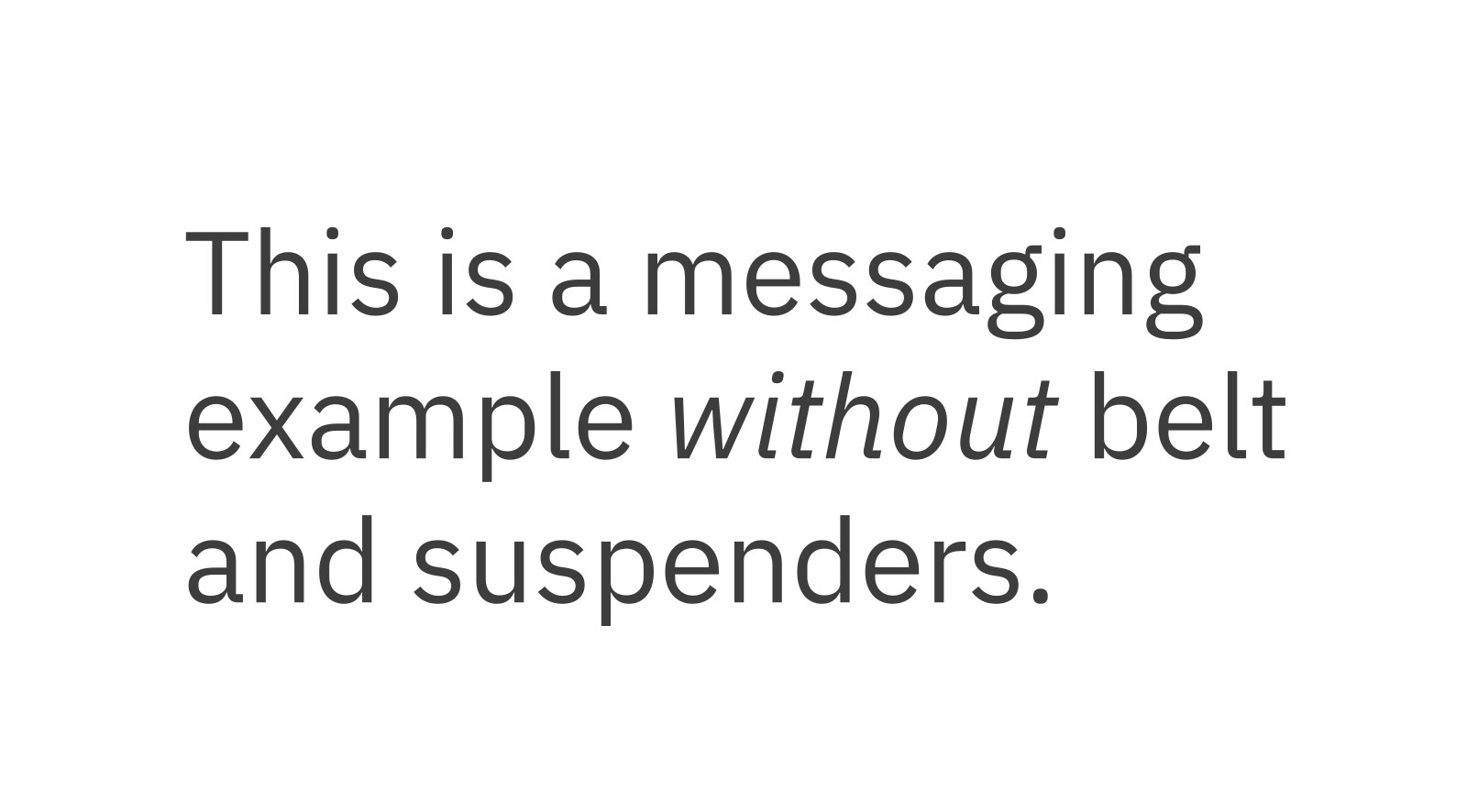
Owning an open typeface makes IBM's voice consistent in every product and language, and lets anyone build in the real face.

| Their face | Use | License | Open stand-in |
|---|---|---|---|
| IBM Plex Sans | Headlines (Light 300 at display sizes), subheads, body, labels | Open (SIL Open Font License); design patented by IBM. On Google Fonts and Adobe Fonts; the GitHub release is the most current | IBM Plex Sans No stand-in: the real face is open and on Google Fonts. |
| IBM Plex Sans | Body (Regular 400), labels and small headings (SemiBold 600) | Open (SIL OFL) | IBM Plex Sans No stand-in: the real face. |
| IBM Plex Mono | Code and code snippets in communications and specs (every glyph in a 600-unit width) | Open (SIL OFL) | IBM Plex Mono No stand-in: the real face. |
| IBM Plex Serif | Editorial; pairs with IBM Plex Math for research | Open (SIL OFL) | IBM Plex Serif No stand-in: the real face. |
| Scale steps (px) | 12, 14, 16, 18, 20, 24, 28, 32, 36, 42, 48, 54, 60, 68, 76, 84, 92 |
|---|---|
| Equation | Xn = Xn-1 + {INT[(n-2)/4] + 1} * 2, y0 = 12px |
| Display (Carbon) | 54/64 300, 60/70 300 -0.64px, 92/102 300 -0.64px |
| Body | body-02 16/24 400; body-01 14/20 400 +0.16px |
| Small heading | heading-02 16/24 600 |
| Code | code-02 Plex Mono 14/20 400 +0.32px |
| ibm.com H1 (observed) | 53.6/62.8 weight 300 at 1440; 32.8/41 weight 400 at 390 |
IBM Plex is the corporate typeface: four subfamilies (Sans, Serif, Mono, Condensed), eight weights with italics, over 100 Latin-script languages plus Arabic, Chinese, Cyrillic, Devanagari, Greek, Hebrew, Japanese, Korean and Thai. It is open source (OFL) and patented. The universal type scale comes from one equation starting at 12px; Carbon splits it into productive (14px base) and expressive (16px base) sets, with light 300 display styles. ibm.com sets its H1 in Plex Sans Light (observed).
Source: ibm.com/design/language/typography/typefaceibm.com/design/language/typography/type-basicsibm.com/design/language/typography/type-scalecarbondesignsystem.com/elements/typography/type-setsibm.com/us-en
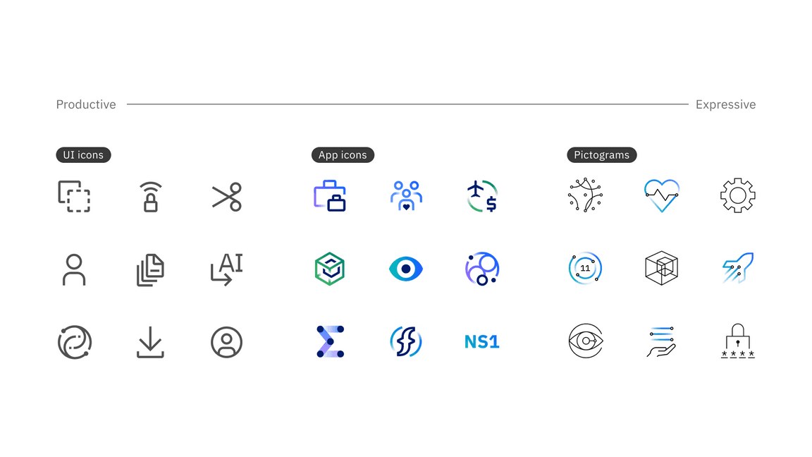
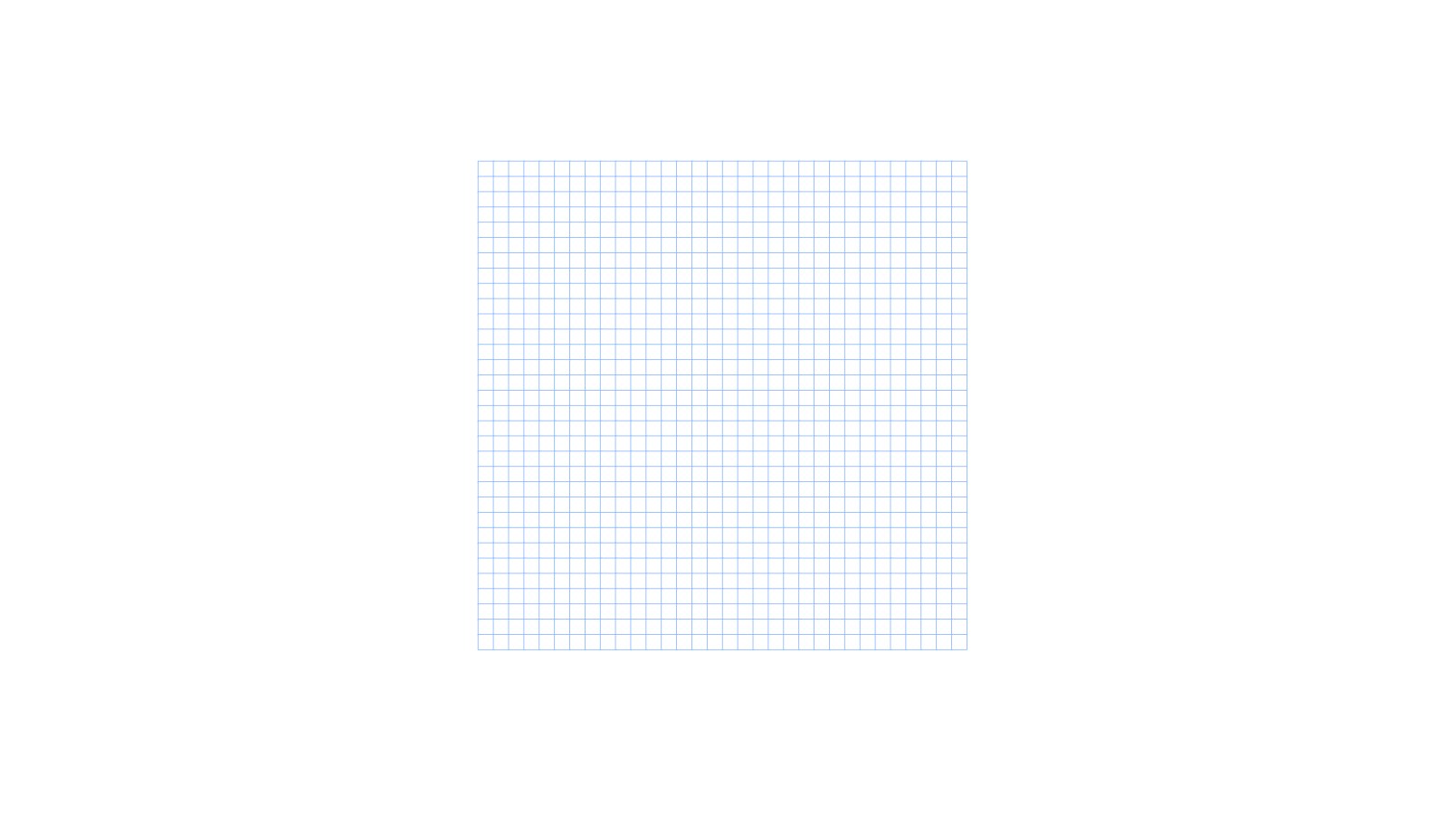
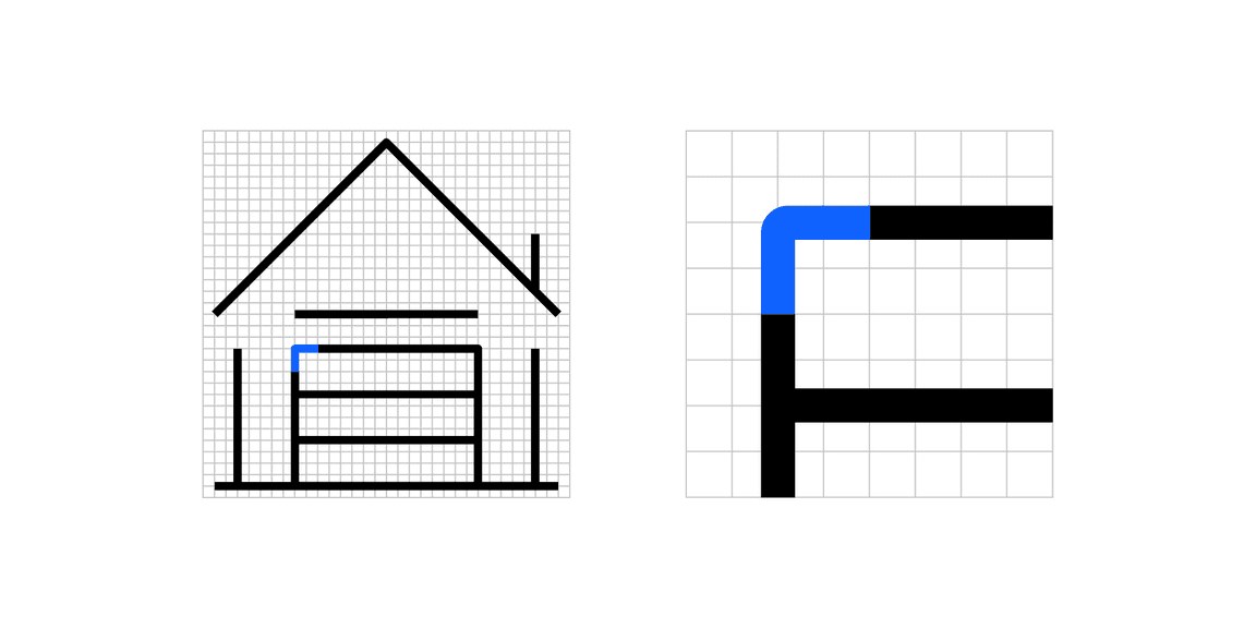
Sharing Plex's details makes icons and type read as one system, and a single stroke weight keeps every icon the same visual weight.
| Grid | 32 x 32px |
|---|---|
| UI stroke | 2px |
| Pictogram stroke | 0.72px / 1.44px expressive |
| Corner radius | 2px (multiples of two) |
| Sizes | 16, 20, 24, 32px |
| Touch target | 44px |
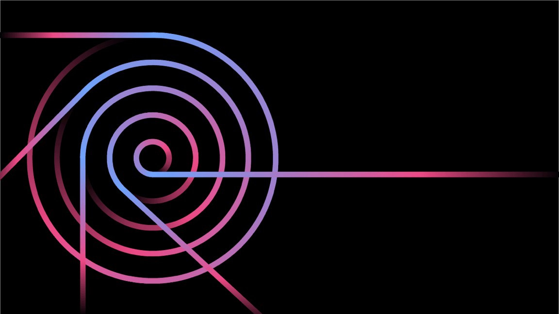
Three types: UI icons for functional actions, app icons for product identification, and pictograms for broad concepts in presentations, web, merchandise and signage. All are drawn on a 32px grid and borrow details from Plex: rounded exteriors with 90° interiors, slab characteristics, square caps and square arrow tips. Pictograms come productive (thin line) or expressive (thicker gradient stroke).
Source: ibm.com/design/language/iconography/overviewibm.com/design/language/iconography/ui-icons/designibm.com/design/language/iconography/pictograms/designcarbondesignsystem.com/elements/icons/usage
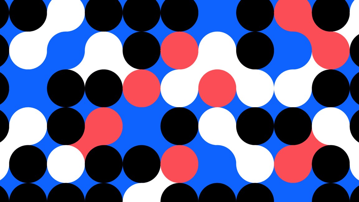
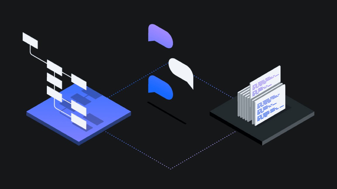
Building every drawing from grid-snapped basic shapes and standard angles keeps hundreds of illustrators recognizably IBM.
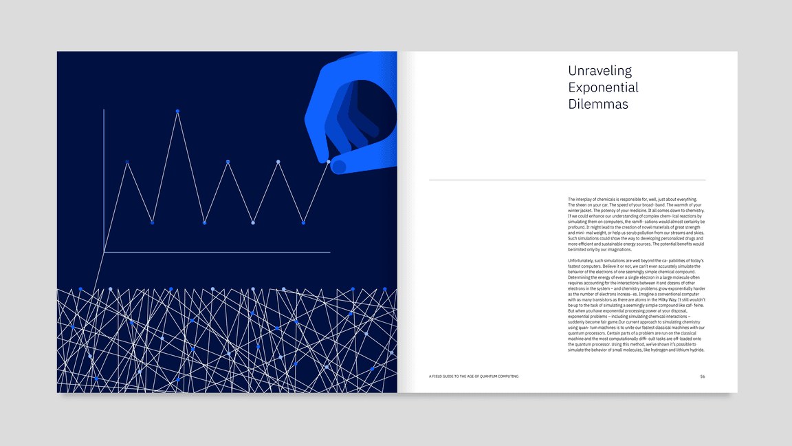
| Line style grid | 4px |
|---|---|
| Flat style grid | 8px, min shape and gap 8px |
| Angles | 15° increments |
| Aspect ratios | 16:9, 4:3, 3:2, 2:1, 1:1 |
Three styles: line (a 4px grid, few line weights, an extension of pictogram logic), flat (bold geometric shapes on an 8px grid, at least 8px wide with 8px spacing) and isometric (dimension for complex processes). Principles: engineered, clear, nimble, diverse, delightful. Color starts from the IBM palette in monochromatic, analogous or complementary schemes.
Source: ibm.com/design/language/illustration/overviewibm.com/design/language/illustration/tips-and-techniquesibm.com/design/language/illustration/flat-style/designibm.com/design/language/illustration/line-style/design
IBM presents itself as an objective observer of the working world; real, sharply focused scenes back up a fact-based brand.
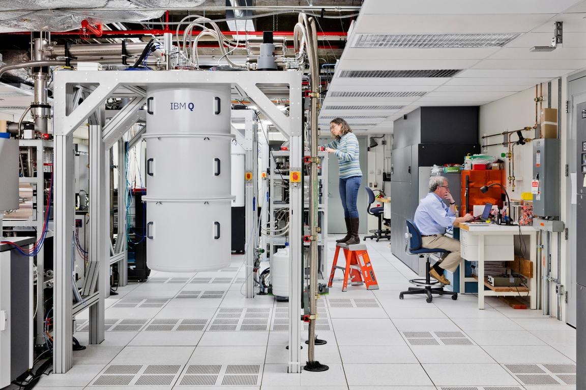
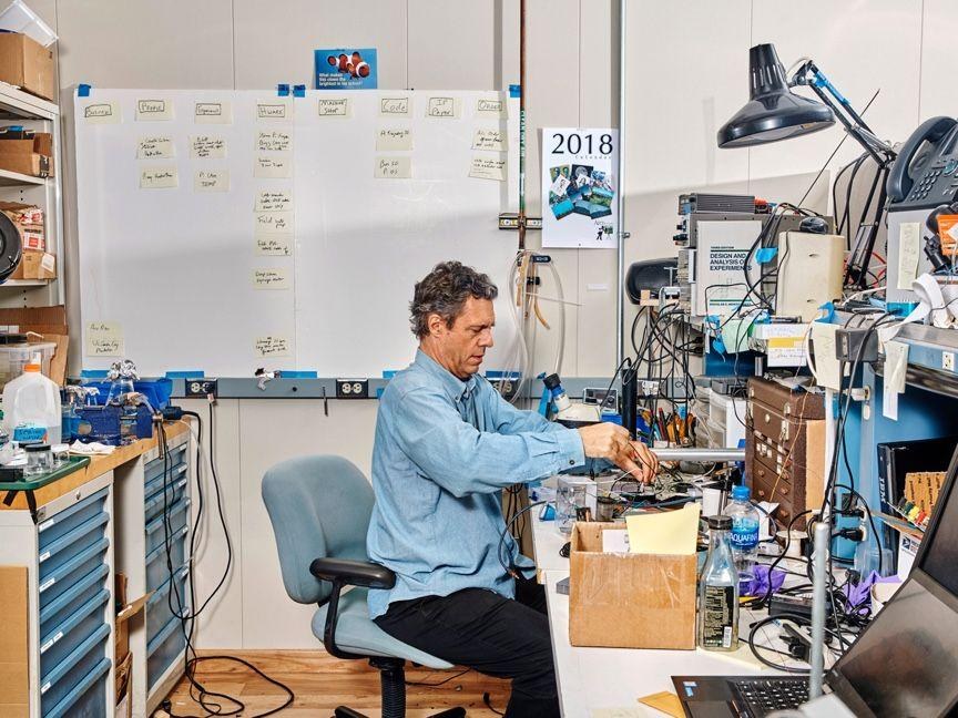
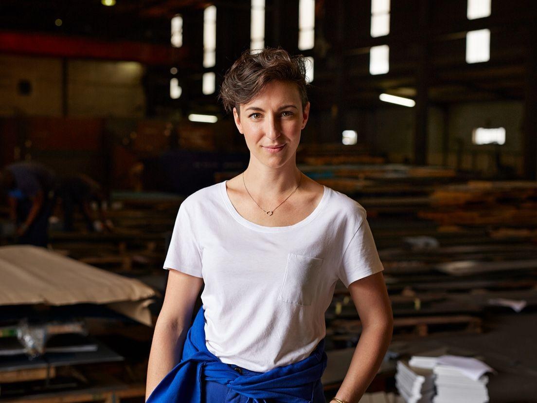
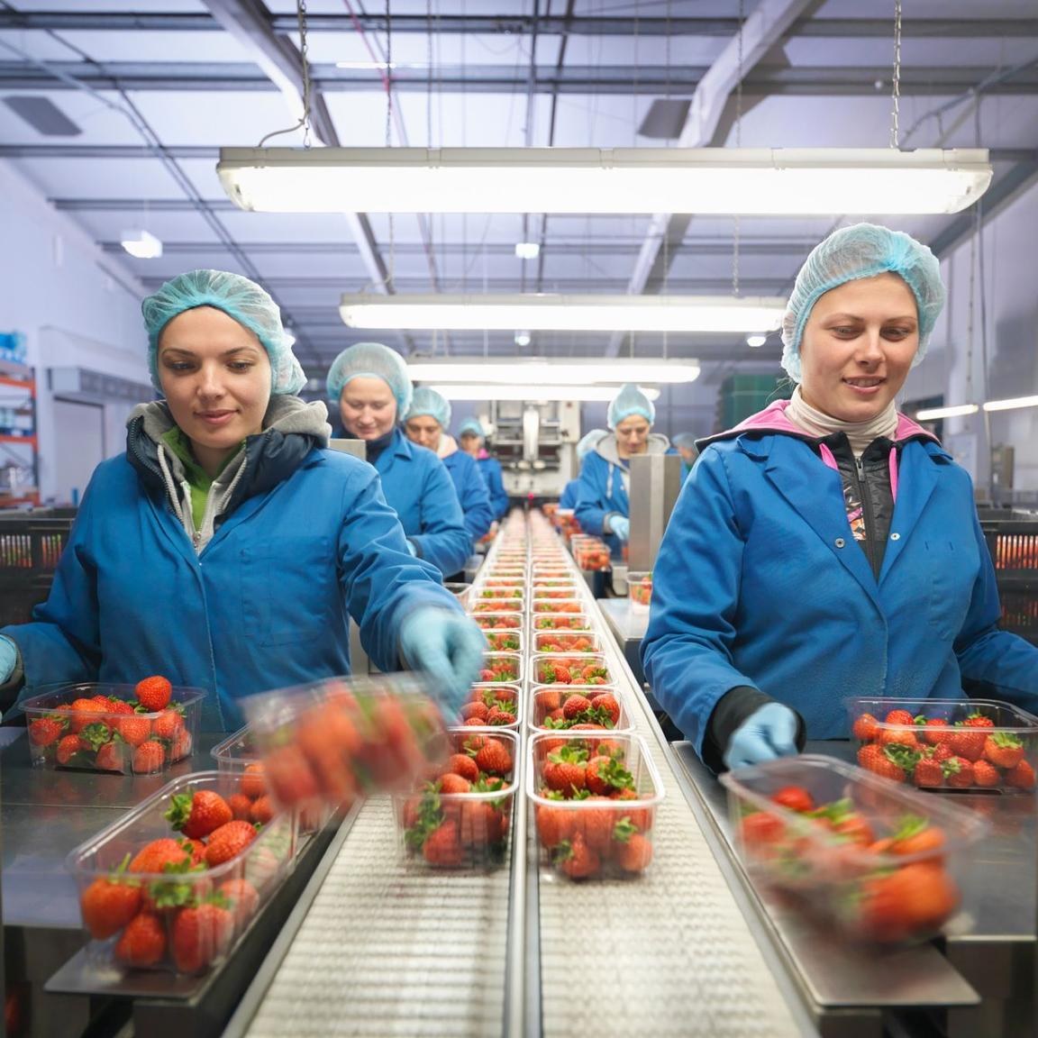

| Types | reportage, portraiture, still life |
|---|---|
| Viewpoint | eye level or aerial |
| Focus | everything sharp |
| Aspect ratios | 16:9, 4:3, 3:2, 2:1, 1:1 |
Three types: reportage of the working world (lifestyle, cinematic, colorful, like documentary film), portraiture of 'progress partners' (IBMers and clients shot with equal care) and still life for products and concepts. Eye-level or aerial viewpoints, natural light, everything in sharp focus, no filters.
Source: ibm.com/design/language/photography/overviewibm.com/design/language/photography/tips-and-techniques
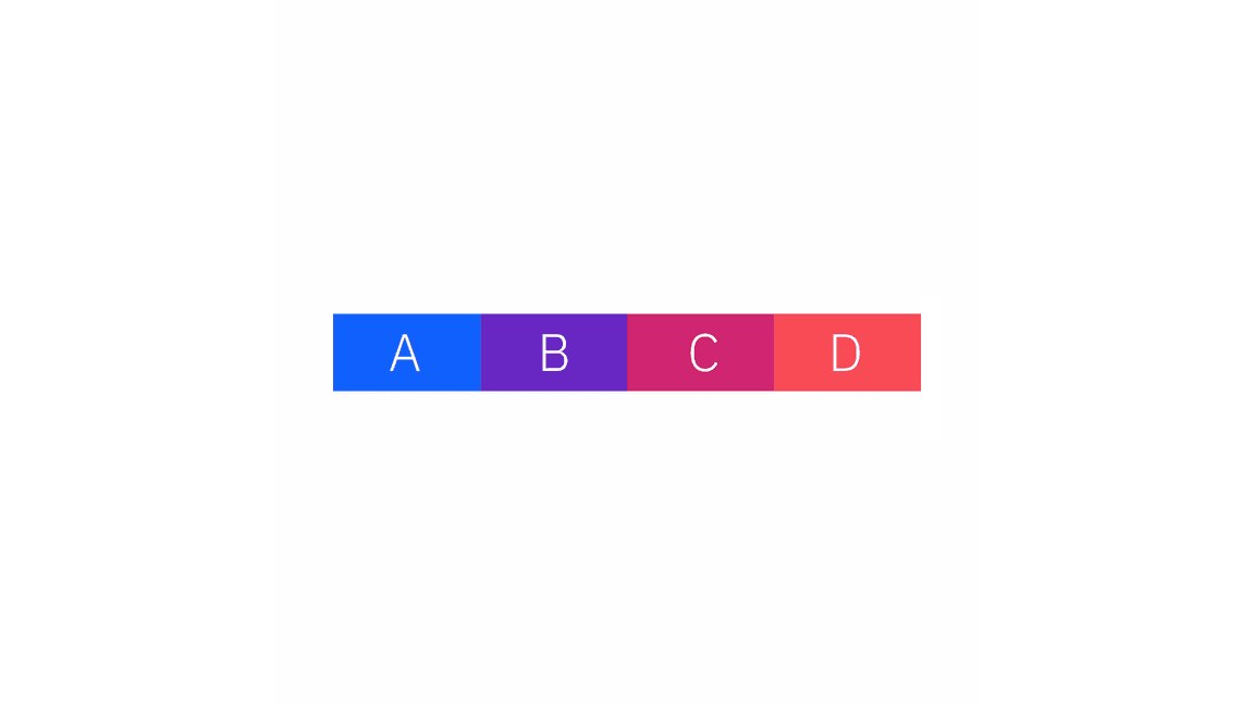
A shared vocabulary lets product and brand teams move things the same way, and keeping expressive motion rare preserves its impact.
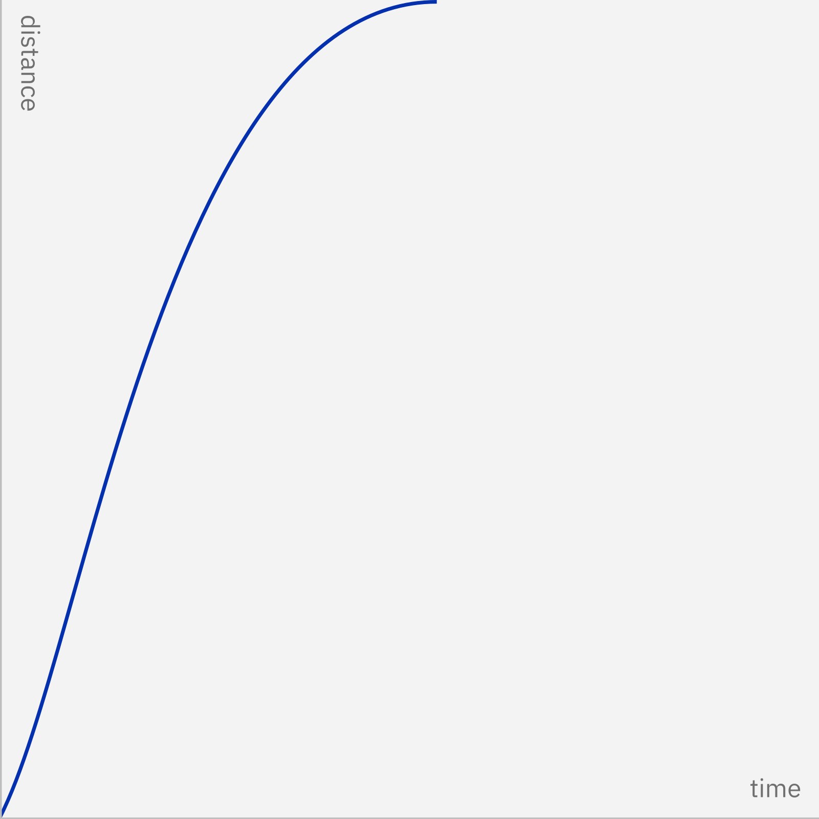
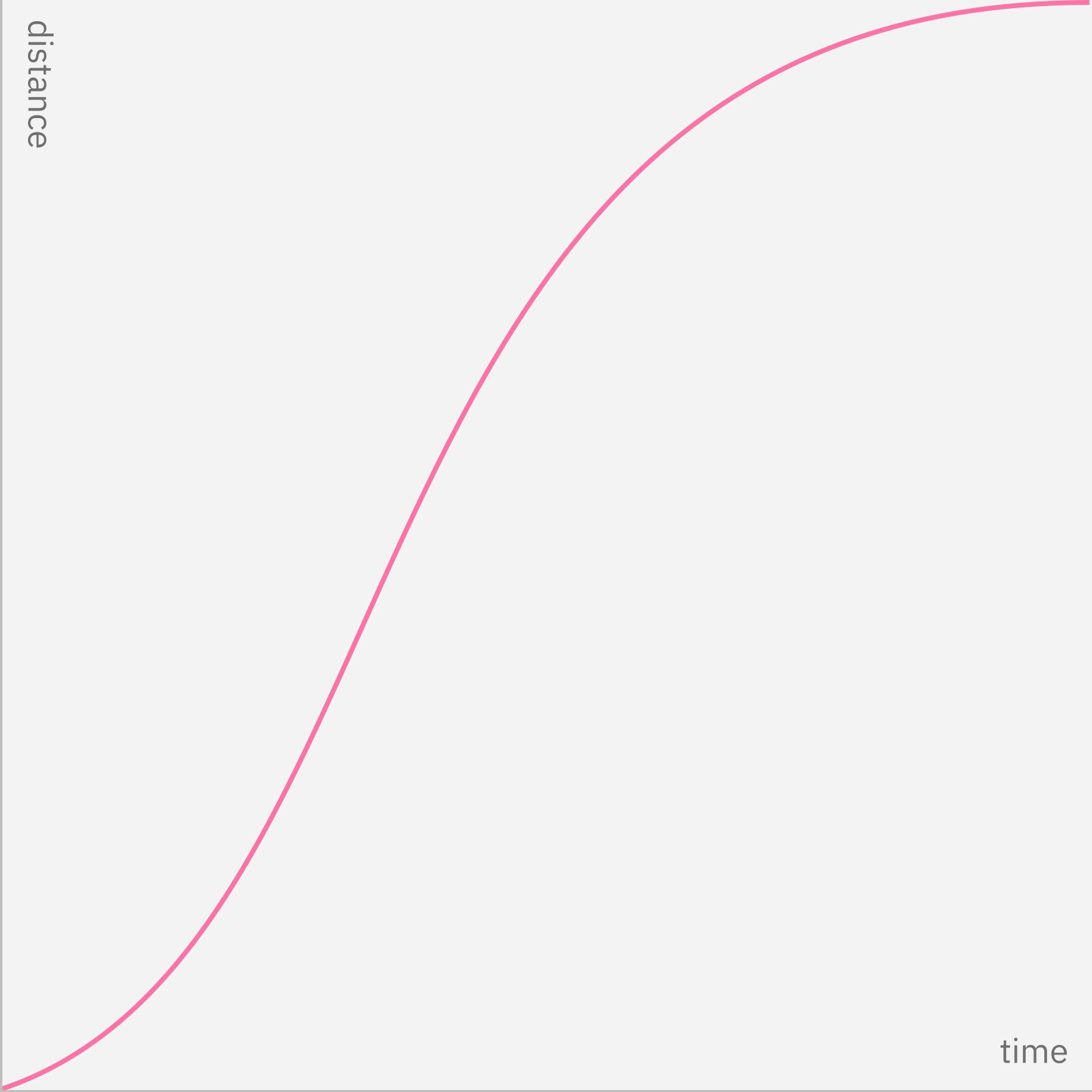
| Standard productive | cubic-bezier(0.2, 0, 0.38, 0.9) |
|---|---|
| Standard expressive | cubic-bezier(0.4, 0.14, 0.3, 1) |
| Entrance | (0, 0, 0.38, 0.9) / (0, 0, 0.3, 1) |
| Exit | (0.2, 0, 1, 0.9) / (0.4, 0.14, 1, 1) |
| Durations | 70, 110, 150, 240, 400, 700ms |
Two kinds of motion, productive and expressive, standing for machine and human. Productive is efficient and out of the way (button states, dropdowns, tables); expressive is vibrant and reserved for significant moments (a new page, the primary action, notifications). Carbon publishes standard, entrance and exit curves for each and six duration tokens from 70 to 700ms. Brand animation should be effective, concise, simple and engineered.
Source: ibm.com/design/language/animation/overviewibm.com/design/language/animation/tips-and-techniquescarbondesignsystem.com/elements/motion/overview
The essentials to scale AI
THE ESSENTIALS TO SCALE AI
Big, light, flush-left Plex · the lead headline of every page and section on ibm.com and in the guide
The Blue 60 button with the label left and the arrow right · primary calls to action on ibm.com (hero) and across Carbon
Do Divide by two: 16 columns at large widths (8 at medium, 4 at small), 8px mini unit, 16px box padding, 32px total gutter, margins fixed per breakpoint; type always aligns to the edge of the box padding. Spacing in mini-unit multiples (Carbon tokens 2, 4, 8, 12, 16, 24, 32, 40, 48, 64, 80, 96, 160px). Images and containers in 16:9, 4:3, 3:2, 2:1, 1:1 (Carbon adds 2:3), width measured to the columns. Always.
Everything on the 2x Grid · layout, type, icons, illustration and photo crops
Do Paul Rand's 8-bar logo (1972), positive or reversed version to match the ground, in core blue or gray colors with at least five steps between logo and background, clear space equal to its height. The rebus is for merchandise, badges and events, never the sign-off. Once, at the end or on the cover.
The 8-bar logo signs off · every official IBM communication: covers in print, the final frame in video
Specimens use sample copy, not IBM’s.
Everything sits on the 2x Grid: divide space by two (2, 4, 8, 16 columns), build from an 8px mini unit, and space in multiples of the base unit. Carbon fixes it for screens: 4 columns at 320px, 8 at 672, 16 at 1056, 1312 and 1584, with 16px padding and a 32px total gutter. The guide asks layouts to be essential, dynamic (balanced asymmetry) and engineered, with ample negative space and clear hierarchy.
Measured from 's .
| Measure | Desktop | Phone |
|---|---|---|
| Page margin | 32px | 16px |
| Card gap | 16px | 16px |
| Navigation | 49px | 49px |
Leadspace headline (h1)
IBM Plex Sans · 53.65px (phone 32.8) · line 1.17 · weight 300
Section headline (h2)
IBM Plex Sans · 53.65px (phone 32.8) · line 1.17 · weight 300
Section intro
IBM Plex Sans · 21.88px (phone 20) · line 1.4 · weight 400
Hero lead
IBM Plex Sans · 20px · line 1.4 · weight 400
Announcement line
IBM Plex Sans · 20px (phone 16) · line 1.4 · weight 400
Case-study headline
IBM Plex Sans · 28px · line 1.29 · weight 400
Form section heading
IBM Plex Sans · 32px · line 1.25 · weight 400
Band label heading
IBM Plex Sans · 20px · line 1.4 · weight 600
Small heading
IBM Plex Sans · 16px · line 1.5 · weight 600
Card title
IBM Plex Sans · 16px · line 1.4 · weight 400
Body
IBM Plex Sans · 16px · line 1.5 · weight 400
Nav link
IBM Plex Sans · 16px · line 1.375 · weight 400
Button label
IBM Plex Sans · 16px · line 1.375 · weight 400
Text CTA
IBM Plex Sans · 16px · line 1 · weight 400
Stat figure
IBM Plex Sans · 20px · line 1.4 · weight 600
Card body small
IBM Plex Sans · 14px · line 1.29 · tracking 0.16px · weight 400
Card heading small
IBM Plex Sans · 14px · line 1.43 · tracking 0.16px · weight 600
Footer link
IBM Plex Sans · 14px · line 1.43 · tracking 0.16px · weight 400
Tag
IBM Plex Sans · 12px · line 1.33 · tracking 0.32px · weight 400
How IBM’s own landing pages are built, observed on ibm.com, 2026-10-29. The full measurements are in spec.md.
Source: ibm.com/design/language/2x-gridibm.com/design/language/layout/overviewibm.com/design/language/layout/tips-and-techniquescarbondesignsystem.com/elements/2x-grid/overviewcarbondesignsystem.com/elements/spacing/overview
Co-creation fits the guide's idea of IBM as a medium between people and technology. Our reading
A question opens a co-creation story without hype, in line with the fact-based voice. Our reading
It names a buyer's real frustration (AI that doesn't scale) and answers with IBM's concrete capabilities, the same move the homepage makes. Our reading
How our engine applies IBM's system to each format. This is our recipe built from their rules, not something IBM publishes. Level = how far toward the expressive end.
| Format | What they did | Source |
|---|---|---|
| website | ibm.com homepage: white ground, Plex Sans Light H1 with gradient text, square Blue 60 and outline buttons with arrow icons, 4px-radius tiles with Gray 30 borders, a Gray 100 footer (observed 2026-10-29). | ibm.com/us-en |
| IBM field guides: expressive but minimal covers, artwork aligned left with the type, ample negative space. | ibm.com/design/language/layout/overview | |
| stationery | IBM business card: simple grid, minimal type, eye led from logo and name to details by alignment. | ibm.com/design/language/layout/overview |
| poster | IBM Garage posters exposing the grid scaffolding; Blueprint and Design Town Hall posters on simple 2x2 grids. | ibm.com/design/language/layout/overview |
| product UI | IBM Security Connect and Watson screens on the 2x Grid with purposeful color (Carbon). | ibm.com/design/language/layout/overview |
| merchandise and events | The rebus on notebooks, T-shirts, an atrium wall, glass patterns and at the US Open. | ibm.com/design/language/ibm-logos/rebus |
| video | 1920x1080 on a 7.5px mini unit in an 8-column grid; the 8-bar as the final sign-off. | ibm.com/design/language/2x-grid |
| data visualization | Understandable, essential, impactful, consistent, contextual charts (Carbon Charts). | ibm.com/design/language/data-visualization/overview |
| Format | Loudness | Must appear | What varies |
|---|---|---|---|
| Landing page | White ground, Plex Sans Light flush-left headline in the homepage voice, square Blue 60 primary button with the arrow right, 16-column 2x Grid with 8px spacing, Gray 10 tiles, Gray 100 footer, 8-bar logo top left | one expressive moment (gradient headline text or one illustration) and which product and proof bands follow | |
| Deck | White or Gray 100 slides, Plex Sans Light titles flush left on the 2x Grid, one blue accent, 8-bar sign-off on the last slide | one illustration style or reportage photo per slide | |
| Proposal page | Homepage voice, numbers only with sources, one Blue 60 next-step button | a pictogram per section | |
| Ad | Short sentence-case line, reportage photo or flat illustration, 8-bar sign-off with clear space | a 2-color gradient from an approved family | |
| Social post | Plex, grid-aligned type, a core-color logo | expressive pictograms or isometric illustration | |
| White ground, Gray 100 text, one Blue 60 button, 8-bar in the header | one hero image | ||
| Product UI | Carbon components, productive type set and motion, grays plus Blue 60 | theme (White, Gray 10, Gray 90, Gray 100) |
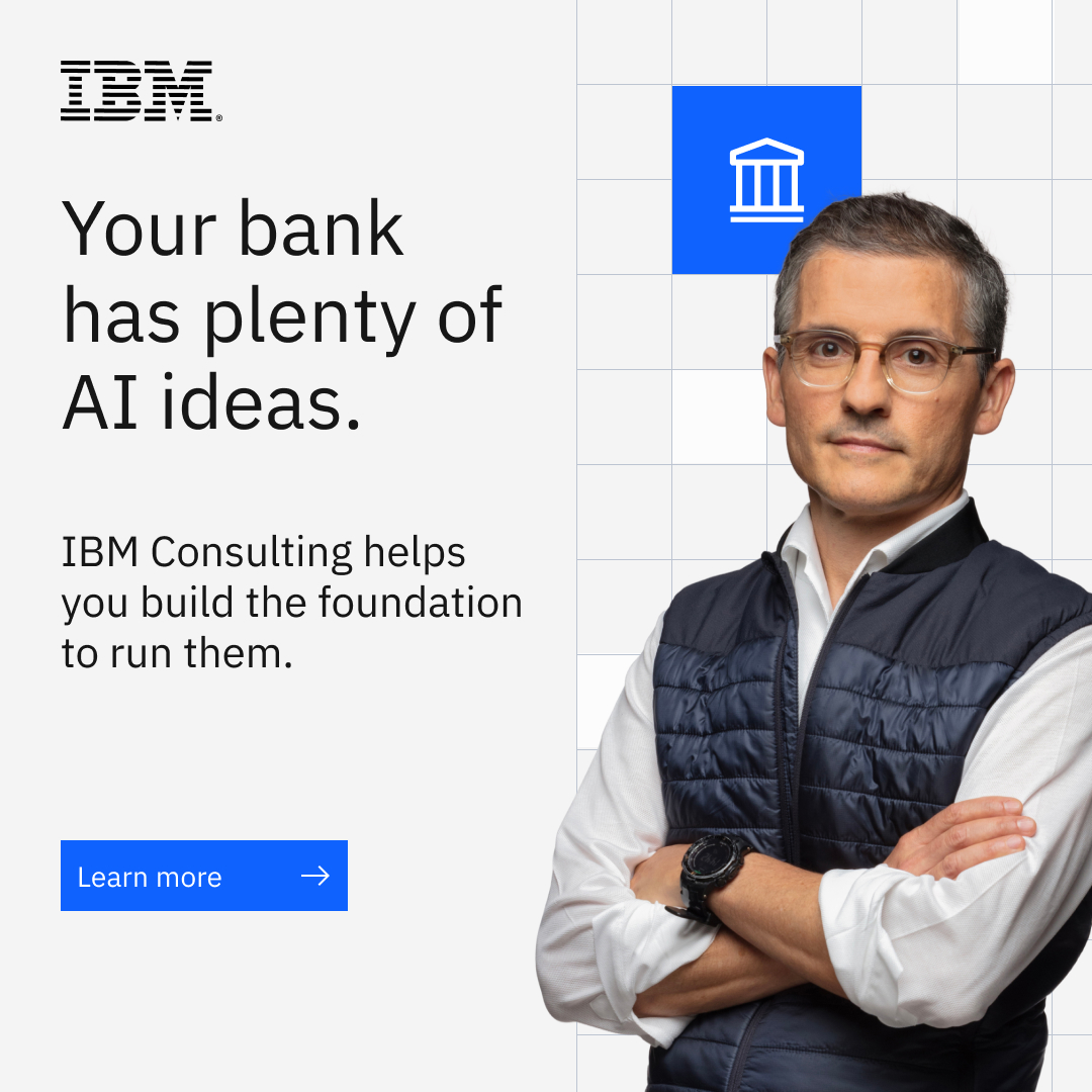 Banking ai foundationMeta · Nov 2026 – now
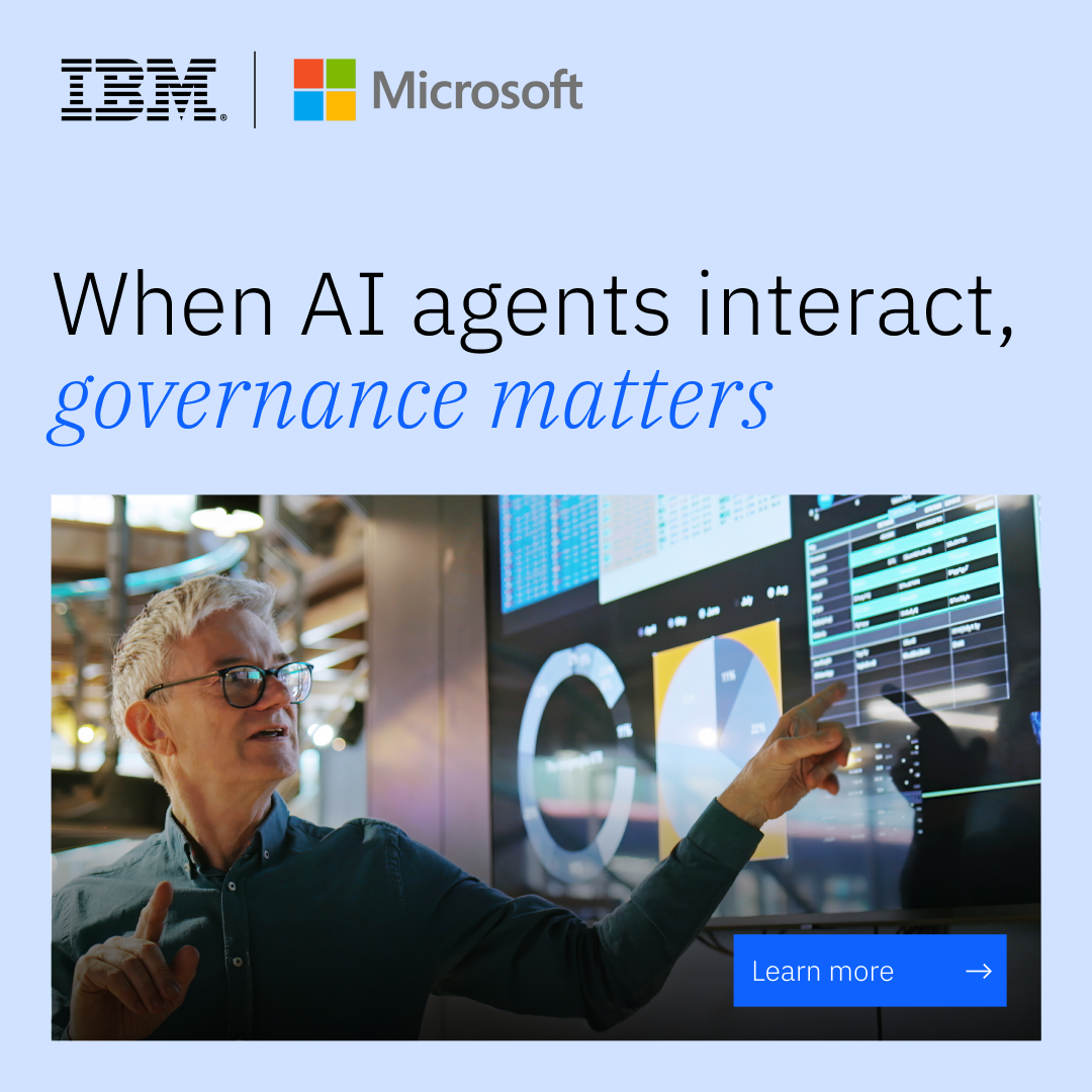 Capital marketsMeta · Nov 2026 – now
 Learn beyond codeMeta · Oct 2026 – now
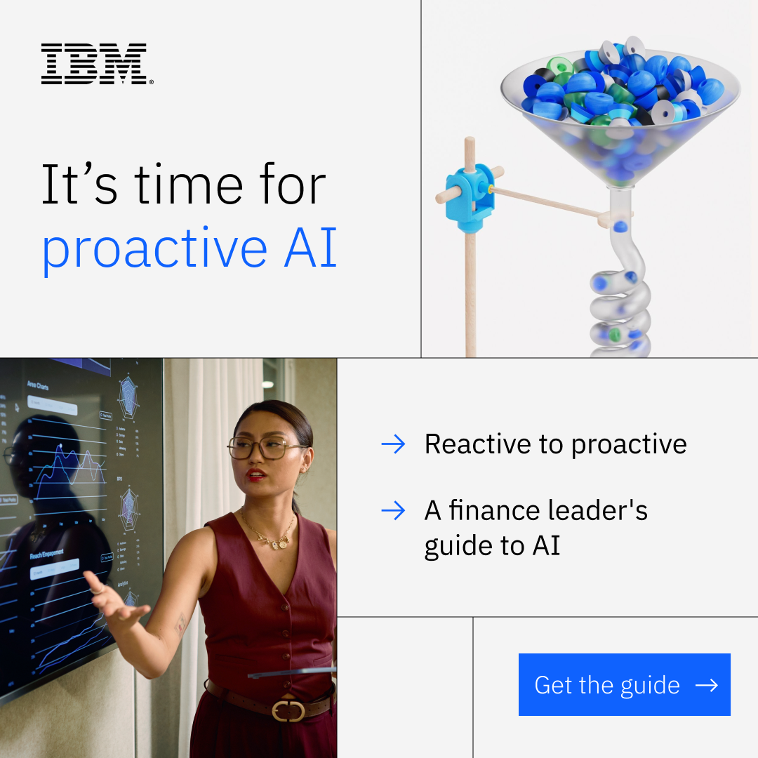 Mkt 52820Meta · Nov 2026 – now
Source: ibm.com/design/language/philosophy/principlesibm.com/design/language/philosophy/pov
Your name and logo, IBM’s system.
Use this kit for my brand Use this brand in Claude
Get your brand audit Put your brand in Claude What goes in a brand book
Each value is marked published, observed, our reading or our recipe, with its source. Checked 2026-10-29. Not affiliated with IBM.