The lesson
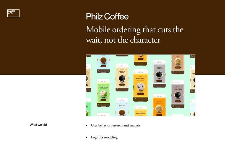
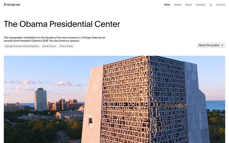
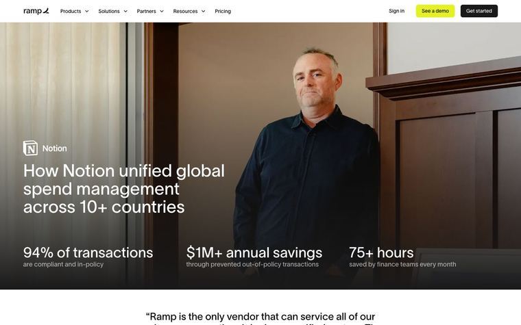
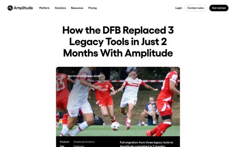
Use a quiet serif headline and a single atmospheric photo of the client's own space, so the page reads like a brand's own editorial.
The move
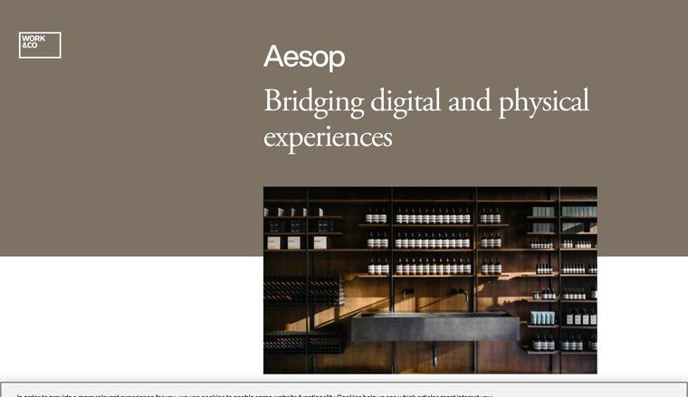
A taupe band holds the small Work & Co logo, "Aesop" in sans, and the serif headline "Bridging digital and physical experiences". Below it, one photo of an Aesop store interior with shelves of bottles and a sink in raking light sits in the text column, overlapping the band's lower edge. A cookie bar covers the bottom edge.
Why it works
- Our readA muted brown background and serif type keep the page restrained, so the client's name and photo carry the first screen.
- Our readThe photo shows the physical store that the headline talks about, linking the claim to a visible place.
- Our readVery little text on the first screen lets the image set the tone before any explanation.
What not to copy
Don't copy the taupe palette or Aesop's store imagery; they only fit that client. Keep the matching of page tone to the client's own brand.