
The lesson
Use a single metaphor to organize a data report, then make each section reveal what the data says buyers actually value.
The move
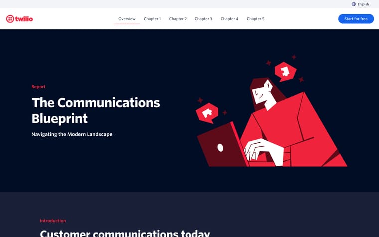
A dark hero introduces the Customer Insights Series and the title, with a red magician-style badge beside it. A jump bar links to sections like "Why faking personality fails", "What consumers value most", "Trading charisma for context", and "The real AI magic behind results". The body opens with "The magic of modern AI", then contrasts company beliefs with consumer views, including "86% of companies believe customers are satisfied with their AI service, yet only 51% of consumers agree." Later sections use headings like "The trick", "The reveal", "The secret", and "Behind the curtain" before a table connects customer experience problems to Twilio products.
Why it works
- Our readThe illusion metaphor gives the report a simple thread, so each section feels like another reveal rather than a loose set of findings.
- Our readCompany-versus-consumer percentages make the argument concrete and show where brands may be solving the wrong problem.
- Our readThe late table turns the research into practical product relevance without making the whole report feel like a product page.
What not to copy
Don't copy Twilio's magician art, illusion language, or product mapping. Keep the structure of a strong metaphor, contrast data, section reveals, and a final bridge from findings to what the company helps fix.
More from Twilio







More content marketing

Steal it for your brand.
Tell us what you want to make. We’ll talk through how to put these ideas to work for your brand.