The lesson
Build a competitor page around the specific reasons to switch, then give the buyer a table that turns those reasons into feature-by-feature evidence.
The move
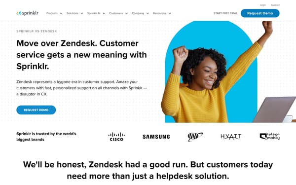
The page opens with "Move over Zendesk. Customer service gets a new meaning with Sprinklr." beside a customer image, a "REQUEST DEMO" button, and logos under "Sprinklr is trusted by the world's biggest brands." It then argues that customers need more than a helpdesk solution, with sections on knowing customers across channels, faster resolutions, and agent tools. The middle compares Sprinklr and Zendesk on support channels, AI accuracy, bot sessions, and social listening, then adds "Sprinklr vs. Zendesk: Features Comparison" in a table. It closes with analyst and review proof, "Make an easy switch to Sprinklr Service with our free and personalized onboarding," and an FAQ about how Sprinklr is better than Zendesk.
Why it works
- Our readThe first screen names Zendesk directly and states the switch argument before any feature detail, so the reader knows this is not a neutral category page.
- Our readThe page moves from broad objections to concrete comparison points, with sections on channels, AI, bots, social listening, and a feature table.
- Our readProof is mixed into the argument with customer logos, AI scale metrics, analyst and review callouts, and customer story links before the switch CTA.
What not to copy
Don't copy the combative "Zendesk had a good run" tone unless your brand can support a direct attack. Keep the sequence of switch argument, named feature gaps, comparison table, proof, and migration CTA.
More from Sprinklr


More landing pages








Steal it for your brand.
Tell us what you want to make. We’ll talk through how to put these ideas to work for your brand.