
The lesson
Put the competitor comparison above the product tour so buyers can first see why they should switch, then see what they would get.
The move
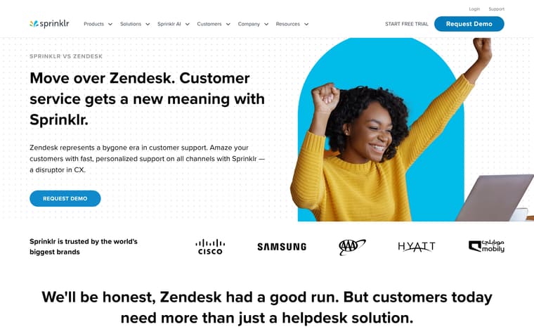
The page opens with "LOOKING FOR A LIVEPERSON ALTERNATIVE?" and the headline "Go beyond conversations. Capture context with Sprinklr", followed by a Request Demo button. It then positions an upgrade from LivePerson through four comparison blocks: omnichannel support, AI-powered agent assistance, customer experience, and reporting. A "Why choose Sprinklr over LivePerson?" table compares capabilities across channels, language support, reporting, AI, customer view, agent desktop, workforce management, surveys, and more. Farther down, the page shifts from comparison to product proof with sections on live chat, bots, real-time AI guidance, productivity, and brand results.
Why it works
- Our readThe first screen names the competitor and immediately frames the switch around context, channels, data, history, reporting, and AI.
- Our readThe early benefit blocks translate the comparison into plain operational gaps, such as channel isolation, built-in voice support, and configurable reporting.
- Our readThe capability table gives buyers a quick way to scan where Sprinklr claims broader coverage before the page moves into product sections.
What not to copy
Don't copy the broad product sweep unless the alternative page can support it with real feature depth. Keep the structure of competitor framing first, scannable table second, and product-specific proof after.
More from Sprinklr


More landing pages








Steal it for your brand.
Tell us what you want to make. We’ll talk through how to put these ideas to work for your brand.