What Spotify does
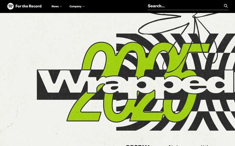
In the identity COLLINS built for Spotify, the brand ran artist photography through a duotone: the image is reduced to its tones and those tones are mapped onto a pair of bold brand colors, so the dark half of the picture takes one color and the light half another. COLLINS describes the treatment (in its case study it is called the Lens) as turning any image into a clear, recognizable Spotify visual, drawing on the duotone screen prints of music history, and as the way third-party content such as artist photography keeps the brand consistent without visual clashes. The same system paired colors as bold, high-contrast pairs (its Vibrating Color part). Developers reproduced the look in the browser with SVG color-matrix filters after it appeared across Spotify's pages, including the Year in Music site.
Spotify's system, as published
- Agency
- COLLINS
- Mapping
- image tones mapped to two colors: shadows to one, highlights to the other
- Color Pairs
- bold, high-contrast pairs (COLLINS: Vibrating Color)
- Applied To
- artist photography and other third-party images
Why it works
Mapping every photo's shadows and highlights onto two brand colors throws away the mismatched color of the original, so photos from any source read as one brand at a glance, even with no logo on them.
Best for
Media, music, events, marketplaces and any brand that runs other people's photos (artists, speakers, partners, customers) and needs them to look like one family; posters, social tiles, campaign heroes, speaker cards
What breaks it
- Two colors of similar lightness: the image goes muddy and the subject disappears
- Busy, low-contrast source photos; pick images with one clear subject
- Adding a third color or keeping some original color; the move is exactly two
- Duotoning product shots where the real product color matters to the buyer
Sources
- wearecollins.com: COLLINS case study: the duotone Lens augment (turns any image into a recognizable Spotify visual, rooted in music's duotone screen printing) and the Vibrating Color pairs
- jmperezperez.com: Developer write-up reproducing Spotify's duotone with an SVG color matrix; notes the new look is full of duotone images and names the Year in Music site
Steal it for your brand
The same system, written in your colors, type and shapes. Nothing of Spotify's look comes with it.
The recipe
- Convert the photo to grayscale and raise contrast by the recipe's contrast so the subject separates cleanly from the background.
- Map the tonal range onto two colors: the darkest tones become
palette.ink, the lightest becomepalette.accent, and mid-tones blend between them at the midpoint. - When a set needs variety, swap in the alternate pair (
palette.accent darkintopalette.highlight) for some images; keep each image to exactly two colors. - Crop to the layout's frame and round corners to
style.radius; if the brand's style.texture is grain, add the recipe's grain over the duotone. - Set type on the duotone only in
palette.paperorpalette.on accent, placed over the flattest tonal area of the image.
What you'll need
- Photos the customer owns or has rights to (portraits, people, events work best)
- A brand kit with an ink and an accent that are far apart in lightness
Recipe as JSON
{
  "recipe": {
    "mode": "duotone",
    "desaturate": 1,
    "shadows": "{palette.ink}",
    "highlights": "{palette.accent}",
    "contrast": {
      "by": "style.emphasis",
      "map": {
        "contrast": 1.3,
        "color": 1.15
      },
      "default": 1.2
    },
    "midpoint": 0.5,
    "radius_px": "{style.radius}",
    "grain_amount": {
      "by": "style.texture",
      "map": {
        "grain": 0.06,
        "dots": 0,
        "lines": 0,
        "none": 0
      },
      "default": 0
    },
    "pairing_alt": {
      "shadows": "{palette.accent_dark}",
      "highlights": "{palette.highlight}"
    }
  },
  "fallbacks": {
    "palette.accent_dark": "{palette.ink}",
    "palette.highlight": "{palette.paper}",
    "palette.on_accent": "{palette.paper}",
    "style.radius": 0
  },
  "steps": [
    "Convert the photo to grayscale and raise contrast by the recipe's contrast so the subject separates cleanly from the background.",
    "Map the tonal range onto two colors: the darkest tones become {palette.ink}, the lightest become {palette.accent}, and mid-tones blend between them at the midpoint.",
    "When a set needs variety, swap in the alternate pair ({palette.accent_dark} into {palette.highlight}) for some images; keep each image to exactly two colors.",
    "Crop to the layout's frame and round corners to {style.radius}; if the brand's style.texture is grain, add the recipe's grain over the duotone.",
    "Set type on the duotone only in {palette.paper} or {palette.on_accent}, placed over the flattest tonal area of the image."
  ]
}The lesson
Run every photo through the same two-color treatment so mismatched sources look like one brand.
The move
The case-study board shows a grid of Spotify logo tiles in flat color shapes (pink, green, navy, lime, orange). Next to it is a billboard reading "Out Now" with a woman in a wide-brimmed hat, her photo colored in yellow, orange and magenta.
Why it works
- Our readThe billboard photo is mapped to yellow and orange on a magenta field, the same loud palette as the logo tiles, so it reads as part of the system.
- Our readShowing the tiles next to the photo makes the link between flat color and photo visible.
- Our readA treatment applied to one photo type can be reused on any picture that arrives later.
What not to copy
Don't copy the exact colors or the cowboy-hat shot. Keep the rule of two brand colors, one for shadows and one for highlights, applied to every photo.