What Apple does
Apple controls every product photo, from framing and composition to lighting and camera angle. Its affiliate brand and photography guidelines say product photos may sit only on a white, off-white, light gray or black background, never on a busy, colorful, textured or patterned one, and that the photos it supplies come on a solid white or solid black background so customers can see the product. Products are shown in their entirety, in correct proportion to one another, with no type, graphics or effects placed on them. On the Apple Store buy pages the product sits whole on a flat light gray field inside a rounded panel, with the copy beside it, not on top of it.
Apple's system, as published
- Allowed Backgrounds
- white, off-white, light gray, or black
- Supplied Backgrounds
- solid white or solid black
- Framing
- product shown in its entirety, in correct proportion to other products
- Never
- type, graphics, violators, animation or enhancement on the product photo; busy, colorful, textured or patterned backgrounds
Why it works
Removing the setting leaves the eye nothing to look at but the product, and one consistent field makes a whole catalog look like a single, controlled system.
Best for
Hardware, consumer goods, packaged products, devices, merch and any store or catalog page where the product itself is the argument; pricing cards, product grids, launch heroes
What breaks it
- Busy, colored, textured or patterned fields behind the product
- Stickers, badges, price bursts or type laid over the product
- Cropping off part of the product or showing items at the wrong relative size
- Mixing cutouts with lifestyle scenes in the same grid
Sources
- apple.com: Apple Affiliate Program Brand and Photography Guidelines: product photography overview, best practice, and mistakes to avoid (allowed backgrounds, no alterations, show products in their entirety)
- apple.com: Live store page: product on a flat light gray field in a rounded panel, copy beside it
Steal it for your brand
The same system, written in your colors, type and shapes. Nothing of Apple's look comes with it.
The recipe
- Cut the product out cleanly from its original background; keep the whole product in frame, never cropped at an edge.
- Place it on a flat field of
palette.surface(orpalette.nightfor a dark section); no gradient, texture, pattern or scene behind it. - Center it in a panel with corners at
style.radiustimes 1.5, scaled so it fills the recipe's product_fill_ratio of the panel's shorter side. - When showing several products together, scale them to their real-world proportions to each other.
- Add at most a faint contact shadow under the product at the recipe's strength; no glow, reflection or added effects.
- Put headline, price and buttons beside or below the panel in
palette.ink, never on top of the product.
What you'll need
- Product photos the customer owns, shot evenly lit against a plain background so they cut out cleanly
- Real product dimensions if several products appear together
Recipe as JSON
{
  "recipe": {
    "mode": "cutout-on-field",
    "field": "{palette.surface}",
    "field_dark": "{palette.night}",
    "panel_radius_px": "{style.radius} * 1.5",
    "product_fill_ratio": {
      "by": "style.density",
      "map": {
        "airy": 0.6,
        "balanced": 0.7,
        "dense": 0.8
      },
      "default": 0.7
    },
    "contact_shadow": {
      "by": "style.shadow",
      "map": {
        "none": 0,
        "soft": 0.12,
        "hard": 0.18,
        "drop": 0.15
      },
      "default": 0.1
    },
    "overlay": "none",
    "texture": "none",
    "crop": "whole-product"
  },
  "fallbacks": {
    "palette.surface": "{palette.paper}",
    "palette.night": "{palette.ink}",
    "style.radius": 12
  },
  "steps": [
    "Cut the product out cleanly from its original background; keep the whole product in frame, never cropped at an edge.",
    "Place it on a flat field of {palette.surface} (or {palette.night} for a dark section); no gradient, texture, pattern or scene behind it.",
    "Center it in a panel with corners at {style.radius} times 1.5, scaled so it fills the recipe's product_fill_ratio of the panel's shorter side.",
    "When showing several products together, scale them to their real-world proportions to each other.",
    "Add at most a faint contact shadow under the product at the recipe's strength; no glow, reflection or added effects.",
    "Put headline, price and buttons beside or below the panel in {palette.ink}, never on top of the product."
  ]
}The lesson
Photograph the whole product on one flat field and keep every product page in that same field.
The move
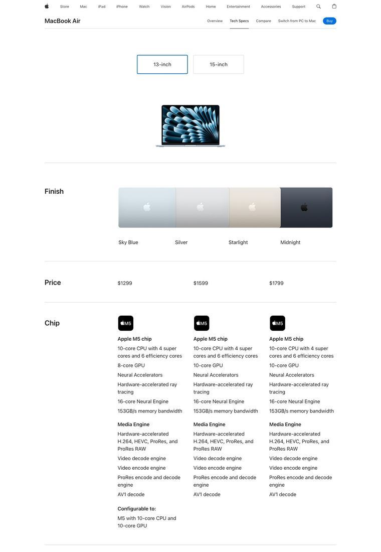
The MacBook Air page puts two laptops, one in front of the other, inside a plain light-gray panel. No desk, hands or room appear in the shot. The headline "Shop MacBook Air" and a "Model. Choose your size." panel with 13-inch and 15-inch cards share the page with it.
Why it works
- Our readWith no scene around the product, the only detail left to look at is the laptop and its screen.
- Our readThe screens carry the color on the page (blue and yellow patterns), so the flat gray lets that color stand out.
- Our readThe plain gray panel carries no setting of its own, so the same field could sit behind any product in a line.
What not to copy
Don't copy the gray or the layout. Keep one background rule for all product shots and let the product supply the color.