The lesson
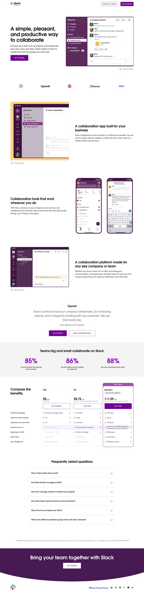
Put the plan comparison on the same product landing page so a convinced reader can choose without leaving.
The move
The page opens with “A simple, pleasant, and productive way to collaborate,” a short line about chat, voice and video, and a Slack workspace animation beside the call to “GET STARTED.” It follows with product sections headed “A collaboration app built for your business,” “Collaboration tools that work wherever you do,” and “A collaboration platform made for any size company or team.” After an OpenAI quote and three proof stats, it shows “Compare the benefits” with Free, Pro, and Business+ plan columns, then closes with frequently asked questions and “Bring your team together with Slack.”
Why it works
- Our readThe first screen pairs a plain collaboration promise with a Slack interface scene, so the reader sees both the outcome and the product shape at once.
- Our readThe middle sections move from how teams talk to how distributed teams work and then to company size, which answers common buying contexts before pricing appears.
- Our readPutting the plan comparison before the FAQ lets the page shift from persuasion to selection without sending the reader to a separate pricing page.
What not to copy
Don't copy the Slack interface-led proof unless your product is already recognizable in a small workspace view. Keep the structure of promise, product use cases, proof, plan comparison, and FAQ on one conversion page.
More from Slack

More landing pages








Steal it for your brand.
Tell us what you want to make. We’ll talk through how to put these ideas to work for your brand.