The lesson
Name the feature plainly on the first frame and pair it with a clean product shot before asking viewers to care about details.
The move
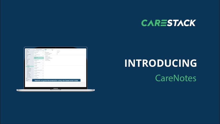
The poster uses a dark blue background with the CareStack logo centered near the top. A laptop mockup on the left shows the product interface, while the right side carries the words “INTRODUCING” and “Online Appointment Booking” in large type. The layout makes the new capability clear before any demo steps or benefits appear.
Why it works
- Our readThe feature name is the largest message, so viewers understand the launch even with the sound off.
- Our readPutting UI beside the headline signals this is a real product capability, not just a brand announcement.
- Our readThe simple two-column composition leaves room for the product and avoids burying the point in copy.
What not to copy
Skip the generic laptop-on-blue treatment if your category is visually crowded. Keep the move: lead with the feature name, show the product immediately, and make the launch easy to grasp from the first frame.
More from CareStack


More launch videos








Steal it for your brand.
Tell us what you want to make. We’ll talk through how to put these ideas to work for your brand.