The lesson
Name the feature first, then anchor it immediately in the actual product screen.
The move
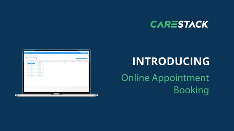
The poster uses a dark blue CareStack background with the CareStack logo at the top right. A laptop on the left shows the product UI, while the right side carries the large words “INTRODUCING” and “CareNotes.” The layout makes the launch feel like a software feature announcement, not a campaign concept.
Why it works
- Our readPutting the feature name in oversized type makes the takeaway clear before anyone watches the whole video.
- Our readShowing the UI inside a laptop frame signals that this is a real workflow inside the existing product.
- Our readThe simple split between screen and message gives sales teams a clean asset to use in emails and demos.
What not to copy
Skip the CareStack-specific colors, logo lockup, and dental software context. Keep the move: pair a plain “introducing” line with a real product screen so the launch is instantly legible.
More from CareStack


More launch videos








Steal it for your brand.
Tell us what you want to make. We’ll talk through how to put these ideas to work for your brand.