Inspiration to action
Discover an idea, save it, then try, buy or do it. Published
Brand book
The content is the brand. Pinterest designs a neutral frame of white, black and warm gray with a single red action, and lets a grid of rounded photo tiles do the expressing. Our reading

How much brand color: product UI stays neutral; brand moments (onboarding, celebrations, launches) may use color fills and reserved colors when contrast holds.
Source: gestalt.pinterest.systems/v1/foundations/brand_expression/guidelines
Our engine's setting, built from their rules.
Cover the logo. A page of rounded photo tiles, one red 16px-radius button and short heavy sentence-case headlines should still read as Pinterest.
If type or color is louder than the pictures, cut it back.
Search the copy for "pin" used as a verb and for "trending" claims.
The visual search and shopping platform where people discover ideas and turn inspiration into action. Published
Discover an idea, save it, then try, buy or do it. Published
Find what you actually like, not just what gets likes; safety and wellbeing built in. Published
Visual search and inclusive filters (skin tone range, hair type, body type) so results reflect the person. Published
People come to plan and shop, so ads feel relevant rather than distracting. Published
Pinterest presents itself as a visual search and shopping platform: people find ideas as Pins, collect them on boards, and act on them. Its newer framing adds Pinterest Intelligence (visual understanding plus AI) and a "more positive place online" stance built on inclusive search, teen safety and wellbeing.
A diverse, equitable workplace and inclusive product features (paraphrase).
PublishedEveryone who visits should feel seen and safer (paraphrase).
PublishedCredible emissions cuts and renewable power (paraphrase).
PublishedCategory. Visual search and shopping platform (newsroom); visual discovery for ideas, plans and shopping Published
Social feeds built around likes and followers (implied by "not just what gets likes").Text search for ideas you can't describe in words (implied by visual search framing).
Pinterest is a visual search and shopping platform where over 600 million people a month discover ideas, find products they love and turn inspiration into action, powered by Pinterest Intelligence. Headquartered in San Francisco; on iOS, Android and pinterest.com.
Create the life you love Observed
A more inspired internet. A better world. Published
Then get started. All on Pinterest Published
Pinterest's story is inspiration turned into action: discover, save, then try, buy or do. The newsroom adds Pinterest Intelligence and a "more positive place online"; the homepage keeps it to one invitation and three feature names.
Source: newsroom.pinterest.com/companyabout.pinterest.compinterest.com
Find more ideas on Pinterest
Trending on Pinterest
Save this idea
Pin this idea
Short, spoken sentences keep the words out of the way of the pictures.
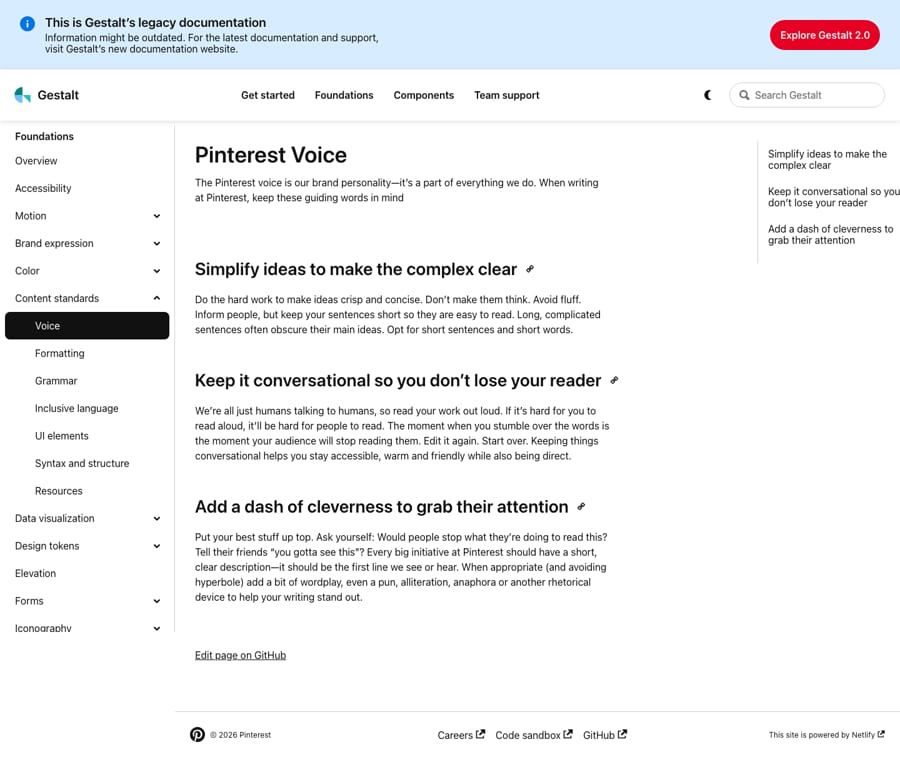
SimpleConversationalClever
Three guiding words: simplify, keep it conversational, add a dash of cleverness. On the homepage the voice is short and warm; seasonal copy plays with words ("spellbinding", "bewitching").
ideasinspirationsavePinsboardsdiscovertry
Trending on Pinterest (partners)Trending Pins (partners)Pin as a verb
Source: gestalt.pinterest.systems/v1/foundations/content_standards/voice
Source: gestalt.pinterest.systems/v1/foundations/content_standards/voicebusiness.pinterest.com/brand-guidelines


Files serialized from the inline SVGs on pinterest.com (2026-10-31). Pinterest's guidelines let partners use only the badge, with a CTA and their own account; the wordmark is not for others. Shown for reference; not affiliated.
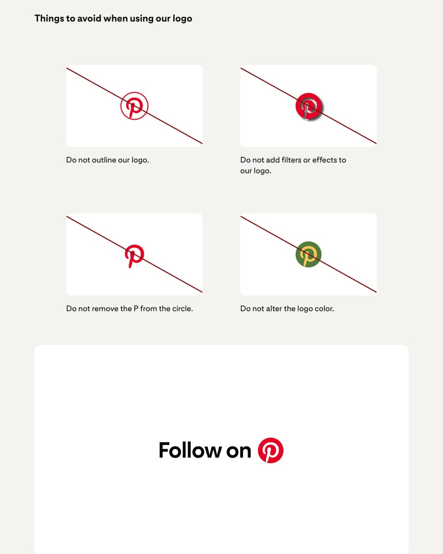
One small, unmistakable mark that always points to a real account keeps the badge from implying endorsement.
| Primary | white script P in a red circle |
|---|---|
| Alternates | black or white |
| Clear space | not published |
| Minimum size | not published |
The primary logo is a script white P in a red circle. Others may use only that badge, never the wordmark, always with a call to action and their own account. It may go black or white when color is limited.
Not published: clear space; minimum size.
Join Pinterest
A neutral frame lets Pinners' photos carry all the color, and one red makes every action obvious.
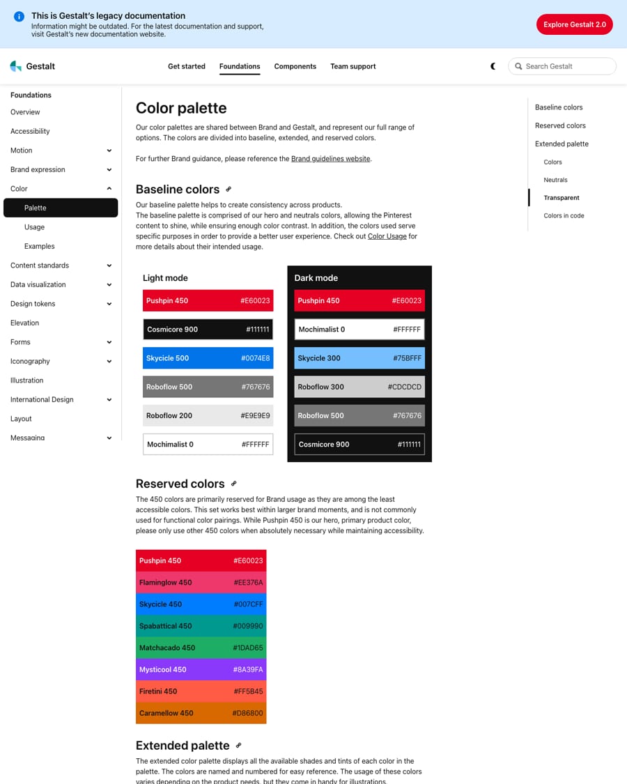
| Hero | Pushpin 450 #E60023 |
|---|---|
| Text | Cosmicore 900 #111111 (product); #000000/#211922 on the homepage |
| Link | Skycicle 500 #0074E8 |
| Token pattern | color-{common}-{pinterest}-{n} |
Shared by brand and Gestalt: a baseline palette (Pushpin red, near-black, blue, grays, white), eight reserved 450 colors for brand moments, and an extended 0-900 ramp per color with playful names (Pushpin, Flaminglow, Skycicle, Spabattical, Matchacado, Mysticool, Firetini, Caramellow; Roboflow grays, Cosmicore black, Mochimalist white). The homepage uses only red, black, white and warm grays; color comes from the photos.
Not published: color proportions.
Source: gestalt.pinterest.systems/v1/foundations/color/palettegestalt.pinterest.systems/v1/foundations/brand_expression/guidelines
Create the life you love
A heavy, friendly grotesk reads as confident and approachable at headline size while the system UI stays fast.
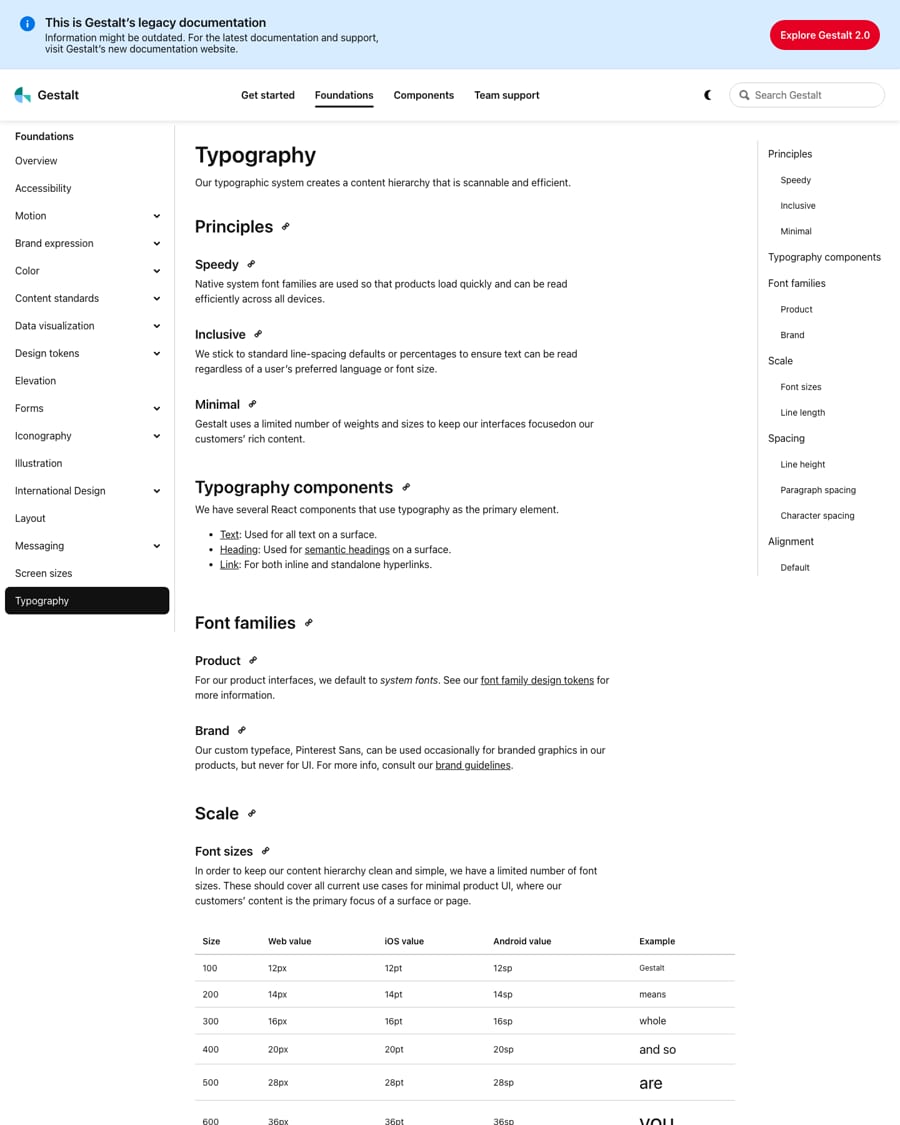
| Their face | Use | License | Open stand-in |
|---|---|---|---|
| Pin Sans (Pinterest Sans) | Brand and marketing type; on pinterest.com loaded in 400, 500, 700 and 800 | Proprietary, Pinterest's own; not licensed for others | Figtree Closest open match by rendered width over 8 homepage strings among Figtree, Albert Sans, Instrument Sans, Hanken Grotesk, Rethink Sans, Public Sans, Plus Jakarta Sans, Manrope, Inter, Geist and others; within 0.4% on 700-weight headings and 1-3% on body; x-height 0.50 vs 0.51. Needs -2px at 48px on the heaviest headings. |
| Pin Sans | All homepage text | Proprietary | Figtree Same family as display. |
| Brand face | Pin Sans / Pinterest Sans (proprietary) |
|---|---|
| Stand-in | Figtree (Google Fonts, OFL) |
| Homepage H1 | 48px 900, -0.5px |
| Product scale | 12/14/16/20/28/36px |
Pinterest Sans (served as Pin Sans) is the brand face; Gestalt's product UI uses system fonts and keeps Pinterest Sans for occasional branded graphics. The homepage sets everything in Pin Sans: very heavy, slightly tight headlines, medium 16px buttons, regular 20px leads.
Source: gestalt.pinterest.systems/v1/foundations/typographypinterest.com/%20(2026-10-31)
Create the life you love
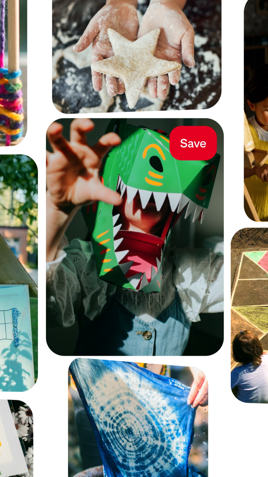
Rounded photo tiles in a loose grid · hero collage, board cards (one big + two small tiles), seasonal banner, signup photo wall
Join Pinterest for free
One red, on buttons only · Log in, Join Pinterest, Continue, the logo
Do linear-gradient(to bottom, #F6F6F3, transparent) over white: a barely-there warm ground that fades within the band.
Warm off-white wash · tops of the seasonal and Bring bands
Do a board = a cluster of saved photos plus a bold title and a "N Pins" count in #62625B; on photos it floats as a white card with a 40px radius and a soft 100px shadow.
The board card · carousels, banner overlay, feature panels
Specimens use sample copy, not Pinterest’s.
The UI is built from Pinterest's own content units, so the page looks like the product.
Rounded photo tiles, the board card (a cluster of photos with a bold title and Pin count), 16px-radius buttons in red or warm gray, and a faint warm wash. No lines, no patterns, no illustration on the homepage.
Source: pinterest.com/%20(2026-10-31)gestalt.pinterest.systems/v1/foundations/elevation
Small, solid icons stay legible over busy photo grids.
Filled single-color glyphs at 12, 16 and 24px from Gestalt's icon library (search, chevrons, info, eye, calendar, verified badge).
Not published: grid; stroke; construction.
Source: gestalt.pinterest.systems/v1/foundations/iconography/librarypinterest.com/%20(2026-10-31)
Illustration explains a state; it never competes with Pins.
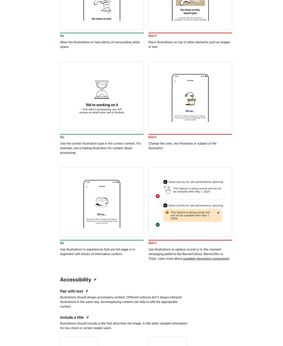
Gestalt line illustrations exist for product states only (empty, error, success, loading) in large, medium and small sizes: a sad plant, a disco ball, an hourglass, a sad coffee.
Source: gestalt.pinterest.systems/v1/foundations/illustration
The pictures are the product; showing many of them at once says "ideas" better than any headline.
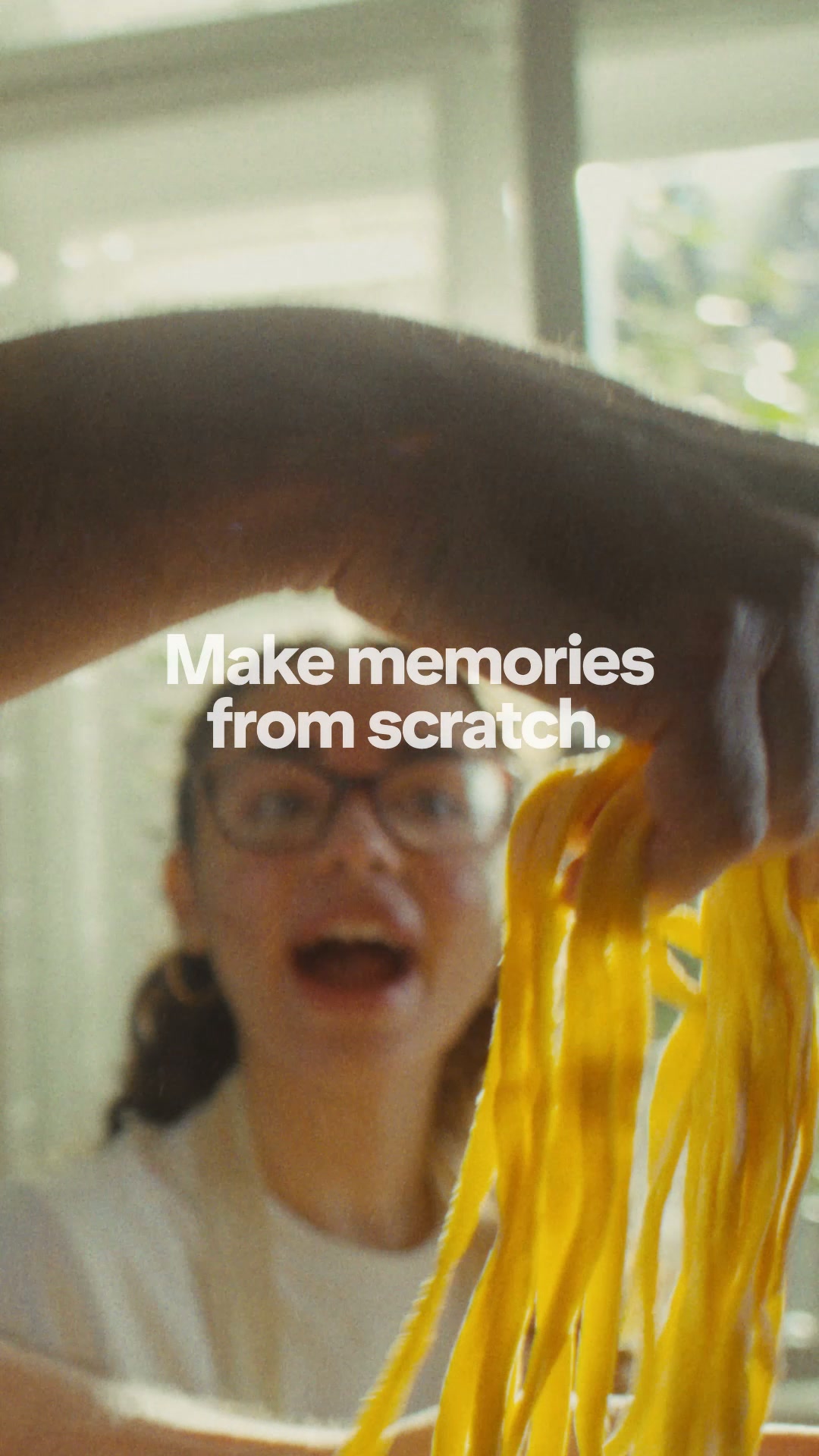
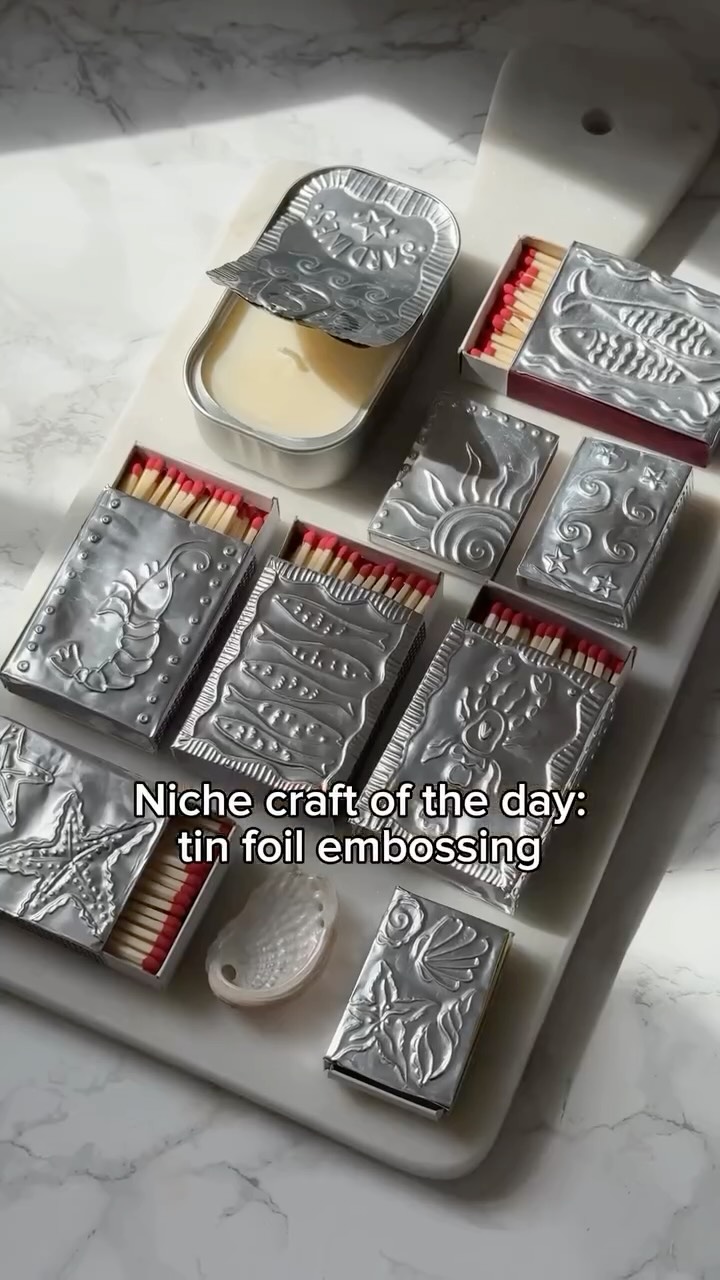
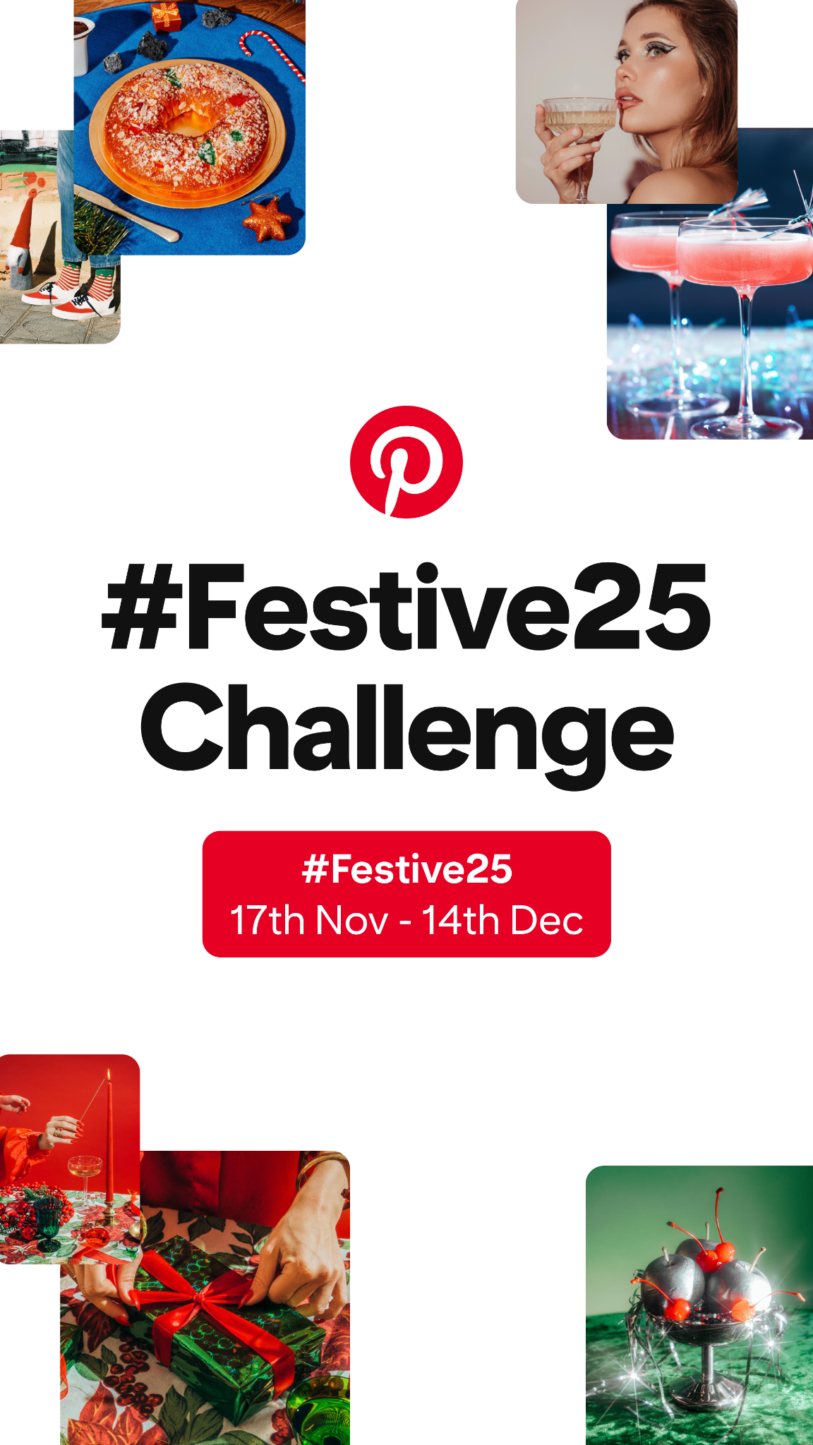
Real Pinners' photos everywhere: bright, saturated, colored-ground studio shots in the hero; moody seasonal photography in the banner; lifestyle tiles on the signup wall. Always in rounded tiles.
Source: business.pinterest.com/brand-guidelinesgestalt.pinterest.systems/v1/foundations/brand_expression/guidelinespinterest.com/%20(2026-10-31)
Motion that feels tactile and brief makes saving feel playful without slowing anyone down.
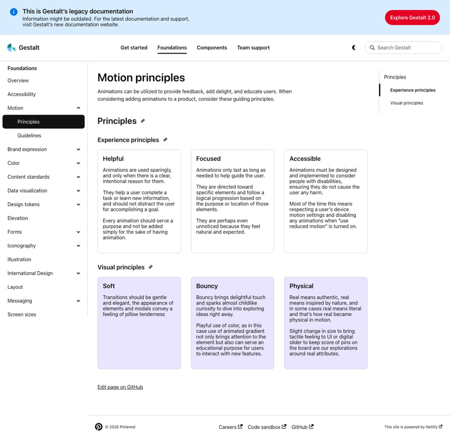
Principles only: helpful, focused, accessible; soft, bouncy, physical. On the site: an 85ms ease-out press, and auto-advancing hero and banner slideshows with a pause control.
Not published: easing curves; durations.
Source: gestalt.pinterest.systems/v1/foundations/motion/principlespinterest.com/%20(2026-10-31)
Product layout is the Pin grid: 2 Pin reps per row on phones, 3-4 on tablets, 8px image margins and gutters, 16px text margins. The homepage is a centred 1140px column with 100px between sections.
Measured from pinterest.com's computed styles and geometry in headless Chrome at 1440x900 and 390x844, desktop user agent, after scrolling the full page; fonts calibrated by rendering.
| Measure | Desktop | Phone |
|---|---|---|
| Page margin | 150px | 8px |
| Section padding | 100px | 100px |
| Hero text width | max 480px, centered | full width |
| Card gap | 16px | 16px |
| Navigation | 80px | 80px |
Signup headline
Pin Sans (Pinterest Sans) · 70px · line 1.2 · weight 600
Hero H1 / seasonal H2
Pin Sans (Pinterest Sans) · 48px · line 1.1 · tracking -2px · weight 800
Section H2 (Bring...)
Pin Sans (Pinterest Sans) · 50px · line 1.2 · weight 700
Feature H3
Pin Sans (Pinterest Sans) · 38px · line 1.18 · weight 700
Carousel heading
Pin Sans (Pinterest Sans) · 36px · line 1.1 · tracking -1.5px · weight 800
Banner card title
Pin Sans (Pinterest Sans) · 32px (phone 11) · line 1.06 · weight 700
Signup card title
Pin Sans (Pinterest Sans) · 28px · line 1.1 · tracking -0.5px · weight 700
Lead
Pin Sans · 20px · line 1.4 · tracking 0.2px · weight 400
Board title / footer heading
Pin Sans · 16px · line 1.4 · weight 700
Nav link / button label
Pin Sans · 16px · line 1.2 · tracking 0.15px · weight 500
Body / footer link
Pin Sans · 16px · line 1.4 · weight 400
Meta / legal
Pin Sans · 12px · line 1.5 · weight 400
How Pinterest’s own landing pages are built, observed on pinterest.com, 2026-10-31. The full measurements are in spec.md.
Source: gestalt.pinterest.systems/v1/foundations/layoutpinterest.com/%20(2026-10-31)
The frame never changes, so seasonal content can swap in without a redesign. Our reading
How our engine applies Pinterest's system per format. Our recipe from their rules and homepage, not something Pinterest publishes.
| Format | What they did | Source |
|---|---|---|
| partner CTA lockups | Badge with "Follow on Pinterest" in centred or left-aligned lockups, interactive and static, with handle or URL. | business.pinterest.com/brand-guidelines |
| product brand moments | Onboarding, milestones, upsells and hero banners in product may use color fills and brand imagery. | gestalt.pinterest.systems/v1/foundations/brand_expression/guidelines |
| homepage | Logged-out pinterest.com: hero collage, seasonal band, feature rows, signup band. | pinterest.com/%20(2026-10-31) |
| Format | Loudness | Must appear | What varies |
|---|---|---|---|
| Landing page | Build it the way pinterest.com is built (kit.spec.page, homepage voice): white page, 80px white nav with the red wordmark, heavy 48px sentence-case H1 with a red and a warm-gray 48px button (16px radius), real photos in rounded tiles (hero collage, board cards, 550px panels with 32px radius), #F6F6F3-to-white washes, a photo-wall signup band under a 50% scrim, black footer | which sections, the seasonal theme, how many feature rows | |
| Deck | White grounds, heavy sentence-case headlines, photos in rounded tiles, red only on the call to action | one brand-moment slide in a reserved color fill | |
| Proposal page | White ground, black copy, one red CTA, rounded photo tiles of the buyer's own work | board-card style summary | |
| Social post | Photo grid in rounded tiles, short clever headline, centred lockup with a link to the account | seasonal wordplay | |
| White, one red button, photo tiles, short lines | a board card |
Source: business.pinterest.com/brand-guidelinesgestalt.pinterest.systems/v1/foundations/brand_expression/guidelines
Your name and logo, Pinterest’s system.
Use this kit for my brand Use this brand in Claude
Get your brand audit Put your brand in Claude What goes in a brand book
Each value is marked published, observed, our reading or our recipe, with its source. Checked 2026-10-31. Not affiliated with Pinterest.