Hot coral card + award-winning app
The app and the hot coral card are the product and the icon. Our reading
Brand book
One hot colour, always present, never forced: Monzo makes the first impression in hot coral, soft white and deep navy, then rewards people with more colour, more wit and more magic the deeper they go. Our reading
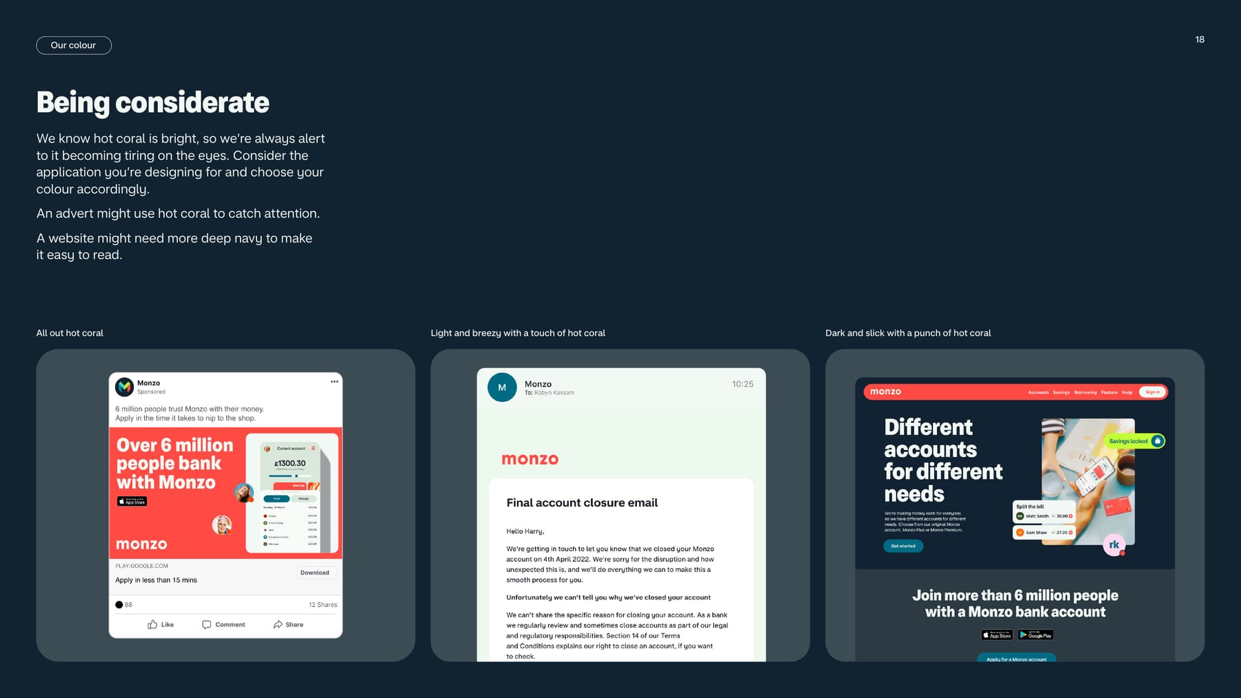
Colour mood and voice dial together: from all-out hot coral with high wit (campaigns, social) to deep navy and soft white with no wit (websites deeper in, operational comms); secondary colours open up the deeper people go.
Source: Monzo style guide (Aug 2022, press kit) p.18Monzo style guide (Aug 2022, press kit) p.21monzo.com/tone-of-voice
Our reading, not published. The guide says hot coral and soft white or deep navy and soft white "can be used in either proportion" (p.19) and that coral "doesn't always need to dominate" (p.17). These numbers sketch the website mood ("more deep navy", p.18); adverts may run all-out coral..
Our engine's setting, built from their rules.
Cover the wordmark. It should still read as Monzo: hot coral somewhere, a puffy extra-bold headline, warm sunlight, a flat app screen or the coral card.
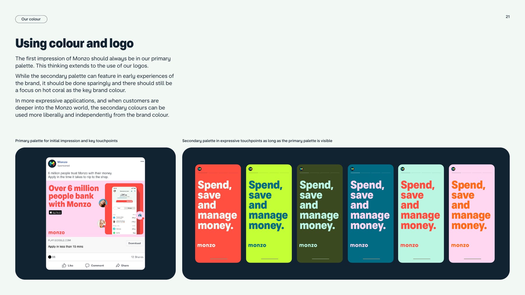
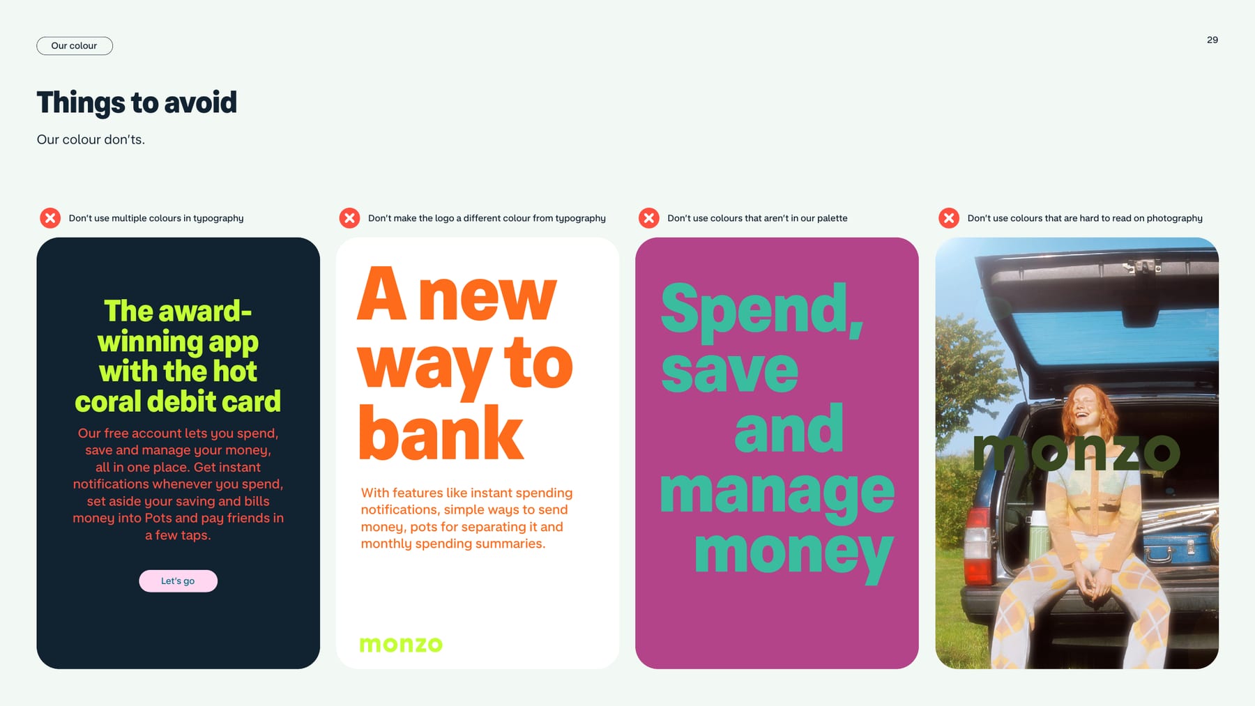
Is the first screen or panel only hot coral, soft white and deep navy? Secondary colours belong further in.
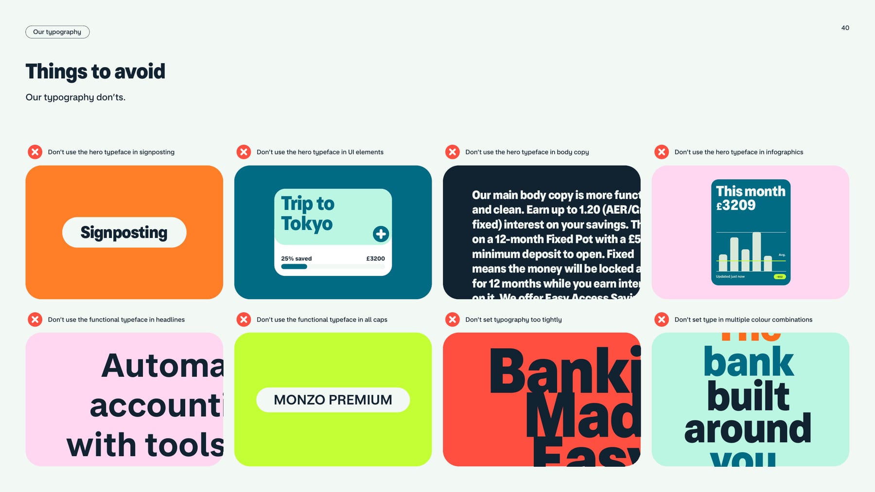
Is the hero face only in big headlines, and never in UI, body, signposting, charts or exaggerated UI elements?
Every headline and line of Monzo Sans in sentence case; nothing in all caps.
Does it sound like something you would say face to face, impact before reasoning, and at most one joke?
No 2022 figures (6 million) where the press page now says 16 million.
Monzo is building a new kind of bank, one built for your smartphone and designed for the way we live today. Published
The app and the hot coral card are the product and the icon. Our reading
Spend, save and manage money in one place: Pots, round-ups, bill splitting, trends. Our reading
A real, regulated bank that is human, warm and inclusive. Our reading
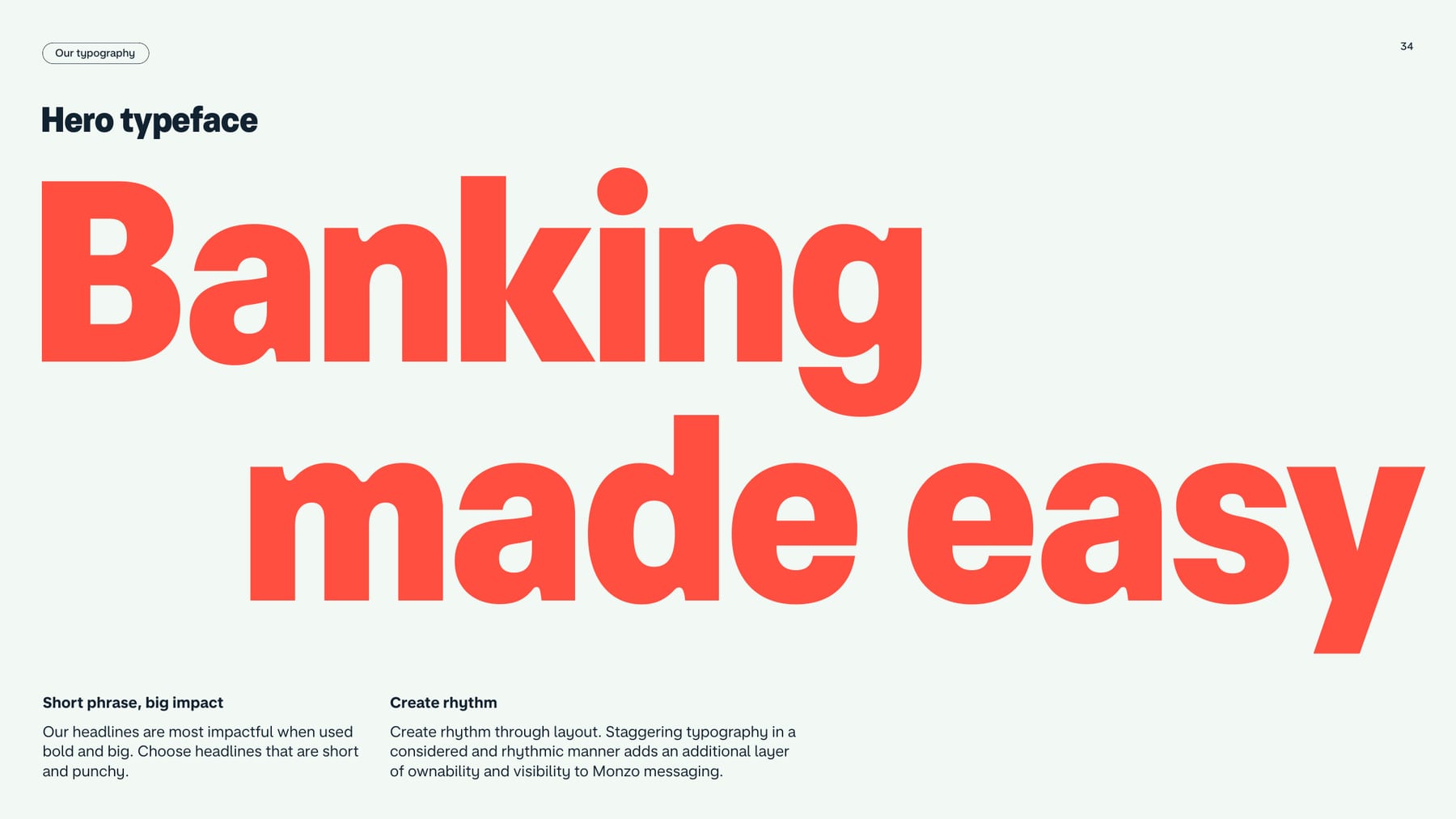
Banking made easy
Brighter Banking
Award winning app with the hot coral card
Different accounts for different needs
Founded in early 2015, a regulated bank since August 2016, now used by more than 16 million personal and business customers.
Clear, inclusive, reader-first; make complex things simple
PublishedTransform the mundane with unexpected delight; celebrate and commiserate
PublishedHumour as seasoning; people feel part of the joke, never its target
PublishedCategory. UK app-based bank (regulated since August 2016) for personal and business customers. Published
Traditional high-street banks (not named by Monzo).
At Monzo we're building a new kind of bank, built for your smartphone and designed for the way we live today. Founded in early 2015 with a mission to build the best bank account in the world; a regulated bank since August 2016; more than 16 million personal and business customers.
Banking made easy Published
Brighter Banking Published
Spend your money on life, not your life on money Observed
Join more than 6 million people with a Monzo bank account
Over 6 million people bank with Monzo
A new way to bank
Organise your life with pots
Leave the maths to Monzo
Spend, save and manage money.
Put money in your hands
Money, managed
Spending, sorted
Sharing, simple
Our world is always sunny and bright.
Spend your money on life, not your life on money
Quit the app juggling act
It all starts with a Hot Coral card
Get the most out of Monzo
Spend your money on life, not your life on money
Get the most out of Monzo
Quit the app juggling act
It all starts with a Hot Coral card
The bank made for travel
Save like a superhero
Make payday twice as nice
A regulated bank with 24/7 support
Which? recommended 2 years in a row
Apply for an account in 10 minutes
Security you can bank on
Independent service quality survey results
Authorised push payment (APP) fraud rankings in 2024
The guide carries no messaging framework; its messages live in sample headlines: "Banking made easy", "Brighter Banking", "Award winning app with the hot coral card", "Spend, save and manage money". The press page supplies mission and boilerplate. The live homepage (2026-10-29) has moved to "Spend your money on life, not your life on money".
Source: downloads.ctfassets.net/ro61k101ee59/2zfabTQILrAL4IDPKjJQCm/ca5ed206d818d2cc45652043f1e984ce/Monzo-Press-Kit-2026.zipmonzo.com/pressmonzo.com
We're sorry. Here's what we're doing to fix it.
We'd like to apologise for any inconvenience caused.
Kindness is the floor and personality is a dial, so a closure email and a TikTok can both be Monzo without either feeling wrong.
Straightforward kindnessEveryday magicWarm wit
Monzo Writing Principles publish three principles and a dial per channel. Straightforward kindness is always on; Everyday magic and Warm wit rise from operational comms (low/none) to organic social (high/maxed out). The 2022 style guide itself has no voice section.
We're sorryblocklistallowlistPotsHot Coral card
We'd like to apologiseblacklistwhitelisthey prestowand emojiEggcellentall wrapped up (Christmas)no tricks, just treatsdiscover (as filler)so much more"even your mum could use it" jokes
Source: monzo.com/tone-of-voicedownloads.ctfassets.net/ro61k101ee59/2zfabTQILrAL4IDPKjJQCm/ca5ed206d818d2cc45652043f1e984ce/Monzo-Press-Kit-2026.zip
| Operational comms | Kindness maxed out; magic low; wit none |
|---|---|
| Customer service | Kindness high; magic low; wit none |
| Marketing comms | Kindness high; magic medium; wit medium |
| Campaigns | Kindness high; magic high; wit high |
| Paid social | Kindness high; magic high; wit high |
| Organic social | Kindness high; magic high; wit maxed out |
Source: monzo.com/tone-of-voice



Logo files from Monzo's public Press Kit 2026 (Logos/Digital use). Monzo is a trademark of Monzo Bank Limited.
monzo
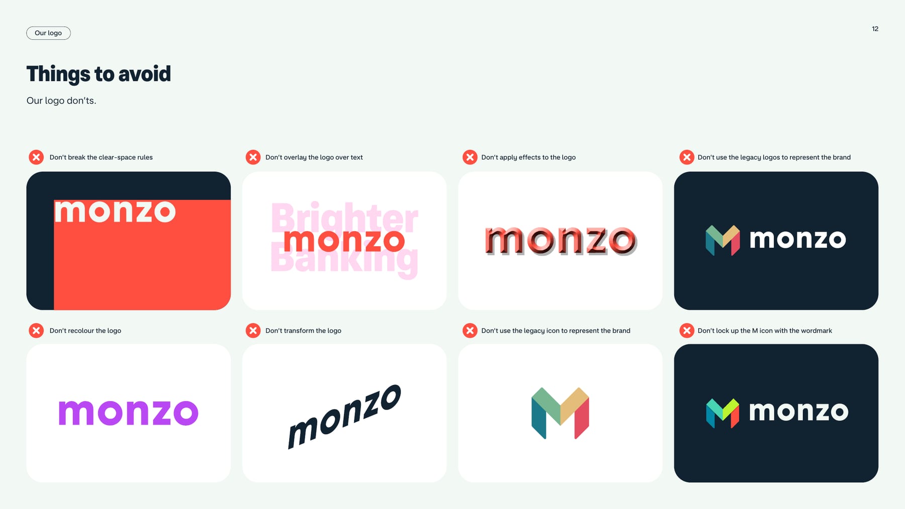
M + monzo
One bold, simple wordmark in three colourways covers every ground in the palette, and retiring the M to small sizes keeps the wordmark the face of the brand.
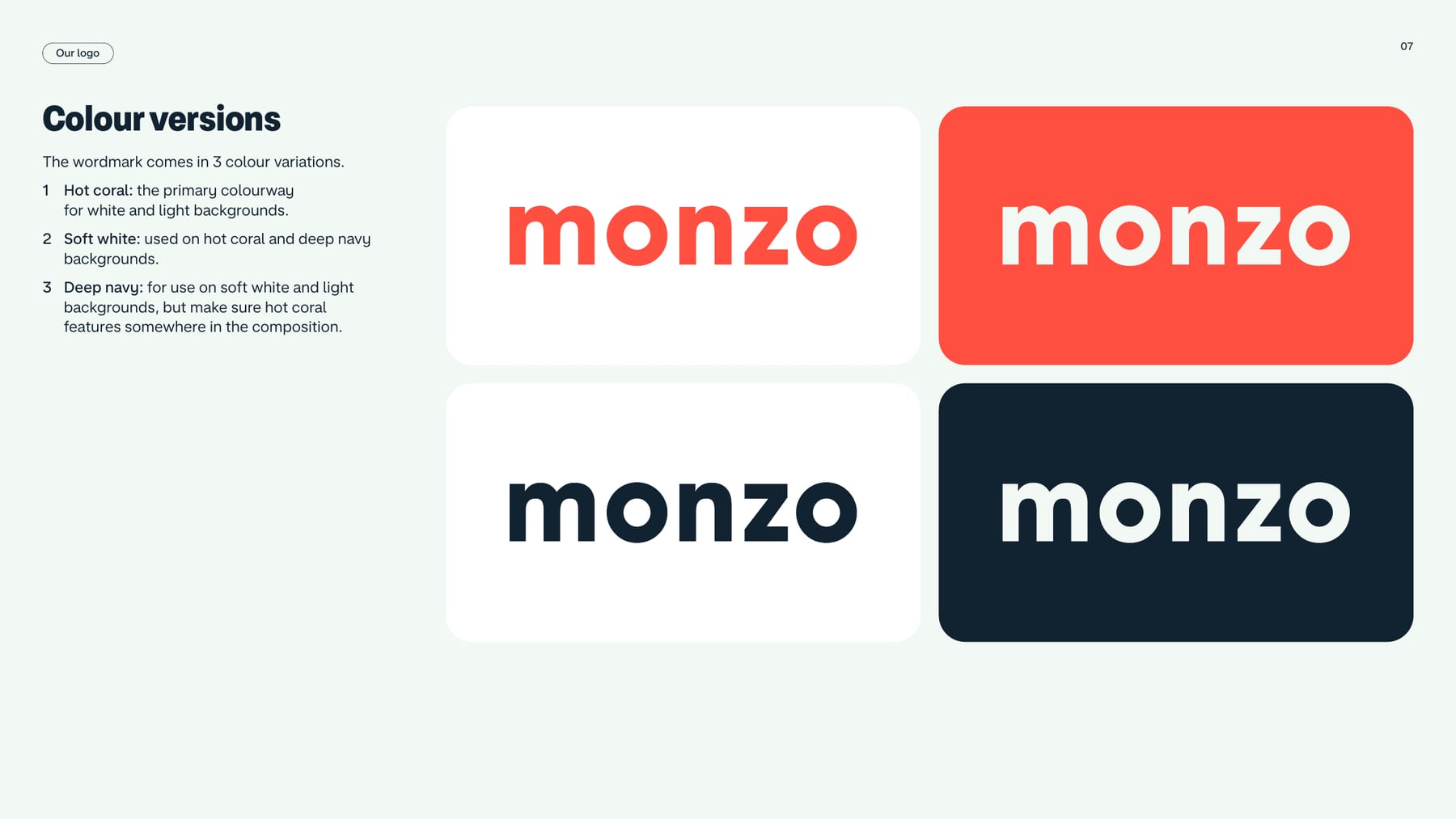
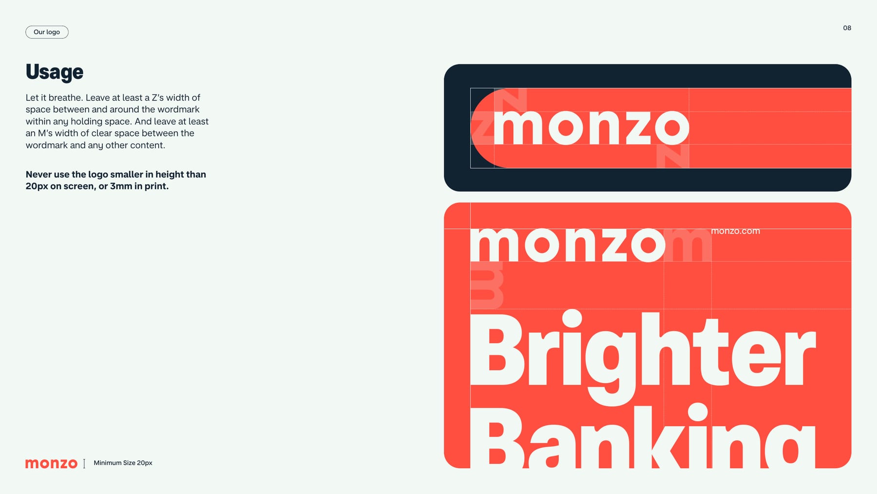
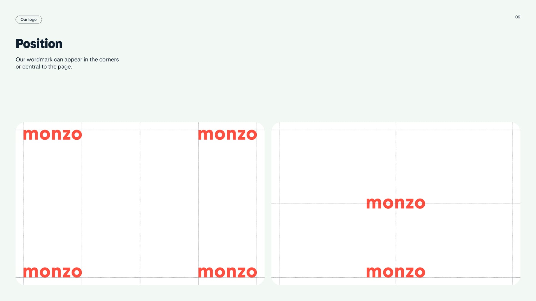
| Primary logo | lowercase wordmark "monzo" |
|---|---|
| Colourways | Hot coral #FF4F40, Soft white #F2F8F3, Deep navy #112231 |
| Clear space (holding shape) | width of a "z" |
| Clear space (other content) | width of an "m" |
| Minimum size | 20px tall on screen; 3mm in print |
| Positions | corners or centred |
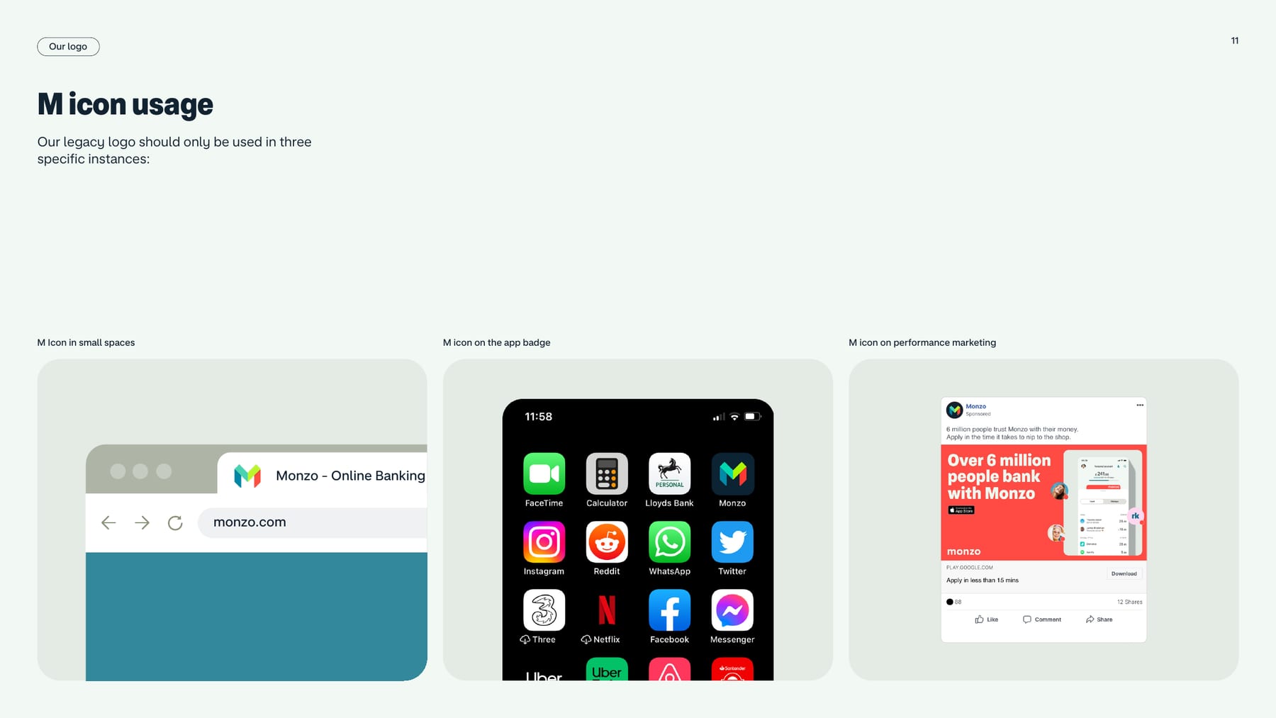
| Secondary mark | M icon (legacy): small spaces, app badge, performance marketing |
The lowercase "monzo" wordmark is the primary logo, shown sitting on the hot coral card. Three colourways: hot coral (white and light grounds), soft white (on hot coral and deep navy), deep navy (on soft white and light grounds, with hot coral somewhere in the composition). It sits in a corner or centred. The M icon is legacy, kept for small spaces, the app badge and performance marketing.
Not published: clear space and minimum size for the M icon; a lockup with tagline or sub-brands.
Banking made easy
Banking made easy
Different accounts for different needs
Spend, save and manage money
A single hot colour on two calm neutrals gives instant recognition at the front door, then the secondary palette rewards people as they go deeper.
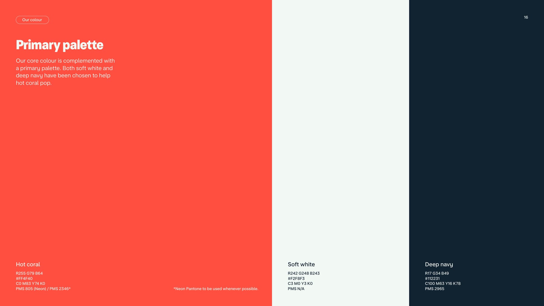
| Hot coral | #FF4F40 / R255 G79 B64 / C0 M83 Y74 K0 / PMS 805 (Neon) or 2346 |
|---|---|
| Soft white | #F2F8F3 / R242 G248 B243 / C3 M0 Y3 K0 / PMS N/A |
| Deep navy | #112231 / R17 G34 B49 / C100 M63 Y16 K78 / PMS 2965 |
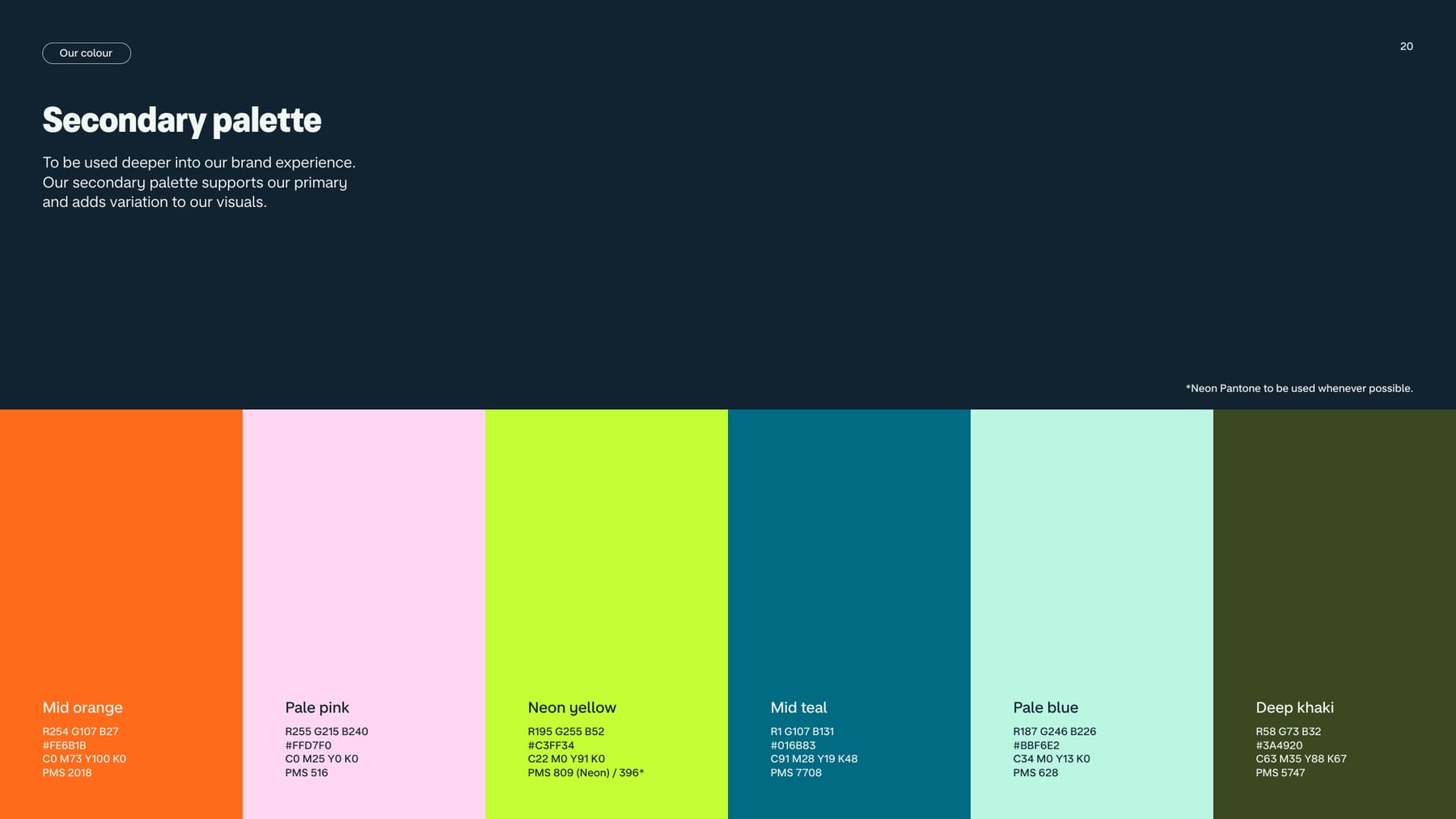
| Mid orange | #FE6B1B / PMS 2018 |
| Pale pink | #FFD7F0 / PMS 516 |
| Neon yellow | #C3FF34 / PMS 809 (Neon) or 396 |
| Mid teal | #016B83 / PMS 7708 |
| Pale blue | #BBF6E2 / PMS 628 |
| Deep khaki | #3A4920 / PMS 5747 |
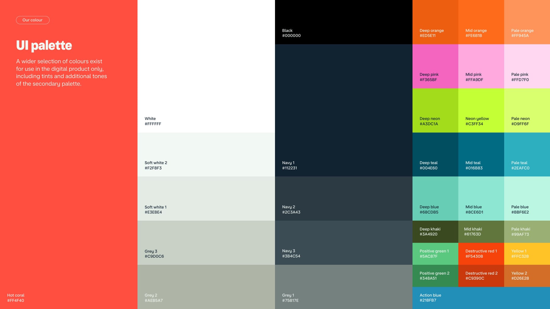
| Action blue (UI) | #218FB7 |
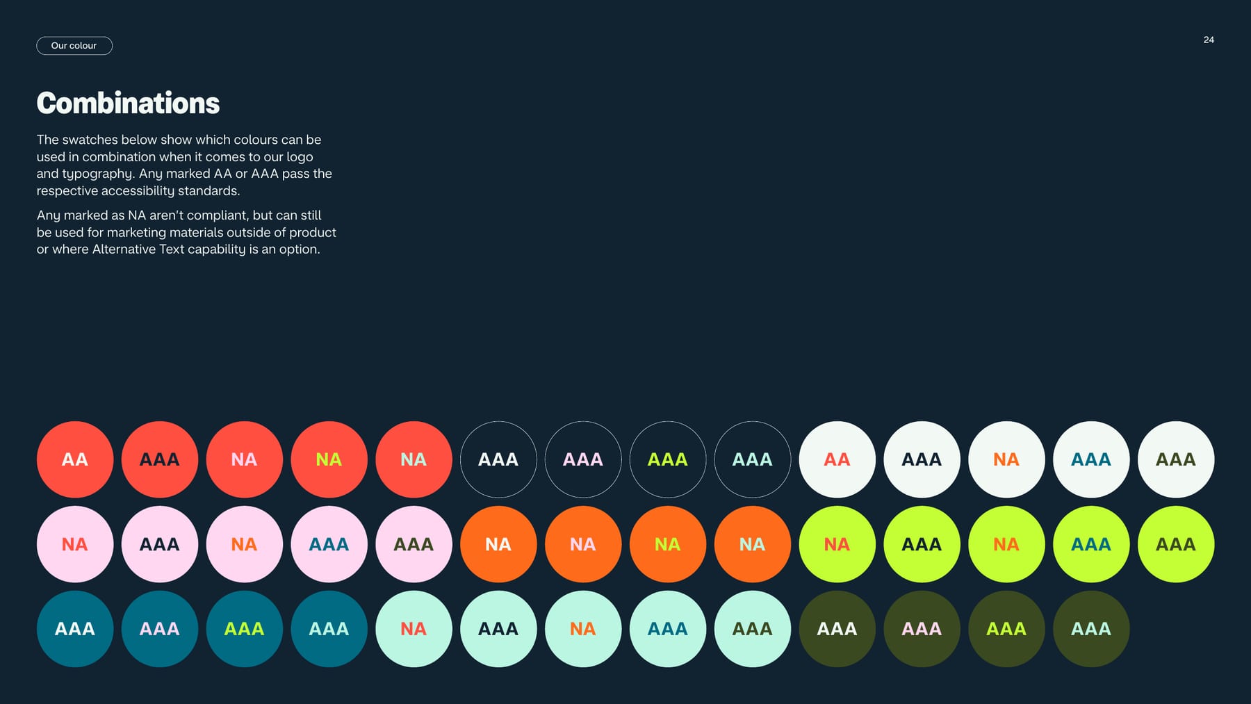
| Contrast | primary pairings AA at 18pt and above |
Hot coral (#FF4F40) is the brand, supported by a primary palette of soft white (#F2F8F3) and deep navy (#112231) chosen to make coral pop. Six secondary colours (mid orange, pale pink, neon yellow, mid teal, pale blue, deep khaki) appear deeper in the experience, and a wider UI palette of tints and status colours is for the digital product only. Live site tokens (2026-10-29): --color-brand #ff4f40, --color-navy-800 #112231, --color-navy-900 #091723, --color-grey-100 #f2f8f3.
Not published: colour proportions as percentages; a muted text colour role; dark-mode token mapping beyond the screenshots.
Source: downloads.ctfassets.net/ro61k101ee59/2zfabTQILrAL4IDPKjJQCm/ca5ed206d818d2cc45652043f1e984ce/Monzo-Press-Kit-2026.zipmonzo.com
Banking made easy
Banking made easy
MONZO PREMIUM
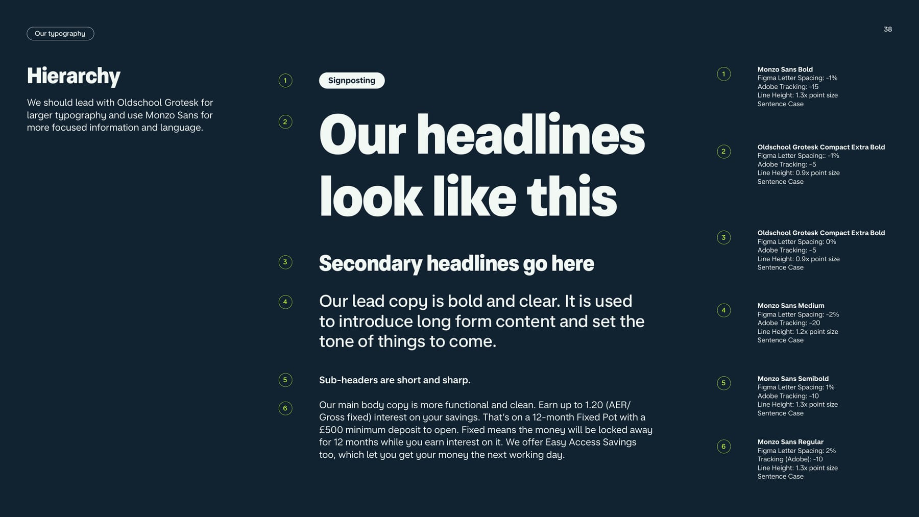
Sub-headers are short and sharp.
Trip to Tokyo
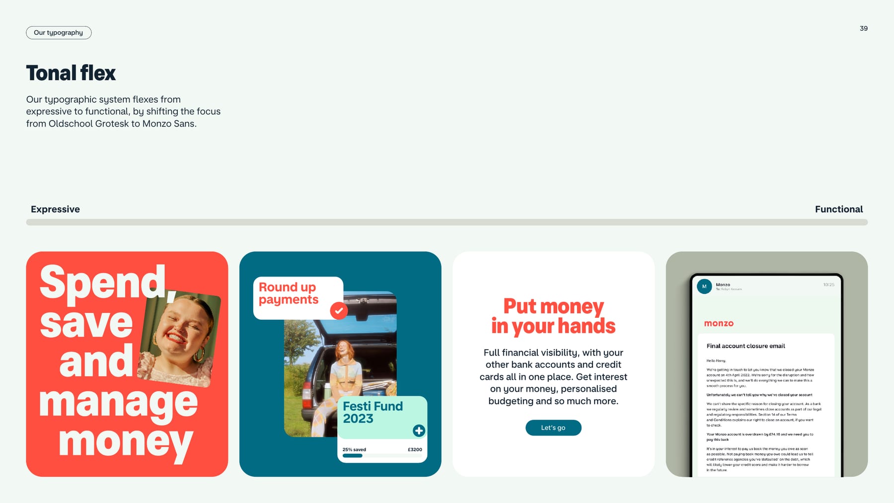
A soft, puffy grotesk carries the warmth in headlines, and a clean house sans keeps money information legible, so expression never costs clarity.
| Their face | Use | License | Open stand-in |
|---|---|---|---|
| MonzoSansDisplay | Every homepage headline: 800 for H1/H2, 700 for card titles, 600 for small heads (observed 2026-10-29) | proprietary Monzo face, self-hosted woff2 from static-assets.monzo.com; not licensed to us | Raleway proprietary face; best width (0.22% mean error) and ink (1.01) among allowed families; set lining-nums |
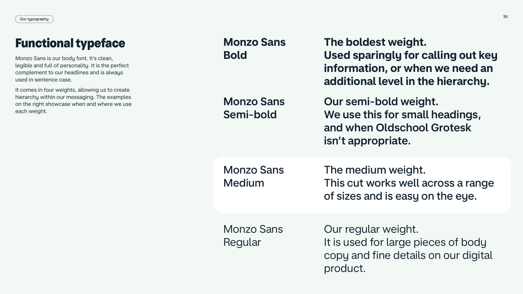
| Monzo Sans (served as MonzoSansText) | Functional typeface in four weights (Regular, Medium, Semi-bold, Bold): body, lead copy, sub-headers, UI, data; always sentence case (pp.35-38) | proprietary Monzo face, not licensed to us | Onest proprietary face; width 0.21% and ink 1.04 vs best on-list Open Sans 450 (0.20%, ink 1.13) |
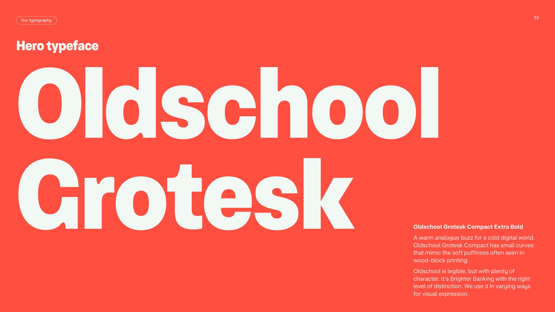
| Oldschool Grotesk Compact Extra Bold | Hero typeface: big, short headlines, staggered for rhythm; expressive end of the tonal flex (pp.33-34, 39) | Proprietary commercial typeface; not in the press kit, not on Google Fonts | Raleway (homepage does not use Oldschool) The site declares @font-face 'Oldschool' but no homepage element uses it. It is NOT MonzoSansDisplay renamed: at the same size it sets 0.855x as wide (528.75 vs 618.53px hero line), x-height 0.505em vs 0.55em, cap 0.68em vs 0.705em; glyph comparison in calibration/real-faces.png and display-big-compare.png |
| Homepage build: stand-in per role (observed 2026-10-29) | Real face weight -> stand-in weight, size/line height in px, tracking. Use these, not the guide rows further down |
|---|---|
| Hero h1 | real MonzoSansDisplay 800 -> Raleway 900, 48.83px/58.59px desktop, 40.67px/48.80px phone, letter-spacing 0 |
| Section h2 | real MonzoSansDisplay 800 -> Raleway 900, 39.06px/46.87px desktop, 33.73px/40.48px phone, letter-spacing 0 |
| Regulatory h2 | real MonzoSansDisplay 800 -> Raleway 900, 44px/52.8px desktop, 32px/38.4px phone, letter-spacing 0 |
| Step numeral | real MonzoSansDisplay 800 -> Raleway 900, 61.04px/73.25px, desktop only, letter-spacing 0 |
| Slide title | real MonzoSansDisplay 700 -> Raleway 750, 31.25px/37.5px desktop, 27.99px/33.59px phone, letter-spacing -0.02em (-0.63px / -0.56px) |
| Carousel card title (product, travel, savings cards; step titles) | real MonzoSansDisplay 700 -> Raleway 750, 25px/35px desktop, 23.23px/29.23px phone, letter-spacing -0.5px (-0.46px phone) |
| Account card title and footer column heading | real MonzoSansDisplay 700 -> Raleway 750, 25px/30px desktop, 23.23px/27.87px phone, letter-spacing -0.5px (-0.46px phone) |
| Spotlight item title (desktop) | real MonzoSansDisplay 600 -> Raleway 675, 20px/28px, letter-spacing -0.4px. Ranking card h3: same face, 16px/19.2px (14px/16.8px phone), letter-spacing -0.32px |
| Lead/intro | real MonzoSansText 400 -> Onest 350, 20px/28px desktop, 19.28px/26.99px phone, letter-spacing 0 |
| Body, card text, legal | real MonzoSansText 400 -> Onest 350, 16px/22.4px (legal 12.8px/17.92px), letter-spacing 0 |
| Emphasis (buttons, nav labels, feature-tile text, footer links, price pills, tags, spotlight titles on phones) | real MonzoSansText 600 -> Onest 550, 16px/22.4px, letter-spacing 0.16px |
| 1 Signposting (guide, 2022; not the homepage) | Monzo Sans Bold; letter spacing -1% (Adobe -15); line height 1.3x; sentence case |
| 2 Headline (guide, 2022; not the homepage) | Oldschool Grotesk Compact Extra Bold; letter spacing -1% (Adobe -5); line height 0.9x; sentence case |
| 3 Secondary headline (guide, 2022; not the homepage) | Oldschool Grotesk Compact Extra Bold; letter spacing 0% (Adobe -5); line height 0.9x; sentence case |
| 4 Lead copy (guide, 2022; not the homepage) | Monzo Sans Medium; letter spacing -2% (Adobe -20); line height 1.2x; sentence case |
| 5 Sub-header (guide, 2022; not the homepage) | Monzo Sans Semibold; letter spacing 1% (Adobe -10); line height 1.3x; sentence case |
| 6 Body (guide, 2022; not the homepage) | Monzo Sans Regular; letter spacing 2% (Adobe -10); line height 1.3x; sentence case |
| Live site faces | MonzoSansDisplay (titles), MonzoSansText (body), observed 2026-10-29; letter-spacing normal everywhere |
The guide publishes ratios and tracking, not point or pixel sizes.
Two faces. Oldschool Grotesk Compact Extra Bold is the hero face, "a warm analogue buzz for a cold digital world", for big, short, staggered headlines. Monzo Sans is the functional face in four weights for everything else: lead copy, sub-headers, body, UI and data. The system flexes from expressive (Oldschool-led) to functional (Monzo Sans only). Live site (2026-10-29) titles in MonzoSansDisplay and body in MonzoSansText; Oldschool survives only in some plan and comparison headers, so the 2022 hero-face rule is older than the site.
Not published: type sizes in px or pt; web font files or licences; Figma and Adobe tracking values that agree (they are printed side by side and differ).
Source: downloads.ctfassets.net/ro61k101ee59/2zfabTQILrAL4IDPKjJQCm/ca5ed206d818d2cc45652043f1e984ce/Monzo-Press-Kit-2026.zipmonzo.com
Do 64px radius at 1440 on every band panel and slide; 32px on cards and media; 16px on list items; 32px (and 34px for the hero bottom) on phones. Bands are panels floating on white, never edge-to-edge color fields on desktop. Many per page.
Big-radius inset panels · hero (1392 wide, 24px inset), Save, Which?, Apply and ranking panels (1312 wide), footer (top corners)
Do the monzo wordmark in #FF4F40 set the full content width (1264x220 at 1440, 326x57 at 390) on #112231, between the locale pill and the legal paragraph. Once per page.
Full-width coral wordmark · footer
Do #FF4F40 and #112231 tiles alternate (checkerboard in the 2x2 grid; slides alternate #F2F8F3 and #112231); text on both is white.
Coral and navy alternation · feature grid, slides
Specimens use sample copy, not Monzo’s.
Implied physicality through shadows means visuals never date with a phone model, and the app itself becomes the illustration.
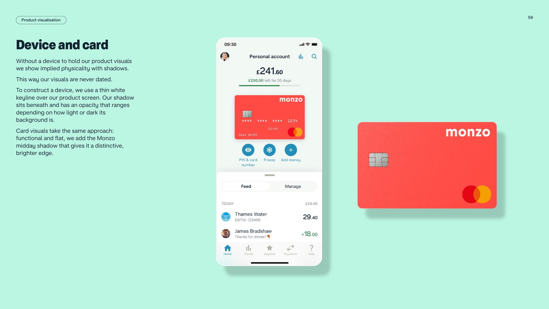
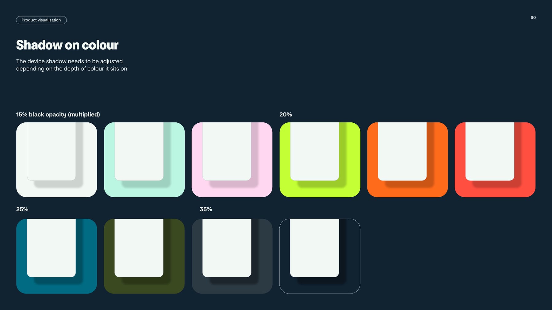
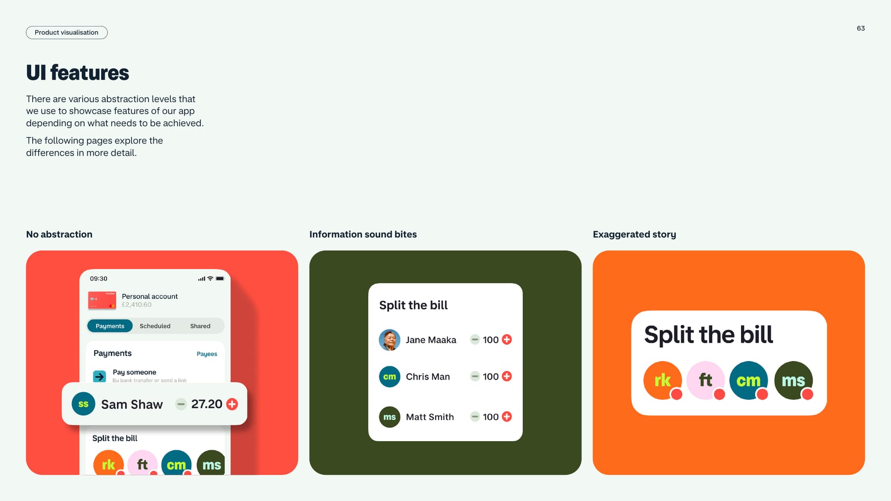
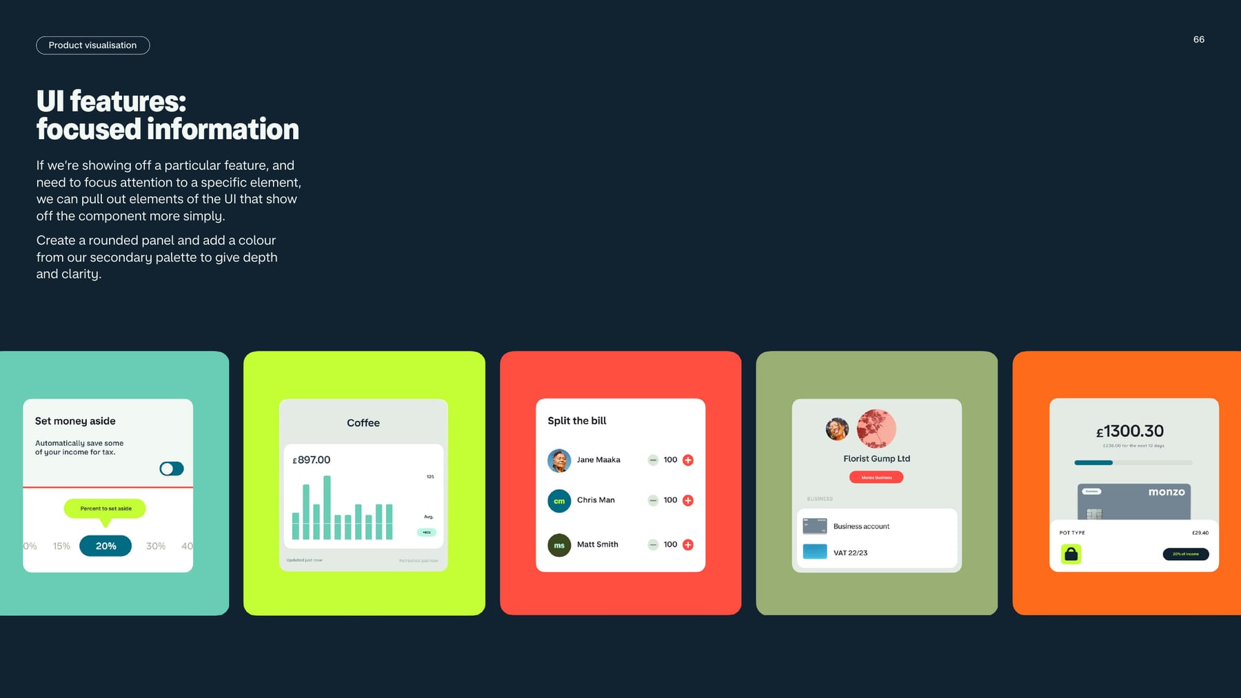
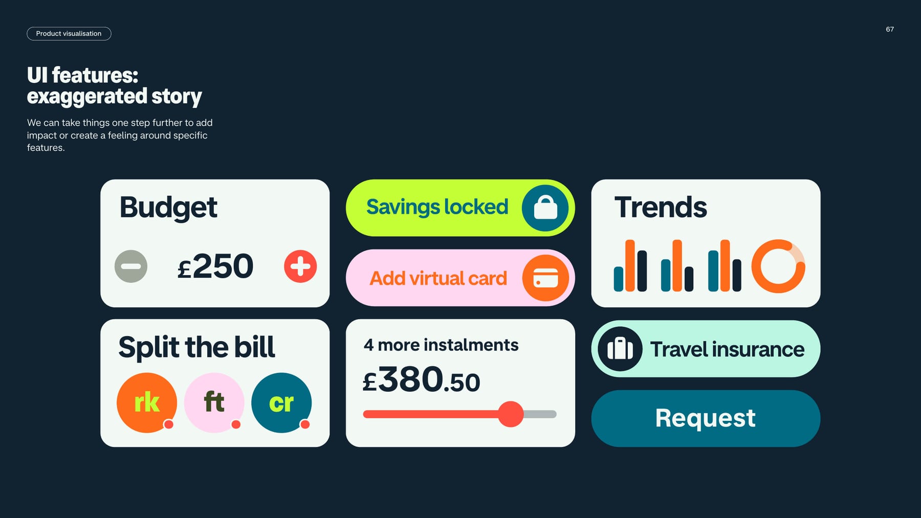
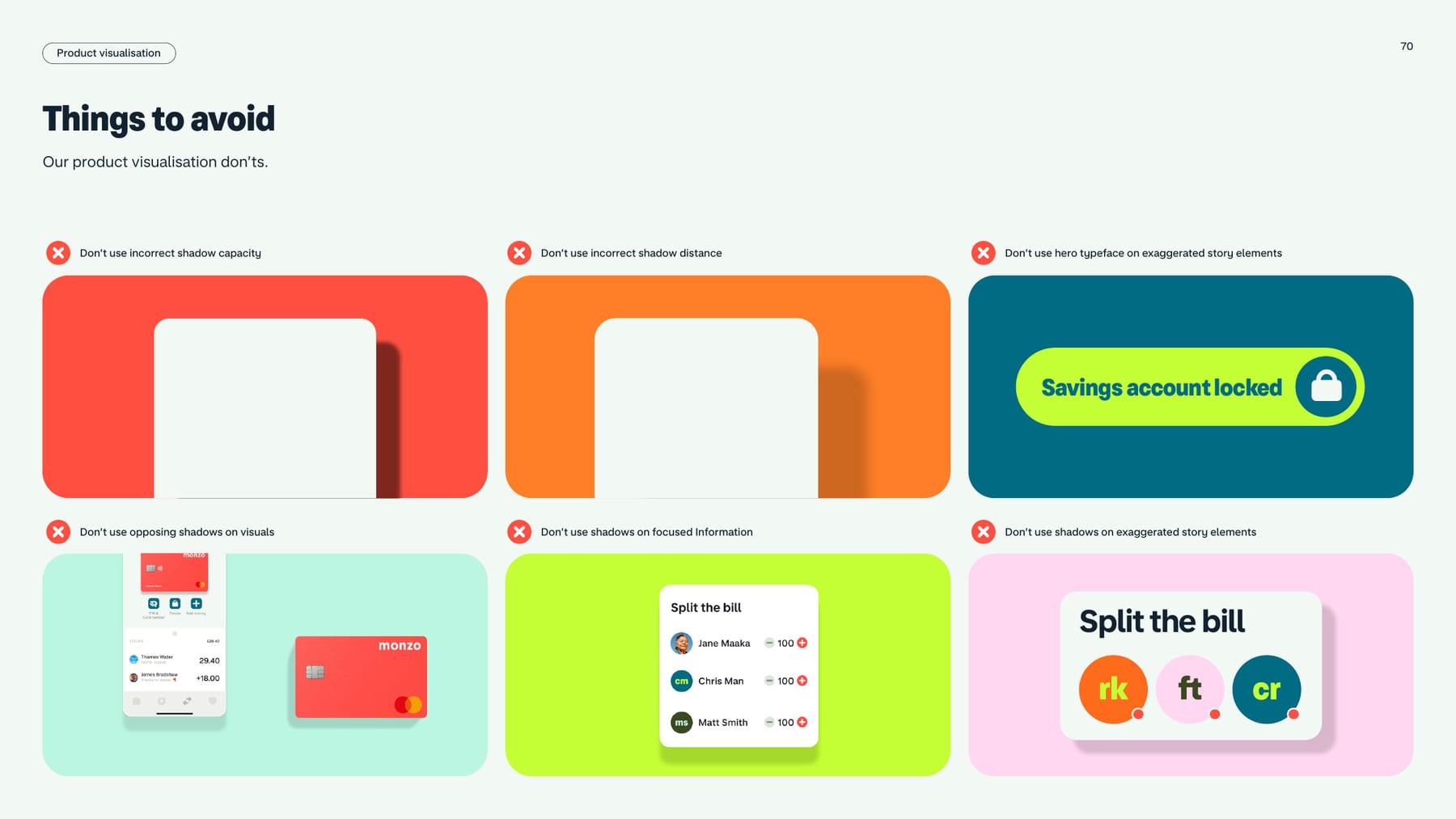
| Device construction | thin white keyline over the product screen, shadow beneath |
|---|---|
| Shadow opacity | 15% / 20% / 25% / 35% black (multiplied), lighter grounds to darker |
| Abstraction levels | no abstraction; focused information; exaggerated story |
| Panels | rounded, secondary palette colour |
Product visualisation is the guide's graphic system. Devices are flat app screens with a thin white keyline and a soft drop shadow; the card is flat with the "Monzo midday shadow". Features are shown at three abstraction levels: no abstraction (the real screen), focused information (UI pulled into a rounded panel on a secondary colour) and exaggerated story (big pills and cards: "Savings locked", "Split the bill", "Budget £250").
Not published: shadow offset, blur and direction values; corner radius of panels, devices and pills.
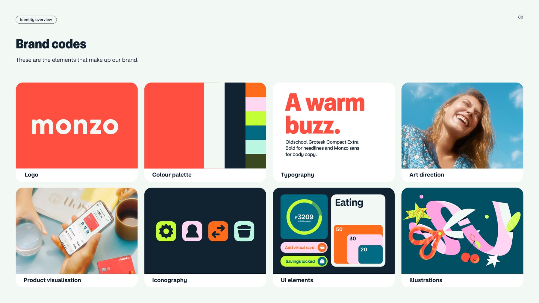
Our reading: icons borrow the secondary palette so they read as product, not decoration.
| Grid | not published |
|---|---|
| Stroke | not published |
| Sizes | not published |
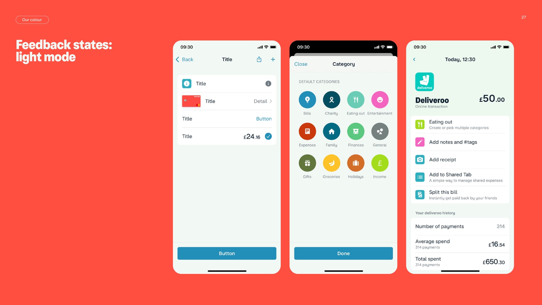
Not specified in the guide. Iconography appears only as a brand-code tile (p.80): bold glyphs in rounded squares in secondary colours on navy. The UI screens (pp.27-28) show category icons as white glyphs on coloured circles.
Not published: icon grid, stroke, sizes, library or rules.
Our reading: illustration is a rare expressive accent for feature stories, drawn in the secondary palette.
| Style rules | not published |
|---|
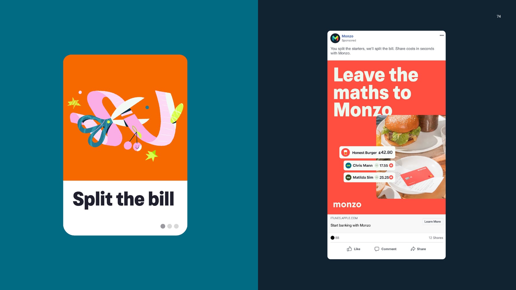
Not specified in the guide. One illustration is shown (pp.74, 80): a pink, orange and yellow ribbon-and-scissors drawing on an orange card for "Split the bill", listed as a brand code.
Not published: illustration style, line weight, palette rules or usage.
Sunlight is the photographic version of hot coral: warmth makes a bank feel human, and the product always lives in a real moment.

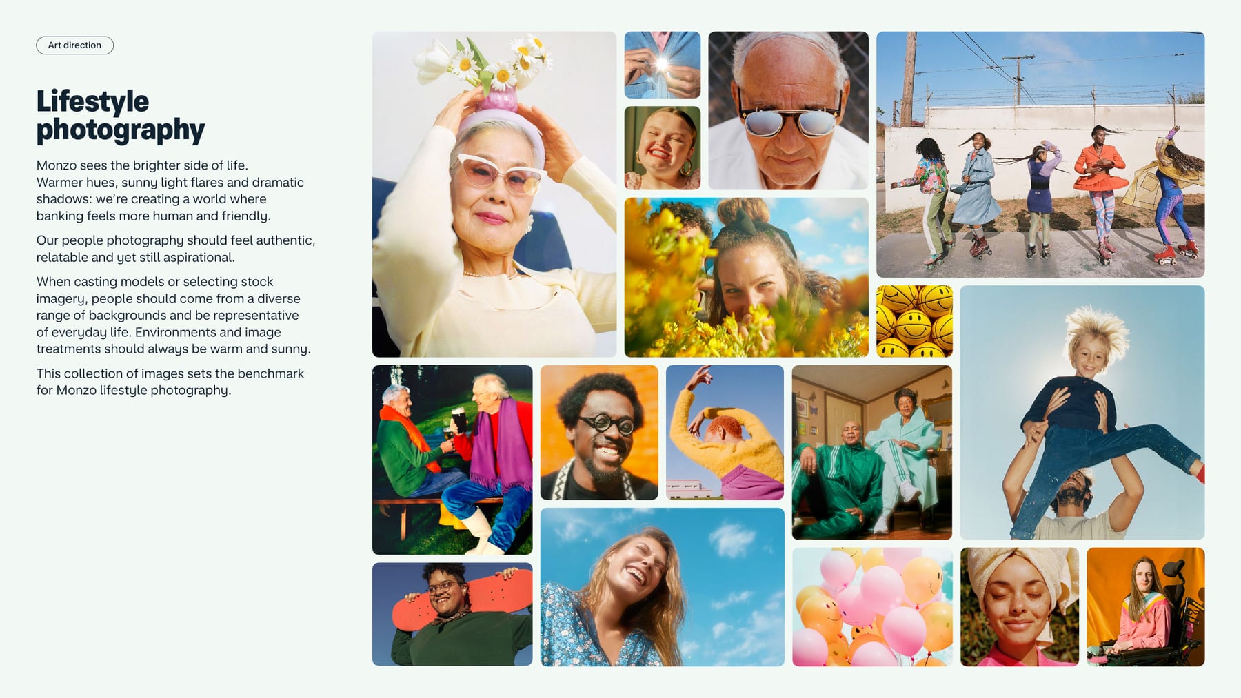
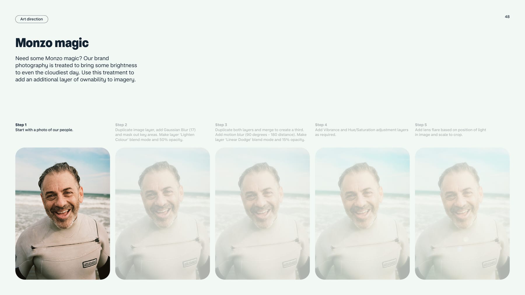
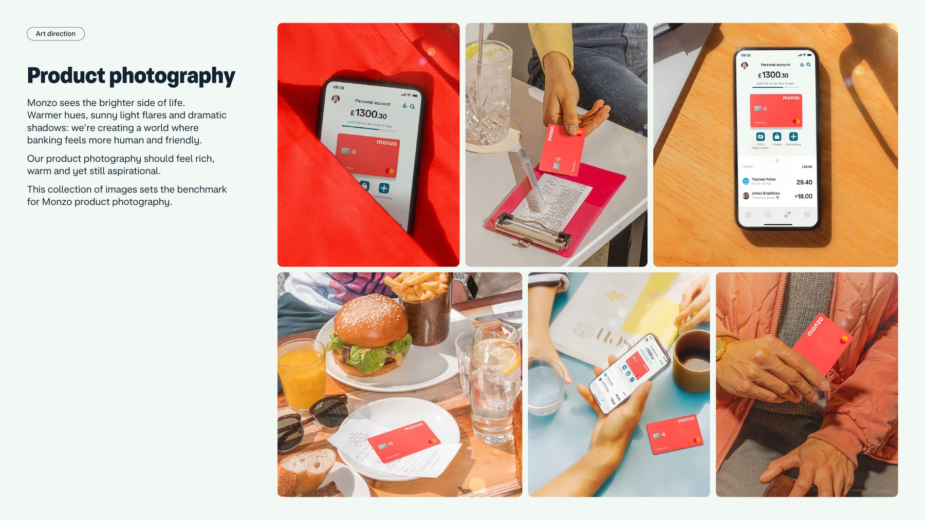
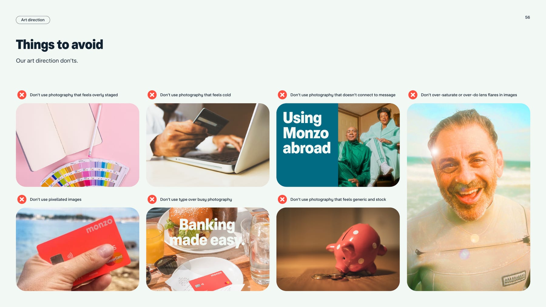
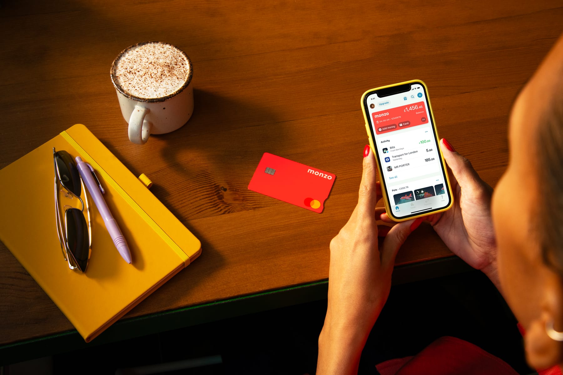
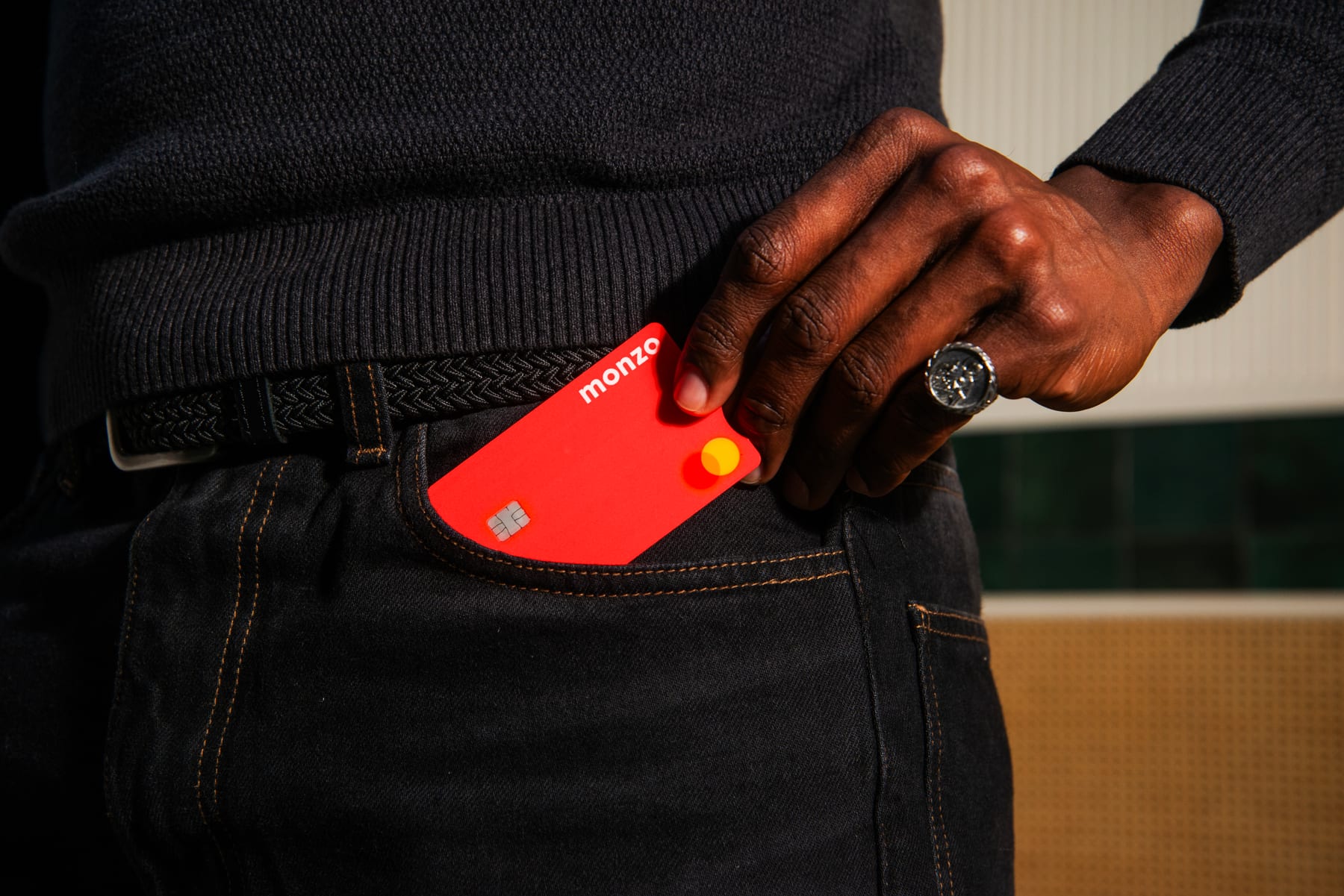
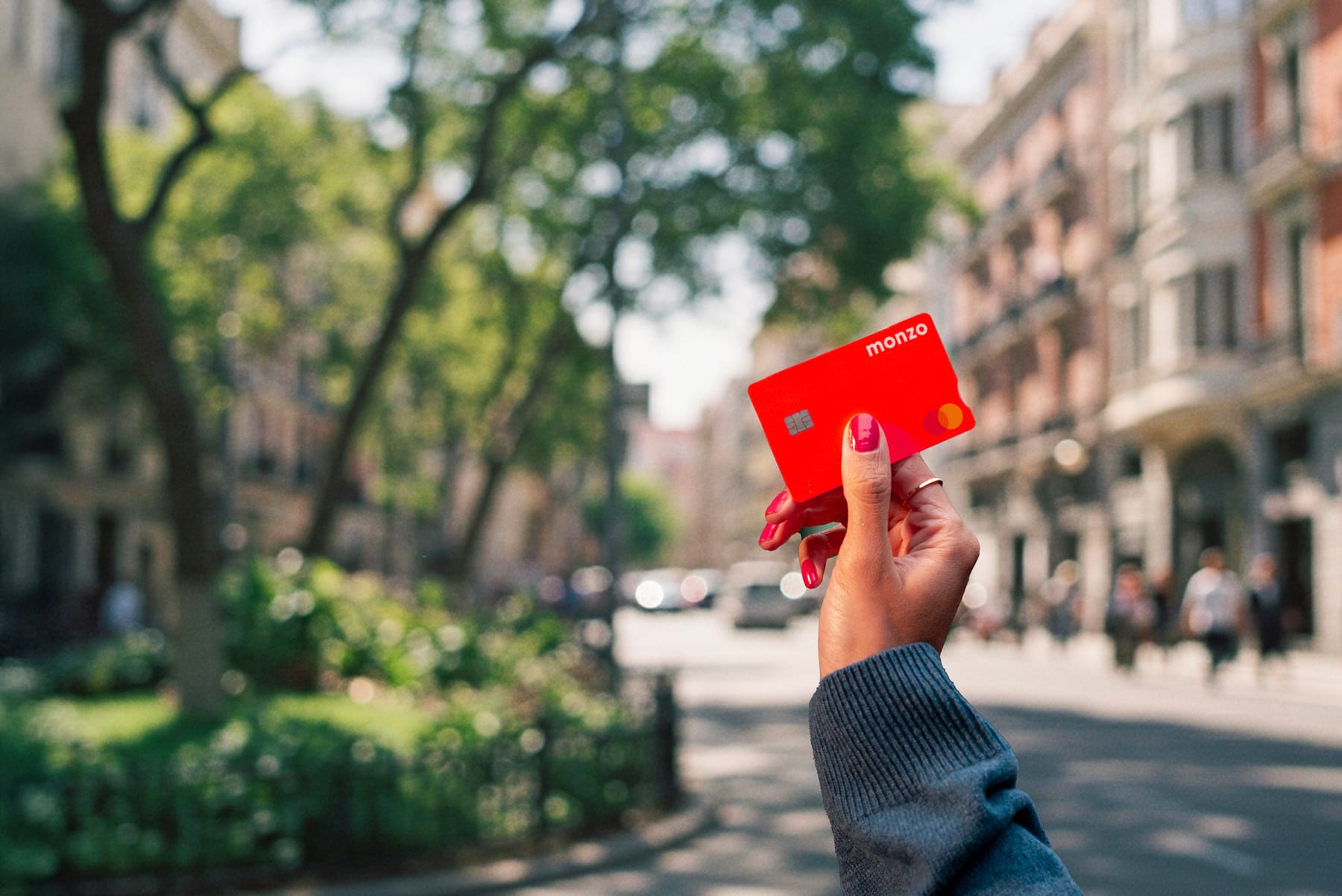
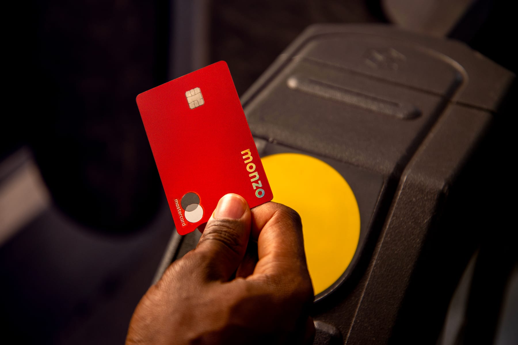
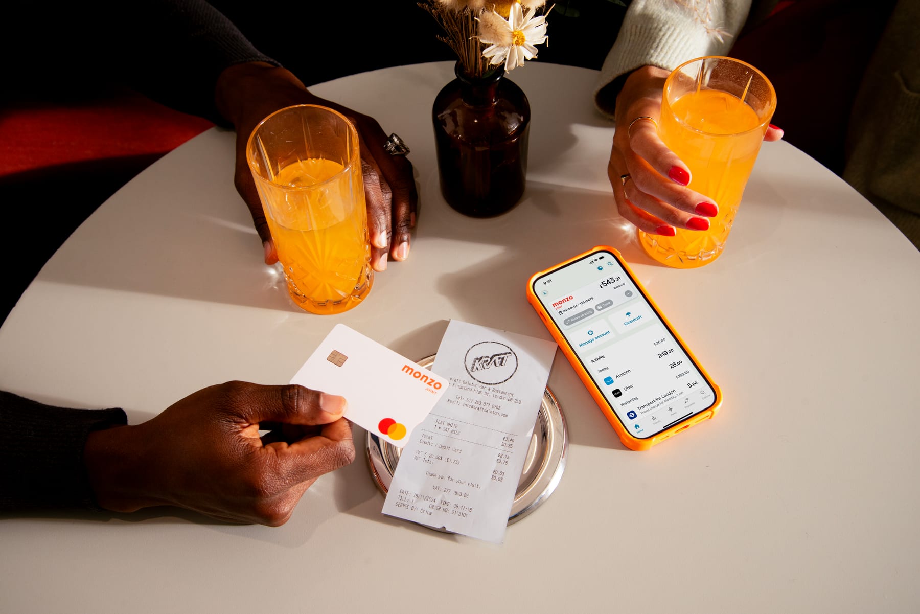
| Light | warm, sunny, flares, dramatic shadows |
|---|---|
| Gaussian blur | 17 px, Lighten Colour, 50% opacity |
| Motion blur | 90 degrees, 180 distance, Linear Dodge, 15% opacity |
| Devices | model and make non-specific |
"Our world is always sunny and bright." Two kinds: lifestyle (diverse, characterful, real people in warm sunlight with flares and dramatic shadows) and product (the card and app in context, in warm dappled sunlight, with hot coral in frame where possible). A five-step "Monzo magic" treatment brightens any photo. The 2026 press-kit photos keep the warm, hard-shadowed, hands-and-product look.
Not published: crop ratios, colour grading values beyond the five steps.
Our reading: none to report until motion is measured on the live site.
| Easing | not published |
|---|---|
| Duration | not published |
Not published. The guide has no motion section and gives no easing, duration or animation rules.
Not published: all motion values.
The guide shows layout through examples rather than grids: big staggered headlines, rounded panels, the wordmark in a corner or centred, and websites that open in the primary palette (the 2022 guide shows a coral nav and deep navy hero; the live homepage, 2026-10-29, instead has a 70% white nav and a photo/video hero, so a homepage build follows the page anatomy) and get more colourful deeper in. Live site tokens (2026-10-29): --color-brand #ff4f40, --color-navy-900 #091723, --color-navy-800 #112231, --color-grey-100 #f2f8f3. Page anatomy comes from the next step.
Measured from monzo.com/%20(2026-10-29)'s computed styles read with Playwright at 1440x900 and 390x844, cookies rejected, geo locale banner closed, scrolled to top.
| Measure | Desktop | Phone |
|---|---|---|
| Page margin | 64px | 16px |
| Section padding | 64px | 32px |
| Card gap | 24px | 24px |
| Navigation | 87px | 87px |
Hero headline h1 (real MonzoSansDisplay 800; set Raleway 900)
MonzoSansDisplay · 48.83px (phone 40.67) · line 1.2 · weight 900
Section headline h2 (real MonzoSansDisplay 800; set Raleway 900)
MonzoSansDisplay · 39.06px (phone 33.73) · line 1.2 · weight 900
Regulatory headline h2 (real MonzoSansDisplay 800; set Raleway 900)
MonzoSansDisplay · 44px (phone 32) · line 1.2 · weight 900
Step numeral, desktop only (real MonzoSansDisplay 800; set Raleway 900)
MonzoSansDisplay · 61.04px · line 1.2 · weight 900
Slide title h3 (real MonzoSansDisplay 700; set Raleway 750, letter-spacing -0.02em)
MonzoSansDisplay · 31.25px (phone 27.99) · line 1.2 · tracking -0.63px · weight 750
Carousel card and step title h3 (real MonzoSansDisplay 700; set Raleway 750, -0.02em)
MonzoSansDisplay · 25px (phone 23.23) · line 1.4 · tracking -0.5px · weight 750
Account card title, footer heading h3 (real MonzoSansDisplay 700; set Raleway 750, -0.02em)
MonzoSansDisplay · 25px (phone 23.23) · line 1.2 · tracking -0.5px · weight 750
Spotlight item title (real MonzoSansDisplay 600; set Raleway 675, -0.02em)
MonzoSansDisplay · 20px (phone 19.28) · line 1.4 · tracking -0.4px · weight 675
Lead / intro (real MonzoSansText 400; set Onest 350)
Monzo Sans (served as MonzoSansText) · 20px (phone 19.28) · line 1.4 · weight 350
Body (real MonzoSansText 400; set Onest 350)
Monzo Sans (served as MonzoSansText) · 16px · line 1.4 · weight 350
Emphasis: tile text, footer links, prices, tags, nav labels (real MonzoSansText 600; set Onest 550)
Monzo Sans (served as MonzoSansText) · 16px · line 1.4 · tracking 0.16px · weight 550
Button label (real MonzoSansText 600; set Onest 550, letter-spacing 0.01em)
Monzo Sans (served as MonzoSansText) · 16px · line 1.4 · tracking 0.16px · weight 550
Mega-menu group, desktop only (real MonzoSansText 600; set Onest 550)
Monzo Sans (served as MonzoSansText) · 20px · line 1.15 · tracking 0.2px · weight 550
Ranking subtitle (real MonzoSansText 600; set Onest 550)
Monzo Sans (served as MonzoSansText) · 24px (phone 20) · line 1.4 · tracking 0.24px · weight 550
Legal small print, in cards and the footer paragraph (real MonzoSansText 400; set Onest 350)
Monzo Sans (served as MonzoSansText) · 12.8px (phone 13.28) · line 1.4 · weight 350
How Monzo’s own landing pages are built, observed on monzo.com, 2026-10-29. The full measurements are in spec.md.
Source: downloads.ctfassets.net/ro61k101ee59/2zfabTQILrAL4IDPKjJQCm/ca5ed206d818d2cc45652043f1e984ce/Monzo-Press-Kit-2026.zipmonzo.com
How our engine applies Monzo's system to each format. This is our recipe built from the guide's three colour moods (p.18) and the Writing Principles channel dial, not a Monzo rule.
| Format | What they did | Source |
|---|---|---|
| website (desktop) | Coral nav bar with wordmark, deep navy hero with "Different accounts for different needs", product photo with UI sound bites, teal pill CTA | Monzo style guide (Aug 2022, press kit) p.75 |
| website (product band + footer) | Pale pink panel with flat app screen and card, coral headline; coral footer with soft white wordmark | Monzo style guide (Aug 2022, press kit) p.78 |
| paid social | Facebook ad: coral panel, "Over 6 million people bank with Monzo" in the hero face, app screen and wordmark | Monzo style guide (Aug 2022, press kit) p.17 |
| paid social (carousel) | "Split the bill" carousel card with illustration on orange | Monzo style guide (Aug 2022, press kit) p.74 |
| app store screenshots | Four panels in coral, navy, neon yellow and pink: "Sharing, simple", "Money, managed", "Spending, sorted" | Monzo style guide (Aug 2022, press kit) p.79 |
| email (operational) | Final account closure email: soft white, small coral wordmark, plain Monzo Sans | Monzo style guide (Aug 2022, press kit) p.18 |
| poster / cover | "Banking made easy" in soft white on hot coral with a hand holding the card | Monzo style guide (Aug 2022, press kit) p.72 |
| card render | Hot coral card on pale pink, elevated with the midday shadow | Monzo style guide (Aug 2022, press kit) p.62 |
| performance marketing | M icon as the ad avatar | Monzo style guide (Aug 2022, press kit) p.11 |
| Format | Loudness | Must appear | What varies |
|---|---|---|---|
| Landing page | Follow the live homepage anatomy: translucent white nav with the coral wordmark, a rounded photo/video hero with a white staggered headline and white pill CTA, product visuals, pill CTAs; secondary colours only in lower bands. (The 2022 guide's 'hot coral nav, deep navy or soft white hero' is older than the site.) | which secondary colour panels carry the feature bands; lifestyle vs product photo in the hero | |
| Deck | Soft white or deep navy slides, one hot coral moment per slide, Oldschool-style headlines short and staggered, Monzo Sans for everything else | section openers may go all-out hot coral or pale blue, as the guide's own dividers do | |
| Paid social | All-out hot coral or coral panel, hero-face headline, app screen or card, wordmark | secondary panel colour; magic and wit high | |
| Organic social | Primary palette visible, warm sunny photography or exaggerated UI elements | secondary palette used freely; wit maxed out | |
| App store screenshots | One feature per panel, short two-word headline, flat device with shadow | panel colour from primary or secondary palette | |
| Operational email | Soft white ground, small coral wordmark, Monzo Sans only, maximum clarity | none; no wit | |
| Print / OOH | Hot coral ground, soft white hero-face headline, card in hand, neon Pantone where possible | crop of the photo, headline stagger |
 SpringGoogle, Meta · Apr 2026 – now
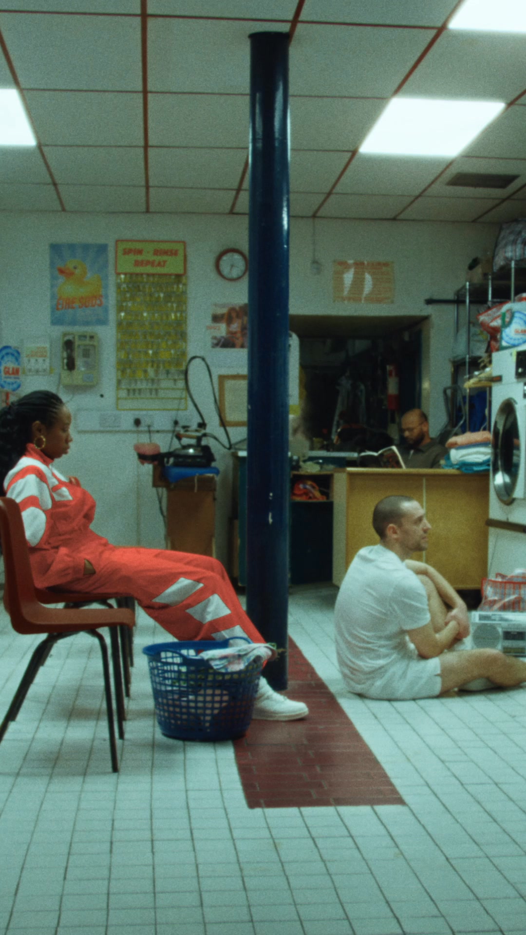 PersonalMeta · Oct 2026 – now
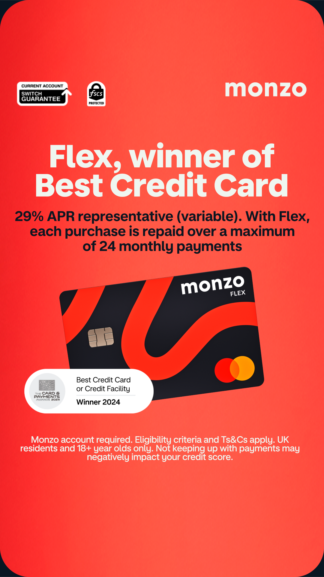 App on Google PlayMeta · Oct 2026 – now
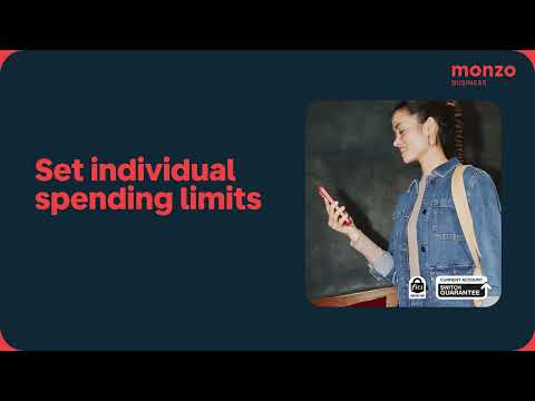 Expense cardsGoogle, Meta · Feb 2025 – now
Source: downloads.ctfassets.net/ro61k101ee59/2zfabTQILrAL4IDPKjJQCm/ca5ed206d818d2cc45652043f1e984ce/Monzo-Press-Kit-2026.zipmonzo.com/tone-of-voice
Your name and logo, Monzo’s system.
Use this kit for my brand Use this brand in Claude
Get your brand audit Put your brand in Claude What goes in a brand book
Each value is marked published, observed, our reading or our recipe, with its source. Checked 2026-10-29. Not affiliated with Monzo.