Human connection
Technology built around people and their relationships; the mission is the future of human connection. Published
Brand book
Meta keeps its own surface nearly colorless so people and products carry the page; the brand lives in one loop, one blue, one typeface and very strict partner rules. Our reading

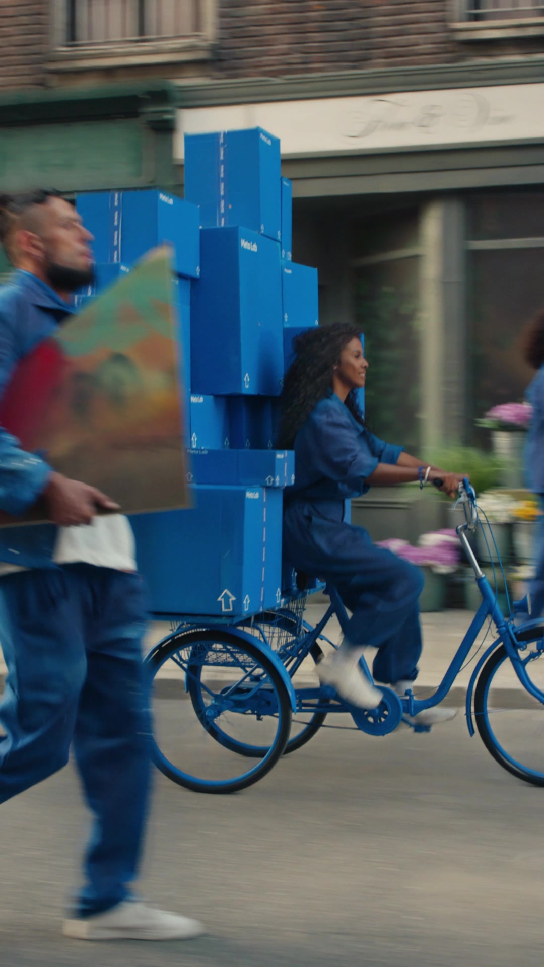
Photography and its color: each product brings its own palette through the photo.
Our engine's setting, built from their rules.
Cover the logo. It should still read as Meta: people-first photos in 24px-rounded cards, a blue pill beside a frosted pill, white sentence-case lines, gray-white surfaces.
Put another consumer-tech logo on it. If nothing about the loop, the single blue or the partner discipline feels out of place, it is generic.
A social technology company building the future of human connection and the technology that makes it possible. Published
Technology built around people and their relationships; the mission is the future of human connection. Published
Moving past 2D screens toward AI glasses and mixed reality. Published
AI built into everyday products: glasses with Meta AI, a personal AI agent device. Observed
Store promises on delivery, returns, warranty and financing. Observed
Meet the all-new Meta Glasses
The weight is over
Athletic Intelligence is here
We're building the future of human connection
Facebook (2004) grew into a family of apps; in 2019 a company brand separated the company from the app, and on October 28, 2021 the company became Meta, a name chosen because it can mean "beyond".
First of Meta's five principles
PublishedSecond principle
PublishedThird principle
PublishedFourth principle
PublishedFifth principle
PublishedCategory. Social technology: apps, AI, AI glasses and mixed reality Published
2D screens and today's online experiences (the brand story frames these as the limit to move beyond).
Meta builds technologies that help people connect, find communities, and grow businesses.
We're building the future of human connection Observed
Meet the all-new Meta Glasses Observed
Iconic style meets Meta AI Observed
Meta speaks at two altitudes. The company line is about human connection and going "beyond" (mission, brand story). The store speaks product by product: a short eyebrow and an exact product name, then Shop.
Source: meta.com/about/company-infoabout.fb.com/news/2021/10/facebook-company-is-now-metaweb.archive.org/web/20230130112237/https://design.facebook.com/stories/designing-our-new-company-brand-metameta.com
Together with Meta
Powered by Meta
Short fragments leave room for the photo; strict naming keeps a family of many brands legible.
OptimisticPlainConfidentWarm
No company voice guide is published. On meta.com the voice is short, upbeat and plain, in sentence case, with fragments and repetition. The partnering guide gives the only written rules: sentence case credit lines from an approved list, never "Powered by", product names left undecorated.
AI glassesmixed realityhuman connection
Powered by
Source: meta.com/brand/resources/meta/partnering-with-metameta.com/brand/resources/meta/company-brandmeta.com

Files as meta.com serves them (2026-10-31). Official packs (default, with and without "Empathetic Color") download from the trademarks page after accepting Meta's terms.
Drawn as one line in space, the symbol works in 2D and 3D and can read as an M or as infinity; the blue ties the new company to its original products (brand story).
| Variations | primary on light, primary on dark, mono dark, mono white |
|---|---|
| Minimum | symbol height 12px / 5mm |
| Clear space | 2x symbol height, all sides |
| Credit line | min 6pt; on top: gap 3h, logo 3h; inline: gap 3h, logo 2h |
The Meta logo is the infinity-loop symbol beside the Meta wordmark. It comes in four color variations: two primary (blue gradient symbol with a dark wordmark on light, or a white wordmark on dark) and two mono (all dark, all white). The wordmark is set in the company typeface introduced in 2019.
Source: meta.com/brand/resources/meta/company-brandmeta.com/brand/resources/meta/partnering-with-metaweb.archive.org/web/20230130112237/https://design.facebook.com/stories/designing-our-new-company-brand-metameta.com/brand/resources/meta/our-trademarks
Meet the all-new Meta Glasses
A quiet interface lets product photos carry the color; the one blue marks every action.
Meta publishes no palette for the company brand. What is consistent: the blue gradient of the symbol, a single action blue on the store, near-black ink, a cool light gray surface, and the dark slate of the wordmark. Color otherwise comes from photography.
Not published: any hex, name or proportion for the company palette.
Source: meta.com/brand/resources/meta/company-brandweb.archive.org/web/20230130112237/https://design.facebook.com/stories/designing-our-new-company-brand-metameta.com
We're building the future of human connection
One family across UI, marketing and the wordmark keeps a large product family coherent; the width axis gives the hero a poster voice without a second face.
| Their face | Use | License | Open stand-in |
|---|---|---|---|
| Optimistic VF (condensed, wdth 82) | Hero headline only | Meta's proprietary company typeface; no public licence or download (not published) | Archivo Archivo has a width axis; at wdth 88 and 700 it sets the hero line within 0.4% of Optimistic's width. |
| Optimistic VF | Everything else: headlines 500, titles 300, body 400, buttons 700 | Meta's proprietary company typeface (not published) | Figtree Same x-height and cap height and the same ink weight; about 7% narrower, so add +0.035em tracking. |
| Optimistic Mono VF | loaded by meta.com, not used on the homepage | proprietary (not published) | JetBrains Mono |
| Real face | Optimistic VF (proprietary) |
|---|---|
| Stand-in, body and headings | Figtree one weight step heavier, +0.035em tracking |
| Stand-in, hero | Archivo 700 wdth 88 |
Meta's company typeface is Optimistic (named in the partnering guide); meta.com serves it as one variable family, "Optimistic VF", weights 200-800 with a width axis. The homepage sets everything in it, from the condensed 130px hero to 12px legal text.
Not published: a type scale, licensing terms or a download for Optimistic.
Source: meta.com/brand/resources/meta/partnering-with-metaweb.archive.org/web/20230130112237/https://design.facebook.com/stories/designing-our-new-company-brand-metameta.com
Meta
The Meta symbol: one continuous loop · logo, event art (the Connect key visual renders it as a 3D chrome loop)
Meet the all-new
Split condensed headline over video · homepage hero
Ray-Ban Meta
Rounded photo cards with a bottom-centred pill pair · every product slot on the homepage
Together with Meta
Host and guest hairline lockup · co-branded partner communications
Specimens use sample copy, not Meta’s.
Soft radii and glass read as consumer hardware; the repeated card pattern makes a long store page scannable.
Three things make meta.com recognizable without the logo: the full-pill buttons (solid blue and frosted glass), 24px-radius photo cards with centred white text at the bottom, and the condensed headline split across the hero.
Source: meta.com
Filled shapes stay legible over video and at small sizes.
Filled, rounded glyphs on a 24px viewBox: nav icons in white or ink, Why-buy icons at 48px in #0457CB, social icons in #465A69. No published icon guidance for the company brand.
Not published: icon grid, stroke or library.
Source: meta.com
The brand story wants the symbol to take on any texture in 3D; photography sells the hardware.
The homepage uses no illustration; imagery is photographic or 3D renders (the Connect key visual renders the symbol as a 3D chrome loop).
Not published: an illustration style.
Source: meta.comweb.archive.org/web/20230130112237/https://design.facebook.com/stories/designing-our-new-company-brand-meta
Products shown on faces read as eyewear and style, not gadgets.
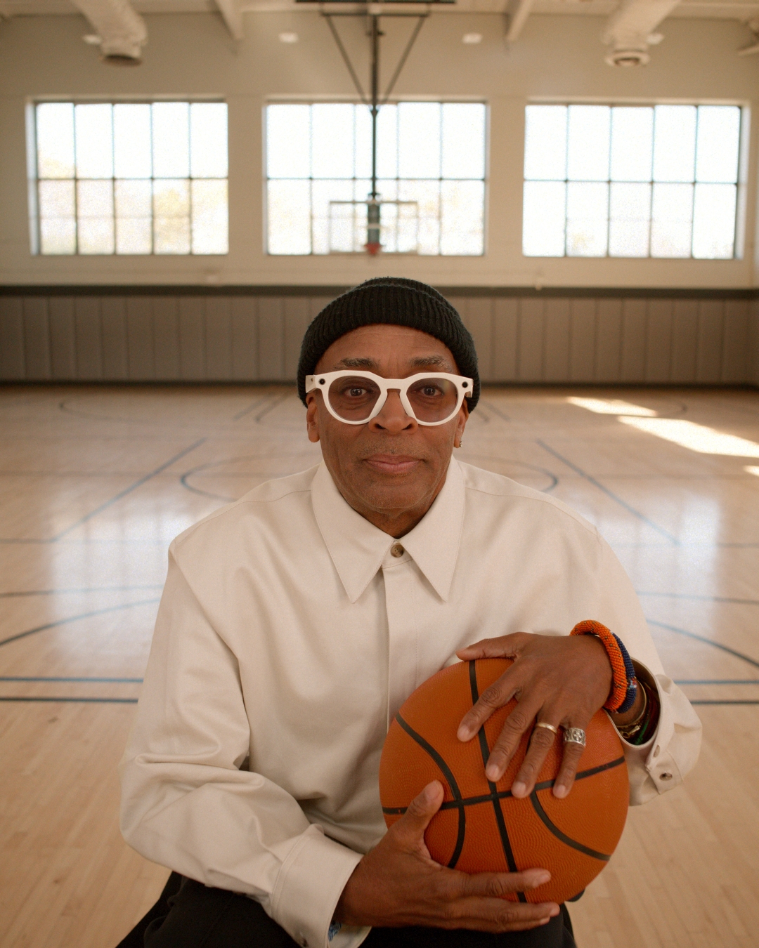
Editorial fashion portraits: one or two people wearing the product, close crops, studio or warm interior light, direct gaze or candid motion. Product-in-hand shots for devices. Approved company imagery lives in the Newsroom Media Gallery.
A symbol drawn in space is meant to be seen moving.
The symbol was designed for motion and 3D (published). On the homepage the hero is an autoplaying video with a pause control and per-letter headline animation; buttons fade over 100ms.
Not published: durations, easing curves.
Source: web.archive.org/web/20230130112237/https://design.facebook.com/stories/designing-our-new-company-brand-metameta.com
Edge-to-edge with 32px margins at 1440 (16px on phone), a 32px gap between every card and tile, 24px corners, and centred section titles. Sections alternate photo-card runs with one light-gray band.
Measured from meta.com's measured with Playwright at 1440x900 and 390x844 from computed styles and bounding boxes, plus rendered font calibration.
| Measure | Desktop | Phone |
|---|---|---|
| Page margin | 32px | 16px |
| Section padding | 80px | 48px |
| Card gap | 32px | 32px |
| Navigation | 64px | 64px |
Hero headline (condensed)
Optimistic VF (condensed, wdth 82) · 130px (phone 66) · line 1 · tracking -6.5px · weight 700
Product card title / section title
Optimistic VF · 48px (phone 32) · line 1.1667 · tracking 1.7px · weight 600
Store intro H1
Optimistic VF · 36px (phone 28) · line 1.278 · tracking 1px · weight 600
Why-buy card title
Optimistic VF · 28px (phone 24) · line 1.214 · tracking 1px · weight 400
Hero lead
Optimistic VF · 24px (phone 20) · line 1.25 · tracking 0.85px · weight 600
News card title
Optimistic VF · 24px (phone 20) · line 1.25 · tracking 0.85px · weight 400
Card eyebrow / newsletter label
Optimistic VF · 18px · line 1.444 · tracking 0.6px · weight 500
Body / tile label
Optimistic VF · 16px · line 1.5 · tracking 0.3px · weight 500
Nav and footer link
Optimistic VF · 14px · line 1.4286 · tracking 0.35px · weight 500
Button label
Optimistic VF · 14px · line 1.4286 · tracking 0.4px · weight 800
Legal and consent text
Optimistic VF · 12px · line 1.333 · tracking 0.35px · weight 500
How Meta’s own landing pages are built, observed on meta.com, 2026-10-31. The full measurements are in spec.md.
Source: meta.com
One loop can be an M, an infinity sign or a 3D object, so the mark carries the "beyond the screen" idea. Our reading
How our engine applies Meta's system to each format. Our recipe from their rules and site, not something Meta publishes. Level = how loud the signature moves are (0 plain, 5 full video hero and photo-card wall).
| Format | What they did | Source |
|---|---|---|
| co-branding lockup | Host logo, hairline, guest logo; Meta lockup in primary blue or white. | meta.com/brand/resources/meta/partnering-with-meta |
| credit line | "Together with" + single-line Meta lockup, line on top or inline. | meta.com/brand/resources/meta/partnering-with-meta |
| brand inclusion | Meta lockup in a row of sponsor logos, 1.5h apart, full color on white or white on dark. | meta.com/brand/resources/meta/partnering-with-meta |
| Format | Loudness | Must appear | What varies |
|---|---|---|---|
| Landing page | Build it the way meta.com is built (kit.spec.page): transparent nav over a full-bleed video or photo hero with the split condensed headline; 24px-radius photo cards with bottom-centred eyebrow, title and Shop/Learn more pills; one #F1F4F7 band of white feature cards; white footer with three link columns. One action blue #0457CB; Optimistic (Figtree stand-in) throughout; sentence case. | number of product cards (full-width or half-width), the hero line, which offers go in the feature band | |
| Partner co-branding | host left of the hairline, guest right; Meta lockup primary blue (or white); clear space 2x symbol height | host brand's own layout and type | |
| Event or sponsor credit | approved credit line in sentence case, single-line Meta lockup, ratio 3h / 3h | credit line wording from the approved list | |
| Social post | a full-bleed people-first photo, white sentence-case line, Meta logo in its primary variation | crop and product |
Source: meta.com/brand/resources/meta/company-brandmeta.com/brand/resources/meta/partnering-with-meta
Your name and logo, Meta’s system.
Use this kit for my brand Use this brand in Claude
Get your brand audit Put your brand in Claude What goes in a brand book
Each value is marked published, observed, our reading or our recipe, with its source. Checked 2026-10-31. Not affiliated with Meta.