Results you can measure
Customers see big returns from email, SMS and automation Our reading
Brand book
Plain on purpose, so the weird lands. Mailchimp is mostly white, off-white and Peppercorn, closing on ochre; yellow is about half a percent of the desktop page. That restraint is what makes one hand-drawn scribble or a flash of Cavendish read instantly as Mailchimp. Our reading

Illustration. It stays playful and changes from piece to piece; everything else holds still.
Source: designweek.co.uk/issues/1-7-october-2018/mailchimp-rebrand-aims-to-unify-branwearecollins.com/work/mailchimp
Share of the rendered mailchimp.com homepage at 1440px each color covers, measured from a full-page screenshot on 2026-10-29; "other" is photos, type and mixed pixels. On the 390px phone page the yellow feature cards lift yellow to about 7% and ochre to 27%.
Our reading, not a published scale. Published basis: tone follows the reader's state of mind; if unsure, keep a straight face; never use exclamation points in failure messages or alerts.
Our engine's setting, built from their rules.
Cover the logo. It should still read as Mailchimp: the yellow, the ink, the serif, the hand-drawn strangeness.
Put a competitor's logo on it. If it still fits, it's generic, and it goes back.
For small and mid-sized businesses and advanced marketers, Mailchimp is the email and marketing automation platform that takes the guesswork out of growth with data-backed recommendations, in a brand that is warm, plain and a little weird. Our reading
Customers see big returns from email, SMS and automation Our reading
Recommendations surface your next opportunity Our reading
Email, SMS, social, landing pages, ads and 300+ apps in one place Our reading
Millions use it; start free Our reading
Turn ideas into emails & SMS that connect
Businesses like yours are thriving with Mailchimp
One marketing platform to unite 300+ apps
Millions of users trust us with their email marketing. You can too.
Ben Chestnut and Dan Kurzius ran a web design agency, the Rocket Science Group, serving large corporate clients, and built an email service for small businesses on the side as a cheaper alternative to costly early-2000s email software. Founded in Atlanta in 2001; acquired by Intuit in 2021.
the workforce they aim for; collaboration and creativity are tools for helping customers reach their goals.
Publishedan inclusive, equitable organization is good for teams, customers and community.
Publishedthe idea behind Give Where You Live, its support for small local organizations.
Publishedthe five writing goals in the content style guide, in that order; 'speak truth' means focusing on real strengths and avoiding grandiose claims.
PublishedCategory. "an email and marketing automations platform" (boilerplate wording) Published
costly early-2000s email software, the alternative the founders built againstOther email and automation platforms, unnamed; the '#1' claim is benchmarked against competitor customer data
Intuit Mailchimp is an email and marketing automations platform for small and mid-sized businesses. It helps them start and grow with marketing technology, customer support and content, putting data-backed recommendations at the heart of their marketing across email, social, landing pages and ads.
Turn ideas into emails & SMS that connect Observed
Millions of users trust us with their email marketing. You can too. Observed
Guess Less, Sell More Published
Did You Mean MailChimp? Published
Find out why customers see up to 27x ROI
Try our Standard plan for free!
Under 250 contacts? It's free.
Work with a trusted industry leader
Built to help you grow your own way
Guess Less, Sell More
Did You Mean MailChimp?
Mailchimp's content style guide orders its writing goals as empower, respect, educate, guide, speak truth, and asks for four qualities in every piece: clear, useful, friendly, appropriate.
Source: styleguide.mailchimp.com/writing-principlesstyleguide.mailchimp.com/creating-structured-contentstyleguide.mailchimp.com/web-elements
Your payment didn't go through. Update your card to keep sending.
Oops! Looks like your card took a little vacation 🌴
Splitting voice (who you are) from tone (how you read the room) lets a playful brand stay trustworthy in serious moments.
PlainspokenGenuineTranslatorDry humor
The voice is fixed: plainspoken, genuine, a translator, with dry humor. The tone moves with the reader, so a billing error never gets a joke.
Source: styleguide.mailchimp.com/voice-and-tone
Source: styleguide.mailchimp.com/voice-and-tonestyleguide.mailchimp.com/writing-about-mailchimp


Logos shown from Brandfetch for reference. Mailchimp is a trademark of Intuit. Not affiliated, and not for download.
The wordmark always travels with Freddie, the winking chimp, who was simplified in 2018 so he works at any size.
The wordmark always travels with Freddie, the winking chimp, who was simplified in 2018 so he works at any size. The current lockup stacks INTUIT over the mailchimp wordmark.
Not published: a numeric clear-space unit; a minimum size.
Source: mailchimp.com/about/brand-assetsdesignweek.co.uk/mailchimp-rebrand-aims-to-unify-bran
Grow your audience
Ink for the result and the close
Everything in yellow
When one color only ever means the brand or the next action, the eye learns it in a page.
When one color only ever means the brand or the next action, the eye learns it in a page. Ink on yellow, not white, keeps the yellow loud and readable.
Cavendish Yellow marks action: buttons, arrow circles, checks, one boxed number. The page is white and off-white with two ink bands, and it ends on a big ochre footer.
Not published: official color proportions (the split below is measured, not published).
Turn ideas into emails & SMS that connect
Turn ideas into emails that connect
TURN IDEAS INTO EMAILS
A regular-weight serif reads warm and confident at size; bold would turn warm into loud.
| Their face | Use | License | Open stand-in |
|---|---|---|---|
| Means Web | Headlines h1–h3, regular weight, tight tracking | Proprietary | Literata Literata 450, opsz 12, at 0.96875x the Means size with -0.01em: hero line 2 760 vs 745px, x-height 31.8 vs 32.2px (measured 2026-10-29). |
| Tally | Body, buttons, labels (the live CSS lists Graphik Web as its fallback) | Proprietary | Hanken Grotesk Variable open grotesque; at weight 330 and -0.01em it matches Tally 400 in width, x-height and stroke (measured 2026-10-29). |
| Source Code Pro | Code | Open (OFL) | Source Code Pro Already open. |
Headlines are Means, a serif, at regular weight with slightly negative tracking; everything else is Tally, a sans. The hero's last words switch to the serif's italic. The 2018 COLLINS system launched with Cooper Light for headlines; the site now serves Means (observed).
Source: mailchimp.com
Every SaaS brand has flat vector people.

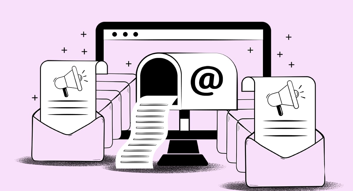
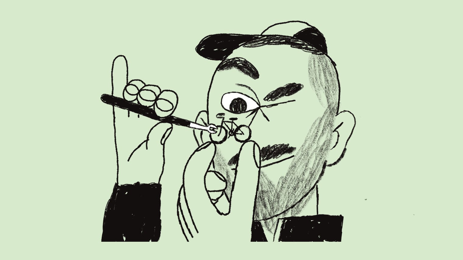
Every SaaS brand has flat vector people. A loose, slightly strange hand is the one thing a competitor can't drop into its own deck, and it carries the brand even when the yellow is absent.
| Brand moments | loose, hand-drawn black line, scribbled and a little surreal, beside a serif headline (COLLINS, 2018) |
|---|---|
| Product moments | thin, even black line drawings of the product's objects on a soft pastel ground |
| Color | black line; color only as a flat ground (yellow or a pastel) |
| Never | flat vector people, gradients, 3D |
Observed from the COLLINS case study and mailchimp.com, 2026-10-29.
Hand-drawn and deliberately imperfect, drawing on outsider art, mostly by in-house artists and several illustrators. COLLINS describes the aim as a balance of the sophisticated and the surreal.
Not published: a public illustration guideline page with rules, types or color use.
Source: wearecollins.com/work/mailchimpdesignweek.co.uk/issues/1-7-october-2018/mailchimp-rebrand-aims-to-unify-brancreativereview.co.uk/mailchimp-rebrand-by-collins
Real small-business owners and teams at work, shot candidly in daylight, often with the product readable on a screen.



Real small-business owners and teams at work, shot candidly in daylight, often with the product readable on a screen. The hero photo runs full-bleed under a light overlay; elsewhere photos sit in 24px corners.
| Subject | a real person or team doing their actual work, often with the product on a screen |
|---|---|
| Pose | candid, not looking at the camera |
| Light | natural daylight, warm interiors |
| Color | full color, ungraded, warm |
| Frame | hero: full-bleed under a flat 25% black overlay, 16:9; story cards: radius 24; feature insets: radius 26 |
| Never | stock handshakes, studio white backgrounds, people posing at the lens, blur |
Observed from the photos on mailchimp.com and its feature pages, 2026-10-29. Mailchimp publishes no photography rules.
Source: mailchimp.commailchimp.com/features/marketing-automationmailchimp.com/about
Turn ideas into posts that land
Customers saw 3x more replies
Try our Standard plan for free
Customers saw 3x more replies in 30 days
Customers saw 3x more replies in 30 days
Yellow box on the number · the ink result band (and its phone cards): one number per headline
Turn ideas into posts that land
Turn ideas into posts that land
Yellow italic phrase · the hero headline on the dark photo; the last two words
Buttons hop onto an ink ledge · every button on hover
Specimens use sample copy, not Mailchimp’s.
Full-bleed bands: dark photo, #F5F5F5, white, ink, white, #F5F5F5, white, ink, then the ochre footer. Content sits 80px in on desktop and 16 to 29px in on phones; most sections turn into swipe carousels on phones.
Measured from mailchimp.com's computed styles and bounding boxes at 1440 and 390 px wide, on 2026-10-28 and 2026-10-29.
| Measure | Desktop | Phone |
|---|---|---|
| Page margin | 80px | 29px |
| Section padding | 80px | 48px |
| Hero text width | max 960px, centered | full width |
| Card gap | 16px | 16px |
| Navigation | 68px | 68px |
Hero headline (phone tracking 0) [Means 64px]
Means Web · 62px (phone 34.88) · line 1.239 · tracking -0.62px · weight 450
Section headline [Means 40px]
Means Web · 38.75px (phone 28.09) · line 1.033 · tracking -0.39px · weight 450
Result-band headline [Means 40px; phone 28px]
Means Web · 38.75px (phone 27.12) · line 1.166 · tracking -0.39px · weight 450
Pricing headline [Means 48px]
Means Web · 46.5px (phone 35.84) · line 1.033 · tracking -0.47px · weight 450
Stat number (case studies) [Means 48px]
Means Web · 46.5px (phone 34.88) · line 1.033 · tracking -0.47px · weight 450
Pull quote on photo [Means 32px]
Means Web · 31px · line 1.29 · tracking -0.31px · weight 450
Lead (phone line height 20px = 1.25) [Tally 400]
Tally · 20px (phone 16) · line 1.6 · tracking -0.2px · weight 330
Card title (sans, never serif) [Tally 400]
Tally · 23px (phone 17) · line 1.3 · tracking -0.23px · weight 330
Card description [Tally 400]
Tally · 14px (phone 12) · line 1.5 · tracking -0.14px · weight 330
Card bullet [Tally 400]
Tally · 16px (phone 12) · line 1.35 · tracking -0.16px · weight 330
Body [Tally 400]
Tally · 16px · line 1.75 · tracking -0.16px · weight 330
Arrow-link label [Tally 400]
Tally · 16px · line 2 · tracking -0.16px · weight 330
Eyebrow (yellow, on ink) [Tally 500]
Tally · 16px · line 1.5 · weight 500
Button (hero CTA is 15px / 600) [Tally 700]
Tally · 13px · line 1.5 · tracking 0.26px · weight 700
Nav link [Tally 700]
Tally · 13px · line 1.1 · tracking 0.26px · weight 700
Small / UI label [Tally 400]
Tally · 13px · line 1.25 · tracking -0.13px · weight 330
Footer column heading [Tally 400]
Tally · 16px · line 1.5 · tracking -0.16px · weight 330
Footer link (underlined) [Tally 400]
Tally · 13px · line 1.35 · tracking -0.13px · weight 330
Disclaimer and legal [Tally 400]
Tally · 11px · line 1.45 · tracking -0.11px · weight 330
One or two sentences on what this does for the reader.
→One or two sentences on what this does for the reader.
→White card on the #F5F5F5 band. The full feature-card anatomy is feature_card
How Mailchimp’s own landing pages are built, observed on mailchimp.com, 2026-10-29. The full measurements are in spec.md.
Source: mailchimp.com

It turns a weakness (a name people get wrong) into a puzzle, and the payoff only lands for people who go looking, which flatters them instead of shouting at them. Our reading
The brand owns the media rather than renting ad space, and earns time with the audience by being useful and entertaining about running a business. Our reading
The absurd image makes you stop; the plain line tells you the benefit. Weird for attention, clear for meaning, the same split the voice guide asks for. Our reading
How our engine applies Mailchimp's system to each format. This is our recipe built from their rules, not something Mailchimp publishes.
| Format | What they did | Source |
|---|---|---|
| website | Homepage hero: dark photo, Means serif headline with the last words in yellow italic, yellow pill CTA, review-rating strip | mailchimp.com |
| event / merch | NYFW: The Shows Capsule Collection, presented by Mailchimp: pop-up show with five BIFC designers, limited-edition pieces sold at Spring Studios and online (2022) | mailchimp.com/newsroom/guesswork-campaign-launch |
| film / podcast | Mailchimp Presents: original series, films and podcasts streamed free (2019) | tubefilter.com/2019/06/10/mailchimp-presents-streaming-service-original-content |
| cinema | Did You Mean MailChimp? one-minute unbranded films screened in select U.S. theaters (2017) | thedrum.com/news/2017/02/21/mailchimp-explains-why-things-failchips-and-snailprimps-are-all-part-its-first-major |
| print / direct mail | Postcards, Mailchimp's first offline product, launched alongside the 2018 rebrand | itsnicethat.com/news/mailchimp-collins-brand-system-graphic-design-270918 |
| report | Against All Odds, an annual report on businesses that succeeded in 2020 (Wink Creative) | mailchimp.com/newsroom/in-house-agency-of-the-year |
| brand guidelines | 2018 system by COLLINS: new logotype, simplified Freddie, Cavendish Yellow palette, Cooper Light type at launch, outsider-art illustration | itsnicethat.com/news/mailchimp-collins-brand-system-graphic-design-270918 |
| Format | Loudness | Must appear | What varies |
|---|---|---|---|
| Landing page | Dark-photo hero with the yellow-italic phrase, one 343 x 48 yellow CTA and review proof; 2 x 2 feature cards on #F5F5F5 with arrow links; logo strip; an ink result band with one boxed number; an ink closing band; ochre footer | the photo, two or four feature cards, whether the story carousel, pricing and integrations sections appear | |
| Deck | Ink type on white, the yellow on the title slide and the ask | one illustration per section opener | |
| Proposal page | Yellow on the next-step button only; one ink band for the price | a spot illustration at the top | |
| Ad | Yellow ground, ink headline, the logo | the illustration carries the idea | |
| Social post | Yellow or the illustration, plus the wordmark | the loudest, strangest illustration | |
| Logo top left, one yellow button | none: plain and useful | ||
| Error or billing message | Plain words, no joke | none |
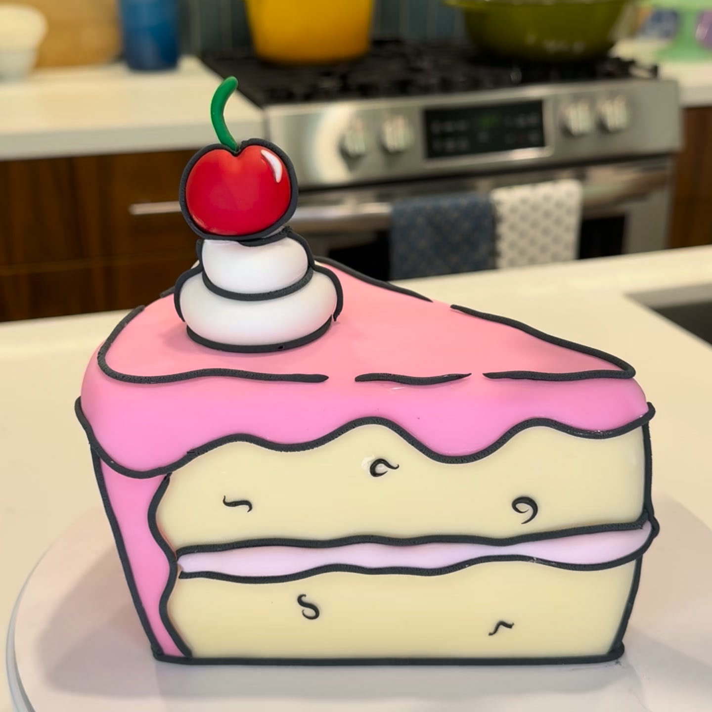 Omnichannel marketing platformMeta · Aug 2026 – now
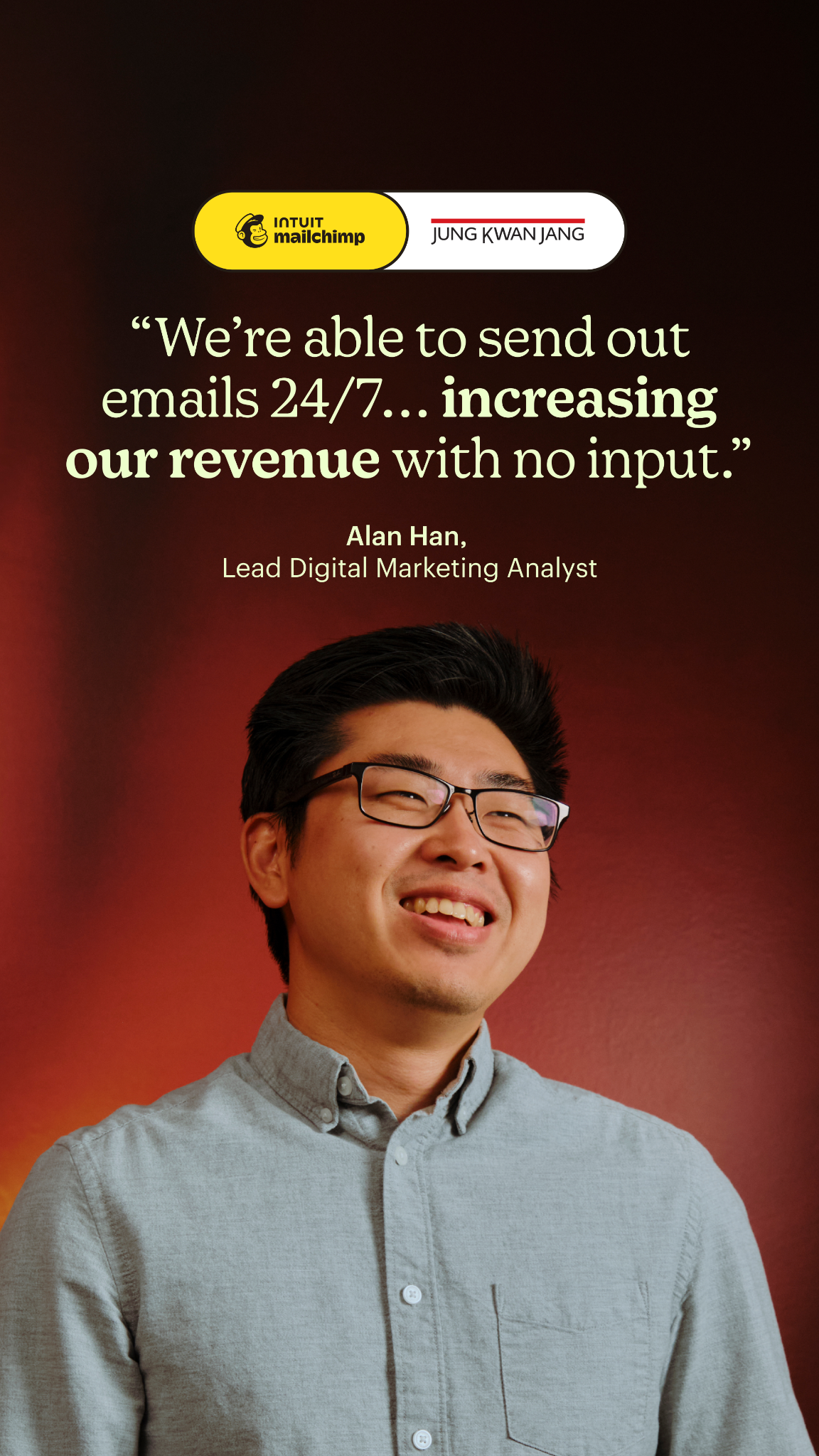 Jung kwan jang marketing automation flowsMeta · Aug 2026 – now
 Priority bicycles shopify integration automationsMeta · Aug 2026 – now
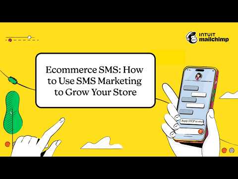 Sms marketing toolsGoogle, Meta · Aug 2026 – now
Source: mailchimp.com/about/brand-assetsstyleguide.mailchimp.com/voice-and-tone
Your name and logo, Mailchimp’s system.
Use this kit for my brand Use this brand in Claude
Get your brand audit Put your brand in Claude What goes in a brand book
Each value is marked published, observed, our reading or our recipe, with its source. Checked 2026-10-29. Not affiliated with Mailchimp.