Speed
Ship software faster: the outcome that matters most to software teams. Published
Brand book
Ship-speed made visible. GitLab draws motion everywhere (gradients that blur, graphics running left to right, lines borrowed from code and pipelines) but keeps every word in white or Charcoal, so the brand feels fast without ever being hard to read. Our reading

How much color and motion: from a white page with one purple link to a full freeform gradient, type repetitions and promptlings for AI stories. The guide sets no level; it limits by asset (one lockup, one radius, one stroke).
Source: design.gitlab.com/brand-design/colordesign.gitlab.com/brand-design/typographydesign.gitlab.com/brand-design/visual-design-promptlings
Our engine's setting, built from their rules.
Cover the tanuki. It should still read as GitLab: white or Charcoal type in a tight Bold sans, a soft orange-purple gradient or purple field, and flat linework with one curved corner.
Put another DevOps vendor's logo on it. If the orange-purple warmth, the code-line graphics and the plain, provable copy don't feel out of place, it's generic, and it goes back.
The intelligent orchestration platform where teams and their AI agents ship secure software faster. Observed
Ship software faster: the outcome that matters most to software teams. Published
Security, compliance and governance are part of the platform, not bolted on. Our reading
One application for the whole lifecycle instead of point solutions duct-taped together. Our reading
Open source roots and a community that builds the product with GitLab. Our reading
GitLab began in 2011 as an open source project with a single commit and has shipped a release every month since (on the 22nd). It was incorporated in 2014, joined Y Combinator and published its handbook in 2015, and listed on Nasdaq in 2021. In 2022 it redrew the tanuki around the DevOps infinity loop to mark its growth into a platform. Today it frames its job as removing the drag between an idea and a customer, for teams of people and AI agents.
First letter of CREDIT, GitLab's six core values (paraphrase).
PublishedResults for customers come first (paraphrase).
PublishedEfficiency, with a stated preference for boring solutions (paraphrase).
PublishedPeople from every background can thrive and contribute (paraphrase).
PublishedDo the smallest thing possible, get feedback quickly; the guide's type repetitions and open icons express it (paraphrase).
PublishedWork in the open; the public handbook and monthly release post (paraphrase).
PublishedCategory. The most comprehensive AI-driven DevSecOps platform (guide); intelligent orchestration platform (homepage) Published
DIY toolchains of DevOps point solutions 'digitally duct taped together'.Multi-app suites that can also call themselves 'integrated' (the messaging page names Atlassian as the example).
GitLab is the intelligent orchestration platform where teams and their AI agents ship secure software faster. It began in 2011 as an open source project to help one team of programmers collaborate, and millions now use it to deliver software faster and more efficiently while strengthening security and compliance.
Software. Faster. Published
Speed with control for agentic software engineering Observed
Everyone can contribute Published
The guide's one line is the tagline "Software. Faster.": the period makes a pause between what teams build and the advantage GitLab gives. The handbook adds the mission (ship trusted software at the speed of imagination), a messaging page with value-proposition lengths, and words to avoid.
Source: design.gitlab.com/brand-logo/branded-lockupshandbook.gitlab.com/handbook/marketing/product-and-technical-marketing/product-and-solution-marketing/messaginghandbook.gitlab.com/handbook/company/mission
GitLab Duo features do not use your content to train models.
The first and only AI platform you'll ever need.
Pairing each trait with the excess it must avoid keeps confident expertise from tipping into arrogance or hype.

VisionaryEmpatheticIntentional
Three traits, each with a published is/is-not table: Visionary (inspirational, not sensationalistic), Empathetic (approachable, not overeager) and Intentional (clear, not pushy). Style follows AP with GitLab overrides: sentence case, serial comma, contractions, American English.
firstonlyintegratedGitlab (lowercase l)his/her
Source: design.gitlab.com/brand-messaging/brand-voicehandbook.gitlab.com/handbook/marketing/brand-experience/content-style-guide
| Traits | Visionary, Empathetic, Intentional |
|---|---|
| Case | sentence case; capitalize after a colon in titles |
| Commas | serial (Oxford) |
| Spelling | American English |
| Dates | November 16, 2023 (external), 2023-11-16 (internal) |
| Time | 6:00 a.m., UTC for virtual events |
Source: design.gitlab.com/brand-messaging/brand-voicedesign.gitlab.com/brand-messaging/style-formattinghandbook.gitlab.com/handbook/marketing/brand-experience/content-style-guide


Official files from GitLab's press kit (about.gitlab.com/images/press/gitlab-logo-NNN-rgb.svg): 100 core full color, 200 core with white wordmark, 300 one-color Charcoal, 400 one-color white, 500 tanuki full color, 600 tanuki Charcoal, 700 tanuki white. GITLAB is a trademark of GitLab Inc. Shown for reference; GitLab's trademark guidelines generally refuse logo use by others. Not affiliated.
GitLab
GitLab
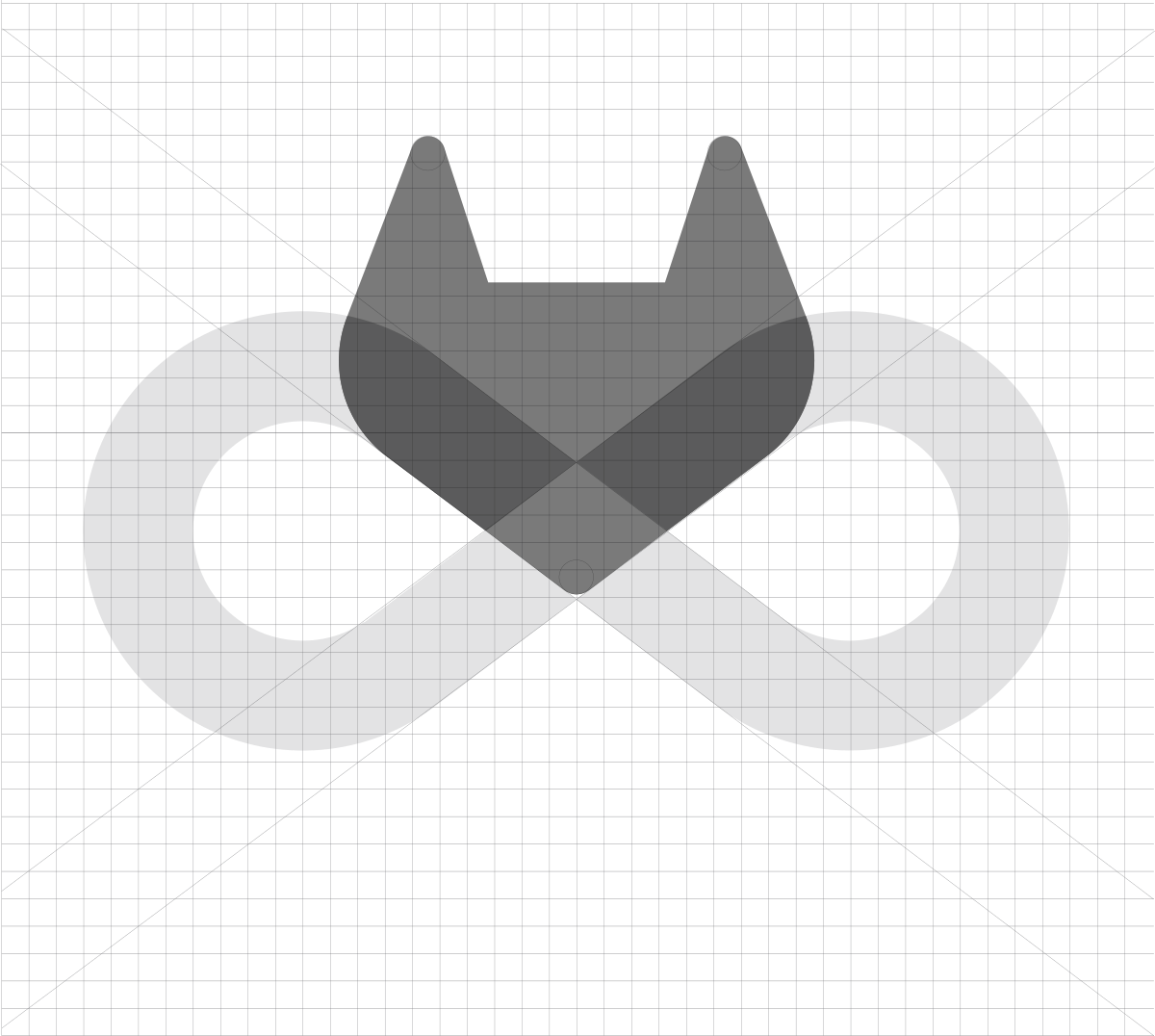
Putting DevOps inside the mark lets the logo carry the product story, and a single unaltered tanuki builds recognition.
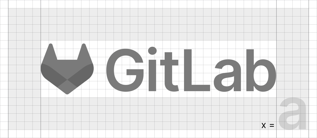
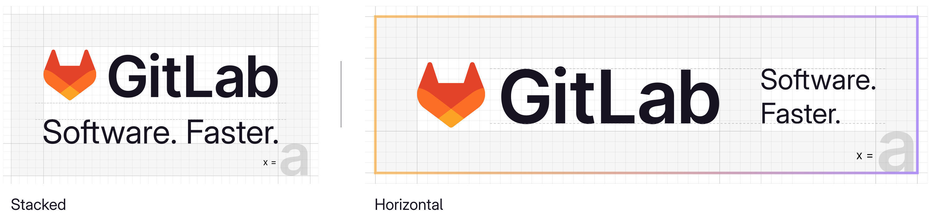
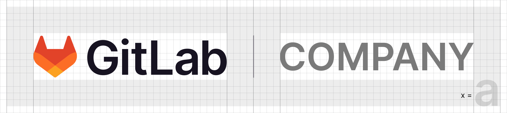
| Clear space | x = height of the lowercase a |
|---|---|
| Minimum | 20px digital; 0.4 in / 11mm print |
| Max | 20% of frame height (scaled from 1080px) |
| Variations | full color; white; Charcoal; tanuki also Orange 02p, Purple 01p, Purple 02p |
| Placement | left corner by default |
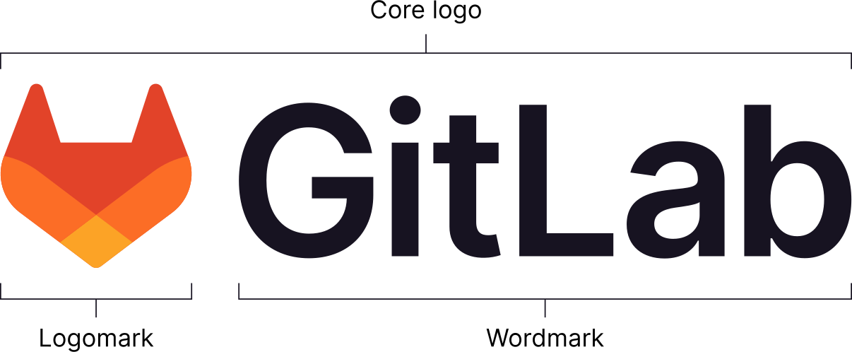
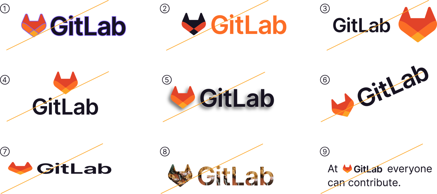
The core logo is the full-color tanuki logomark beside the GitLab wordmark, horizontal. The tanuki, redrawn in 2022 around the DevOps infinity loop, can stand alone once the core logo has given context; the wordmark never stands alone. Placement defaults to a left corner, top or bottom.
Source: design.gitlab.com/brand-logo/core-logodesign.gitlab.com/brand-logo/logomarkdesign.gitlab.com/brand-logo/branded-lockupsabout.gitlab.com/press/press-kithandbook.gitlab.com/handbook/marketing/brand-experience/brand-creative
Learn more about GitLab Duo
Software. Faster.
Software. Faster.
Keeping words black or white lets the warm tanuki oranges and the purple carry identity in graphics without hurting legibility.
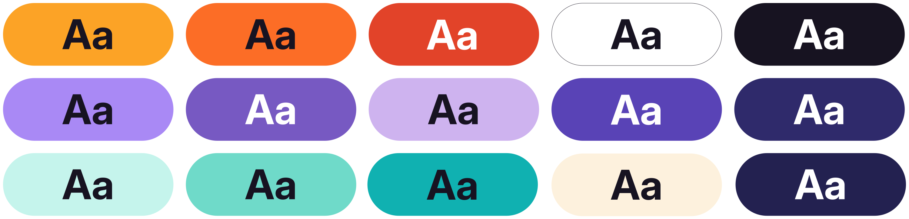

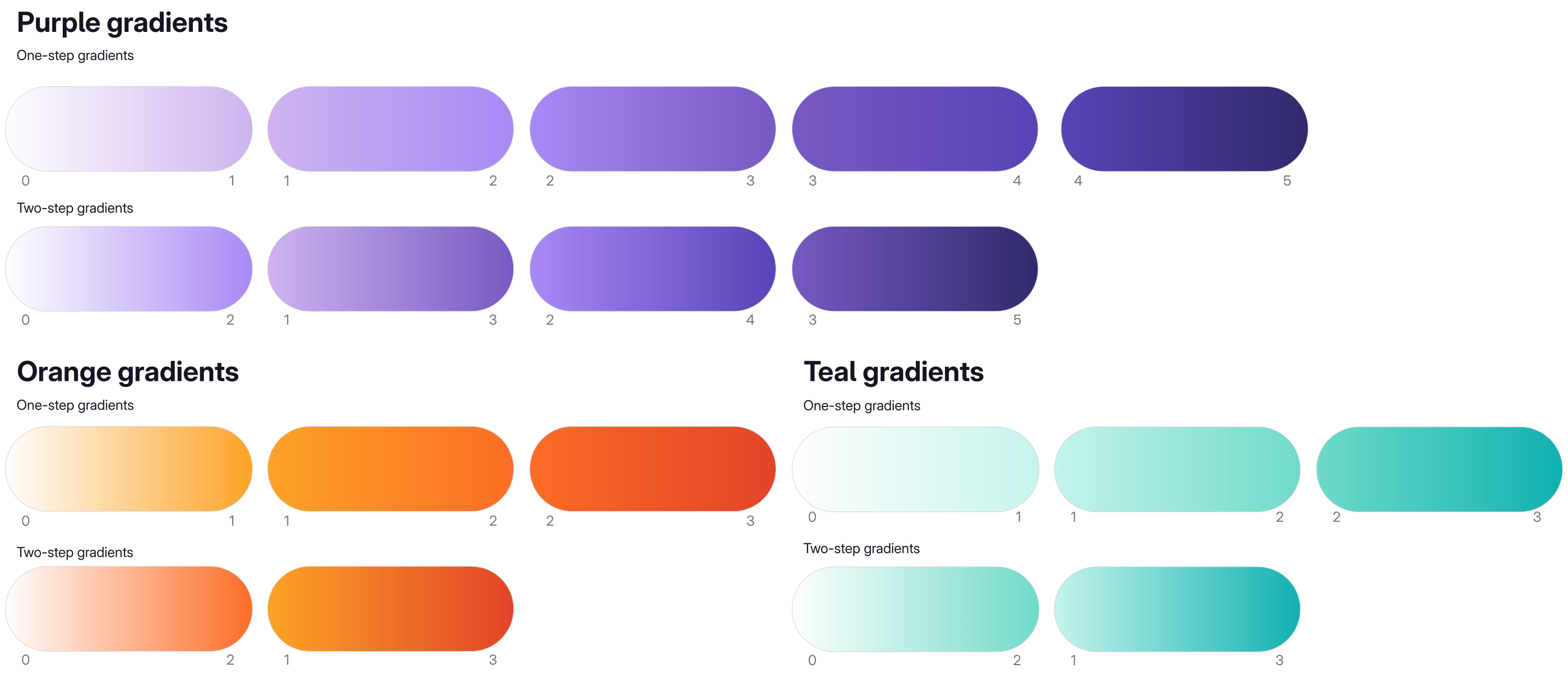
| Default gradient | Orange 02p + Purple 01p + Pink 01g on white |
|---|---|
| Dark base | Purple 04s #232150 |
| Contrast | 4.5:1 text, 3:1 large text |
Primary: White, Charcoal, three tanuki oranges and two purples (Purple 01p is the signature). Secondary adds tints, deep purples, teals and cool grays. Gradient-only pinks and a vermillion feed complex backgrounds. Copy is only ever white or Charcoal; color lives in gradients, graphics, links and small data points.
Not published: color proportions or ratios; a muted text color or a surface color.
Source: design.gitlab.com/brand-design/colordesign.gitlab.com/brand-design/visual-design-promptlings
Software. Faster.
Remediating vulnerabilities with GitLab's security insights and AI
Remediating Vulnerabilities with GitLab's Security Insights and AI
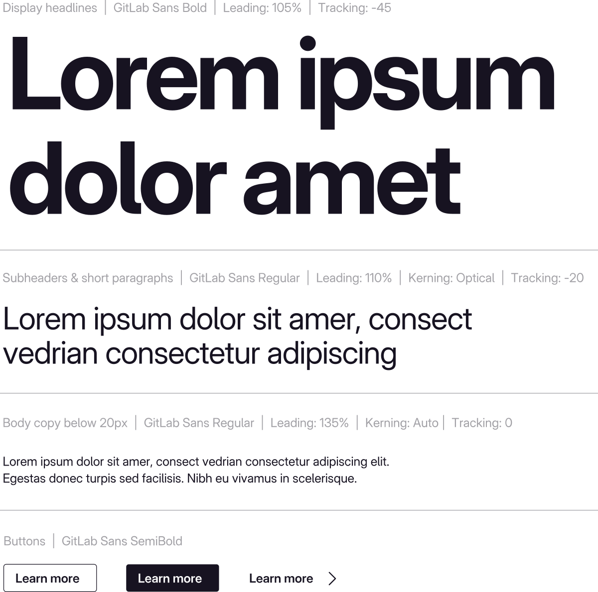
Tight, heavy headlines read as confident and technical; Mono quietly points back to code without becoming a second voice.
| Their face | Use | License | Open stand-in |
|---|---|---|---|
| GitLab Sans | Everything: headlines Bold (105% leading, -4.5% tracking), subheads Regular (110%, -2%), body Regular (135%, 0), CTAs SemiBold | Open (SIL OFL 1.1). GitLab's own face derived from Inter (copyright The Inter Project Authors, portions GitLab B.V. 2022); free download, npm @gitlab/fonts 1.3.1 | Inter The real face ships with this book (fonts folder) and builders should load it. The public shelf can only name families in its library; Inter is GitLab Sans's open parent and the guide's own named substitute where GitLab Sans isn't available. |
| GitLab Sans | Body Regular 400, 135% leading, 0 tracking; Bold and Regular are the main weights | Open (SIL OFL 1.1), npm @gitlab/fonts 1.3.1 | Inter Same as display: Inter is the open parent and the guide's named fallback. |
| GitLab Mono | Sparingly, Regular only: labels, code snippets, callouts, select taglines, numerical stats; never inside a GitLab Sans paragraph | Open (SIL OFL 1.1). Derived from JetBrains Mono; npm @gitlab/fonts 1.3.1 | JetBrains Mono JetBrains Mono is GitLab Mono's open parent and the nearest family on the public shelf; load the real GitLab Mono file when building. |
| Headline | Bold 700, 1.05, -0.045em |
|---|---|
| Subhead | Regular 400, 1.10, -0.02em |
| Body | Regular 400, 1.35, 0 |
| Button | SemiBold 600 |
| Mono | Regular 400 only |
| Video lower third | Inter SemiBold 60px name / Regular 40px title |
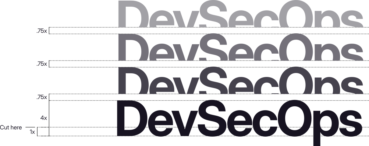
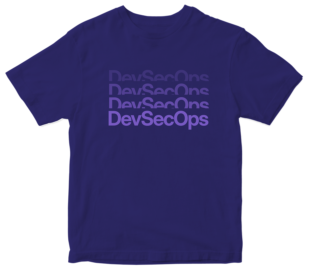
One family does everything: GitLab Sans, a tall-x-height derivative of Inter, mostly in Bold and Regular, SemiBold for buttons. GitLab Mono, from JetBrains Mono, appears sparingly for labels, stats and code. Copy is left-aligned in sentence case, and a stacked 'type repetition' marks emphasis.
Source: design.gitlab.com/brand-design/typographydesign.gitlab.com/brand-design/visual-design-diagrams-infographicsdesign.gitlab.com/brand-design/motion
Software. Faster.
Software. Faster.
Soft freeform gradient ground · backgrounds of core brand assets (hero banners, slides, social); the guide's own intro banner is one
Software. Faster.
Software. Faster.
The AI gradient · content about AI and GitLab Duo, and the stroke around the horizontal tagline lockup
Iterate
Iterate
Type repetitions · moments of emphasis: one word or a short phrase in a hero, a slide, a video
A container with one soft corner
Every corner fully rounded
One curved corner · containers for copy or images, photo crops, icons and illustration shapes
Specimens use sample copy, not GitLab’s.
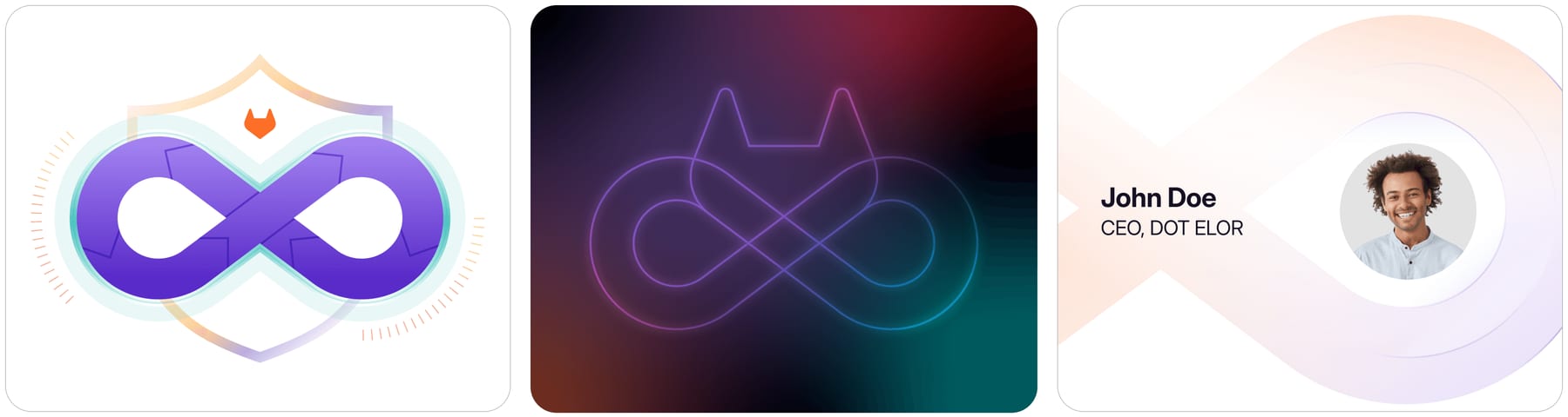
Every shape points back to the product, so even an abstract layout reads as software delivery.
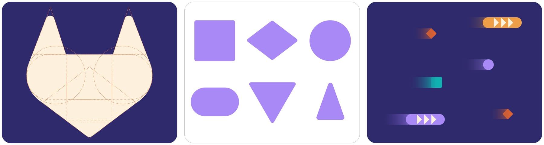
| Shape radius | 10-20% of a side |
|---|---|
| One curved corner | 25-30% of width |
| All corners | 5-10% |
| Label | pill, max 3 words |
A kit of product-derived graphics: foundational shapes cut from the tanuki's geometry, the DevOps loop, pill labels, code lines, curved containers, pipelines with nodes, and commit and plus symbols as accents. Everything is flat and front-facing, with one stroke weight and one corner radius per asset, moving left to right.
Source: design.gitlab.com/brand-design/visual-design-core-elements
Marketing icons are open linework on an 8px grid in two sizes, 24px with a 1px stroke and 96px with a 2px stroke, each with one rounded corner and deliberate line breaks.
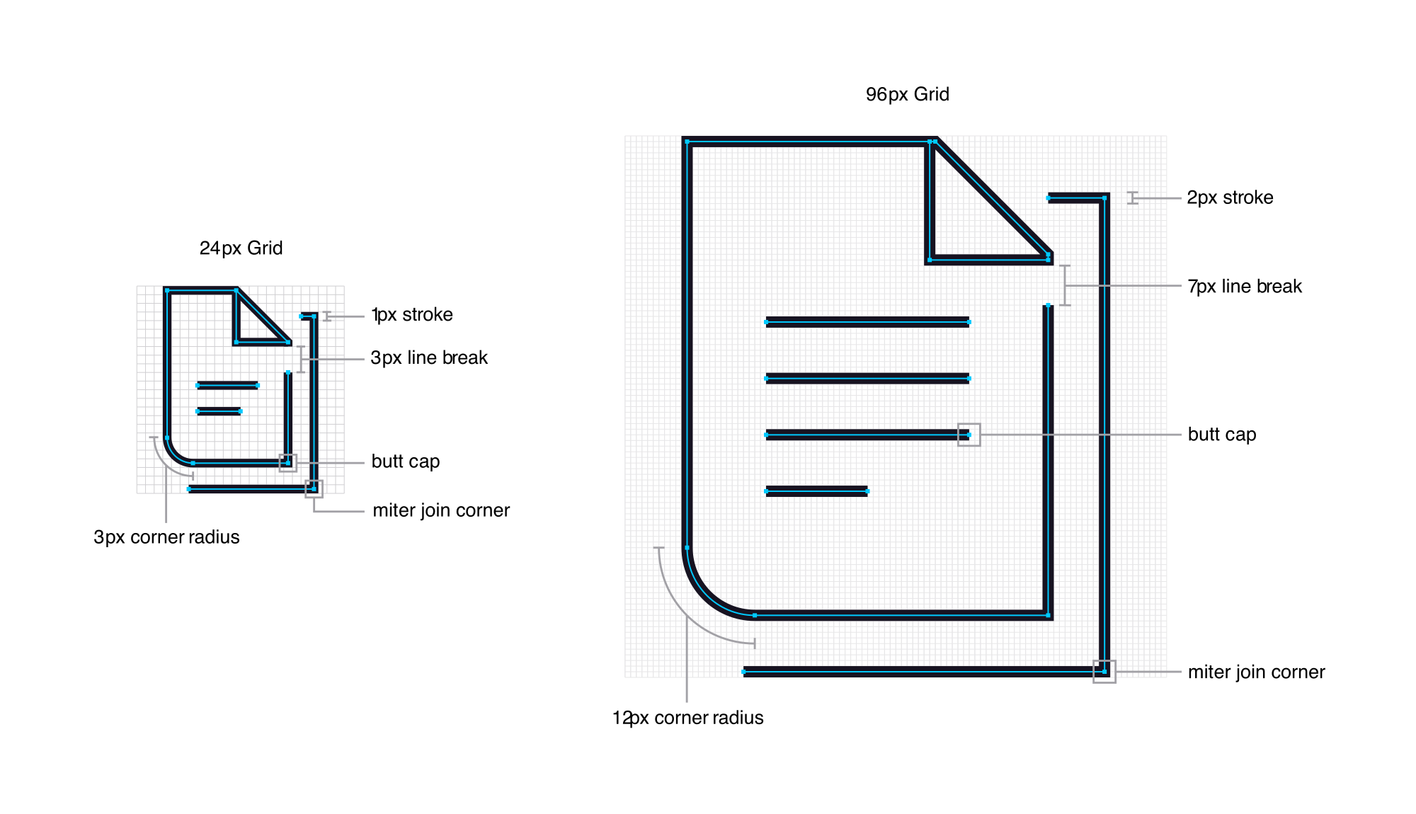

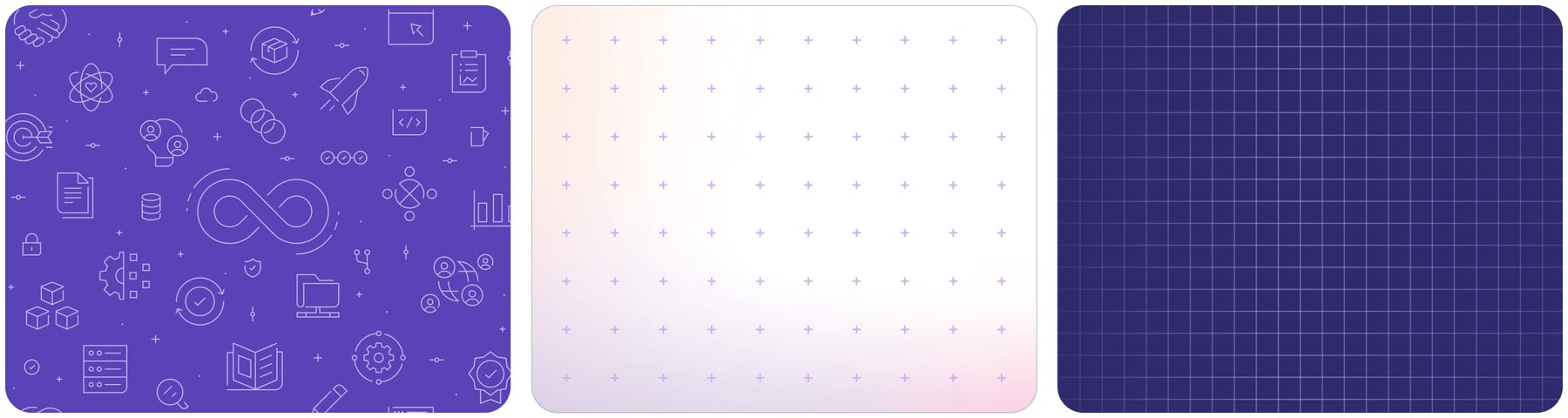
Marketing icons are open linework on an 8px grid in two sizes, 24px with a 1px stroke and 96px with a 2px stroke, each with one rounded corner and deliberate line breaks. A software development lifecycle set covers each stage. Product UI uses a separate icon set.
| Grid | 8px |
|---|---|
| Sizes | 24px / 96px |
| Stroke | 1px / 2px |
| Radius | 3px / 12px |
| Breaks | 3px / 7px |
| Caps, joins | butt caps, miter joins |
Source: design.gitlab.com/brand-design/visual-design-brand-icons-and-patternsdesign.gitlab.com/brand-design/visual-design-diagrams-infographics
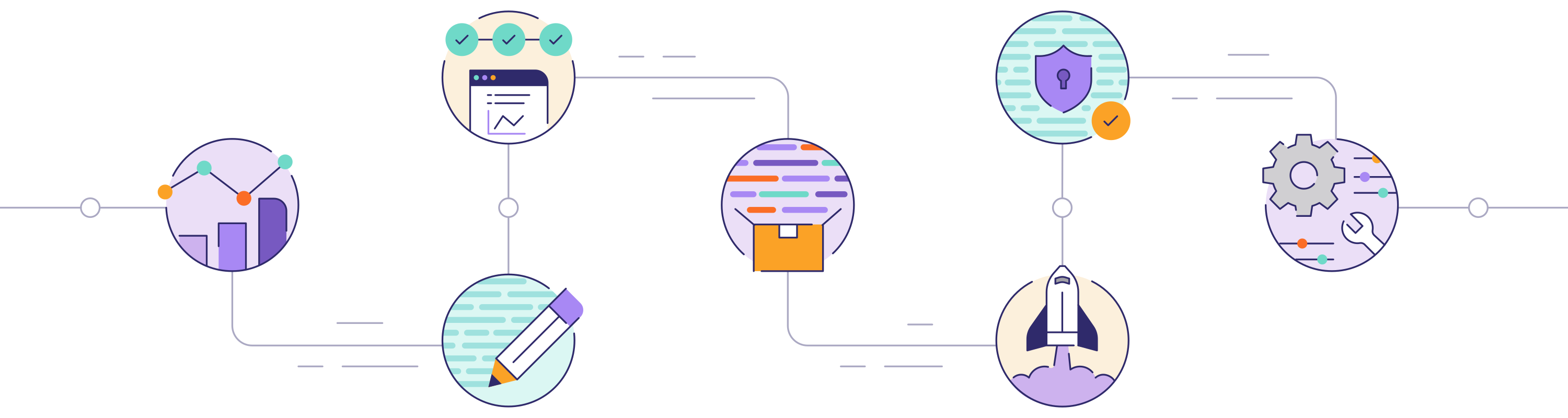
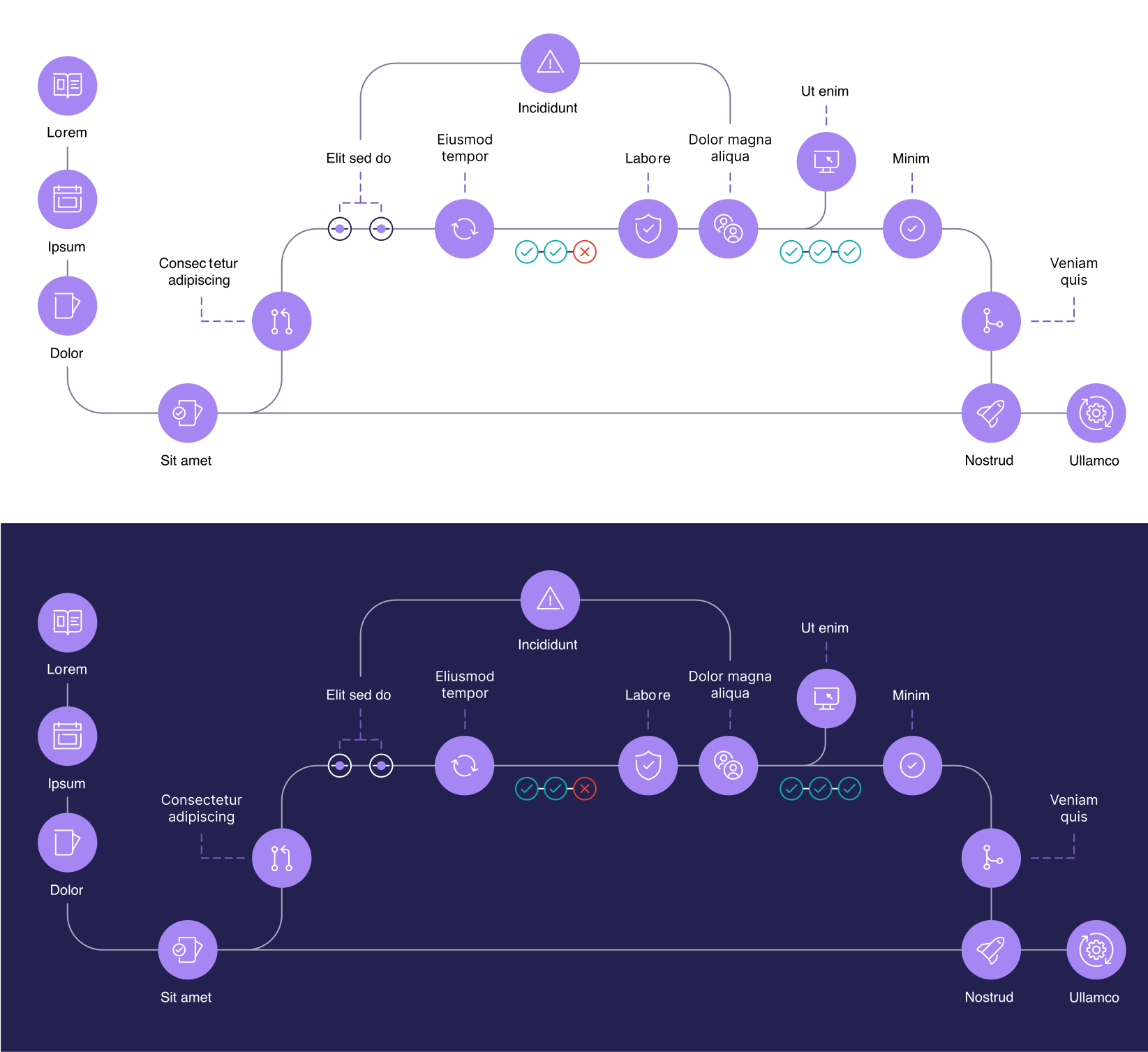
Building illustration out of icons and code lines keeps storytelling tied to the product rather than to characters.
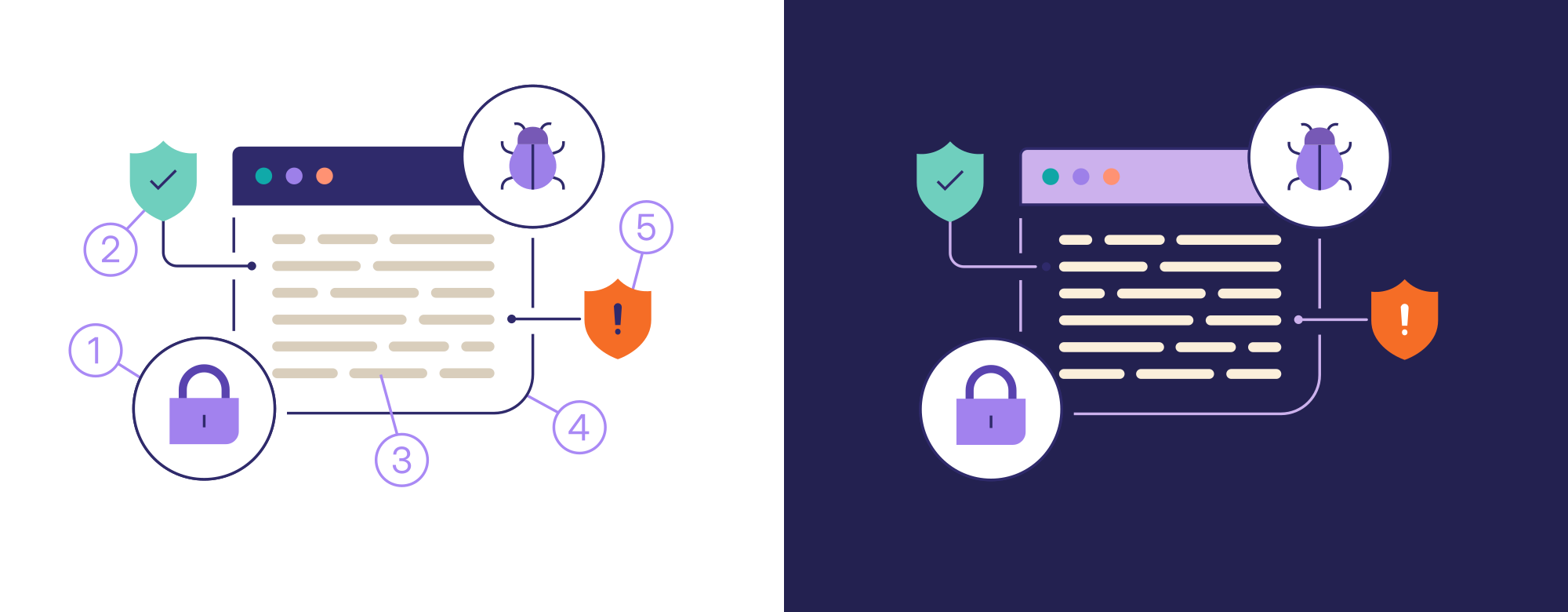

| Stroke | 2px digital, 15px large print |
|---|---|
| Grounds | White or Purple 04s |
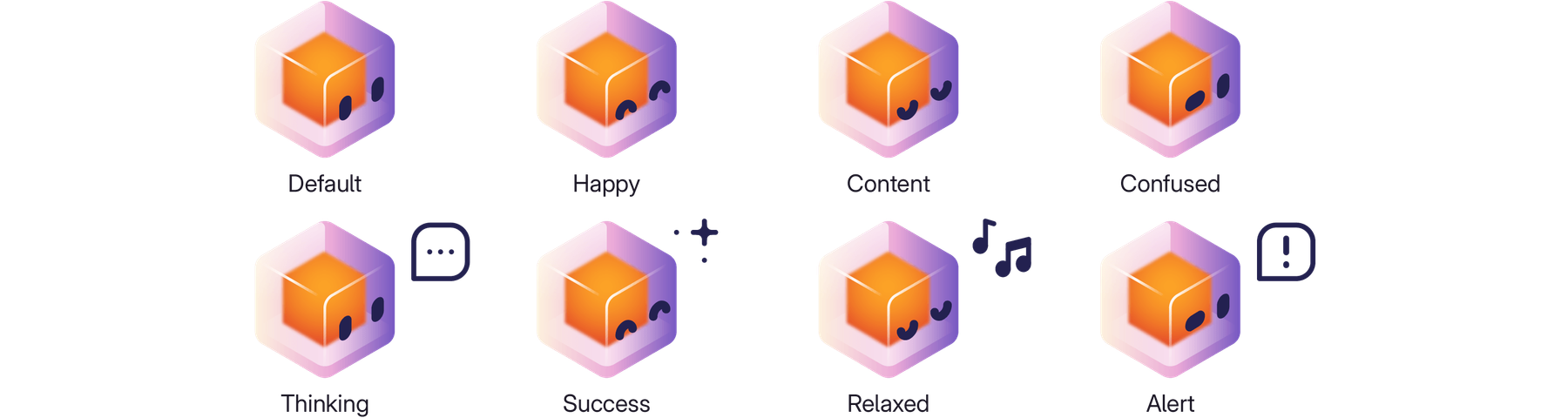
| Promptlings | 6 colors, 4 expressions, 6 poses |
Illustrations extend the icon system: thin linework from code lines, solid shapes for weight, dashed lines for iteration, and color from the palette, on white or Purple 04s. Promptlings, colorful cubes with a glowing orange core, stand for GitLab Duo's AI agents. Diagrams and infographics use the same parts with lots of negative space.
Source: design.gitlab.com/brand-design/visual-design-brand-illustrationsdesign.gitlab.com/brand-design/visual-design-diagrams-infographicsdesign.gitlab.com/brand-design/visual-design-promptlings
Real people, objects and landscapes, authentic and positive.



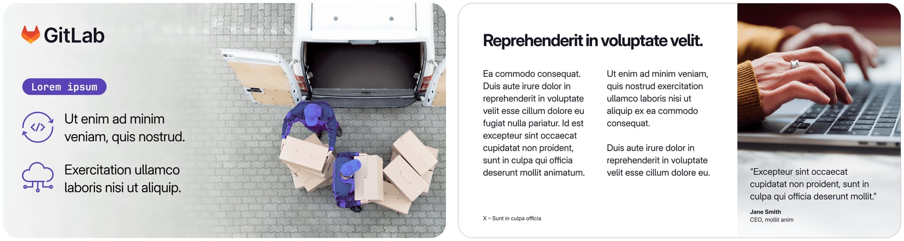
Real people, objects and landscapes, authentic and positive. Three subjects: heroic customer portraits (eye level, neutral ground, soft light), top-down metaphors (texture, pattern, paths), and top-down or over-the-shoulder collaboration. Photos can carry light graphic overlays, white or Charcoal text, or contained and masked crops.
| Portraits | eye level, neutral ground, soft light |
|---|---|
| Metaphors | top-down, texture or paths |
| Collaboration | top-down or over the shoulder |
| Overlays | graphics or text, not both |
Source: design.gitlab.com/brand-design/photographyhandbook.gitlab.com/handbook/marketing/brand-experience/brand-creative
Sleek and clean, lots of negative space, frames split into rows and columns.
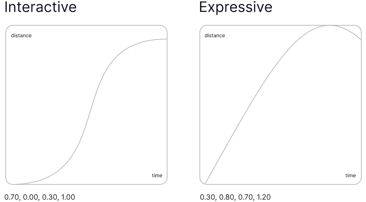
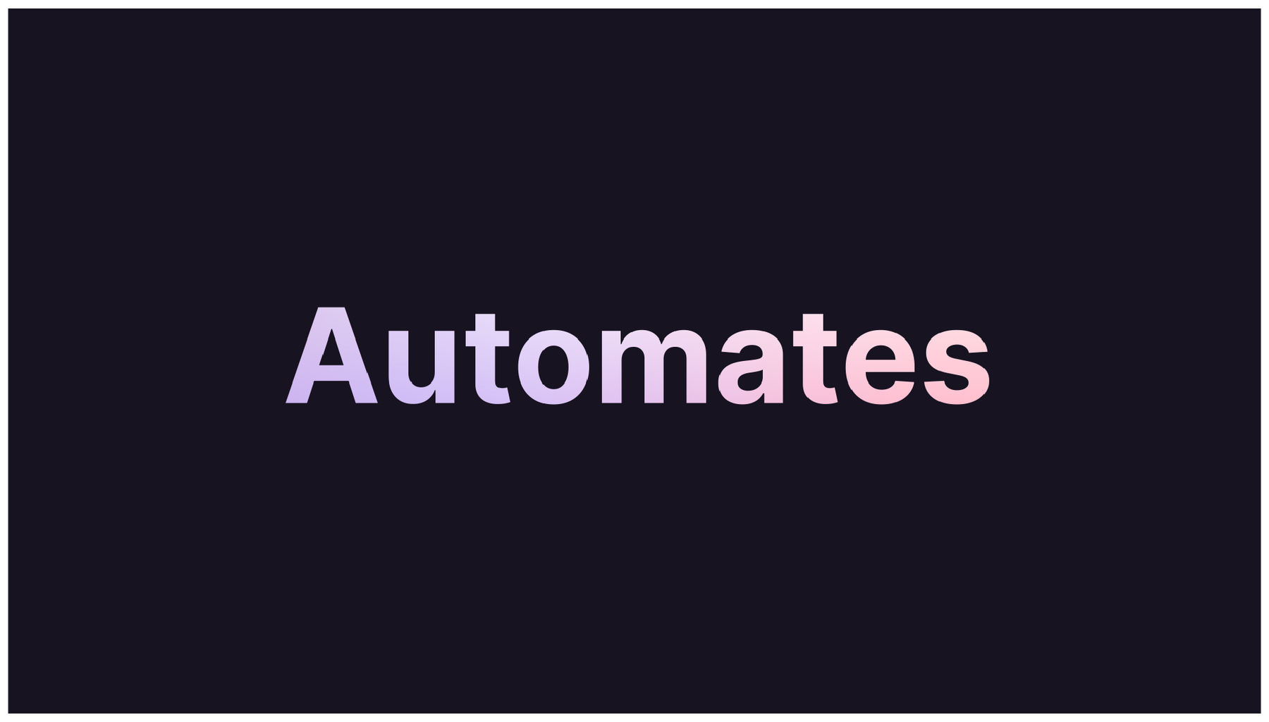
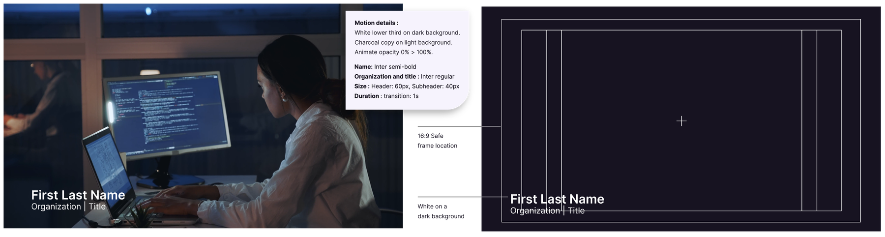
Sleek and clean, lots of negative space, frames split into rows and columns. Two published eases (Interactive and Expressive), stroke reveals for lines and the logo, snap edits and subtle drifts for type, slowly evolving blurred gradients, and the DevOps loop as the only transition mask.
| Interactive | cubic-bezier(0.70, 0, 0.30, 1) |
|---|---|
| Expressive | cubic-bezier(0.30, 0.80, 0.70, 1.20) |
| Icons | 0.65s |
| Lower thirds | 1s in, 4-5s hold, 1s out |
The guide publishes composition principles, not a grid: generous negative space, logo in a left corner, copy left-aligned, graphics flowing left to right, gradients behind and one emphasis device (type repetition or tagline lockup) per asset. Web page measurements come from the homepage step.
Measured from design.gitlab.com/brand-introduction's GitLab's public brand guide (design.gitlab.com, read from its Markdown source in gitlab-org/gitlab-services/design.gitlab.com, branch main) and its embedded images, plus handbook brand pages, fetched 2026-10-29.
| Measure | Desktop | Phone |
|---|---|---|
| Page margin | 165px | 16px |
| Section padding | 96px | 64px |
| Hero text width | max 1111px, centered | full width |
| Card gap | 24px | 24px |
| Navigation | 69px | 69px |
Hero H1 / closing H2
GitLab Sans · 96px (phone 48) · line 1.04 · tracking -2.88px · weight 660
Section H2 / quote headline
GitLab Sans · 64px (phone 48) · line 1.0625 · tracking -1.92px · weight 660
Feature card title
GitLab Sans · 32px · line 1.125 · tracking -0.64px · weight 580
Card title / resource title
GitLab Sans · 24px (phone 22) · line 1.167 · tracking -0.48px · weight 580
Lead paragraph
GitLab Sans · 24px (phone 22) · line 1.33 · tracking -0.48px · weight 400
Body large / Flex body
GitLab Sans · 18px · line 1.44 · weight 400
Hero card title / footer heading
GitLab Sans · 18px · line 1.556 · weight 660
Button label
GitLab Sans · 18px · line 1.25 · weight 660
Body
GitLab Sans · 16px · line 1.5 · weight 400
Small body / card text
GitLab Sans · 14px · line 1.571 · weight 400
Stat number
GitLab Sans · 64px (phone 48) · line 1.2 · tracking -1.92px · weight 500
Ordinal
GitLab Sans · 32px · line 1.2 · weight 400
Industry label
GitLab Sans · 16px · line 1.5 · weight 700
Section eyebrow
GitLab Sans · 14px · line 1.714 · weight 400
Hero card eyebrow
GitLab Sans · 12px · line 1.5 · weight 400
Vertical rail
GitLab Sans · 11px · line 1.5 · tracking 2.42px · weight 400
How GitLab’s own landing pages are built, observed on about.gitlab.com, 2026-10-29. The full measurements are in spec.md.
Source: design.gitlab.com/brand-logo/core-logodesign.gitlab.com/brand-design/motiondesign.gitlab.com/brand-design/visual-design-diagrams-infographics
The product story lives inside the mark, so the logo itself argues 'one platform for the whole loop'. Our reading
Two words and a period make the pause the guide describes: what you build, then the advantage. Our reading
Visionary through data: the guide asks for provable claims, and the survey supplies them every year. Our reading
How our engine applies GitLab's system to each format. This is our recipe built from their rules, not something GitLab publishes. Level = how much color and gradient the format carries (0 plain, 5 full gradient and promptlings).
| Format | What they did | Source |
|---|---|---|
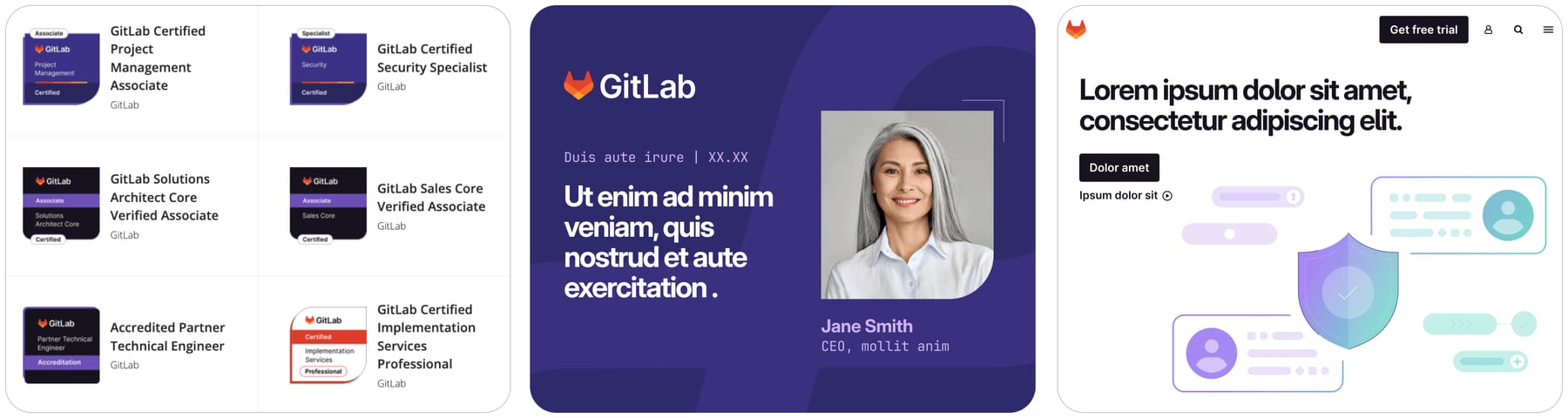
| certification badges | GitLab certification badges (Associate, Specialist, Professional) as small dark and purple tiles with a curved bottom-right corner. | design.gitlab.com/brand-design/visual-design-core-elements |
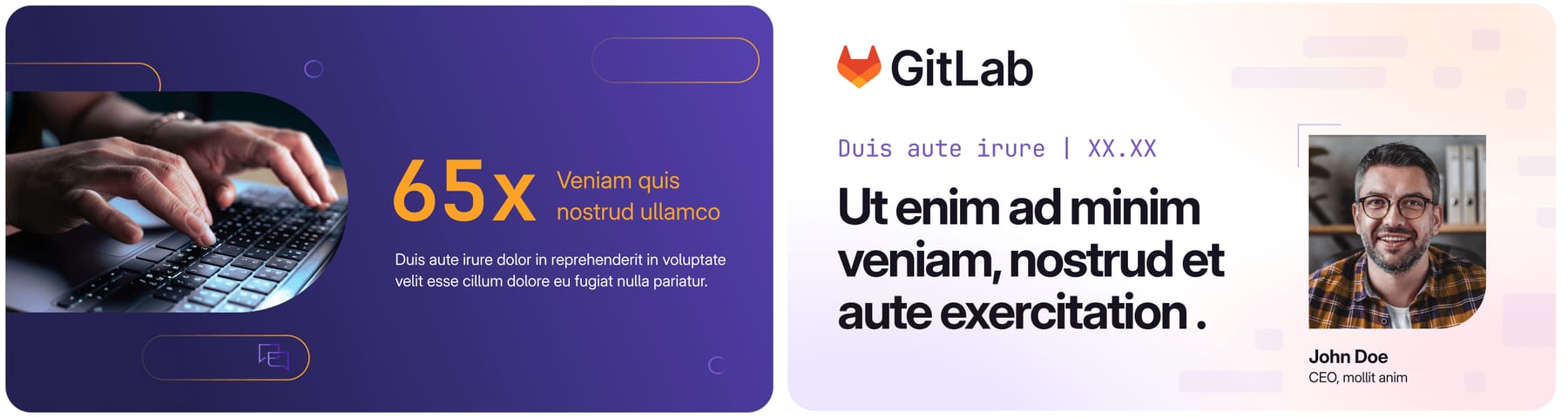
| social / speaker card | Purple 03s card: core logo top left, Mono date label, Bold white headline, portrait in a one-curved-corner container, name in a light purple and title in Mono. | design.gitlab.com/brand-design/visual-design-core-elements |
| web page | White page with tanuki top left, Charcoal 'Get free trial' button, Bold sentence-case headline, Charcoal CTA plus a text link with arrow, and an illustration of labels, code lines and a gradient shield. | design.gitlab.com/brand-design/visual-design-core-elements |
| video | Lower thirds in white on dark (Inter SemiBold 60px name, Regular 40px title), DevOps-loop transitions, trace logo reveals. | design.gitlab.com/brand-design/motion |
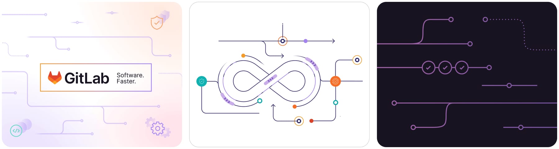
| diagrams and infographics | Product diagrams on light or dark grounds with circled icons; long vertical infographics with GitLab header and CTA footer. | design.gitlab.com/brand-design/visual-design-diagrams-infographics |
| partner collateral | Partner lockup in purple gradients with the partner logo below, plus co-branded lockups for approved partnerships and events. | design.gitlab.com/brand-logo/branded-lockups |
| self-serve templates | Branded Canva templates for digital ads and promotional assets, with Brand review before use. | handbook.gitlab.com/handbook/marketing/brand-experience/brand-creative |
| events and swag | Booths, signage, event social posts and merch go through Brand Design issue templates; one-color logos for swag; the Team Expressions Tanuki Tabs (2024) let groups express themselves without altering the logo. | handbook.gitlab.com/handbook/marketing/brand-experience/brand-creative |
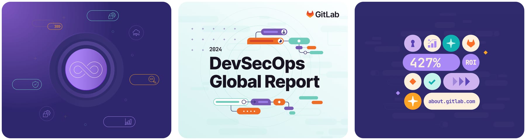
| AI marketing | Promptlings shown free-floating or in stacked grids with emote icons to depict GitLab Duo agents planning, coding and analyzing. | design.gitlab.com/brand-design/visual-design-promptlings |
| Format | Loudness | Must appear | What varies |
|---|---|---|---|
| Landing page | Build it the way about.gitlab.com is built (kit.spec.page, homepage voice): Charcoal #171321 hero with the dot field, 3-column hairline grid and two glass cards; 96px GitLab Sans 660 sentence-case headline; one gradient-glass CTA bar; white monochrome logo marquee; light card section, dark bands, white closing CTA; tanuki top left; copy only white, Charcoal or the measured greys; 4px-radius buttons, square cards | which sections and how many cards; the guide's lighter default (white page, Charcoal or white SemiBold buttons, purple links, soft orange-purple-pink gradient behind the hero) for pages that are not homepage-style | |
| Deck | Logo in a left corner, Bold sentence-case headlines, white or Purple 04s grounds, one stroke weight and radius throughout | type repetitions on the opening slide; masked-crop photos | |
| Proposal page | White ground, Charcoal copy, provable numbers only, Charcoal CTA | one curved-corner container for the buyer's logo or photo | |
| Ad | Core logo left corner, white or Charcoal headline, tagline lockup unless the headline says it | AI gradient if the ad is about AI | |
| Social post | Gradient or Purple 03s/04s ground, white Bold headline, Mono label | promptlings for AI topics, portraits in curved containers | |
| White, Charcoal type, one Charcoal button, purple links | a small gradient header | ||
| Error message | Plain language, Charcoal on white, honest about the limitation | none |
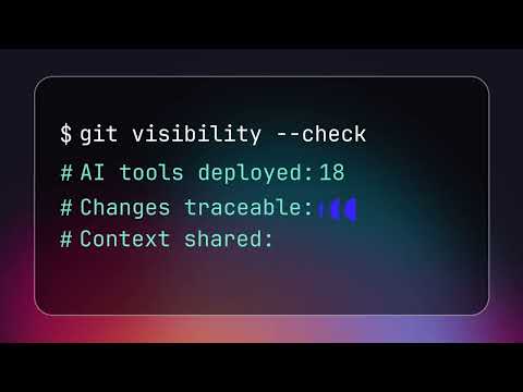 VirtualGoogle, LinkedIn · May – Nov 2026
 Epic munichLinkedIn · Oct – Nov 2026
 Webcasts nov5 gitlab omdia emea amerLinkedIn · Oct – Nov 2026
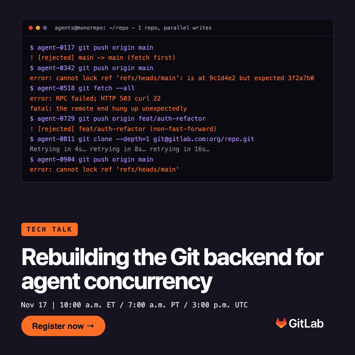 Webcasts nov17 rebuilding git scm emea amerLinkedIn · Nov 2026
Source: design.gitlab.com/brand-design/colordesign.gitlab.com/brand-design/typographydesign.gitlab.com/brand-logo/core-logodesign.gitlab.com/brand-logo/logomarkhandbook.gitlab.com/handbook/marketing/product-and-technical-marketing/product-and-solution-marketing/messaging
Your name and logo, GitLab’s system.
Use this kit for my brand Use this brand in Claude
Get your brand audit Put your brand in Claude What goes in a brand book
Each value is marked published, observed, our reading or our recipe, with its source. Checked 2026-10-29. Not affiliated with GitLab.