The lesson
Launch hardware by making the object and the payment moment instantly legible before you explain anything.
The move
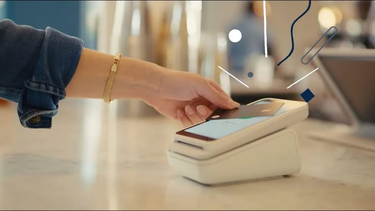
The poster shows a white Stripe Reader floating on a pale gray background next to a black Stripe card. Both the reader and card show contactless marks, so the use case is clear without a caption. The title, “Introducing Stripe Reader,” frames it as a product introduction rather than a feature walkthrough.
Why it works
- Our readThe isolated product render makes the hardware feel like the main event, not an accessory buried inside software.
- Our readShowing the card and reader together explains the transaction in one glance.
- Our readThe minimal background keeps attention on form, scale, and the contactless payment cue.
What not to copy
Skip copying Stripe’s exact white-on-gray product-world if your brand needs warmth or context. Keep the move: show the new object beside the thing it interacts with, so the launch is understood before the script starts.
More from Stripe

More launch videos








Steal it for your brand.
Tell us what you want to make. We’ll talk through how to put these ideas to work for your brand.