The lesson
Compare against the buyer’s existing platform by naming what it already does, then show what your added layer changes by security goal.
The move
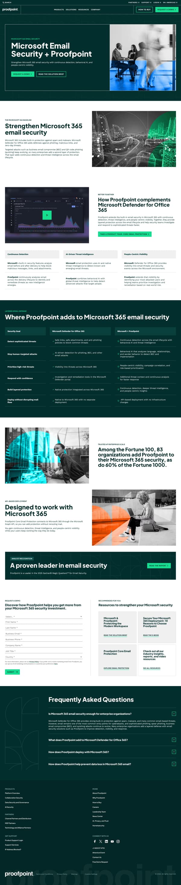
The page opens with “Microsoft Email Security + Proofpoint” and the promise to “Strengthen Microsoft 365 email security with continuous detection, behavioral AI, and people-centric visibility,” followed by “Request a demo” and “Read the solution brief” CTAs. “The Microsoft 365 baseline” explains built-in Microsoft 365 protection and why enterprises add a second layer, then “How Proofpoint complements Microsoft Defender for Office 365” introduces continuous detection, AI-driven threat intelligence, and people-centric visibility. “Where Proofpoint adds to Microsoft 365 email security” uses a table of security goals, with one column for Microsoft Defender for Office 365 and one for Microsoft + Proofpoint. The page then adds enterprise-scale proof, an API-based deployment section, analyst recognition, and a request-a-demo form.
Why it works
- Our readThe hero frames Proofpoint as an added layer for Microsoft 365 rather than a rip-and-replace choice, which matches the comparison the reader is likely making.
- Our readThe page explains the Microsoft baseline before introducing Proofpoint, so the argument starts from what the buyer already has.
- Our readThe security-goal table compares Microsoft Defender for Office 365 with Microsoft + Proofpoint by outcome, which makes the added value easier to scan than a feature list.
What not to copy
Don't copy the Microsoft positioning, Fortune proof, or Gartner claim unless they are true for your product and current collateral. Keep the structure of baseline first, added layer second, outcome comparison third, and conversion form last.
More from Proofpoint
More landing pages








Steal it for your brand.
Tell us what you want to make. We’ll talk through how to put these ideas to work for your brand.