The lesson
State the competitor difference in two plain bullets before the comparison tables.
The move
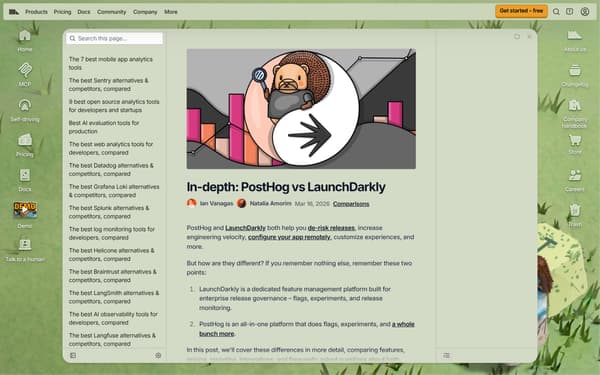
The page opens with “In-depth: PostHog vs LaunchDarkly,” then says both tools help with releases, engineering velocity, remote configuration, and customization. It asks “How is PostHog different?” and answers with three claims: “It’s an all-in-one platform,” “We’re transparent and open source,” and “Built for startups and engineers.” A small install block says “Install PostHog with one command” and shows “npx @posthog/wizard.” The comparison then moves into feature tables for “Platform,” “Feature management,” and “Experimentation,” with notes under the tables explaining where LaunchDarkly gates workflow features and where PostHog calculates recommended run time.
Why it works
- Our readThe opening reduces the choice to two plain points, so a reader understands the claimed difference before reaching the feature tables.
- Our readThe section “How is PostHog different?” argues from product shape, transparency, and fit before asking the reader to compare rows.
- Our readTables are grouped by jobs like “Platform,” “Feature management,” and “Experimentation,” which lets a buyer check the category they care about instead of reading one long checklist.
What not to copy
Don't copy the developer-terminal install block unless your buyer can actually start that way. Keep the short opening verdict, then break the comparison into job-based tables with explanatory notes under the rows that need context.
More from PostHog


More landing pages








Steal it for your brand.
Tell us what you want to make. We’ll talk through how to put these ideas to work for your brand.