
The lesson
Frame a competitor page around the situations where the buying decision becomes hard, then give readers the questions to ask any provider.
The move
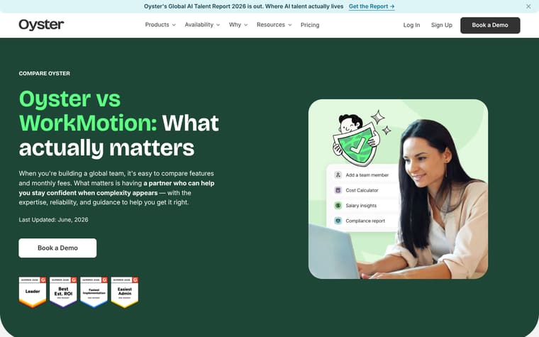
The page opens with "Oyster vs RemoFirst: What actually matters" and a Book a Demo button, then names three reasons growing teams choose Oyster: "Reliable, expert-led support," "Deep compliance expertise," and "Transparent, predictable pricing." It follows with "Who each option is best for," splitting the choice into Oyster-fit and RemoFirst-fit lists. The middle turns the comparison into a table headed "What actually matters when choosing an EOR," with rows for support, pricing, compliance expertise, complex situations, employee experience, automation, and accountability. Later sections add expert proof, G2 user quotes, a list of questions to ask any EOR provider, and "Our point of view" on technology plus human expertise.
Why it works
- Our readThe hero concedes that buyers compare features and monthly fees, then reframes the decision around confidence when complexity appears.
- Our readThe "Who each option is best for" section gives RemoFirst a clear fit, which makes Oyster's argument feel more useful than a one-sided attack.
- Our readThe comparison table is built around questions to ask a provider, so the reader gets a buying checklist instead of only a vendor claim.
What not to copy
Don't copy the comparison if you can only say the competitor is worse. Keep the fair-fit section, the buyer questions, and the table organized around what matters after the contract is signed.
More from Oysterhr
More landing pages








Steal it for your brand.
Tell us what you want to make. We’ll talk through how to put these ideas to work for your brand.