
The lesson
Put a sidebar beside the story that names every party involved, including the products used, the agency partner and the integration, so a buyer can see the whole setup at once.
The move
A large SABO wordmark and the headline sit beside a lifestyle photo, with three stat tiles below: "11%" increase in conversion rate, "5x" for loyalty members' repeat purchases and "9.3%" increase in AOV for loyalty members. A left column holds a quote from Jason Anderson, Chief Operating Officer at Andzen, then cards for Product (Loyalty, Reviews, Surveys), Details (saboskirt.com, VERTICAL Apparel, REGION APAC), Agency Partner and Integration (Klaviyo). The right column runs "About", "Challenges", "Solution" and "Results" as short bullet lists, then a "Like What You See?" demo box and a "Keep Exploring" carousel of other customer stories with their own headline stats.
Why it works
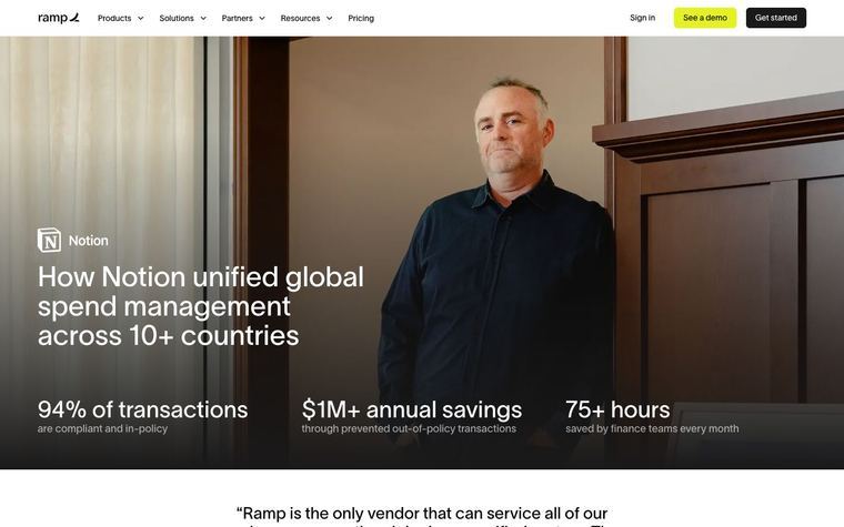
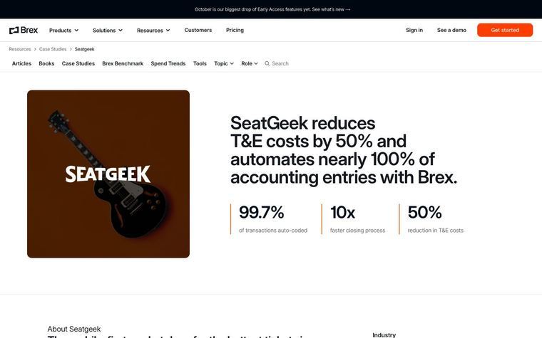
- Our readThe three stat tiles repeat the Results section, so a reader who stops at the first screen already has the outcome.
- Our readThe sidebar cards for vertical, region, agency partner and integration let a Shopify merchant check fit and see which tools and partners were involved without reading the body.
- Our readBullet lists under four plain headings keep each section to a few lines, which suits a reader comparing several stories in the carousel below.
What not to copy
Don't copy the Sabo Resort Greek Island theme, the hidden VIP tier details or the lead quote from the agency partner instead of the customer. Keep the stat tiles under the hero, the sidebar of product, firmographic, partner and integration cards, the About, Challenges, Solution, Results bullets, and the related-stories carousel with one stat per card.
More from Okendo


More case studies
Steal it for your brand.
Tell us what you want to make. We’ll talk through how to put these ideas to work for your brand.