
The lesson
Lead a competitor page with the product system you want buyers to remember, then let the comparison table carry the detail.
The move
The page opens with "Stripe Treasury vs. Mercury Business Banking" and a short explanation that Mercury connects cards, bill pay, expenses, accounting, and balances. It follows with "Built to stand the test of time" and proof points including "450K+", "1 in 3", "$20B+", and "4.9". The next section, "Why businesses choose Mercury", turns the pitch into six plain capability blocks. Then "How Mercury Business Banking compares to Stripe Treasury" runs a two-column table across operating accounts, FDIC insurance, card cashback, expense management, yield-bearing accounts, financing, support, and money transfers.
Why it works
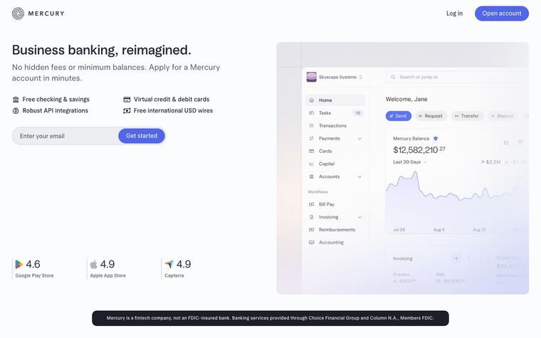
- Our readThe hero states the comparison in the headline, then defines Mercury as one system for holding, moving, and spending money before asking for an email.
- Our readThe proof row comes before the product argument, so readers see adoption, transaction volume, and app rating before the detailed claims.
- Our readThe comparison table names the source and date for Stripe Treasury figures, which makes the side-by-side feel like a buying reference rather than a loose attack ad.
What not to copy
Don't copy the competitor table unless you can cite current product terms and published fee schedules. Keep the order of promise, proof, reasons to choose, then a detailed side-by-side table.
More from Mercury




More landing pages








Steal it for your brand.
Tell us what you want to make. We’ll talk through how to put these ideas to work for your brand.