
The lesson
Turn a competitor comparison into a product breadth argument before you show the table.
The move
The page opens with “Ramp vs. Mercury Business Banking” and positions Mercury as “one intelligent financial system” for banking, cards, spend controls, payments, invoicing, and more. It follows with logo proof under “Loved by 450K+ ambitious companies,” then states “Why startup and growth-stage companies prefer Mercury over Ramp” with short feature blocks such as “Banking-native financial workflows,” “Use AI to analyze and run your finances,” and “Invoicing and banking in one place.” The comparison table then uses three columns, “Mercury Business Banking,” “Ramp,” and “Takeaway,” across rows like transaction fees, cashback, yield bearing accounts, and invoicing. After the table, Mercury returns to broader proof, testimonials, product cards, and plan pricing.
Why it works
- Our readOpening with the full product system gives the reader a reason to compare beyond one fee or card feature.
- Our readThe “Takeaway” column translates dense fee and product details into a plain decision point after each row.
- Our readPutting testimonials and product cards after the table helps the page move from side-by-side evaluation back into a normal buying path.
What not to copy
Don't copy the direct fee-by-fee comparison unless you can keep the source note current. Keep the structure of product breadth first, comparison table second, and conversion proof after.
More from Mercury
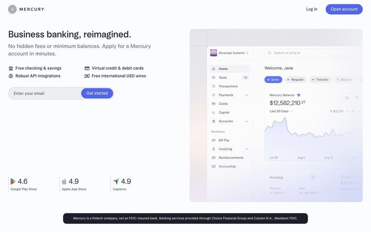
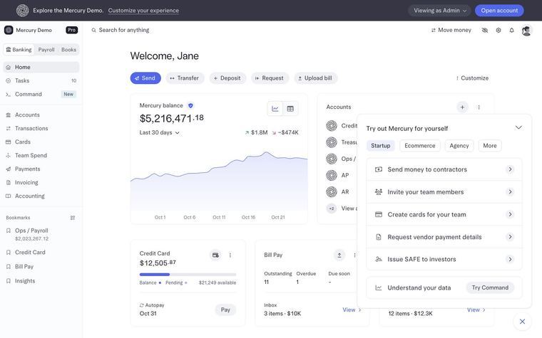
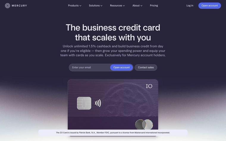





More landing pages








Steal it for your brand.
Tell us what you want to make. We’ll talk through how to put these ideas to work for your brand.