
The lesson
Give the build-it-ourselves option its own section, so the reader sees why the obvious alternative was rejected before you show the product.
The move
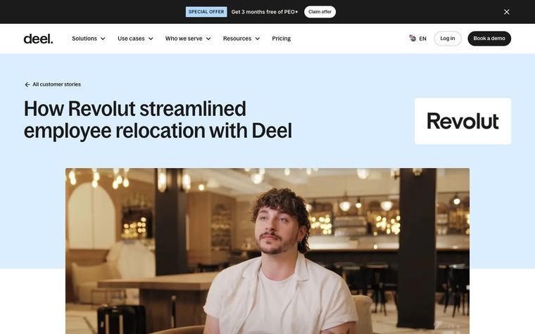
The page opens with a date, the CreatorIQ logo and a headline built on a before number, '30-Hour Dashboard Builds', followed by a video of the customer and a boxed quote from Brett Kobold, Director of GTM Engineering, comparing 30 hours of development to maybe two hours in HockeyStack. A sticky table of contents lists six sections: 'The Who', 'The Problem', 'The Alternatives', 'The Requirements', 'The Insights' and 'The Results'. 'The Alternatives' covers continuing internal builds, where each report took 30 or more hours, and 'The Requirements' lists what a new platform had to do. 'The Results' gives five bold-labeled bullets such as 'Massive time savings' and 'High adoption across teams', then closes on a quote about finding an additional half million dollars in pipeline.
Why it works
- Our read'The Alternatives' answers the question a technical buyer will ask, which is why not keep building dashboards in-house, using the customer's own reasoning.
- Our read'The Requirements' list doubles as a buying checklist that a reader with the same problem can hold up against their own needs.
- Our readPlacing the 30 hours versus two hours comparison in both the headline and the lead quote gives a reader who stops after the first screen the core before and after.
What not to copy
Don't copy CreatorIQ's influencer marketing context, the Odin product mention or the lagging-indicator framing. Keep the logo, before-number headline, video and lead quote at the top, the sticky table of contents, the separate alternatives and requirements sections, and the bold-labeled results bullets that end on a customer quote.
More from HockeyStack


More case studies
Steal it for your brand.
Tell us what you want to make. We’ll talk through how to put these ideas to work for your brand.