
The lesson
Anchor a competitor comparison on the single product difference that changes what a buyer can know later.
The move
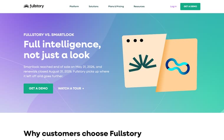
The page opens with “Fullstory vs. Amplitude” and the headline “Every untagged moment is a question you can’t answer,” followed by “Get a demo” and “Watch a tour.” It then lists why customers choose Fullstory over Amplitude, framing Fullstory around historical journeys, shared context, and automatic adaptation, while framing Amplitude around lost untagged data, high-level charts, and tracking-plan maintenance. The middle sections compare “The ‘why’ behind every drop-off,” “One snippet. No maintenance.” and “AI that understands your users,” each with separate Fullstory and Amplitude explanations. After a demo CTA and customer quotes, the page links to other Fullstory comparisons and ends with “Fullstory vs. Amplitude, at a glance,” a side-by-side table covering design, primary use, data capture methods, AI insights, MCP and agent support, and privacy model.
Why it works
- Our readThe hero turns the comparison into one clear question about untagged moments, so the reader knows the argument before any detail appears.
- Our readThe early bullets contrast Fullstory's automatic capture with Amplitude's preset and manually tagged events, which makes the table feel like evidence rather than the first explanation.
- Our readCustomer quotes about missing data and developer time add a practical cost to the product comparison without needing a long case study.
What not to copy
Don't copy the claims about Amplitude's Autocapture, AI, or tracking plans unless you can verify them against the current product. Keep the structure of one sharp comparison premise, short objection-style contrasts, customer pain quotes, and a final side-by-side table.
More from Fullstory



More landing pages








Steal it for your brand.
Tell us what you want to make. We’ll talk through how to put these ideas to work for your brand.