
The lesson
Build a comparison page around one repeated contrast, then use every section to make that contrast easier to believe.
The move
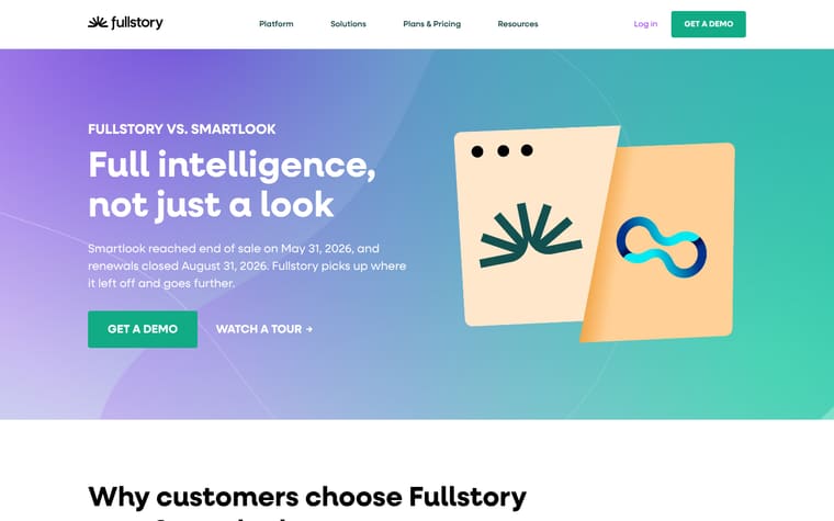
The hero names the comparison as "Fullstory vs LogRocket" and leads with "Curated is another word for incomplete." Under "Why customers choose Fullstory over LogRocket," the page pairs Fullstory claims about automatic capture and retroactive AI with LogRocket drawbacks around Conditional Recording, sanitizer functions and tiering. The middle sections turn the same argument into side-by-side blocks: "See what actually happened, not just what got flagged," "One snippet. No rules to tune," and "AI that understands your users." It then adds more comparison links, customer quotes, and a "Fullstory vs. LogRocket at a glance" table.
Why it works
- Our readThe headline gives the whole comparison a simple frame, so the reader is not just comparing features but judging complete capture against curated capture.
- Our readRepeating Fullstory and LogRocket labels inside each section keeps the page easy to scan without forcing the reader into a dense table too early.
- Our readPutting quotes before the at-a-glance table gives the claims a human break before the page shifts into structured feature comparison.
What not to copy
Don't copy the attack line unless the competitor's weakness is central to the buying decision. Keep the pattern of one clear contrast, repeated through bullets, side-by-side sections and a final table.
More from Fullstory





More landing pages








Steal it for your brand.
Tell us what you want to make. We’ll talk through how to put these ideas to work for your brand.