The lesson
Build a competitor page around a few named comparison claims, then give each one its own proof block below the first scan.
The move
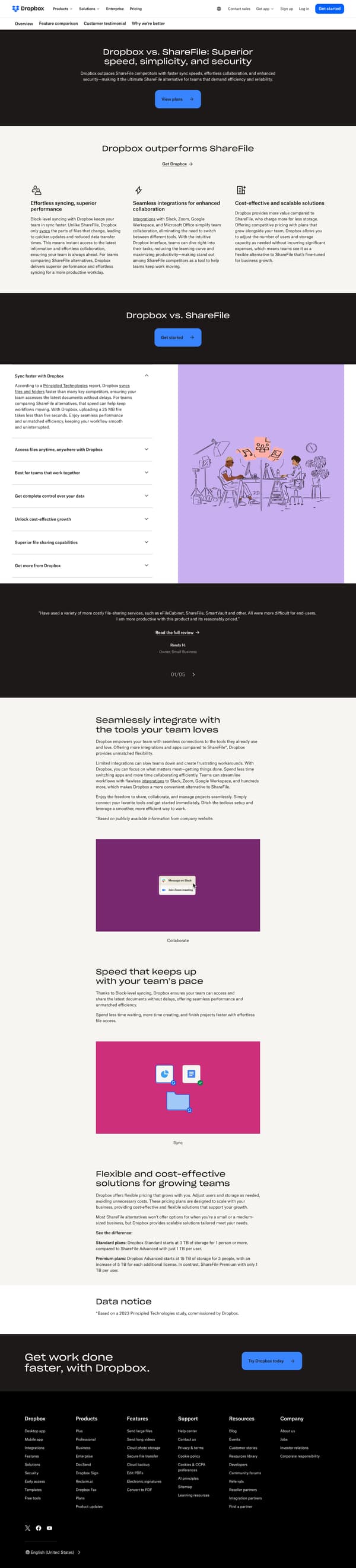
The page opens with "Dropbox vs. ShareFile: Superior speed, simplicity, and security" and a short paragraph that frames Dropbox as a ShareFile alternative, followed by a "View plans" button. It then states "Dropbox outperforms ShareFile" and presents three reasons: syncing performance, integrations, and cost-effective scaling. Lower down, "Sync faster with Dropbox" cites a Principled Technologies report and says uploading a 25 MB file takes less than five seconds. The rest of the page stacks customer testimonials, an integrations section, a block-level syncing section, a pricing-and-storage comparison, and a closing "Get work done faster, with Dropbox" call to action.
Why it works
- Our readThe hero names the competitor and the claim immediately, so a visitor knows this is a ShareFile alternative page before any feature copy starts.
- Our readThe first comparison section reduces the case to three plain reasons, giving the reader a fast scan before the longer proof blocks.
- Our readCustomer quotes appear before the deeper sections, so the page does not rely only on Dropbox's own claims about speed and ease of use.
What not to copy
Don't copy the broad superiority language unless the page also gives the reader concrete comparison points. Keep the competitor-named hero, the short reason set, and the later proof sections that expand each claim.
More from Dropbox




More landing pages








Steal it for your brand.
Tell us what you want to make. We’ll talk through how to put these ideas to work for your brand.